SVG (Scalable Vector Graphics) images offer web designers a flexibility with imagery they have not previously known. Now compatible with all current web browsers and most mobile device platforms, here is another technique that is threatening the popularity of Flash.
SVG images are small in file size and they scale pretty much to any size without losing quality. Some software programs that support .svg files are: Adobe Illustrator, CorelDRAW, Inkscape and Serif DrawPlus. There are also some online .svg editors, such as Google’s SVG-edit. You can learn more about why and how you should use SVGs in our recent article Designing for Changing Technology: Font Icons vs SVG. Here we have collected some examples of SVGs in use in web design.
SVGs in Web Design
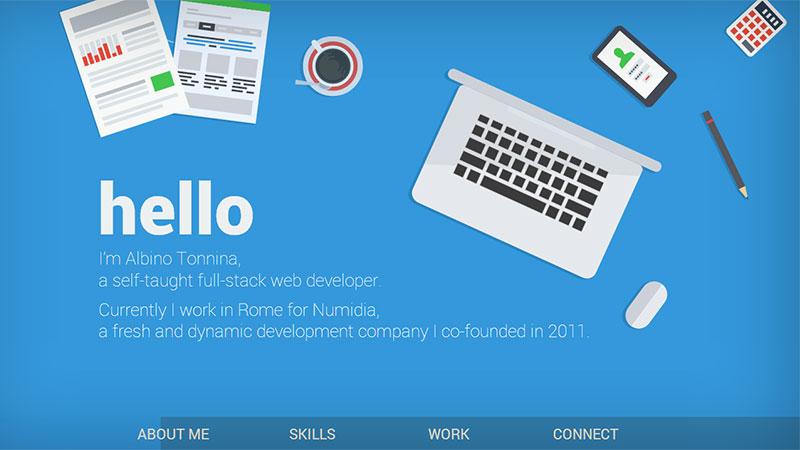
Albino Tonnina
This site has some very nice scrolling animations on the vertically scrolling page. A modern design style that is becoming more and more popular.
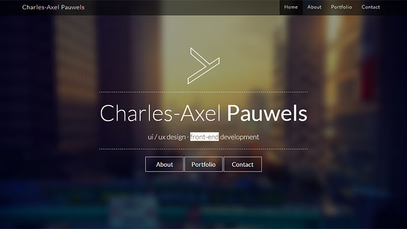
Charles-Axel Pauwels
No bells and whistles in this design, just some tasteful little animations where key words from the changing sub-heading are highlighted.
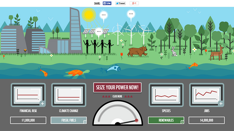
Your Power
This site is owned by the WWF, and is rallying for natural fuel. You scroll down and read the story, then at the end there is a call-to-action button that asks you to ‘Seize Your Power Now’ – when you click on that, you are presented with a form that will pledge that you want a world powered by nature.
Brut Magazin
This site has some creative animations that lead you from one screen to the next.
Kevin Lagier
This is the portfolio site of an aspiring art director. Most of the horizontal scrolling pages have an animation, some automatic, some scrolling animations. Very well presented site.
VT Creative
As you scroll down this page, the illustrations are drawn as you reach them.
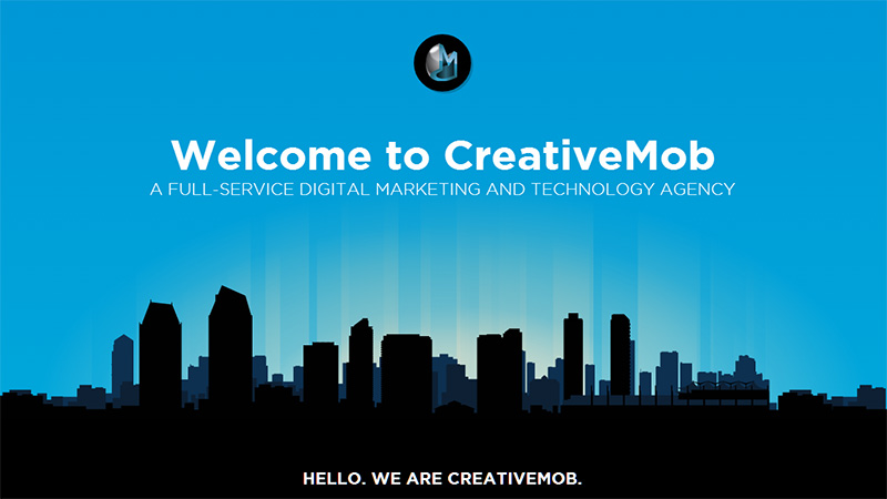
CreativeMob
Some very nice animations as you scroll down this site.
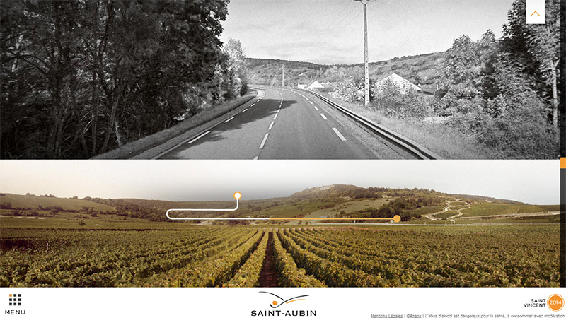
Vins Saint-Aubin
On this site, you scroll up, and there are some wonderful scrolling animations along the way.
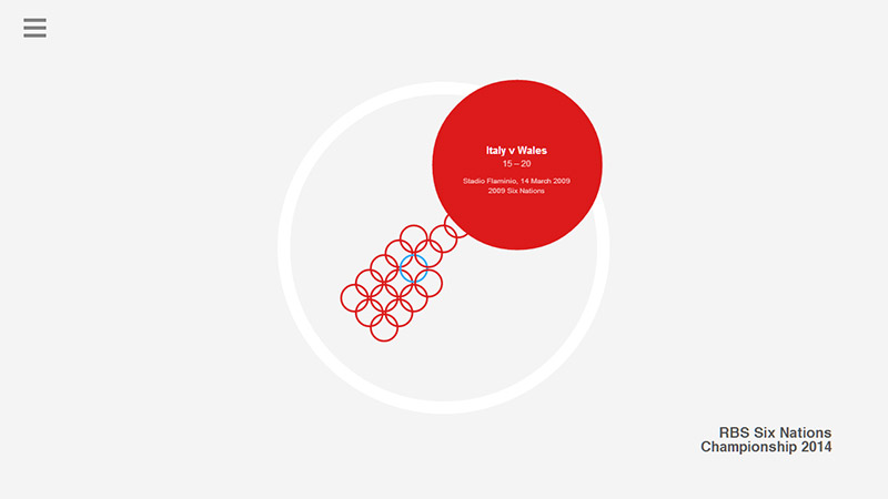
Sequence – Six Nations
This site gives you the results of all Six Nations rugby matches played between any 2 teams. The map of circles are links that expand to a match containing the result and the date played. They go back a long way… the oldest match I found was France v England in 1906 – score was 8-35.
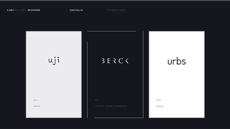
Carl Philippe Brenner
This is a grid-style layout design with a nice little animation on mouseover of any element. If you click on the category there is another opening animation on each page.
Kaipoche
This site that is dedicated to a kite flying festival that took place in Goa in January 2014 has some beautiful scrolling animations.
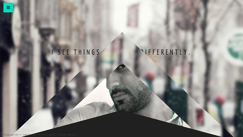
Alee Foroughi
There are some very nice, sophisticated scrolling effects on this portfolio site.
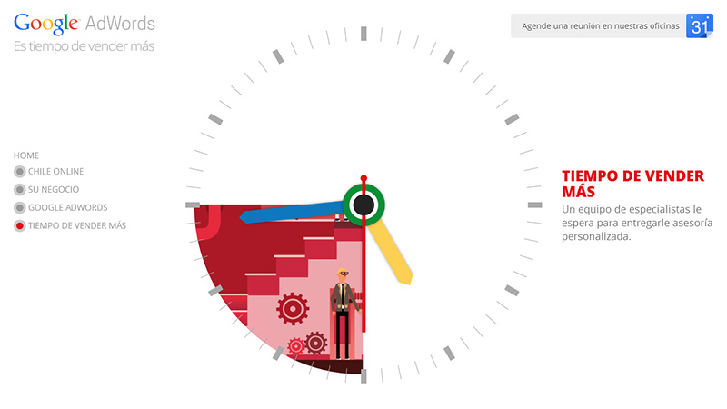
Tiempo de Vender Más
This is an interactive one pager introducing Google AdWords marketing and info from the Chilean market. The clock with Google-colored hands works, and the links in the sidebar bring portions of the circle into focus. When you click on a link the clock is replaced by a round, animated image for the category.
Chango
This site has some subtle and appropriate scrolling animations as you make your way down the page. Very tastefully done.
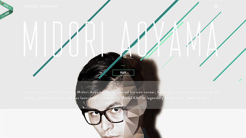
Midori Aoyama
There appear to be quite a few things wrong with this Japanese DJ’s portfolio site, but the animations are not among them – they are relevant and smooth.
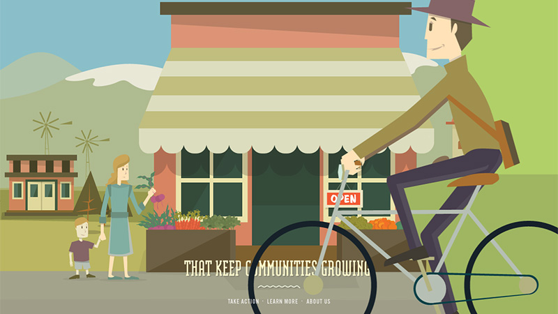
Make Your Money Matter
This project is a collaboration of a few US credit union companies. The scrolling animations, scrolling on a path and excellent illustrations tell Americans the benefits of keeping their savings in a credit union rather than in a bank.
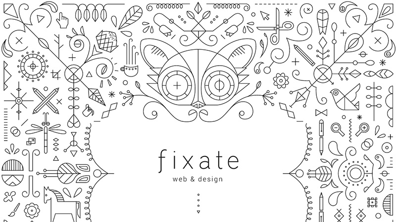
Fixate
Although the eyes of the cat(?) are animated, the unique thing about this site is that amazing illustration.
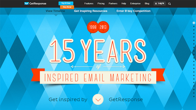
Get Response
This site celebrates Get Response’s 15th birthday. As you scroll down, there is a 15 year timeline. Most entries include something that happened in the world and a milestone for Get Response. All screens have a little mouseover animation.
A Guide to Making Things
This site was created by Fieldwork, a digital agency, to celebrate their first birthday. Each screen has a small animation.
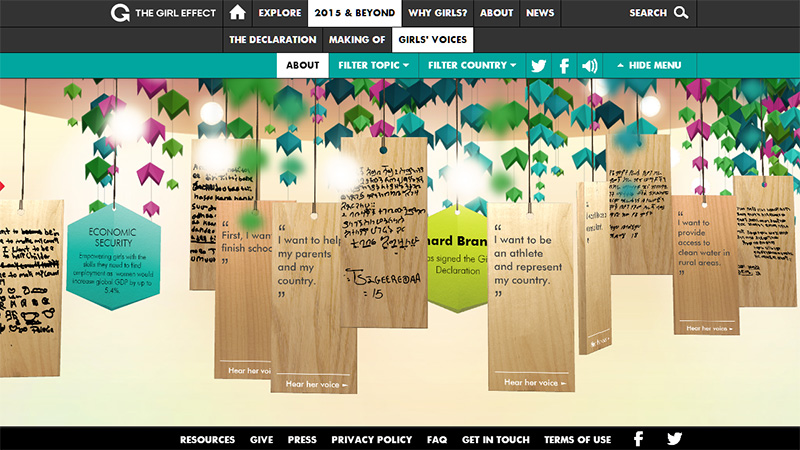
The Girl Effect – 2015 & Beyond
This side is dedicated to African girls who currently have little control over their own lives. The tags swing as you navigate left and right by clicking and dragging. Each tag has a statement by a girl, in her own writing on one side and in English on the other side. Good animation effects.
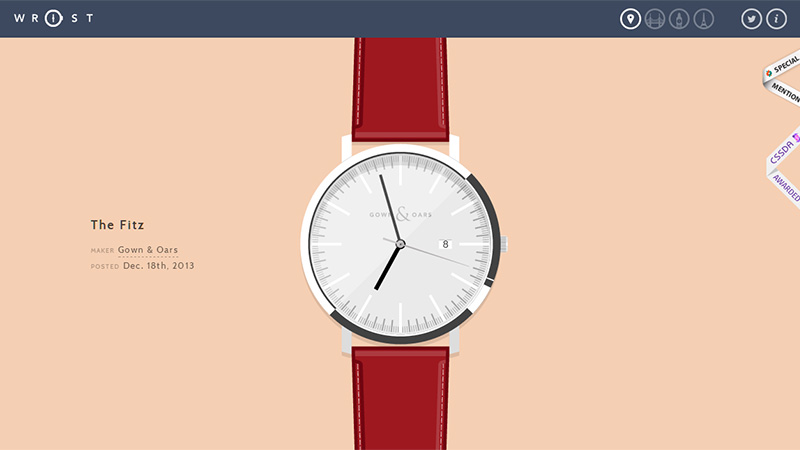
Wrist
This site is owned, perhaps strangely, by a designer and developer. The site is an illustrative exercise to explore typography, colors, clock mechanics and everything else that goes into watch design. The watches work and show your local time.
Conclusion
The flexibility of adding animations and scrolling animations can add more interest to a design. Chris Coyier has written a tutorial on using SVG on his CSS-Tricks site, that you may find very helpful.
Have you designed a site using SVG images? Are you up with the trend of SVG usage, or do you not see the need? Please share your links, comments and opinions with us in the section below.

