
Introduction
We’re living in an era in which the constant and rapid changes of habits and the increasing presence of technology in our lives is presenting very big challenges to developers and designers.
The growing importance given to the design and development of applications that will be used on mobile devices with a range of characteristics has as a consequence that the problems that a web designer may encounter become many, and they are not all easy to solve. In fact, it is not easy to think up and develop the design of an application giving attention to all the details, not just graphics, which could mark its success or, otherwise, its failure.
Take a moment and follow me in this brief reflection: how would you feel if people who use your application fail to understand immediately how to proceed? And if they found difficulty in carrying out a search, filling out a form or viewing an image? How high do you think would be their level of satisfaction? Probably not much, and certainly many of them would decide not to use it ever again. Surely, that is not what you want.
Professionals are well aware that, even before the eye-catching graphics and the brilliant performance of the software, what should never be underestimated is the experience that users of different ages and with different skills and abilities will have when they use it.
So how do you prevent this from happening?
There are some problems that are widely shared by developers, such as the arrangement and creation of the menu-list, the selection of the most appropriate image galleries, the placement of the buttons, and so on.
For each of these problems there are one or more solutions that, also in the specific case of the design, are contained under the terminology of “Design Pattern”.
But, more specifically, what are these “Design Patterns”?
Design Patterns: what are they?
Let’s take the simple and concise definition provided by Wikipedia:
A design pattern in architecture and computer science is a formal way of documenting a solution to a design problem in a particular field of expertise. The idea was introduced by the architect Christopher Alexander in the field of architecture and has been adapted for various other disciplines, including computer science. An organized collection of design patterns that relate to a particular field is called a pattern language.
The elements of this language are entities called patterns. Each pattern describes a problem that occurs over and over again in our environment, and then describes the core of the solution to that problem, in such a way that you can use this solution a million times over, without ever doing it the same way twice. — Christopher Alexander
The problems encountered in the phase of development are often recurrent and predictable. Design patterns are nothing but the solutions proposed to solve certain problems, which could be configured as a sort of “distillation” of previous design experiences.
A Design Pattern has four basic components, that is: a name, the problem it aims to resolve, the proposed solution and the consequences and trade-offs of its application.
Design Patterns are typically language and implementation independent: their application is neither mechanical nor automatic. Moreover, the solution described by the developer must be translated into concrete terms in the context of the application to be implemented.
Design patterns that are worthy of mention and deeper attention are many but, obviously, I won’t be able in this mini-series to provide a detailed overview of each of them.
Examples of Mobile Design Pattern: Forms
How many times recently have you had the need to fill out a form? To make purchases, to answer to surveys, to create a new account on a website–there are so many uses that justify the presence of a form on a web page or a mobile application. Well, would you say that you’ve had a pleasant browsing experience and completed the fields without any difficulty?
Probably not all of you will respond positively to this question because, unfortunately, not all developers are aware of the steps to follow in order to create a pleasant, complete with strictly necessary fields and easy-to-use form.
Let’s see some practical examples of well-planned and organized forms in a very well-know mobile application: Pinterest.
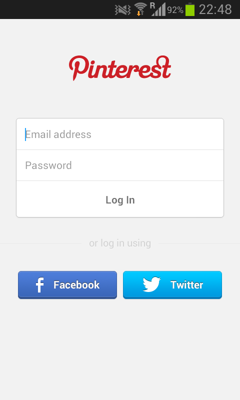
As you can clearly see from the image above, the Log in form is short, concise and reduced to the minimum. This type of form should have just the main input fields, that is: username, password, and action button. Even if in this specific case it’s not present, a “password help” button could be appropriate. Like many other applications, Pinterest also gives its users the option to sign on with their Facebook, Twitter, Google (and more) accounts. As you can see, this is made possible thanks to clear, direct and recognizable large buttons.
Another form that you can use as a case study is the Registration form, taken from the same application.
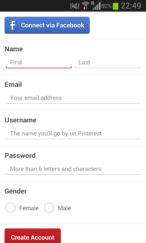
Even for a Registration form, the number of inputs has to be minimal. You should omit all the elements that don’t refer to important functions in the mobile application. Be careful and insert only the elements that are necessary in this step: name, e-mail, password and nothing more.
Give users the possibility to use their existing accounts: in most cases, they’ll be grateful to you for having saved a further insertion of personal data and a new registration.
That said, these first two examples give us an important tip: do not try to lead innovation on these types of forms; keep them simple, easy to complete, clearly visible on a single page and requiring only the most necessary information. This simple shrewdness will surely help you to improve your users’ experience.
Examples of Mobile Design Pattern: Searches
Now, let’s have a look at a few interesting approaches to search in mobile applications, in order to understand which might be the pattern most suitable for your goals. Even in this case, Pinterest application is good for our purpose.
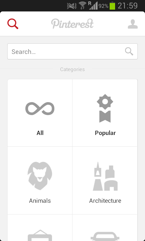
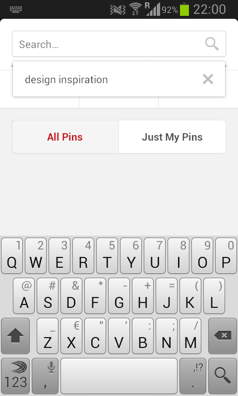
In this first image, you are faced with a pattern called Scoped Search. This is a type of pattern that lets you select criteria or filters before starting your specific search. You can choose to search in different folders before or after clicking on the search button. It is a simple, fast and good possibility to get quickly to the wanted result. Be careful of the icons: use simple and recognizable icons. Pinterest provides a perfect example of nice and direct ones.
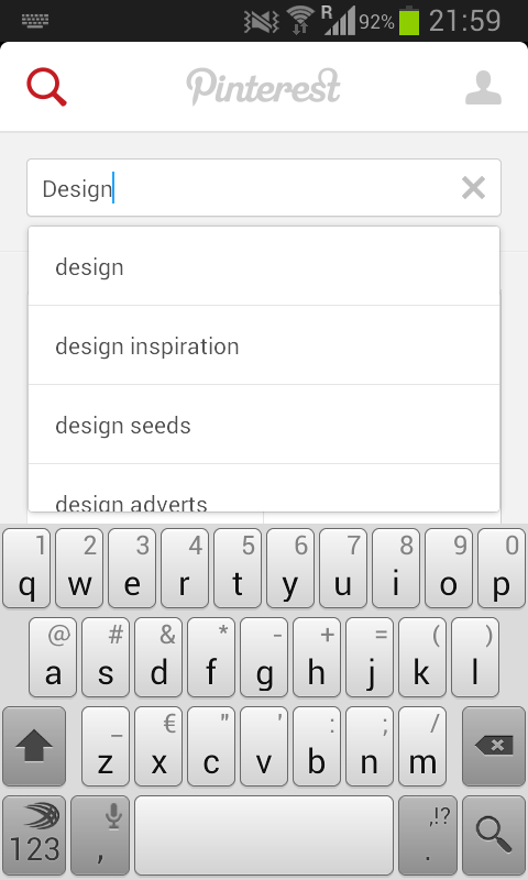
The second image of this category shows us a very good example of Search with auto-complete, which is probably the most used search pattern in mobile (but also web) applications. When you start writing what you intend to search, the system displays a set of possible results, helping you going forward with your activity.
The third and last image represents a pattern that your users will greatly appreciate: Saved and recent searches. This is undoubtedly a very useful pattern that makes it simple to select from previous searches and respects the users’ known behavior. In fact, in this way they wont’t have to replicate the same keywords or choose the search criteria because their searches are already saved in the system.
Quick tips
Let me say a few more words on the search pattern and give you a few tips:
- Use a feedback system to help your users: even if the results should be displayed immediately, there’s always the possibility of a delay of this activity. Use a progress indicator to indicate that the search is going on so that users know that it is being performed.
- Insert a clear button and options to cancel the searches.
- Consider the possibility of emphasizing with bold characters the matching search text in the results list.
Examples of Mobile Design Pattern: Galleries
The Gallery pattern is indicated for contents that are updated with a certain frequency. Contents may vary: you can find images, videos, articles, recipes, and there are several ways to organize them.
Generally, especially for the images, the choice falls on grids which can be arranged according to personal needs. However, it’s also common to use carousels and slideshow that are suitable for this purpose.
Let’s take, for the last time, the Pinterest app and see how images are arranged.
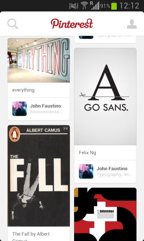
As you can clearly see, the Pinterest app itself is organized on a grid system. Images followed by the title and the author of the pin are displayed one next to the other in a vertical sense, so that the user can see more content simply by scrolling down. If he wants to see an image more in detail, he just has to tap on it and then he’ll have the possibility to pin it himself, add a comment, send it and so on.
Galleries are the best solution to show multiple content in less space.
Conclusions
In this article I’ve outlined some useful tips and tricks for a better organization of forms, galleries and search functions. In the next one you’ll understand the correct way to manage tables and you’ll test the importance of invitations, suggestions and feedback for users who interact with the application, while for the last article of this short series, I’ve planned to do an overview of the most common (but not recommended) anti-patterns.