A few years ago, the use of effects and gimmicks was prevalent in web design. However, as with everything else design trends changes, and what used to be out of fashion becomes trending again.
The use of flat, typographical and simple elements in interface design has been increasingly popular recently, making flat web design one of the hottest trends. For quite some time websites using three dimensional attributes, gradients, shadows etc. has been popular however, like with everything else the trend of keeping it simple and “going back to basic” has also caught on to web design. Some might even considered flat web design to be a countermeasure to the tendency of adding effects as all bling is peeled off and the design is left flat and straightforward. Nonetheless, though flat design is not using a variety of effects it still succeeds in achieving depth and dimension in its design primarily by focusing on colors.
If you are looking to create a flat web design, you might want to have a look at an article from wpbriefly.com listing some of the best minimalistic flat WordPress themes currently available. You can find the article here.
As coming up with the right design always takes time and a thorough research I have done some of the homework for you and listed 35 inspirational examples of flat web design in this article. I hope you will find the needed inspiration!
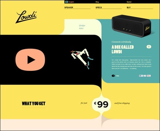
Lowdi – MORE INFO
United Pixels Workers – MORE INFO
![]()
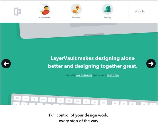
LayerVault – MORE INFO
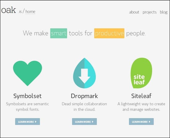
Oak – MORE INFO
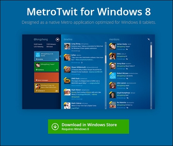
MetroTwit – MORE INFO
Super Eight Studio – MORE INFO
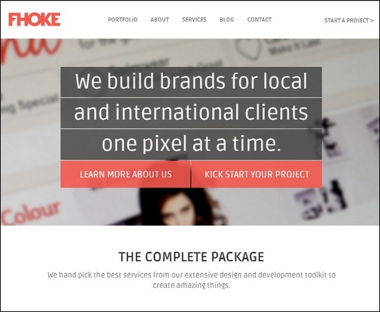
Fhoke – MORE INFO
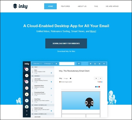
Inky – MORE INFO
True Digital – MORE INFO
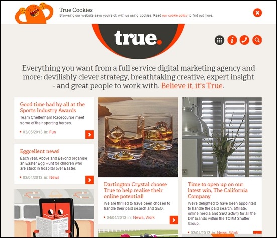
Symbol Set – MORE INFO
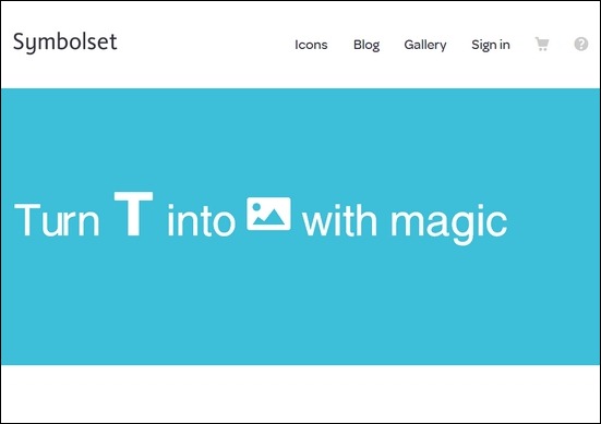
William Leeks – MORE INFO
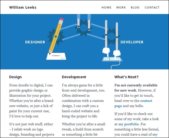
Award Online – MORE INFO
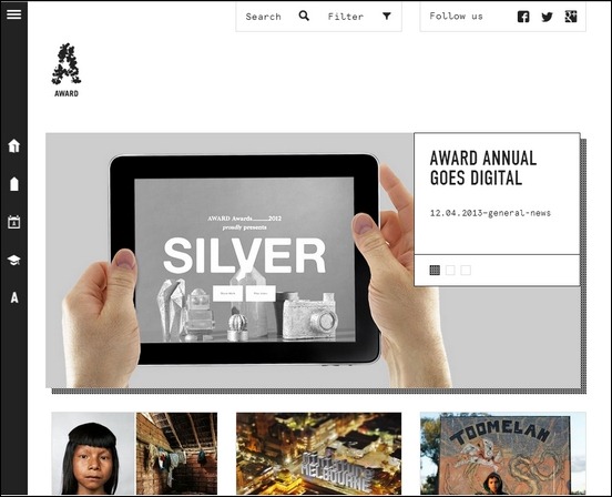
Thomas Schrijer – MORE INFO
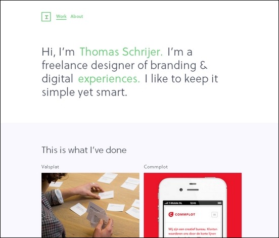
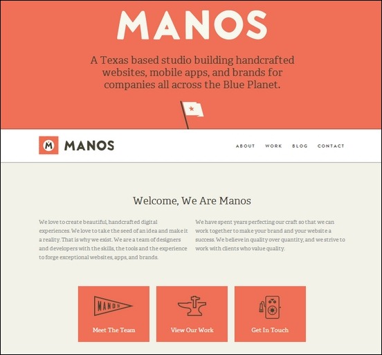
Manos Crafted – MORE INFO
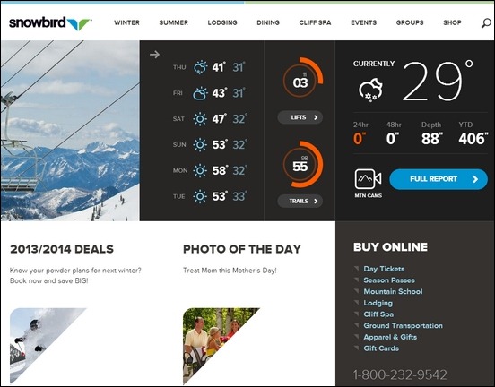
Snowbird – MORE INFO
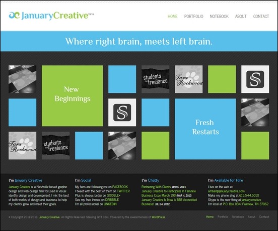
January Creative – MORE INFO
Pixel Plant – MORE INFO
![]()
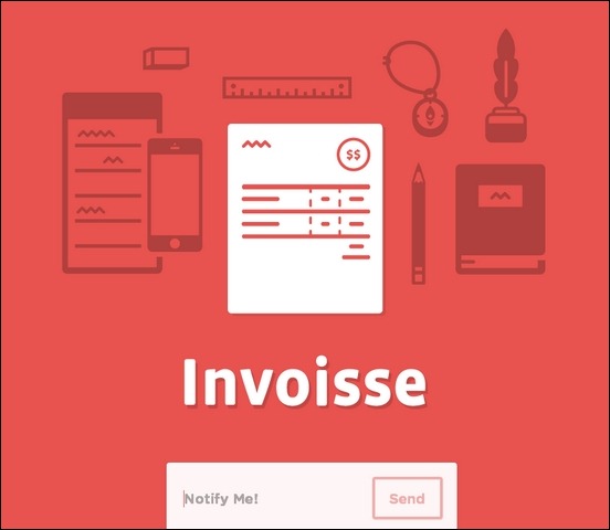
Invoisse – MORE INFO
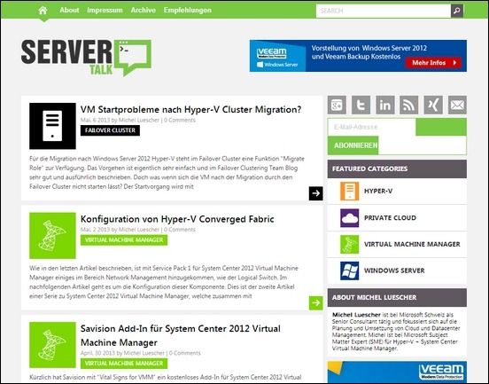
Server Talk – MORE INFO
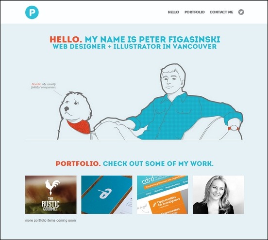
Peter Figasinski – MORE INFO
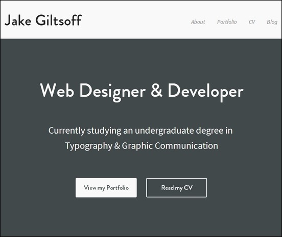
Jake Giltsoff – MORE INFO
Touch Ality – MORE INFO
VT Creative – MORE INFO
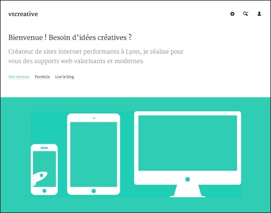
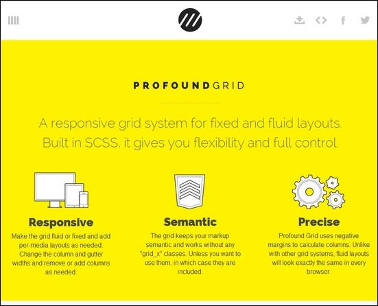
Profound Grid – MORE INFO
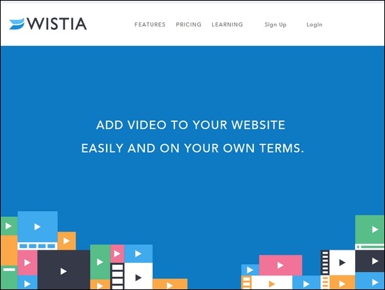
Wistia – MORE INFO
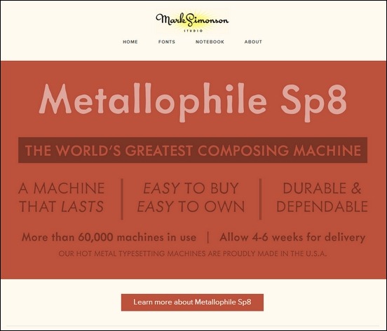
Mark Simonson – MORE INFO
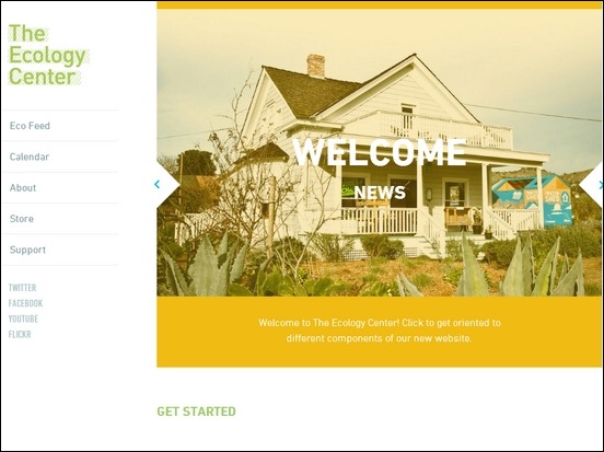
The Ecology Center – MORE INFO
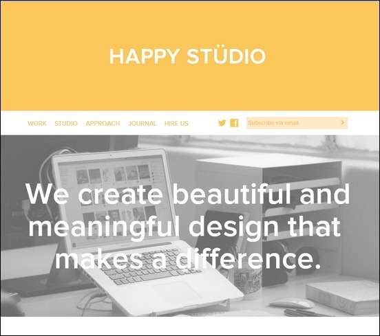
Happy Studio – MORE INFO
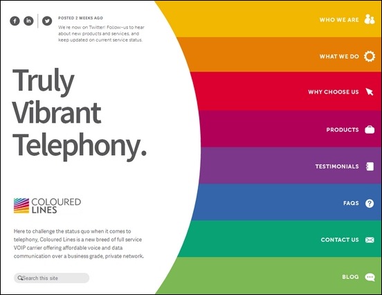
Coloured Lines – MORE INFO
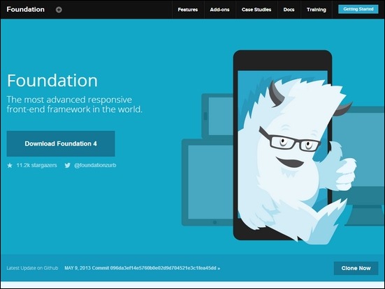
Foundation – MORE INFO
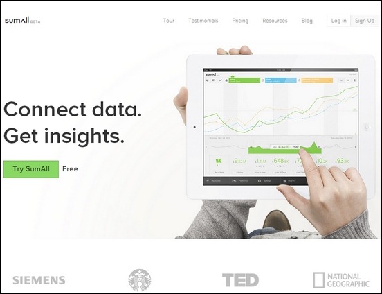
Sum All – MORE INFO
