Patterns can make a website stand out and be more appealing to the visitors. Adding textures to a website will make it more interesting, but keep in mind that textures should be used carefully, too many textures may make the website look crowded. To help you out we’ve selected 20 websites with unique pattern designs for your inspiration. Which ones are the best?
Shannon Moeller
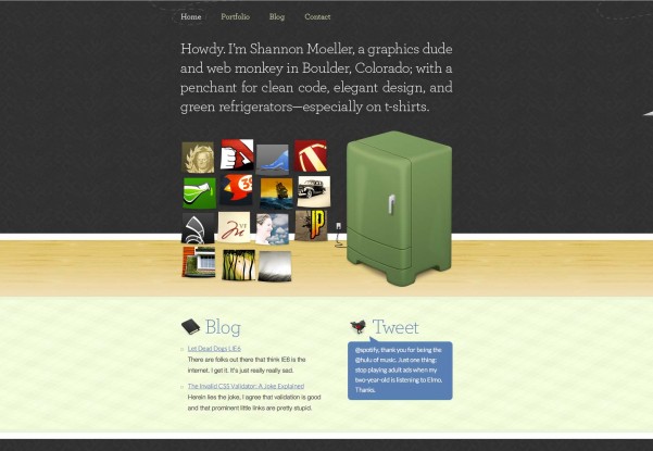
These simple and appealing textures are eye-grabbing and the visitors will surely like them.
Taro Horiuchi
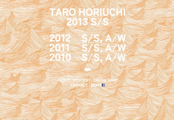
This website is truly amazing! Hover on links and see multiple, unique patterns.
Tenthmil
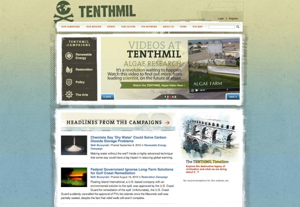
This website uses a custom texture which mimics the contours found on maps. Very clever!
Pop The Box
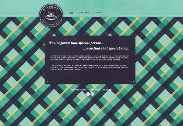
This bold and powerful texture is hard to use on a website as it may not work in any context but it surely works in this case!
The Crazy Love Campaign
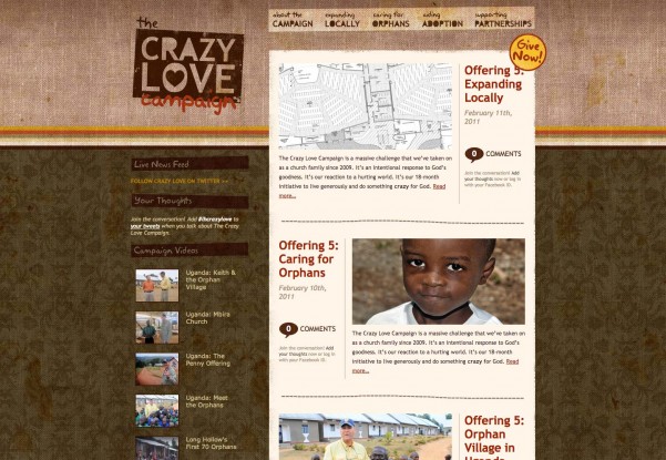
This website uses several textures combined. It has a grungy feel and looks excellent.
WakWAW
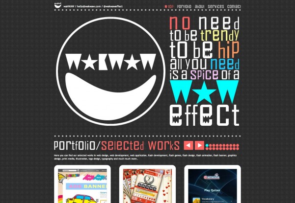
The star texture is very appealing and combined with bold, large typography, it makes this website look great.
Bzzy App
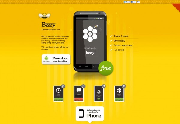
This is a pretty simple texture which looks great because of the vibrant yellow color chosen by the designer. Well done!
Cake Sweet Cake
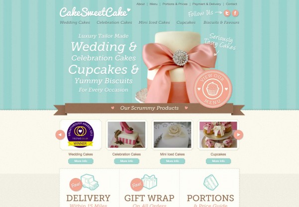
Girly textures with pastel colors, this is a great combination for this sweets selling website.
Coca-Cola
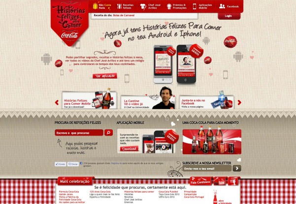
This is a very complex website and the designer was very inspired when he chose the colors. The dotted pattern looks great and the colors work well together.
Cultural Solutions
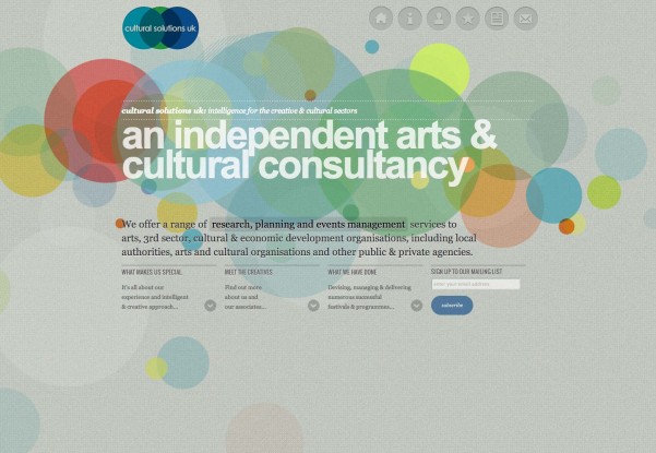
The big, colorful circles on the grey, noisy background look amazing in this design!
Gelateria Savoia
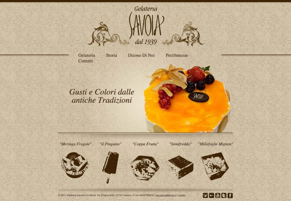
This delicate, vintage, elegant background patterns is surely an attention grabber!
GS 3 Internet
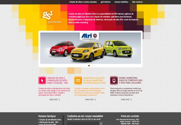
The use of vibrant colors on a dark grey background does miracles for this simple website.
Havana Mojito
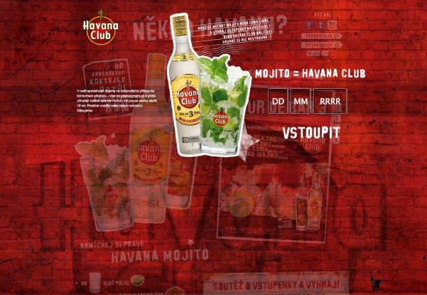
The red bricks background pattern greate a very dramatic look. It’s a very good choice for this design!
IconSweets 2
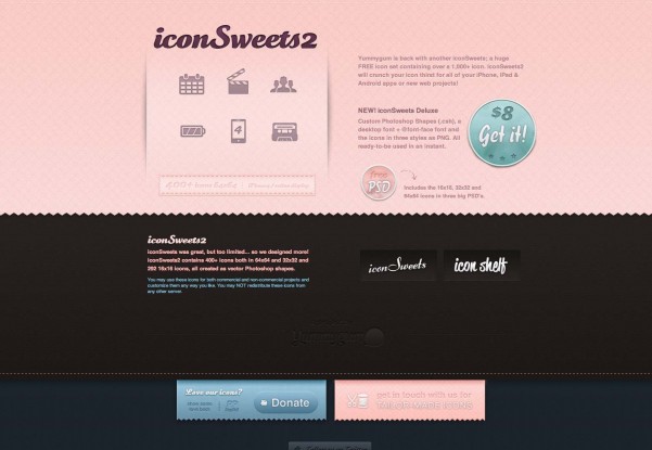
Pink may be a difficult color to work with. In this case, the designer did a great job and the subtle pink pattern looks great.
Kite Experience
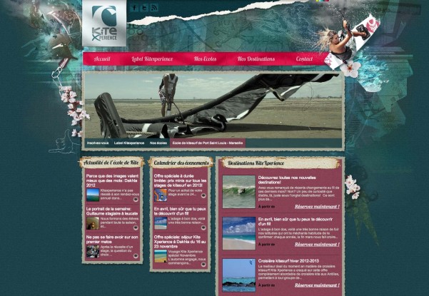
This website has a fresh, dinamic look, thanks to the very well chosen background patterns.
Mad about Make Up
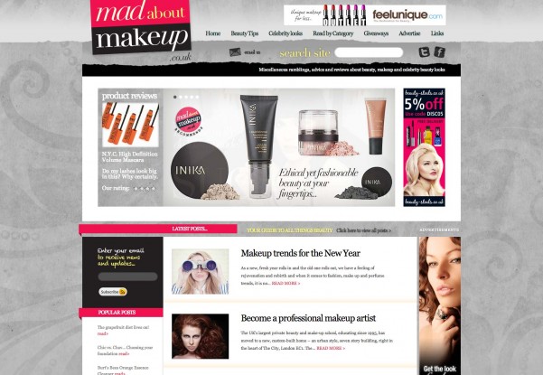
This subtle grey pattern may not be easy to notice the first time but its delicacy makes it suitable for this blog.
Made by Craft
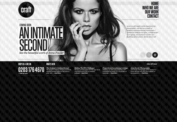
These patterns look great and add a bold, powerful feel to the whole website.
Mind Epic
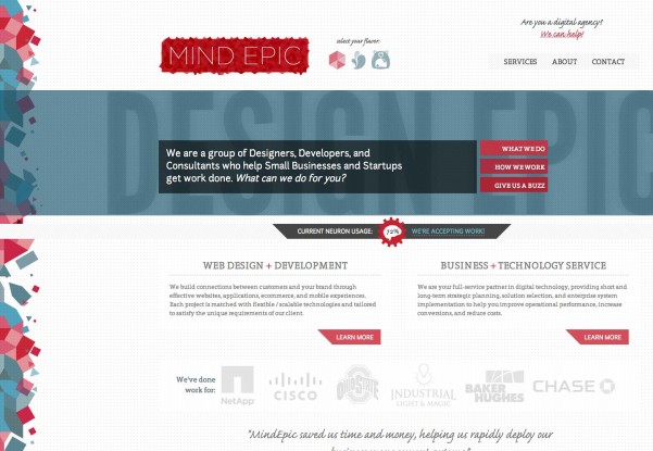
This website uses lots of patterns, from dotted, to squared and colorful textures. The designer managed to combine them masterfully.
