The beginning of any web design project is the hardest part. As a web designer, I sometimes get lucky and have some really solid inspiration that feels like it’ll be enough; it’s the kind of inspiration that’s strong enough to help you get started on a new project and enough to sustain you through all the mistakes, self-doubt, and second guessing that comes with the territory.
Then there are those other times. You know the ones I’m talking about. They involve you blankly staring at an Illustrator artboard, at which point your ADHD becomes stronger than your will to figure out design problems, at which point your struggle happens to coincide with a need to see what’s new on Netflix, delete spam from your inbox, and have another beer (I mean, it’s almost 5:00PM).
When you’re inspired, design is just work to be done — even when you have just the smallest inkling of direction to go on. It has a nice, smooth flow.
But without that direction, design is hell. It’s like trying to start a square wheel rolling uphill.
Emotion As Framework
In web development, there exist certain frameworks — starting points in code intended to be adapted for specific instances of a given project. They are meant to solve the basics of web development, which enable you to solve more complicated problems.
Emotions can work in the same way with design. If you understand the emotional context of your project, it gives you the direction and inspiration you need to solve design problems.
It’s a vision – a “feeling” that delineates what elements will and will not work in your design.
If I’m launching a tech product for young guitarists, I’m going to guess that the design can be a little edgy itself. I’m thinking of a minimal design, off-canvas navigation elements, alternative or uncommon UI elements, snappy natural language copy and bright colors.
If I’m launching a website for a local antique shop in a small town, I’d lean towards traditional layout patterns, slideshows with arrows, stock photography, rounded buttons, thoroughly explained checkout processes, and informational, factual copy.

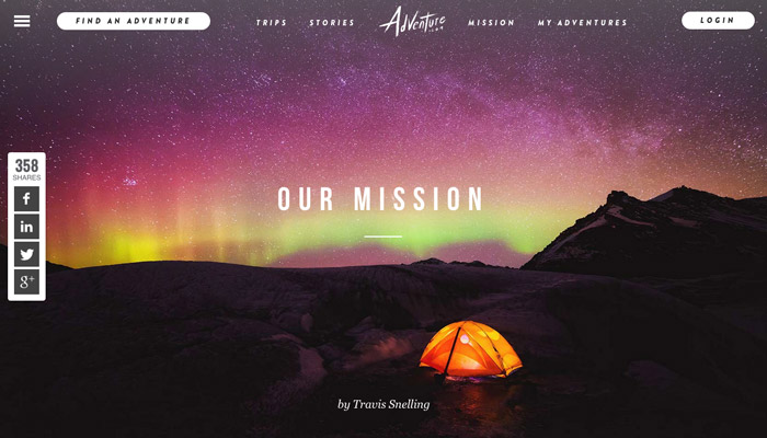
Landscape photos are an on-trend method web designers are using to add gravitas and scale. (Adventure.com)
Emotions work because you feel things and so do other people; it’s the common ground that connects a website with an audience, and your job, as a designer, is figuring out the most appropriate relationship between the brand and its audience.
Emotion As A Tool
Using emotion in this way is an intuitive exercise that, frankly, scares some people away. And to be fair some designers are more than capable of producing successful user experiences without discussing emotions.
I am not one of those people; I doubt I’m alone in that.
While we’re discussing emotion as a tool for solving design problems, it’s also normal to use emotion to maintain your own personal sanity.
On one level, that “I’m solving something beyond the way this looks” thinking is something that motivates me to power-through projects that either bored me to death or ones that I simply couldn’t figure out.
Sometimes you need to believe that whatever you’re making has the power to impact your audience in a way that goes beyond whatever you’re actually getting them to do (like buy something).
That belief goes hand-in-hand with your motivation to make good things, and your ability to give a damn on sites that seem devoid of any emotional impact (or projects you just don’t like).
You can use emotion as a way to impact the strength of your design through the idea that you are going to transform some freaking lives today. Reverting back to that initial feeling or vision is a great tool for keeping the faith when you’re unsure of a particular direction, or to keep your project on track.
Learning To Translate Emotion To Design
Enough nebulous fluff that hides the “how” of this article. Let’s discuss how you can transform these intangible feelings into web design.
1. Describe What You See
This is not a guide where I tell you that this certain user interface element translates to sadness or excitement or any other emotion, which is a goofy way to approach this problem.
My point is, if you think of web design and feel nothing, there isn’t anything I can say in a 1,000 word article to change that.
Instead, I think it’s better you teach yourself.
The process is simple: find a website, grab a notepad and a pen, or your favorite app, and describe what you see. That’s it. The first thing you learn as a budding designer is how to critique someone else’s work. What works? What doesn’t work? What’s actually going on in that design? You have to be able to dissect something into pieces before you can put those pieces back together in your own work.

As a process, describing ignites your ability to think about emotions and design.
Describe everything you see on the site you selected: colors, pictures, graphics, photos, layout, elements and copy. These are the pieces that combine to create a complete design, and eventually make you feel something.
This will be hard to do, and you will feel silly. Especially if you’re not used to it. But with each successive attempt you’ll start to understand how to convey web design through emotion and be a better web designer. You’ll also start to pick-up on trends. Certain genres of sites or designs obviously geared towards certain audiences share certain similarities. Learn these.
2. Empathize With Your Audience
Sympathy is when you feel bad for someone. Empathy is when you understand how their sadness feels. Your goal is always empathy.
Empathy, of course, requires that you have someone to empathize with, also known as your audience.
You serve your audience. This is hard for some designers (including myself), but you’re goal is to create the emotional experience that makes them feel how you or your client wants them to feel.
Those, for lack of a better phrase, “emotional expectations” of your audience often do not match your personal design preferences and quite often do not match modern web design, which is hard for some designers (myself included) to understand.
I’ve designed websites that look like they were built a decade ago, because a client was too afraid to push away from their audience’s expectations. In some cases that’s a valid concern, in some cases maybe not so much.
For example, I hate bad stock photography. You know the photos — where perfect white people with perfect white teeth smile and stare directly into the camera. To me, it comes across as incredibly fake and generic.
But for certain groups of people, this is actually comforting. It’s what they’ve seen in advertising for a very long time – it’s familiar and safe. To see natural, candid photography with imperfections may even seem sloppy to certain groups.
After you describe some sites and get the hang of it, you must learn to empathize with your audience by creating the elements that seem comforting; that seem to fit with a certain group or demographic.
This can take the form of UI elements, photography styles, navigation structures, on-page elements and copy.
3. Believe
As alluded to above, there’s a connection between your emotionality and your motivation as a method for empathizing with others. In other words, simply caring about an audience and that they acknowledging that they do have emotions transforms you from being just a web designer into a guardian of aesthetics tailored for a particular audience.
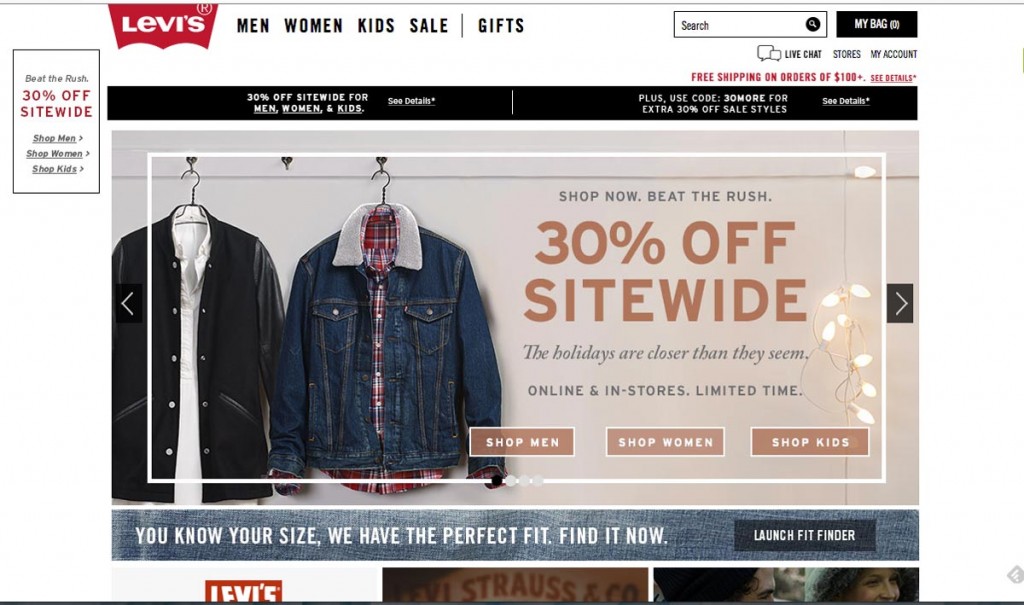
Retail brands are an easy starting point since any photography shown is likely selected with a certain demographic in mind. Several years ago, Levi’s went through a rebrand designed to reflect authenticity, lived experiences, and youthfulness; all traits that could be used to define the design of the website.
Accordingly, we see hallmarks of current web design: flat colors, white text on image overlays, lack of border radiuses on buttons, emphasized line work, and bold typographic choices; it feels of this moment in time.
They’ve combined those current elements with content and copy that give it a natural, authentic look: use of candid, as-if-I-took-this-photo photography, use of natural textures like wood and denim, and snappy copy like “Be In The Know” on the newsletter pop-up.
At the same time, the design is framed like a pretty old hat e-commerce site — fixed widths, simple blocked out sections, filters on the left, and sorting on the right. Layout wise, the site feels like pretty much every other e-commerce site online.
Again, the combination of audience-appropriate emotional content and design, with comforting traditional layout makes it a winning combination of emotion-centric design.
Wrap Up
Emotion is a critical tool I use everyday when designing. It’s intuitive and more about feeling that an answer feels right.
Emotion and design, discussed together, feel strange. Together they feel intangible and ambiguous, but, like all things, how people feel about something determines how they act.
If you can harness your understanding of emotion in design, you’ll be able to break through design roadblocks faster, helping connect your creations with your audience.

