For years, I’ve continuously read how print is a dying industry and how print designers are in danger.
It’s hard to argue, when many big name newspapers and magazines of the past see more readership online than in print. It’s even harder when many of these magazines and newspapers cease printing altogether to go full-blown digital.
Print designer’s skills are too basic and not interactive enough in a world where everything digital seems to flourish. Print designers are seen as slower-paced when we have to compete with websites that load in less than a second.
Print designers are seen as the ancient ancestors of the young, new web designers. As a print designer, I sometimes resent this and sometimes I embrace it. Starting out in print allows me to see from a bigger picture perspective rather than a narrow-sighted one. It can be discouraging for those who started in print to make that switch to the web. Years ago, it absolutely was intimidating. But now? Not so much.
It’s no secret that the world of web design is stuck on a minimalist binge. It just seems to work (for now). We’ve stripped our websites down to the bare essentials and freed them from busy designs and over-the-top graphics. This easily plays into the hands of the print designer who rarely has the luxury to deal with these kinds of things.
In print, the simpler, the better and this is a mantra becoming quickly adopted by the web…
Heliom
Right off the bat, we start with a site that is putting emphasis on large headlines and one left adjusted column of text. It reminds me of magazine spreads and brochures that offer a little explanation next to a picture. As you scroll down, we see more content organized into wonderful columns, categorized by different flat colors and headlines.
Freytag Anderson
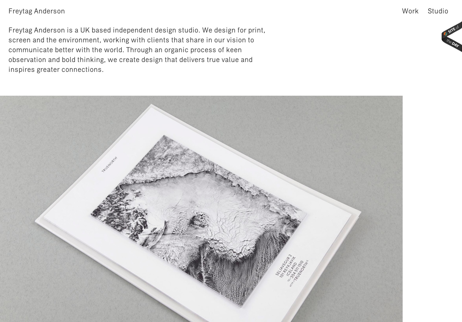
Freytag utilizes a layout that you don’t see too often. It’s rather unbalanced and there are some elements that are on top of one another. However, I believe the consistency is created with the headlines and the copy that seems to take a page from…well, other pages.
Dassel Und Wagner
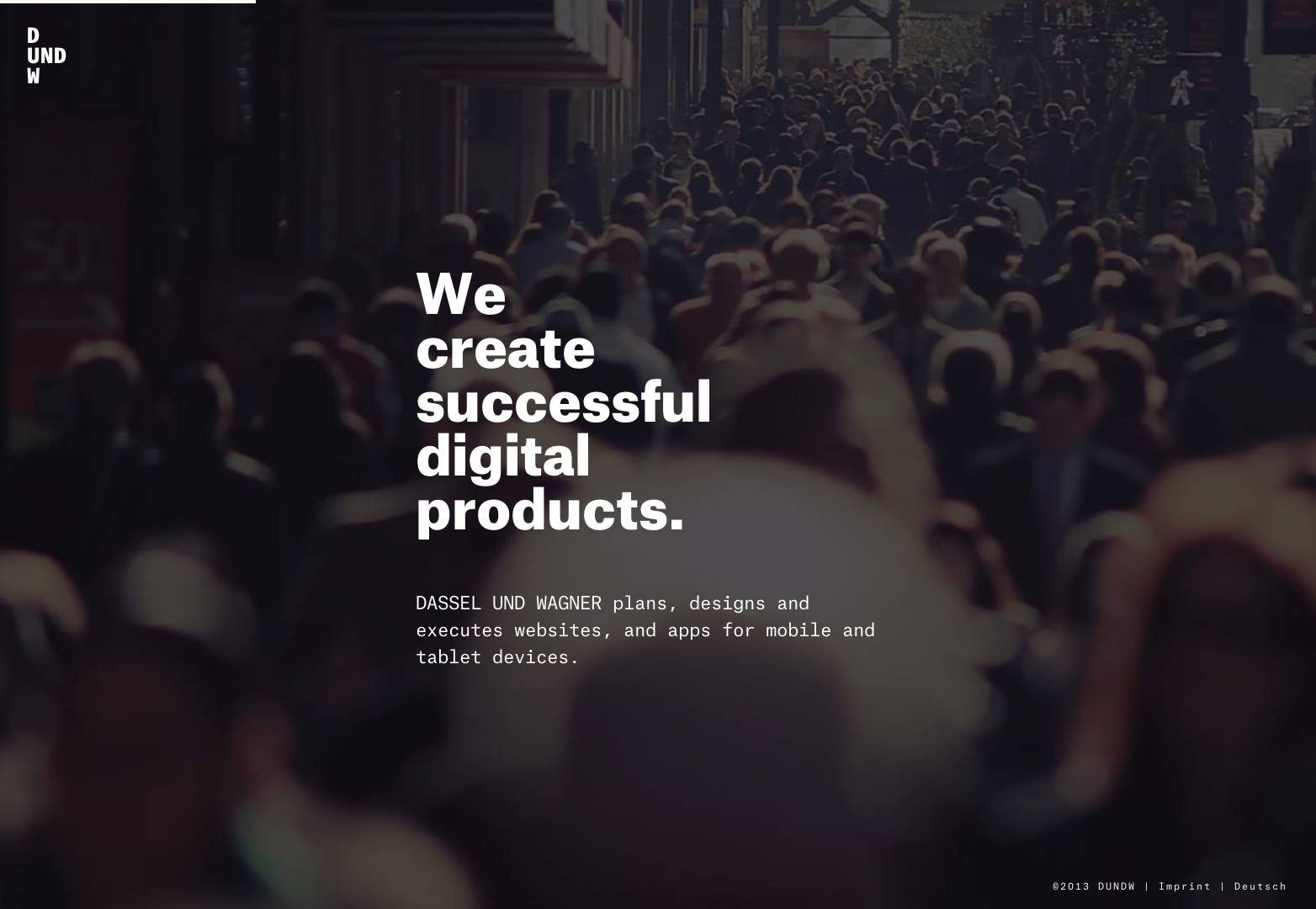
The way Dassel Und Wagner has set up their website, first of all is extremely interesting and provides a great user experience. Secondly, it reminds me a lot of magazine spreads. With little graphical additions to the pictures and headline-esque type over them, it seems like Wagner has borrowed a bit from the simple, print side of things.
Young & Hungry
I absolutely love and adore the simplicity of this site. The color palette is neutral enough to put emphasis in the places necessary. It’s a well designed site that looks much like a page from a simple brochure.
Coastal Conservation
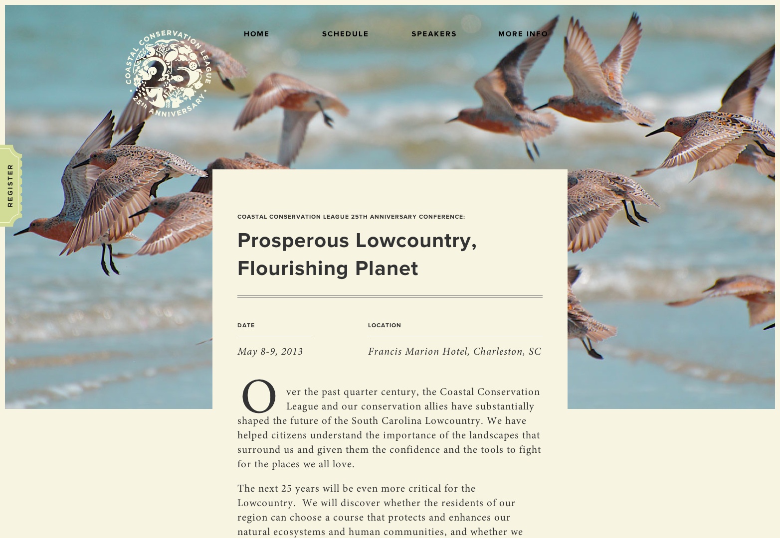
The initial text on this site is laid out as if it’s on a piece of paper that’s on top of the header phone. As you scroll down, you’ll notice the styling of the actual content is very similar to what we see in books and novels. There’s a wonderful added touch with the drop cap as well, which was obviously made popular in print.
Fitz Fitzpatrick
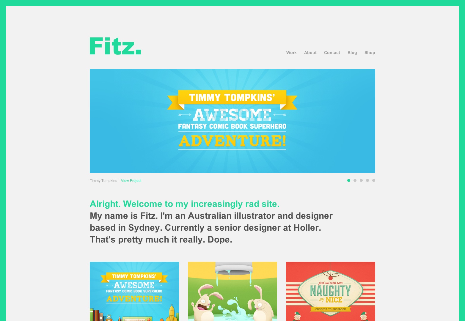
The most interesting part of this website is the border around the window of the site. This is something I see a lot in print design to make things stand out. I like how this was incorporated almost unknowingly in this web design.
Plans & Politics
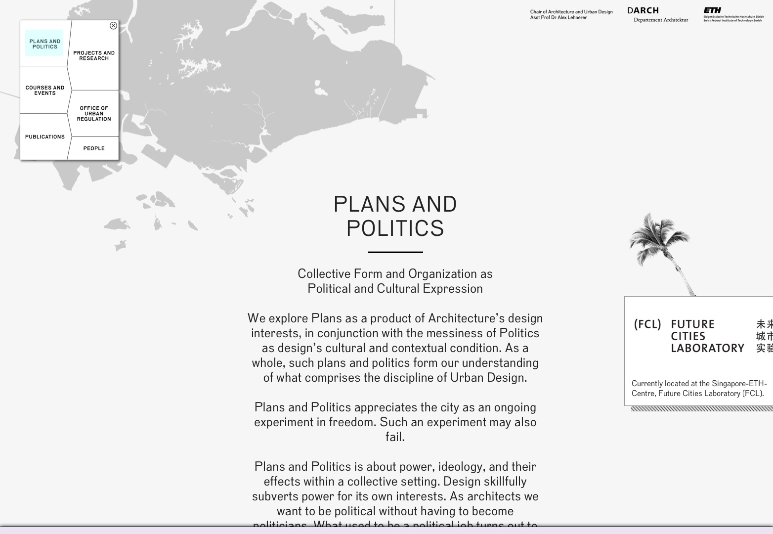
Plans and Politics is definitely an unorthodox way to treat websites. It seems like it’s this big picture with different pieces of text on it, that you navigate via the box in the top left of the screen. It reminds me a lot of a map that happens to have some descriptions on it, while the navigation is the map key.
Newsweek
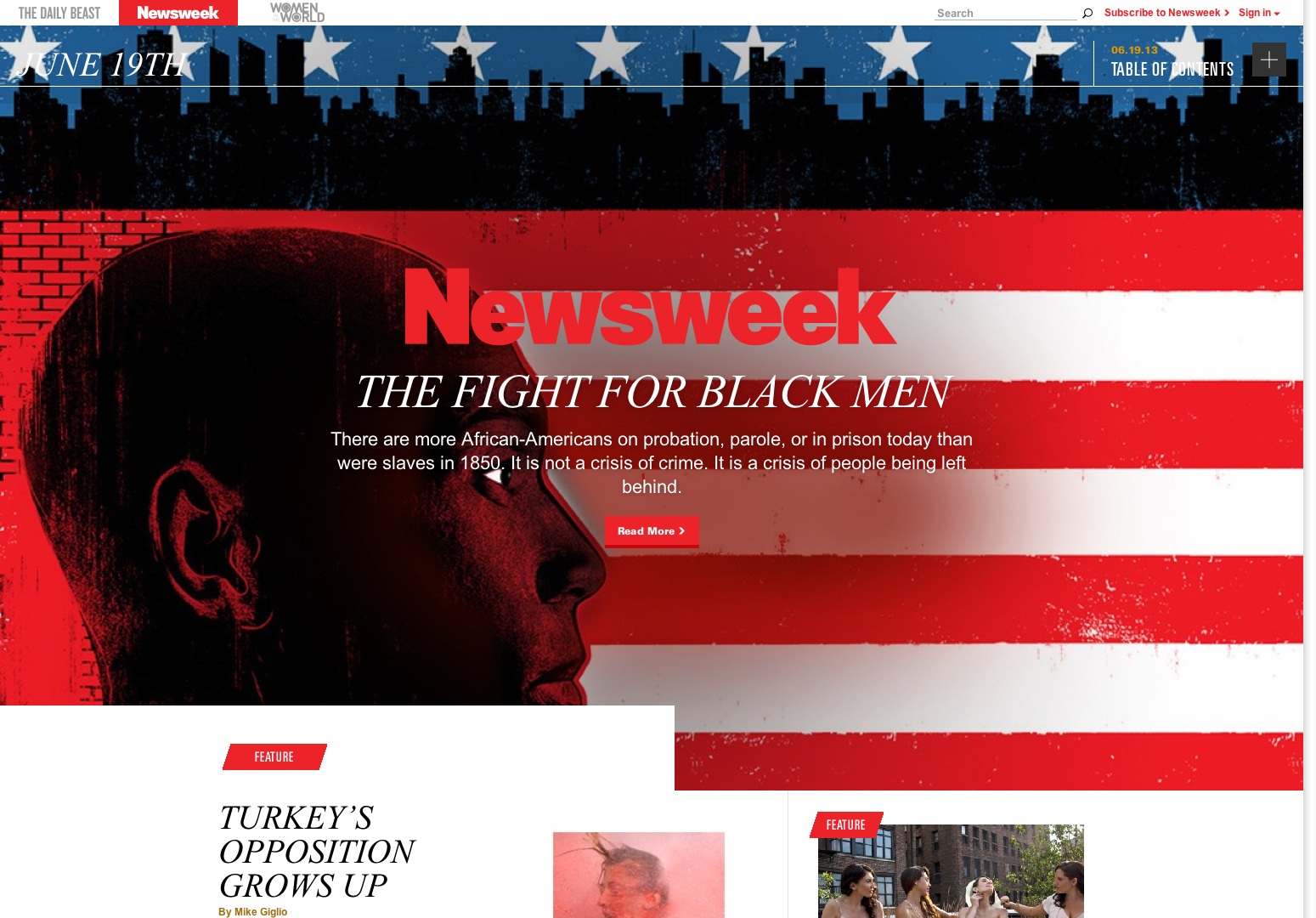
Well, obviously Newsweek is a well known publication that was, at one time, a printed publication. Last year, however, they decided they wanted to join the digital world and offer their news only online. Of course, it’s no surprise that many of their layouts and lots of their stories seem to look much like printed articles. It’s what they know.
Exponent PR
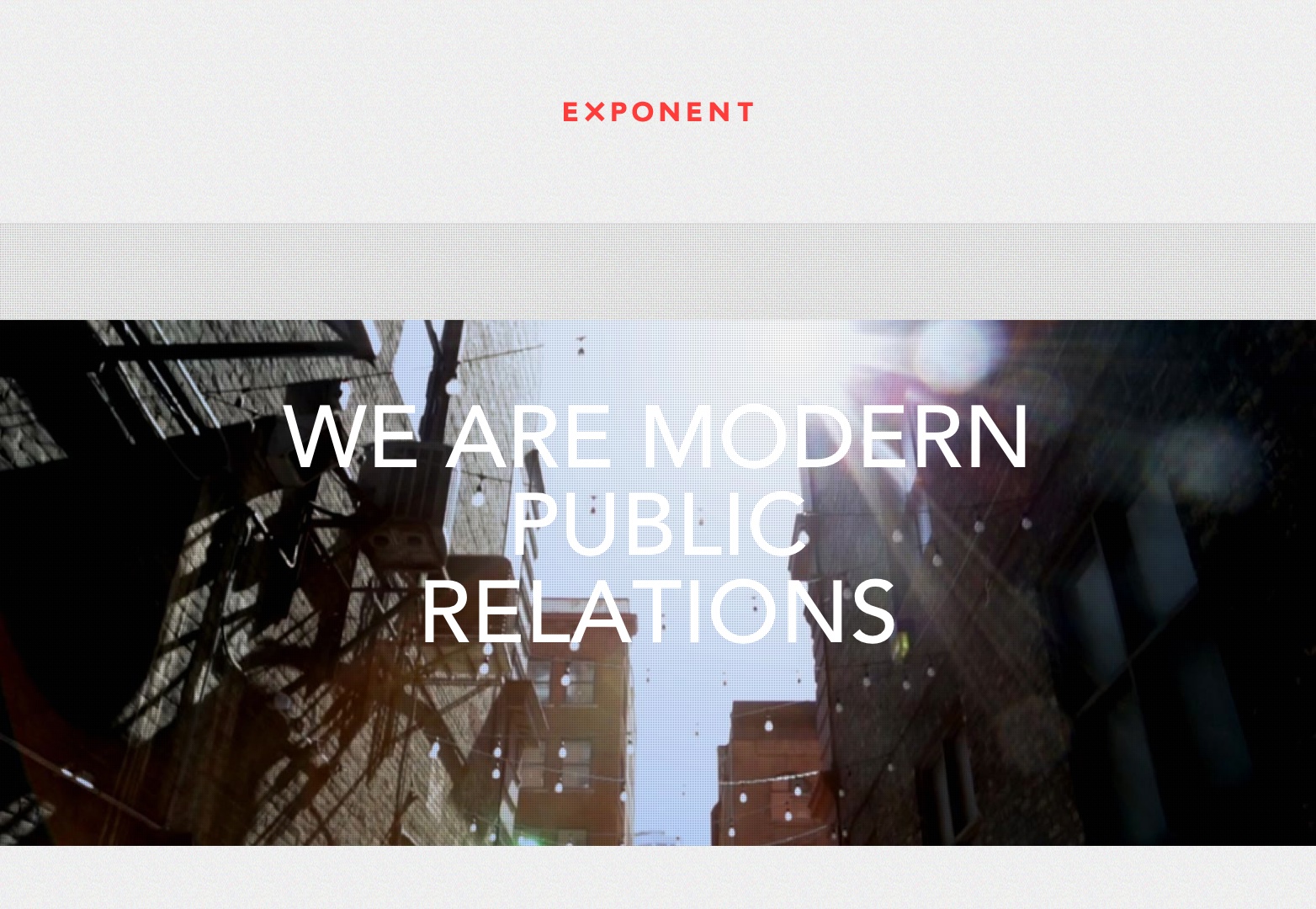
Exponent does a great job of borrowing from many print genres, including water color and illustration to create their site. They have some elements that are native to the web (but that can be done in print) and have some layouts that will remind you of quick pieces in magazines and books.
Millhaus
I think that the black and white picture automatically relates to print. In addition, the pictures have a slight texture on them that seems like it’s some sort of heavy paper. The typography, again, seems to borrow some layout techniques from magazine and newspapers.
Assembly
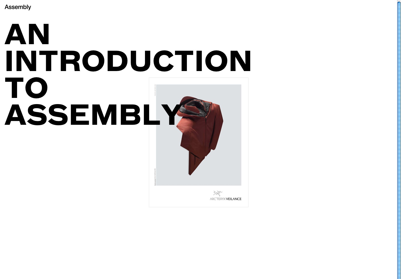
This site starts as an introduction to the brand. As you scroll down, you get a moving picture set and a new headline for each piece. It makes me think about how we used flashcards to learn new things, and I think this may be a borrowed concept here. As you continue to scroll down, you’ll see columns of text, which is obviously similar to what we know in print.
Made Together
I like this site because it’s extremely simple and has little to no fluff. It’s easy to read and understand and it’s not hard to figure out exactly what they’re selling. There are no distractions and again, I feel like that’s something standardized in print. The layout also seems to be rooted there, as we have many headlines with centered body text to help us categorize our sections better.
Magentur
Magetur is a digital printing agency that uses a good mix of what’s native to web and what’s native to print. The bold headlines and flat, block colors help set up tones of print design. Great hover effects and shadows on some elements add some character and show us the web design side of things. While I’d say this design is still heavily based off print, this is a wonderful way to show how to mix the two.
Anne Vallés
If you were handed a portfolio filled with photography, chances are each photograph would have it’s own page, and if the pages were loose you’d have to go through each page to see each picture. This is how it feels like Anne Vallés set up her portfolio. Also, in the about section, the layout of the text is very reminiscent of print work, with the use of columns.
Conclusion
No matter how many times I try to get into the digital world, there’s just something about paper. I’d much rather thumb through the pages of a paper or hard back than swipe through them in an e-book. I’d rather write down my ideas and to-do lists than type them into an app on my smartphone. I may be too “old-school” or traditional, but it helps me with my connection to my work. Understanding this type of relation in print makes it much easier to do in web design. Don’t kill off print just yet, because it’s gone digital.
