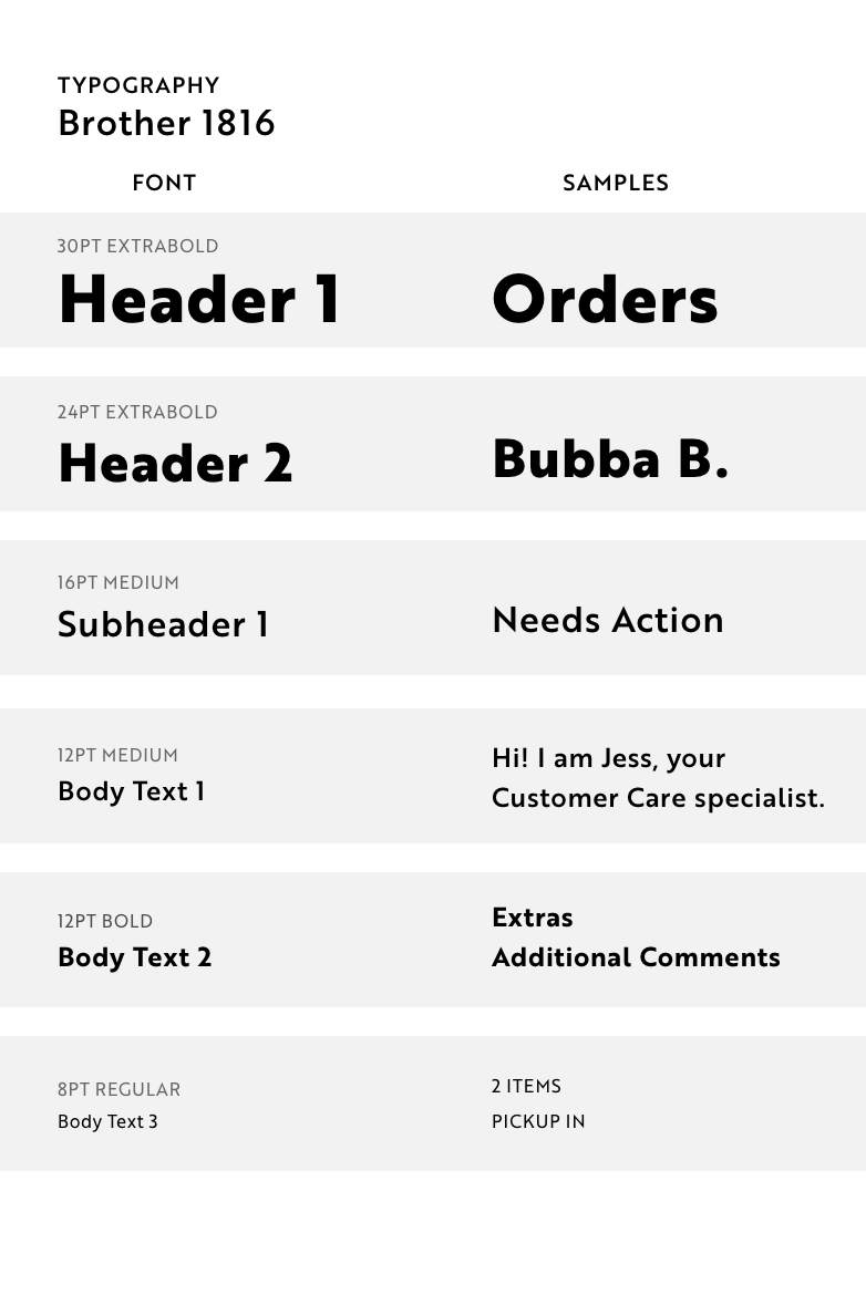
Type Considerations
The official font for DoorDash is TT Norms, which is a modern geometric grotesque created by the Russian type foundry TypeType. It’s a neutral font with humanist sans-serif qualities which gives the characters a sense of warmth and personality.
I couldn’t afford to purchase TT Norms from their store so I substituted it with Brother 1816 made by the Uruguayan type foundry TipoType. It’s a sans-serif typeface which combines geometric and humanistic elements as well. For the purpose of the redesign, it’s the closest approximation to the official brand typeface.
I wanted to keep the number of different text weights and sizes constrained both for ease of design and for developer purposes. I went with 4 font weights and five type sizes in the end.
Order Management — Wireframes and Iterations
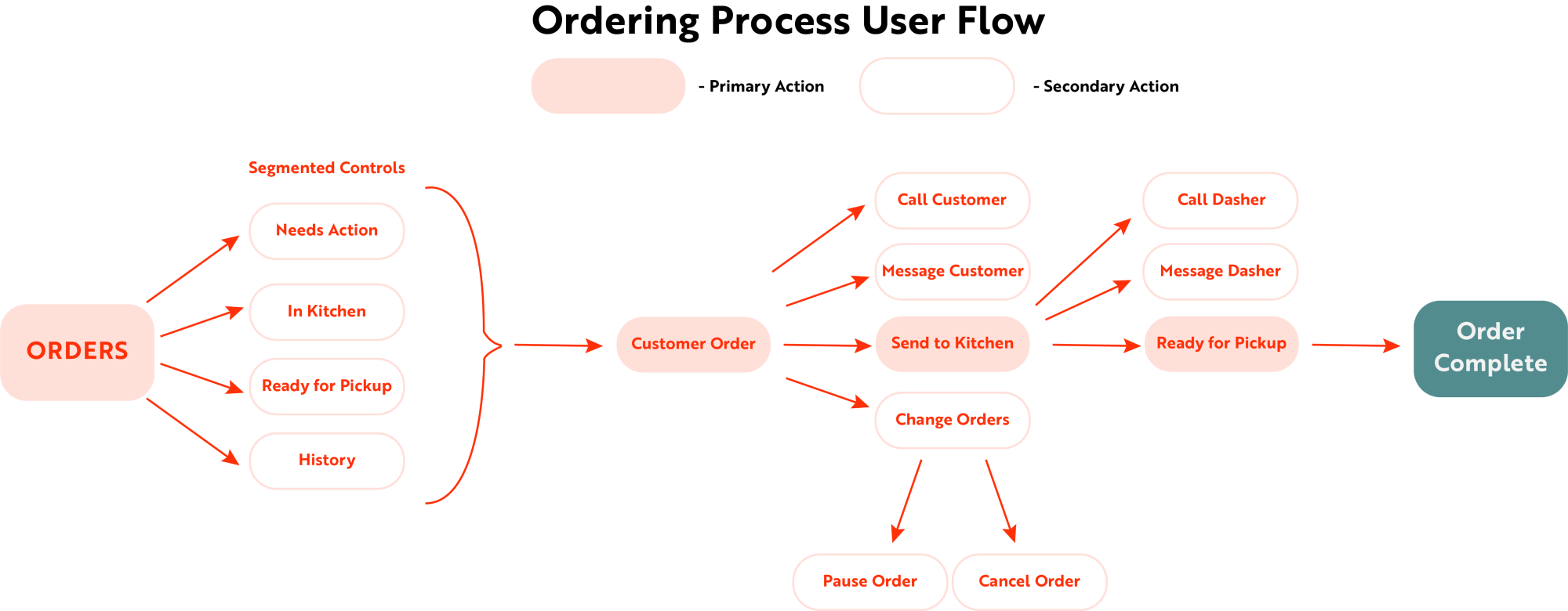
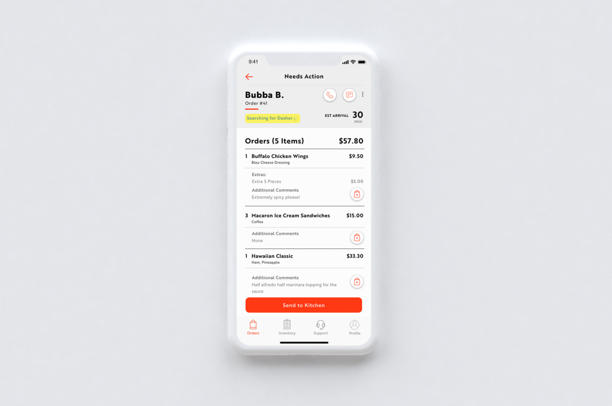
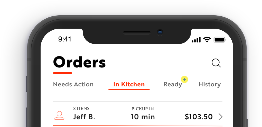
a: Detailed Order Page
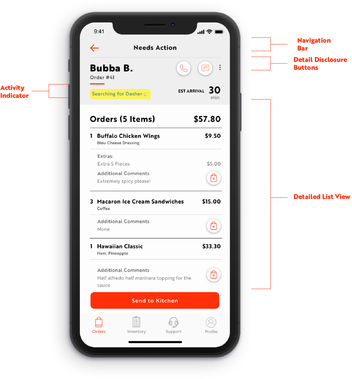
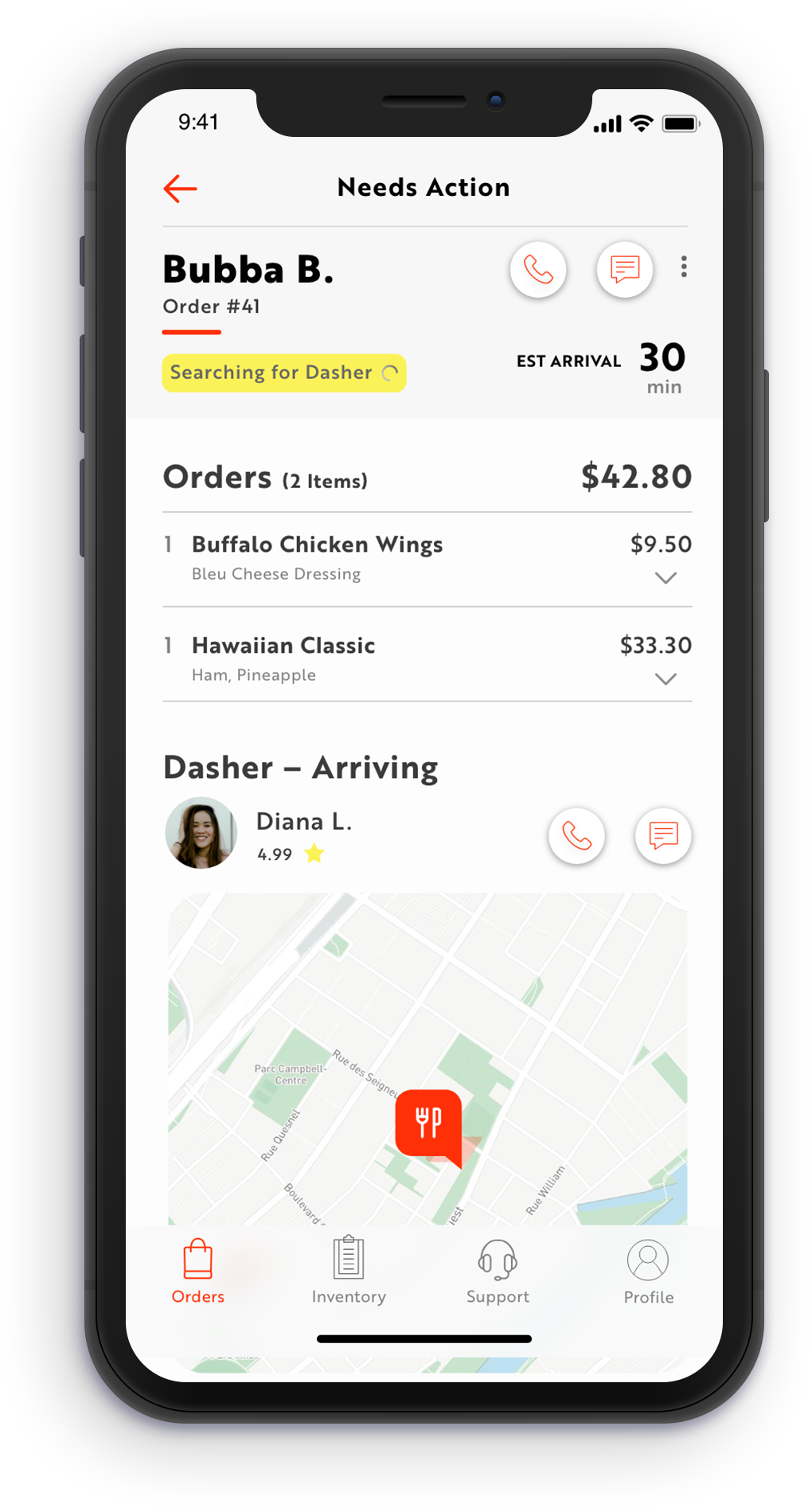
In my initial wireframes, I wanted to focus on order management first because I felt it required the most amount of experimentation to ensure. In terms of layout design, I found myself deciding between a traditional list approach where information about the orders was presented in horizontal rows which stretch to the full width of the screen and separated by dividers, or using “cards” to separate the information. I decided to go with the “full-width list approach” for the following reasons: the structure was more similar to the main consumer app which maintained cohesion, it allowed me to use a vertical hierarchy where the top-level information such as order, quantity, and price is given a higher level of importance, making it easier for merchants to read important information at a glance. When the order was ready for pickup, I wanted the Dasher’s information to be displayed on the screen as well their location on the map.
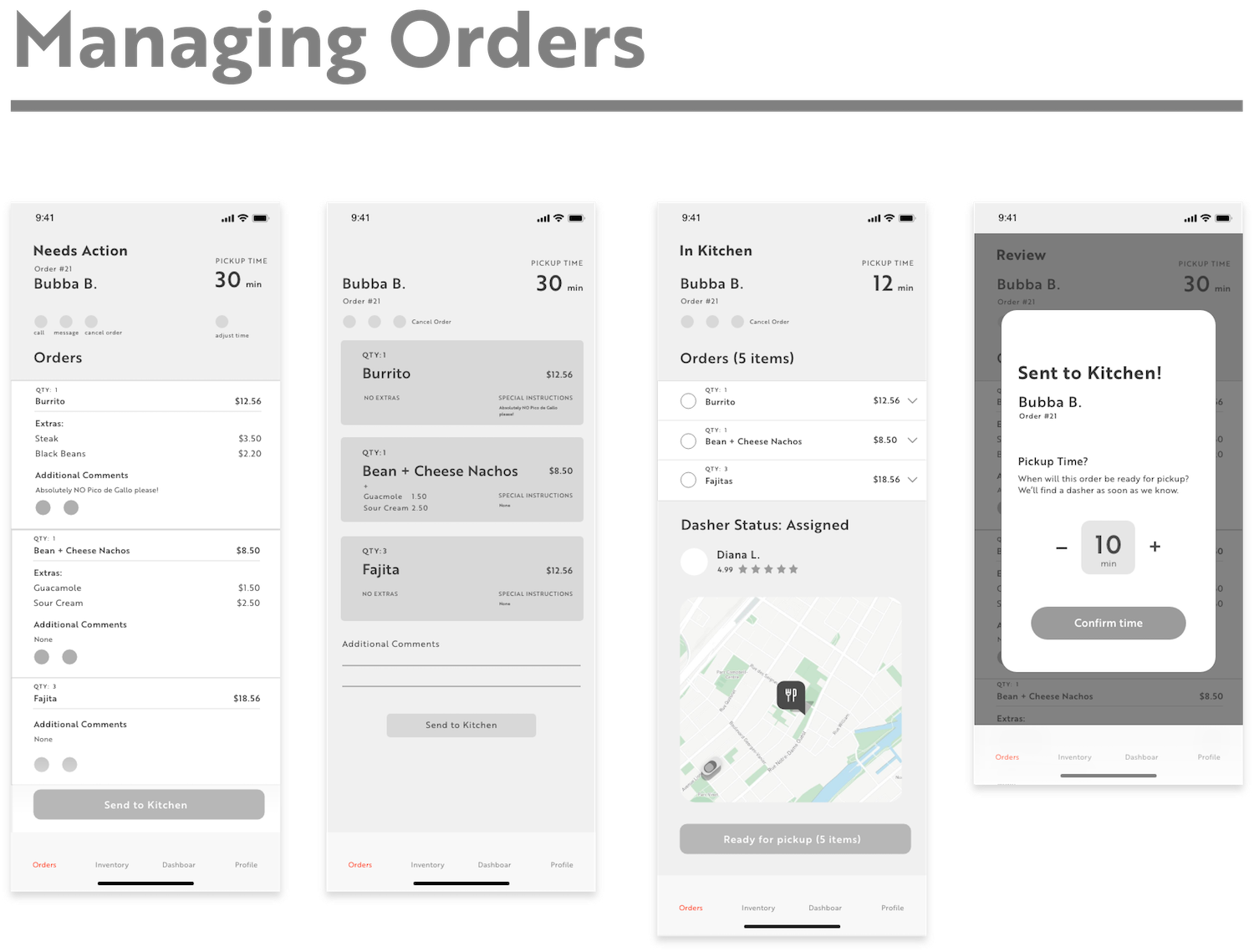
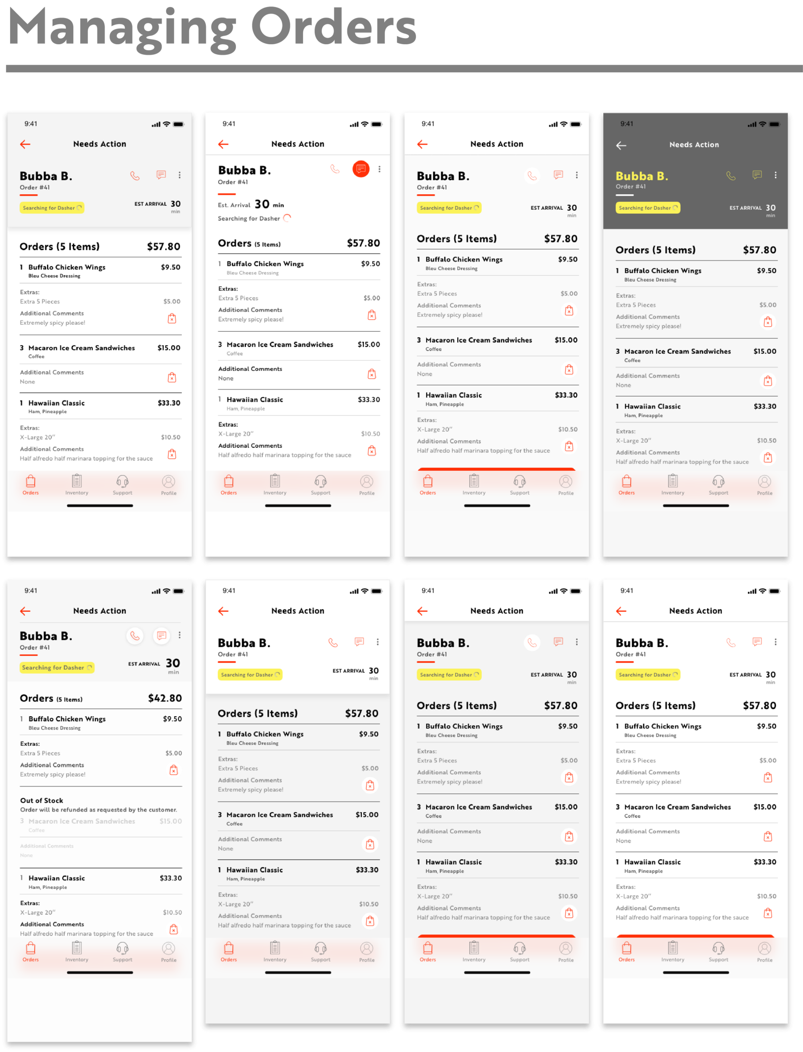
In these different variations, I experimented with keeping the duotone color scheme from the original order manager app. However, I still wanted the background to be lighter so it’s more in line with the redesigned consumer app. The darker background was used for high contrast buttons, and I experimented with different ways of keeping the headers segmented and easily legible because it contained the most important information, such as name, order number, and estimated arrival time. The original app only used red as an accent color but I wanted to bring in other colors form their palette. I tried yellow as another accent color, which I felt was unconventional and is as bright and saturated as the red. However, because of the context where the app will be used — in loud and busy restaurants — merchants need loud indications to get their attention. As for the buttons, I added drop shadows so they could better stand out from the background. I felt this was a good compromise to fulfilling the need for a darker background in the original app for legibility purposes while retaining the same visual language of the new consumer app.
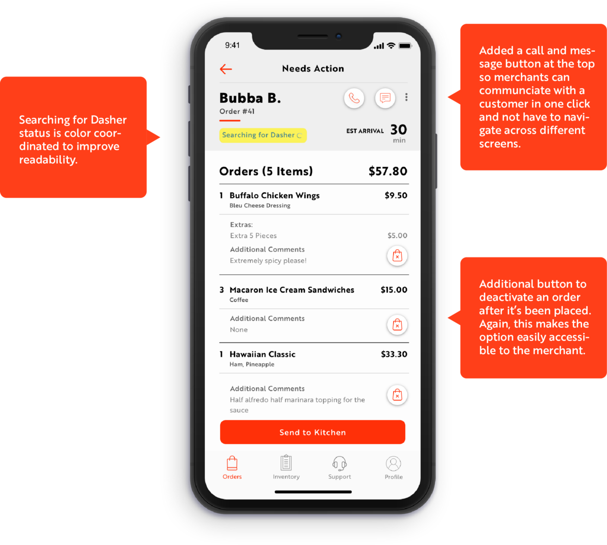
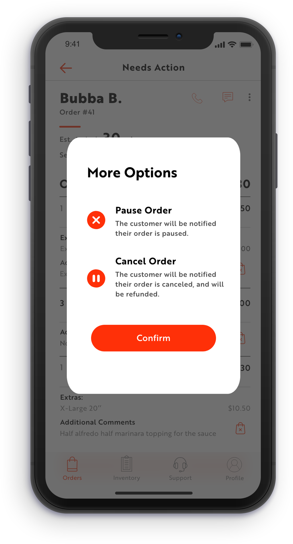
By clicking on the 3 vertical dots button, the merchant will be greeted with a popup that allows them to pause or cancel the current order. Once a dasher is assigned, they will show up on the map, letting the restaurant know how far away they are.
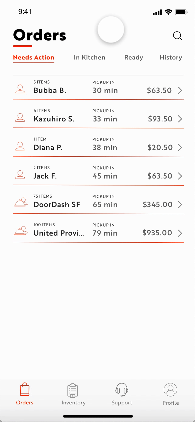
b: Main Order Page
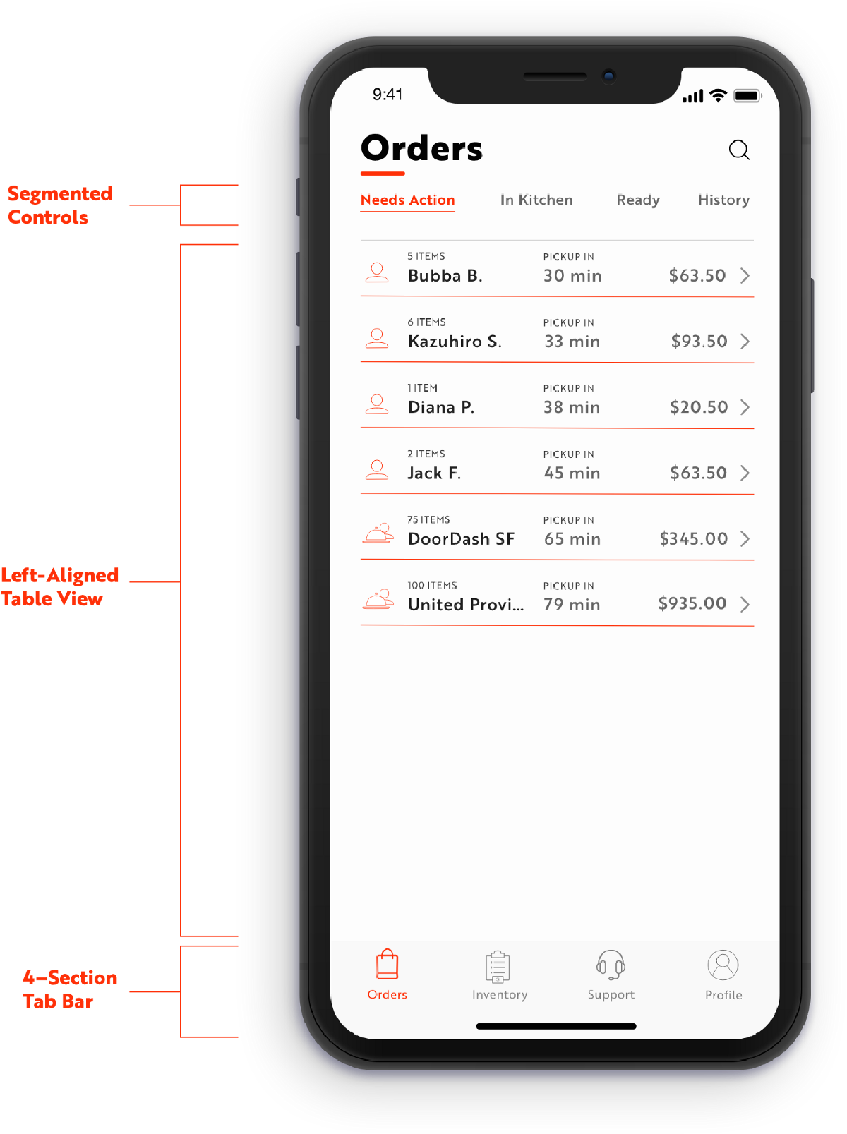
For the main order page, the main change I implemented is I split up each stage chronologically in order of completion from left to right using clickable segmented controls. This eliminated the long single-column scrolling format in the original tablet version because of the reduced screen size on mobile.
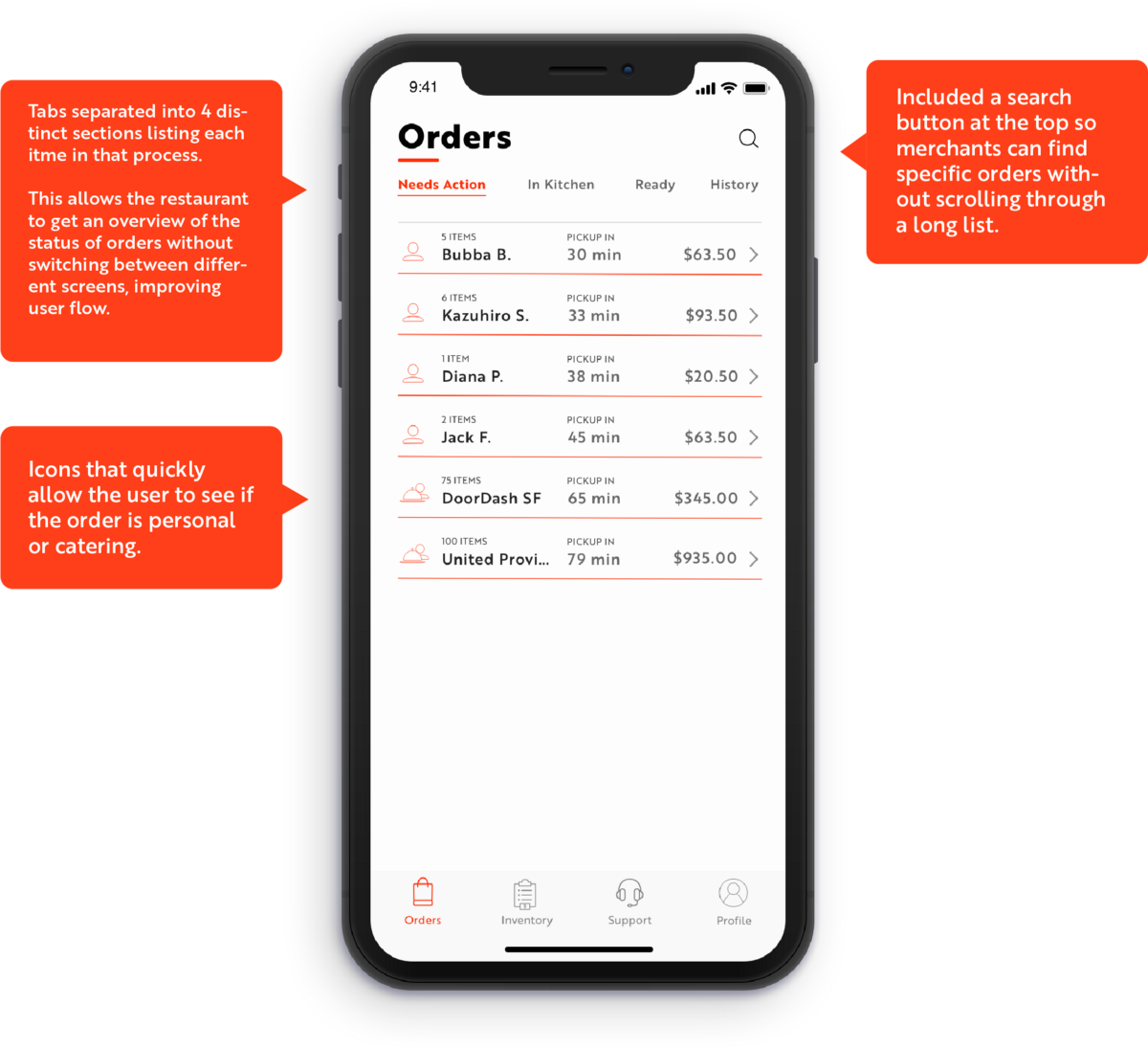
The merchant will also be alerted when the most recent order moves to the next stage of the process.
Inventory Management
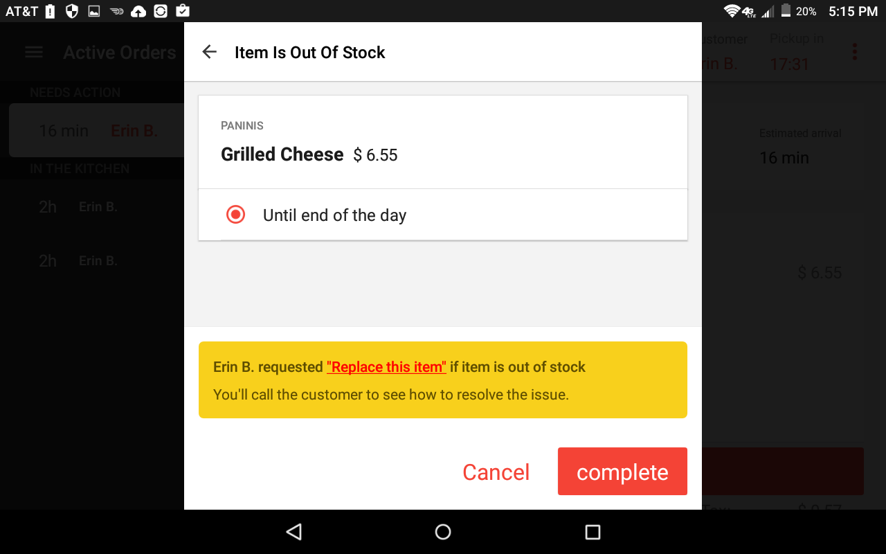
a: Out Of Stock Management
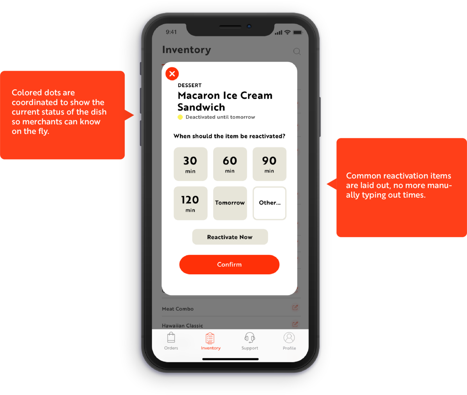
The biggest changes made to the inventory system was the inclusion of different options to deactivate orders. Currently in the app, there is only one option for out-of-stock options and that is disabling the item until the end of the day:
However, based on feedback I received from restaurant owners and from the app’s online reviews, merchants found this option limiting because it doesn’t account for other edge cases when they want to deactivate the order for a shorter amount of time. This can be times when the restaurant’s on lunch break, the restaurant is currently swamped with in-store orders and wants to deactivate popular items, or if a restaurant doesn’t have the ingredients to prepare the dish.
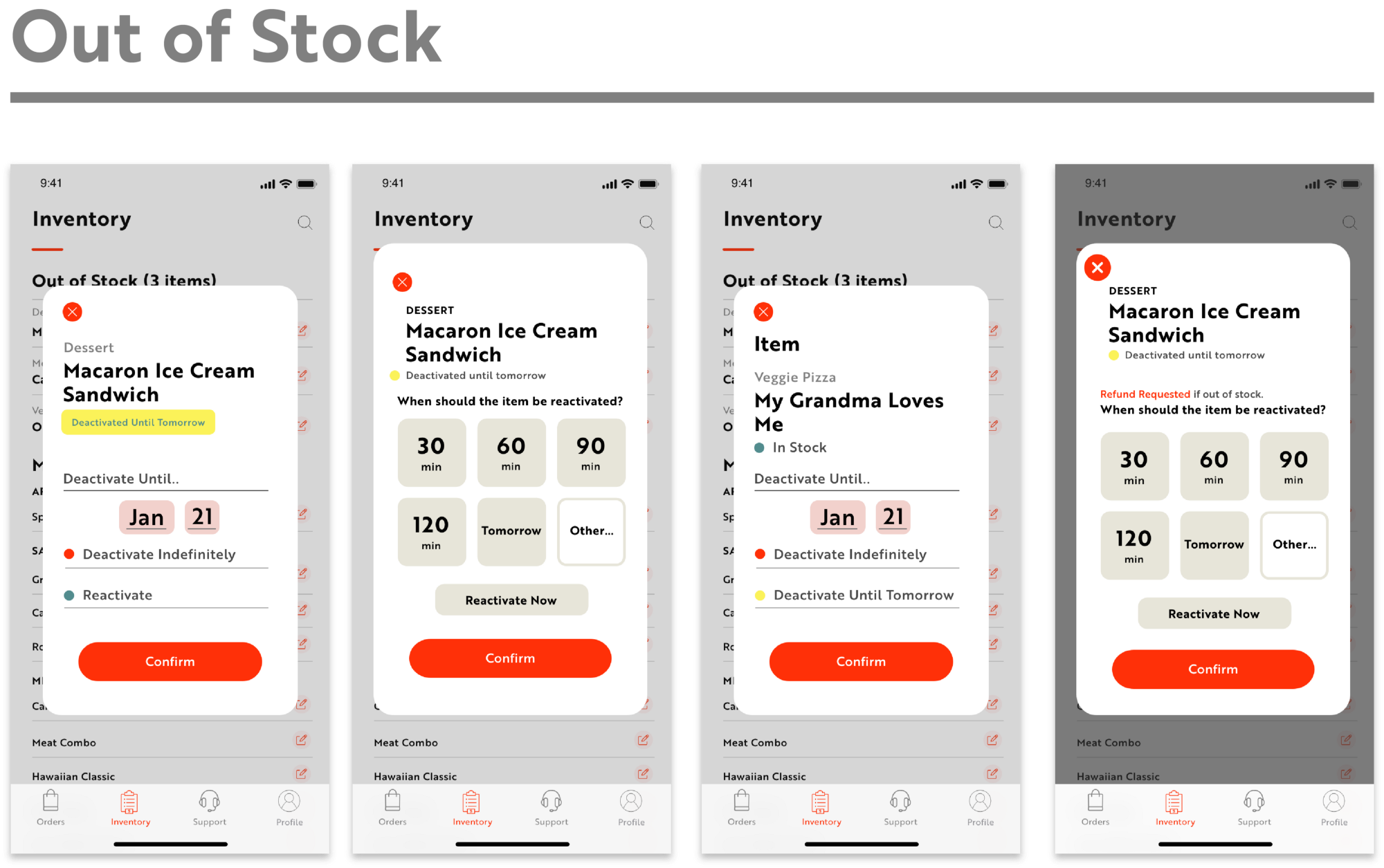
Above are a couple of my iterations for out designing out of stock options. Here, I was looking to address the merchant’s issue of not having enough options to choose the length of time when a dish is deactivated while also showing the availability status of the current dish. I was mainly looking at two ways of representing the information: in a list like the order function or through clickable buttons. Ultimately, I chose the buttons because I felt it was more legible; the list and bolded headers could give users cognitive overload from too much data presented.
b: Inventory Home Page
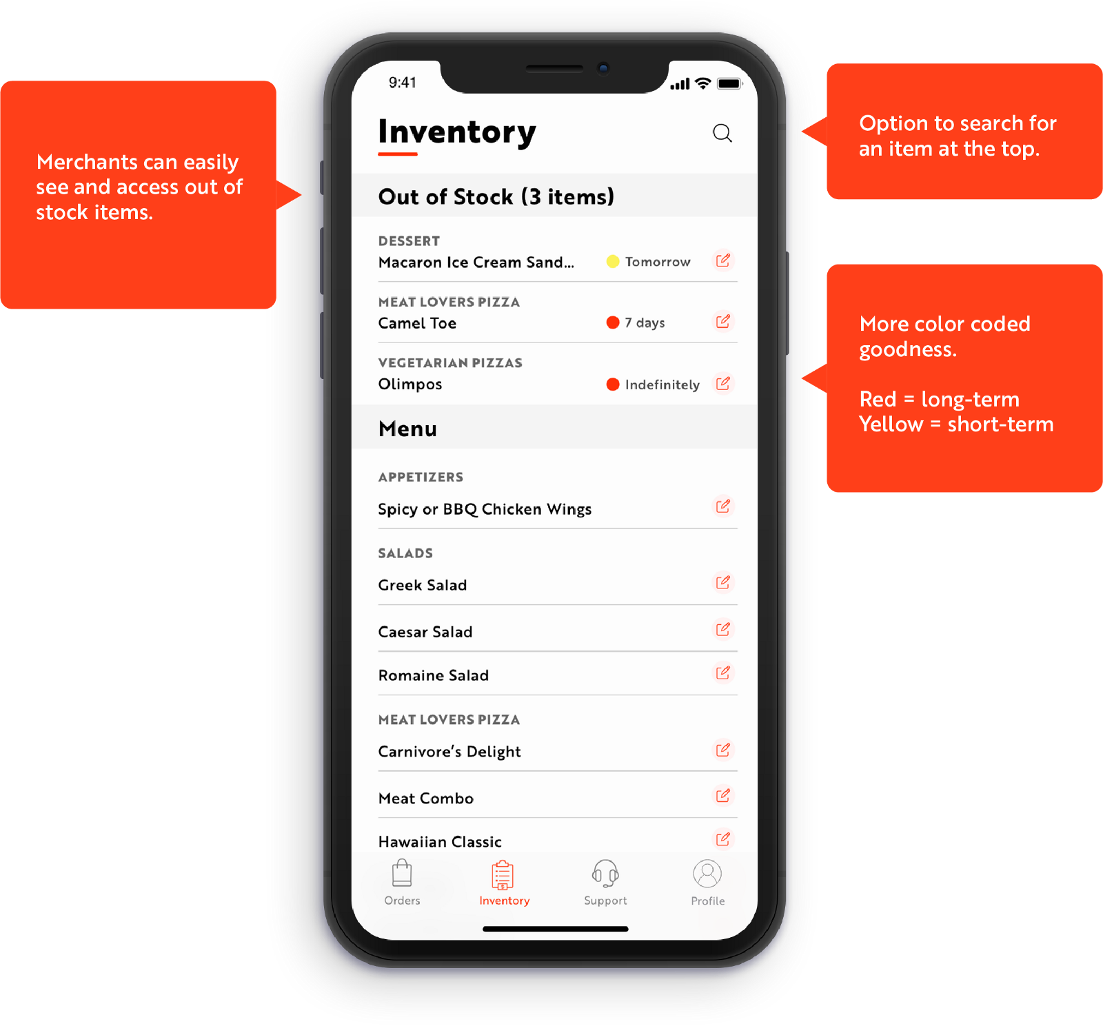
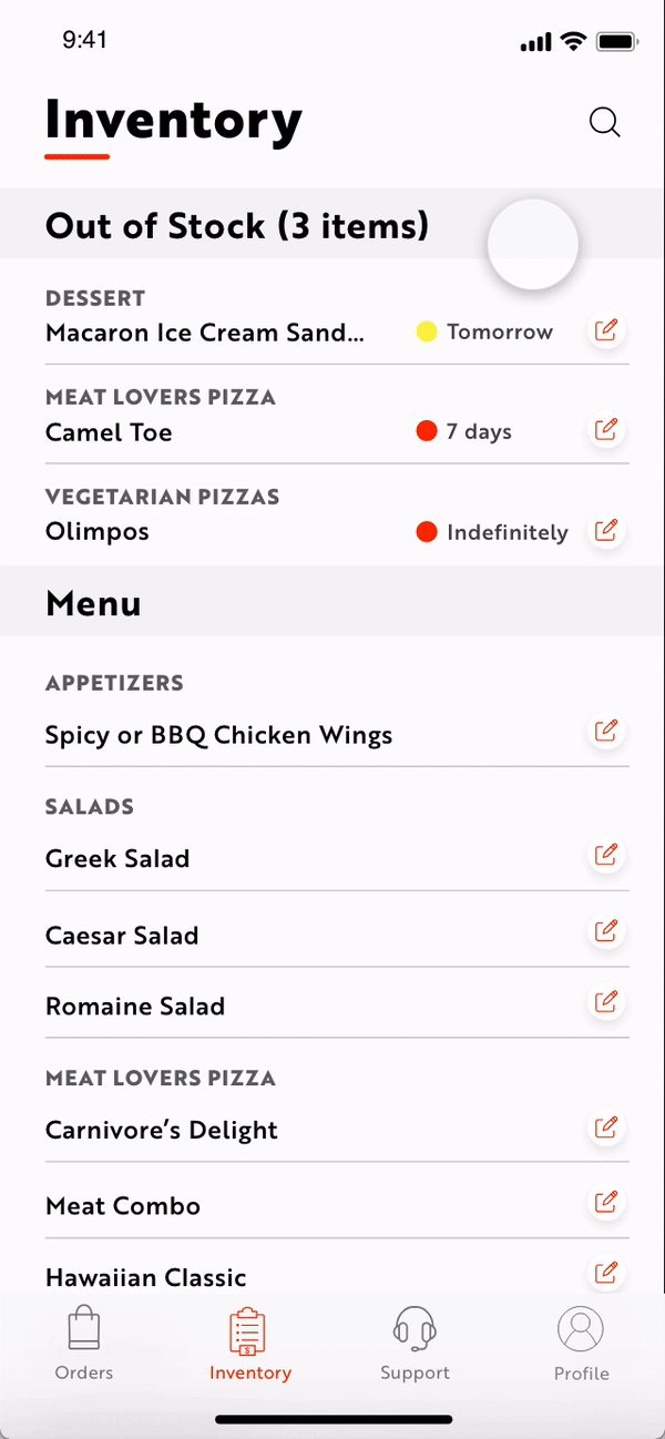
Like the main order tab, the orders are organized in single-column rows. The biggest change to the original design is I split the main headers into out of stock items — which are at the top so a merchant can easily access it — and the rest of the in-stock menu. In the out of stock section, the items are further color coded into long-term(red) and short-term (yellow) out of stock options. The rationale for this was because the new inventory design is created to give merchants more flexibility when deactivating and activating menu items, but the menu page can look easily cluttered if there are items deactivated with various times. Short-term is anything shorter than a day, and long-term is anything longer than that. Clicking on any list item will bring up the option of either deactivating it (if it’s in stock) or reactivating it (if it’s out of stock).
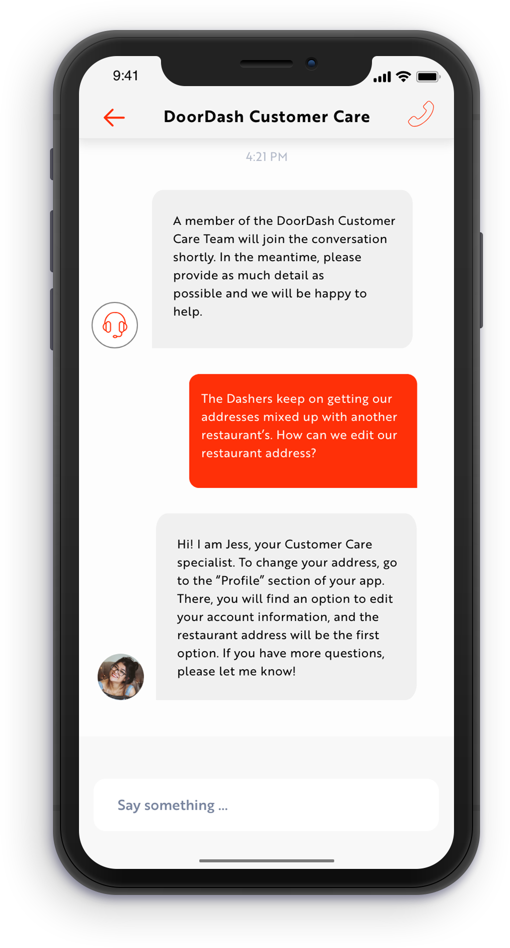
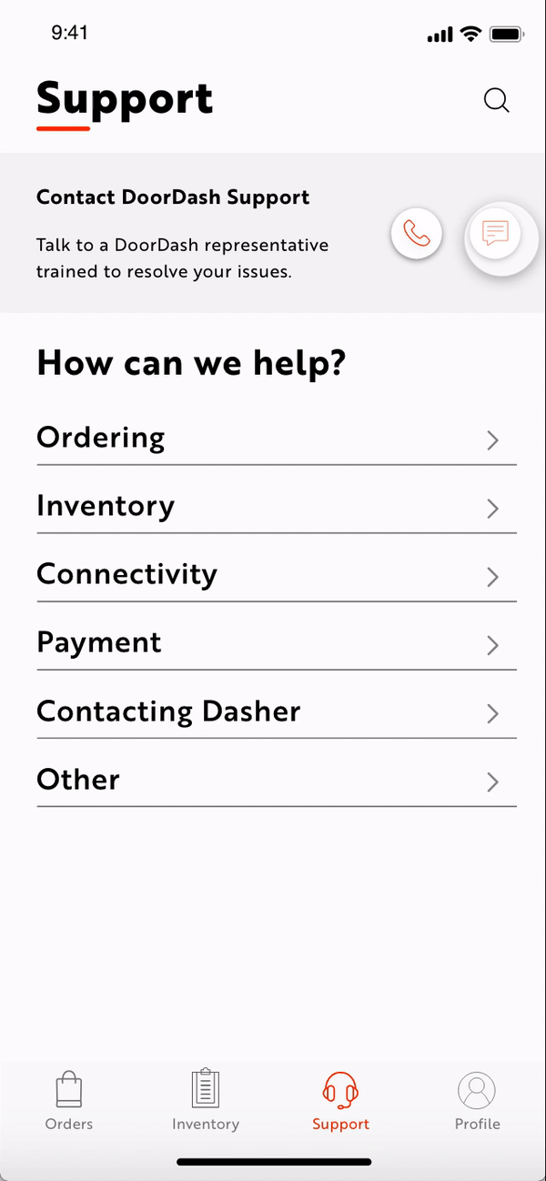
Merchant Support
a: Main Support Screen
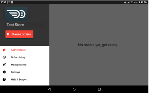
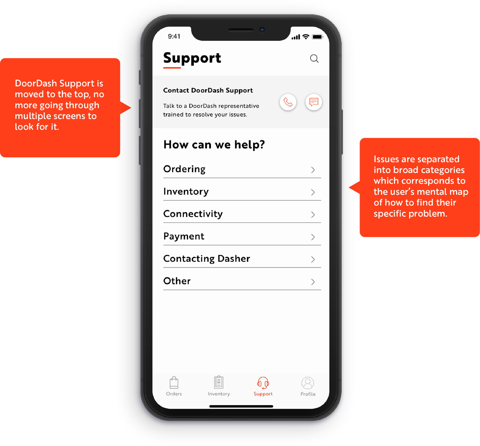
Lastly, I revised merchant support so restaurants can have an easier time contacting DoorDash’s customer support team. Again, this takes into account the hectic environment of working in a restaurant so if there is a bug with their app or if they don’t know how to use a feature they may be under high pressure to correct it as soon as possible. The current feature for “Help and Support” is located at the bottom of the sidebar that does not open by default, making it difficult to find. Furthermore, when you click the button you are only presented with three options which may not be relevant to your problem. If you want to call customer support, you are not linked to directly calling the number (because tablets don’t support cellular calling for the most part). The “chat here” link is also written in a small font that makes it easy to miss.
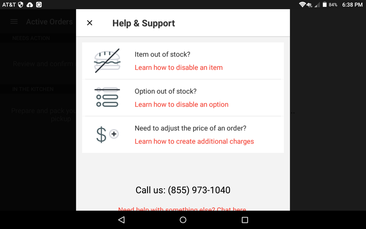
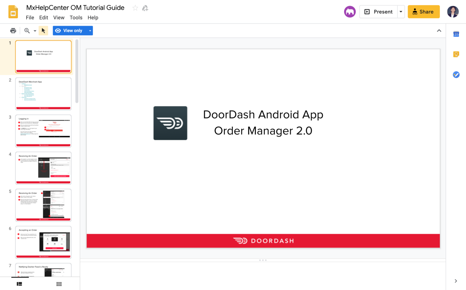
If you have additional questions or learn how to use the app, you are taken to a “Tutorial Guide” which is a Google Slides presentation. This takes merchants out of the experience of using this app because it requires them to exit the DoorDash app and open up an internet browser to look at it.
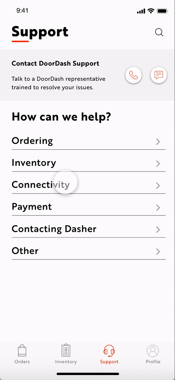
Taking those factors into account, I revised the layout to make the option of contacting DoorDash support the first option the user sees. This reinforces the human connection of asking for help and there is someone on the other end of the line who can help with the issue. Next, I broke down the issues into categories and the user can click on a row, taking them to another screen with more detailed issues pertinent to that category.
b: Live-Chat Feature
Similar to the layout of chatting with customers, I incorporated a live-chat feature that fits the mental model users have with other chat apps. This is part of the effort to make asking for support with an issue more conversational and easy-to-use.