The first component I feel is vital to brand guidelines is logo variation. Logo variations are alternative visual variants of a primary brand logo. Ideally, for maximum consistency and user recognition, the logomark or symbol/icon should always exist in one recognised colour. As an example, everyone recognises Facebook and Twitter as blue, HSBC as red, Spotify as green etc. If a brand such as these were to market their primary logo using an alternative colour, for instance a red Facebook logo, brand recognition, brand authenticity and trustworthiness would be initially questioned.
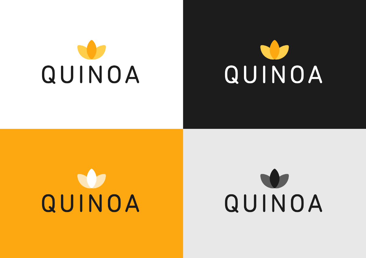
Logo variations are alternatives that enable recognition and identity to remain strong, whilst also allowing the logo to be used on multiple background types.
Using our Quinoa logo as an example, if this were to be positioned on a black background colour, the legibility of the wordmark (Quinoa) would be lost. If we wanted to position our logo on a yellow background, our logomark would be lost. In order to achieve flexibility we can use inverted versions of our logo.