Summary:
Effective icons depend on recognizability and interpretation. Evaluate them with methods appropriate for your specific research questions
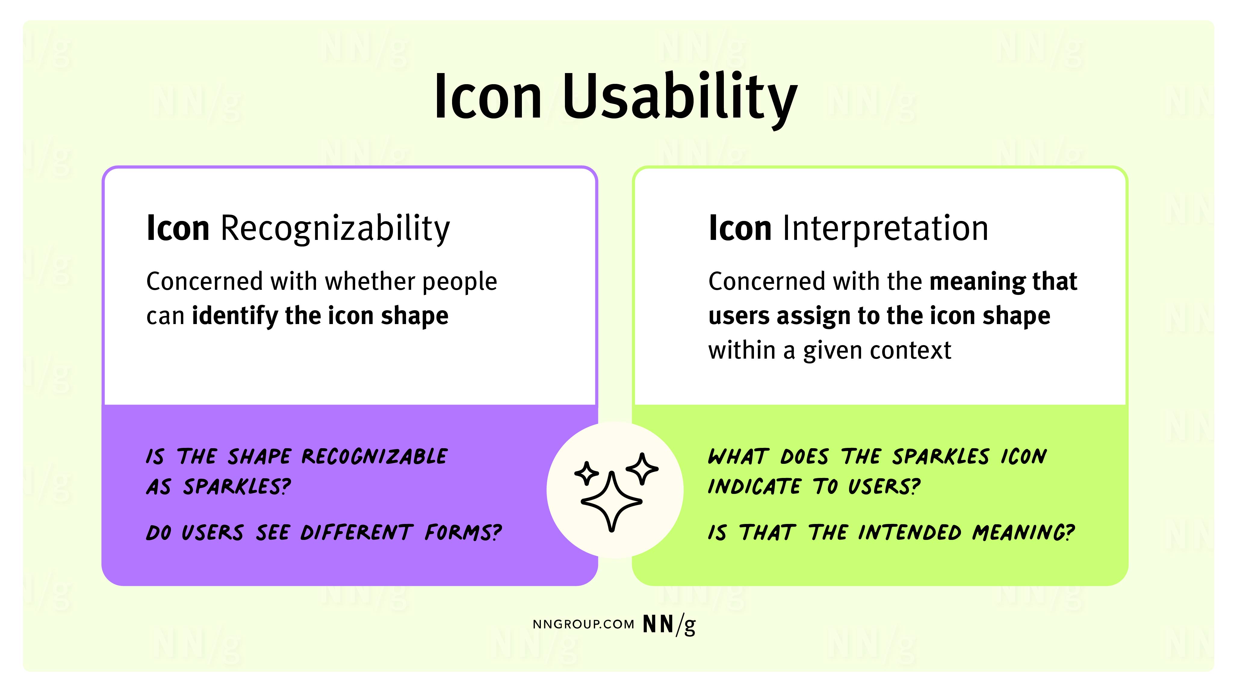
Icon Usability
Effective icons can increase usability by helping users understand and interpret available functionality. However, when poorly implemented, they harm usability and introduce confusion.
In Digital Icons That Work, I emphasize the importance of two variables that affect overall icon usability: icon recognizability and icon interpretation.
Icon recognizability is concerned with whether people can identify the shape or symbol that the icon depicts. (Does the star look like a star?)
Icon interpretation is concerned with the meaning that users assign to the icon’s shape or symbol within a given context. (What does the star indicate in this particular interface?)
Icon Recognizability
When it comes to recognizability, you don’t have to look far to find icons that use complicated, overly detailed symbols and shapes that are difficult to decipher. But even seemingly simple shapes are often difficult for users to recognize. In fact, it might surprise you how often users struggle to recognize icons depicting simple, everyday objects.
Consider the following icons. If you had to guess, what would you say they are? Don’t try to predict the action or idea they represent; just take a guess at what physical object is depicted.
(Guess before scrolling down for the answers!)
When we showed users these icons without labels, but within the context of the interface where they were used, recognition of these simple shapes varied greatly!
|
#1 |
#2 |
#3 |
#4 |
|
|
|
|
|
|
Ribbon or keyhole? The website for Ramp, a financial platform, used a ribbon to represent rewards, but some users thought it was as a keyhole. |
Shopping bag or briefcase? The Outnet’s ecommerce mobile application used this icon to represent a shopping bag, but some users thought it was a briefcase for storing files. |
Shopping bag, lock, or clipboard? The YouTube mobile application used this icon to represent a shopping bag, but some users saw either a clipboard or a padlock. |
Menu or document? The Saks Fifth Avenue mobile application used this icon to represent a navigation menu, but it was recognized as a document (e.g., a shopping list, record of past orders, or privacy statement) by many users. |
Achieving high icon recognizability is the first step in making your icons usable. As one study participant trying to deduce an icon’s shape wisely complained:
“I’m not sure what that icon is, and when you are unsure of what the icon looks like, you are unsure of the meaning behind it!”
Well said! Understanding the intended message behind an icon is often difficult enough. That challenge escalates to near impossible when the shape is cryptic or unidentifiable.
Icon Interpretation
Icon interpretation is the second, sometimes even trickier part of the equation. (Remember, icon interpretation is concerned with the meaning that users attribute to the icon.) Part of what makes icon interpretation a challenge is that recognition and interpretation do not always go hand in hand. Even when an icon is recognized as intended, it can be interpreted in a way that was not intended.
In other words, even when people accurately identify the depicted object or idea, they might not be able to accurately predict the action or function that the icon represents.
For example, in one of our studies, four applications used some version of a storefront icon to represent various actions.
|
|
|
|
|
|
Find a physical store Nordstrom mobile app |
Find a physical store Sephora mobile app |
View and search vendors Ramp website |
View shopping categories (menu) DSW mobile app |
While almost all users recognized each of these variations as a storefront, interpretations varied greatly. When asked what the icons would do (without showing them the icon label, if there was one), users predicted a variety of functionalities: going to the homepage (perhaps because of the icon’s similarity with a typical home icon), viewing a list of store locations, finding the nearest physical store, accessing in-store deals, or even viewing other related retailers and brands.
Why is it so difficult to communicate a simple idea? Are users daft? No, of course not! Nor are they being exceedingly difficult. It’s just that even considerably targeted user populations have great diversity of ages, lived experiences, experience levels with any given domain, cultural backgrounds, educational backgrounds, socioeconomic status, geographic locations, or accessibility needs. All these factors (and more) influence how people interpret meaning.
Because of all these complications, it’s critical to test your icons for both recognition and interpretation early in the design process. Don’t assume that simple objects will always be easily recognized, and don’t take for granted that, even when users can recognize an object, they’ll correctly interpret the intended idea, action, or meaning behind it.
Other Factors Influencing Icon Usability
In addition to interpretation and recognizability, a few other factors affect the usability of icons in a user interface and should be evaluated in user testing. They include:
- Relevance: How applicable does the icon appear to be for the task at hand or the goal the user wants to achieve?
- Findability: Can people find the icon on the page when they are looking for it?
- Discoverability: Is the icon salient and noticeable enough for people to discover it in the interface?
- Tappability or clickability: Is the icon large enough to tap or click? Or, is it prone to target-acquisition errors?
- Visual appeal: Does the icon look good?
All these attributes are important and work in concert to achieve high icon usability.
Choosing Methods for Icon Evaluation
Choosing the most appropriate method begins with formulating clear research questions. Before doing any testing, establish clear research goals and questions. Then, align those questions to the methods best suited to answer them.
Icon-testing methods can be separated into two main categories: out-of-context and in-context testing, depending on whether the icon is shown to the user in isolation or in the context of the actual interface.
Here’s an example of how we might align specific research questions about the attributes above to various methods across the design process.
|
|
Imagine that you work on an ecommerce mobile website, and you need to feature a direct pathway to new products in the home-screen navigation. You’ve designed this icon, hoping that the timer depicted is a good visual metaphor for recency and just-in products. |
Here’s how you might address some sample research questions related to this icon.
|
Research Question |
Related Attribute |
How to Evaluate |
When |
|
Does this icon look like a timer to users? |
Recognition |
Out-of-context recognition surveys: Show the icon to people in isolation, without a text label, and ask them what it is or represents. In-context screenshot testing: Show users a screenshot of the interface and ask them to describe any icons they see and what they think those icons do or represent in the context of the interface. |
Early in the design process |
|
Do users understand and associate the timer with just-in products? |
Interpretation |
Out-of-context surveys: Show the icon to users in isolation and ask them to describe what the icon would do if they saw it within the context of an ecommerce website. In context of the interface (even if in a screenshot or static mockup): Ask users to describe any icons they notice and predict their functions while referencing the interface. |
Early in the design process or as soon as you have your first interface mockups |
|
Do users like how the icon looks? |
Visual appeal |
Out-of-context rating: Show the icons to users in isolation and ask them to rate attractiveness (or other attributes) using semantic differential or Likert scales. Out-of-context preference testing: Show users different versions of the same icon (with alternate visual styles) to understand which one they prefer. |
Early in the design process or in a redesign |
|
Does the icon appear applicable to people looking for new products on the website? |
Relevance |
In-context usability testing: Provide users with a task related to finding a newly arrived product, and observe them interact with the interface: Do they use the icon? In-context A/B testing: Show users variations corresponding to different icon options. |
Once you have a prototype or a working interface or after the design has been launched |
|
Do users notice the icon in the interface? Can they find the icon in the interface when searching for new products? |
Discoverability Findability |
In-context usability testing or click tests: If users do not interact with icons or take too long to interact with them, they may not be noticeable. |
Once you have a prototype or a working interface or after the design has been launched |
|
Can users easily tap the icon without errors? |
Target acquisition |
In-context usability testing: Provide users with icon-related tasks and observe how easily they can tap the icon reliably, without accidentally selecting another nearby target. (In addition, follow general guidelines for touch-target sizes.) |
Once you have a prototype or a working interface or after the design has been launched |
Learn More in The Book: Digital Icons That Work
If you enjoyed this discussion and want to deepen your understanding of icon design, Digital Icons That Work offers a wealth of icon-design guidelines based on my recent icon research.
To explore more research insights and discover strategies to create effective iconography that enhances UX, get your copy here.