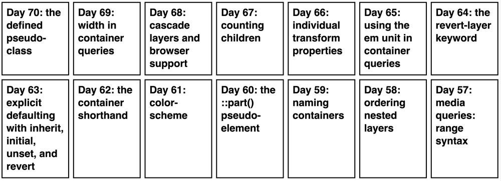
The masonry keyword allows you to create masonry grid layouts.
If you want to create a masonry layout, all you have to do is turn one of the grid axes into a masonry axis using the masonry keyword.
<ol>
  <li>
    <a href="/blog/2023/100daysof-day70/">
      Day 70: the defined pseudo-class
    </a>
  </li>
  <li>
    <a href="/blog/2022/100daysof-day69/">
      Day 69: width in container queries
    </a>
  </li>
  <li>
    <a href="/blog/2022/100daysof-day68/">
      Day 68: cascade layers and browser support
    </a>
  </li>
  …
</ol>
ol {
display: grid;
gap: 1rem;
grid-template-columns: repeat(auto-fill, minmax(16.5rem, 1fr));
grid-template-rows: masonry;
}This simple layout turns into…

…this “so much better” layout.

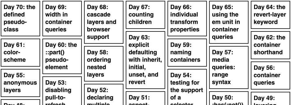
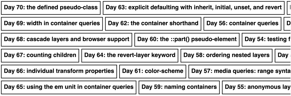
You can also turn the other axis into the masonry axis.
ol {
  display: grid;
  gap: 1rem;
  grid-template-columns: masonry;
  grid-template-rows: repeat(auto-fill, 6rem);
}
Accessibility
By default, the packing algorithm puts items into the column with the most space. This may cause a disconnect between DOM and tabbing order, which can be an issue for keyboard and screen reader users. Test your masonry grids sufficiently.
Browser support
Why am I showing screenshots instead of rendering the result directly? Well, because Firefox is the only browser that supports the keyword at the moment and the feature is still behind a flag. You can enable it by visiting about:config and setting layout.css.grid-template-masonry-value.enabled to true.
Can you use it today? Yeah, why not?! Most users will still get a grid, it’s just not a masonry layout.
My blog doesn’t support comments yet, but you can reply via [email protected].