The humble request
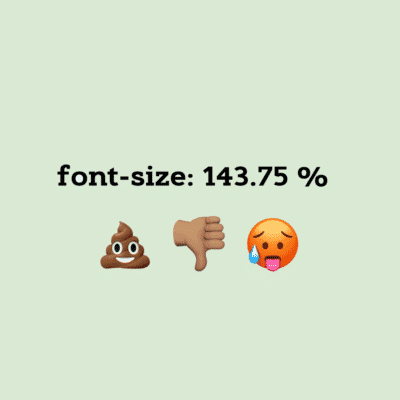
Nice font size 143.75% on that page. Maybe next they’ll have an article about why that sucks.
This graciously worded request was actually not sent directly to me, but to a fellow accessibility guru Nicolas Steenhout, who forwarded it to me in this tweet.
So sadly I don’t know who this mystery fan is, but I’ll write this article, and like a message in a bottle I hope it finds its way to you somehow!
Why our 143.75% font size sucks
1. Your eyes don’t get the training they need
Having a font size that’s too easy to read is like lifting 100 gram weights at the gym. Your eyesight, like your muscles, need to be challenged to become stronger. A large font size isn’t challenging to anyone, not even people with low vision. So nobody is getting the training they need, not even people with disabilities. #abelism
2. Large is not as aesthetic as small
Look at this tiny painting:
Super impressive right? So much better than if that same painting had been on a regular sized canvas. This obviously also applies to letters on a webpage. Smaller letters are more impressive than larger ones. Simple logic. And we all know that users mainly visit webpages and read articles to experience beauty. Ergo large fonts suck.
I suggest pausing this article to browse the Pinterest page All things miniature for about 30 minutes, and then returning.
Welcome back!
3. Font size isn’t a requirement in WCAG
The Web Content Accessibility Guidelines (WCAG) is the holy grail of accessibility. And surprise, surprise, WCAG doesn’t include a single success criteria on font sizes!
That means that font sizes don’t matter to anyone because WCAG contains every single important consideration when it comes to accessibility. You can make font sizes 1 px. As long as they have good contrasts, anyone will be able to read them.
It’s just like people running around thinking that making interfaces intuitive and testing them with real users would somehow be important for accessibility reasons. It’s not in the WCAG so it’s not important. Glad we got that sorted out once and for all.
4. 143.75 is a stupid number
Who specifies font size with two decimal places? That’s just dumb. Also, it’s hard to remember such a long number for the programmer who writes the CSS code. This discriminates against programmers with memory impairments. #abelism
5. Other crappy sites use large fonts
CSS-tricks, IFTT and A list apart use font sizes that are in the same ballpark as the ones on this site. They, like us, know nothing about usability or web design and are shooting themselves in the foot with this poor choice of font size.
6. Relative font sizes let users control too much
Having your font sizes in relative units like %, EM or REM, instead of absolute units like pixels, makes it possible for users to adapt the font sizes as they wish. This jeopordizes the whole look-and-feel of the site. Users don’t know what makes a site look aesthetic, and shouldn’t be given the chance to mess it up.
It’s like giving everyone who visits the Picasso Museum a paint brush, and encouraging them to adapt the paintings if they don’t like them. Picasso is the expert in paintings, not the museum visitors. Programmers are experts in web design, not the site visitors.
I could go on forever…
But I think you get the point! So thanks for the great article suggestion and hope this was what you were looking for.
And just for legal reasons, this is a joke. We think larger than normal fonts are quite great!
If you liked this article…
You might also enjoy:
Get notified when we write new stuff
About once a month we write an article about accessibility or usability, that’s just as awesome as this one (#HumbleBrag)!
Get notified by following us on Twitter @AxessLab or Facebook.
Or simply drop your email below!
