Here’s a fact: a great video game requires an equally awesome website. TV commercials, promotional videos, and teasers are a good start to gain exposure; however, it is not enough. For a successful and well-known brand, these kinds of promotional strategy are already sufficient. For a startup brand, you will need to do a little bit more to convince buyers to support you. That is when your awesome website will do the work for you.
Let us take a look at list of some of the best gaming website designs provided by fireart.studio that you can use as an inspiration for your own.
Injustice 2
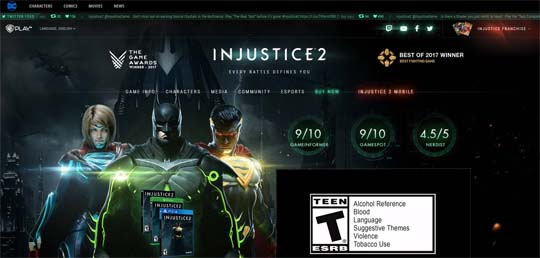 Following the success of the first Injustice game, there was no doubt that a second game was on the way. One of the strategies they utilized to make some noise for their return to build the game’s own website. The designers nailed the theme of the game by incorporating its elements in the website’s design. This way, the gamers will get a feel for what kind of mood and gameplay they should expect once the game is released.
The interface is also clean and easy to understand. You can easily find what you are looking for, such as the background of the game, its characters, and the recent news about their development. The font choice, color, and size are also ideal for the theme, making it easy on the eyes.
The website also follows a responsive design, which means it can be easily viewed on any platform.
Borderlands
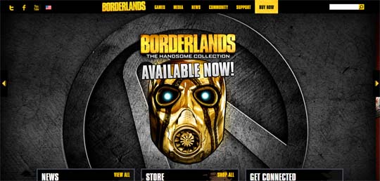 This video game series is well-loved by the gaming community. Upon entering their website, you will immediately see why fans are going crazy over the titles.
The game websites design already gives off the exciting action vibe the game possesses. Despite being simple, it was still able to give visitors a certain wow factor. Also, it utilizes elements that can be found in the game, such as the graphics, the texts, and the color scheme. This will give the fans the sense of familiarity and new players the feeling of curiosity and excitement.
Everything you might need is readily available in their fixed navigation bar. Wherever you are on their page, you can just look up and choose your next destination. Their website also follows a responsive design, which makes viewing easier for every user.
Tom Clancy’s The Division
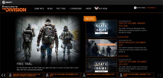 The Division is an online RPG that supports multiple gaming platforms. With this in mind, the challenge for the designers would be to create a gaming website design that is both attractive and functional. Since they would need to consistently post updates, their website needs have a space dedicated to their news alone.
One might think that a website might end up overcrowded with all the elements required. However, it is possible to make everything work together, and this website is a proof. They still managed to capture the mood and theme of the game while providing news about recent happenings. The website remains clean, easy on the eyes, and informative.
They also didn’t forget to make room for a responsive website design, which is an absolute plus!
Persona 5
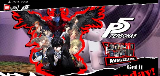 Atlus’ most awaited game did not disappoint and neither, did their website. Once you enter their page, you will immediately know what’s in store for you. It’s safe to say that it is one of the most original and awesome game website design. This was possible because their elements heavily rely on the color scheme, mood, and theme of the game. It is a custom design done right. Fans of the game are sure to enjoy browsing through the site.
Aside from its faithfulness to the game’s elements, it also follows today’s trends. For example, their banner is a video compilation of some events in the game. Also, you would see animations happen as you scroll down. Surprisingly, the website still maintains a fast loading speed, which is great for user experience.
Metal Gear Solid V
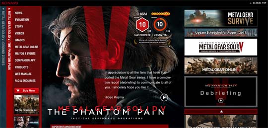
“A picture says a thousand words” is one of the oldest sayings that we know, but it still remains true to today’s time. This was the technique used by the game website designers of Metal Gear Solid. In the homepage, you will be welcomed by an intense photograph of the game’s protagonist. In that picture alone, you will already feel what your character will face during the game.
Navigation is simple, easy, and visible. Despite having a simplistic look, it still manages to stand out because of how everything was designed. In addition, the website supports a responsive design for viewers of different platforms.
God of War
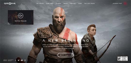 Usually, a video game website only consists information, media, and news about the game. However, God of War’s website decided to try something new and exciting. While it does offer the basics, the game website design was what made their pages stand out from the rest. Imagine playing a point-and-click adventure game in 3D. That is the experience you will get while browsing through their website.
It features animations and videos as the background of some of their pages. Also, the background images will move as your cursor travels across the screen. These kinds of designs can really capture one’s attention and curiosity. The best part is that the website still maintains a fast loading speed.
Animal Crossing: New Leaf
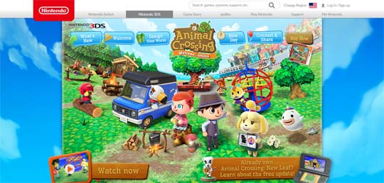 Last but not the least is the cutest entry on this list, Animal Crossing: New Leaf. The website’s color scheme just screams how fun and light-hearted the game is.
The designers did not forget to incorporate the game’s elements into the website. This will give visitors some ideas on what to expect when they buy the game. Despite having a colorful design, they still managed to give the “just right” feeling. It is not too much but also not underwhelming.
Several animations will also be activated once you scroll down just to add subtle spices. Overall, it is a clean, fun, and faithful website counterpart for the game.
Conclusion
To sum it up, here are the following best gaming web designs inspirations that you should follow:
– Faithfulness to the video game’s theme and mood;
– Reference to some of the in-game elements;
– Ease of use;
– Easy yet attractive to the eyes;
– Follows a responsive design.
Boost your business by keeping these tips and guidelines in mind, but don’t forget to add your original flavor!