If you kept up with Google I/O 2015, then you likely saw that Polymer 1.0 has been released to the public. If you have been around since Polymer 0.5, then you likely saw that all your favorite building blocks have been deprecated. For all those who have used 0.5, consider this a migration assistant. Those of you who have never seen Polymer before, you’re in for a treat!
Polymer is a library that leverages web components to allow you to define and use custom HTML elements. With custom elements, designing and building a website becomes a game of Legos. Polymer 1.0 replaces the shadow DOM polyfill with a lightweight shim, reduces the code size, and speeds up data-binding for an all around smoother experience.
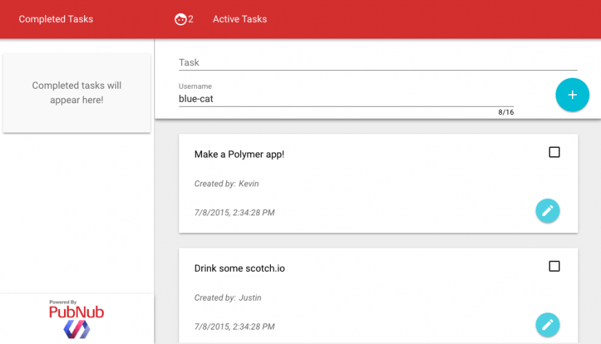
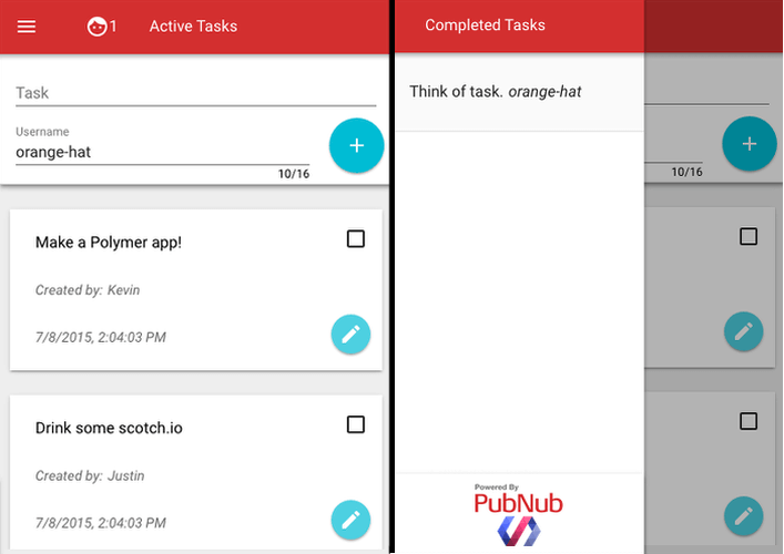
Today, we’ll be building a realtime collaborative to-do application, where task status is synced in realtime across all connected devices as their state is changed. We’ll use Polymer to build our application, and PubNub to send and receive updates between connected devices, and to sync state.
So let’s get started! When building with Polymer you must import elements before you use them. A standard polymer use looks like this:
<link rel="import" href="http://feeds.feedblitz.com/~/t/0/0/scotch_io/~paper-fab"> ... <paper-fab icon="send"></paper-fab> One of the best parts of Polymer, is the use of Material Design. Most of us have probably seen Material Design on Android Lollipop, but the specification for visual and interaction design spans all different screen sizes. These elements in Polymer are called paper elements, and they are made to adapt screen sizes and look beautiful on any device.
A Note on Testing and Debugging
If you try to open file://<your-polymer-project> in your browser, you will likely run into Cross-Origin Resource Sharing (CORS) errors. So, to test your code you have a few options. You can upload your files to a web server, like Github Pages if you prefer. However, to keep development local, I recommend you setup a simple server using Python.
To do this, open your terminal and change directories into your current project and depending on your version of Python, run one of the following modules.
cd <project-dir>
# Python 2 python -m SimpleHTTPServer <portNo>
# Python 3 python -m http.server <portNo>
For example, I run Python2.7 and the command I use is python -m SimpleHTTPServer 8001. Now I can go to http://localhost:8001/index.html to debug my app! Try making an index.html with anything in it and serve it on localhost before you continue.
1. Creating Your To-Do App with Paper Elements
1.1 Install Polymer
In order to use Polymer, we must first install it. The recommended method is through Bower. Follow the official instructions to install Bower. Then from the terminal, install Polymer with the following lines.
$   cd <project-directory>
$   bower init
$   bower install --save Polymer/polymer#^1.0.0
Now make your index.html and load the webcomponents-lite.js file. For those who used v0.5, bower includes all webcomponents script files, however, the new components are in the -lite file, so choose that one.
<!DOCTYPE html><html>
<head>
<script src="bower_components/webcomponentsjs/webcomponents-lite.min.js"></script>
</head>
<body>
 ... </html>
1.2 Downloading Paper Elements
First, you should know that there are loads of great looking paper elements, so if you decide to choose different elements, I fully support you. You can see all elements in the Polymer Element Catalog. Version 0.5 users, note that all core-elements are deprecated. Now the core building blocks are part of iron-elements.
As a general syntax, if you see something you like in the catalog, downloading the element with Bower looks as follows:
$ bower install polymerelements/<element-name>The elements that I use in this demo are:
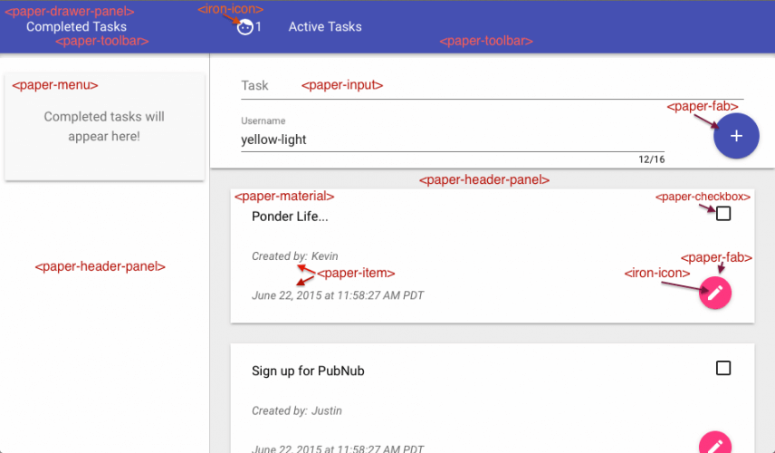
paper-checkboxto check off a taskiron-inputto handle input binding functionalitypaper-inputfor a Material Design inputpaper-drawer-panelto provide the app structure (in place of thecore-scaffoldof v0.5)paper-buttonfor a good looking buttonpaper-fabfor the round floating action buttonspaper-menuto create a nice sidebar of completed tasksiron-iconsto provide material icons for buttons
These can be installed with the following lines in the terminal.
$   bower install polymerelements/paper-checkbox#^1.0.1
$   bower install polymerelements/iron-input#^1.0.0
$   bower install polymerelements/paper-input
$   bower install polymerelements/paper-drawer-panel
$   bower install polymerelements/paper-button
$   bower install polymerelements/paper-fab
$   bower install polymerelements/paper-menu
$   bower install polymerelements/iron-icons
Now you are ready to import and use these elements to make a custom element of your own!
2. Creating Custom To-Do Element
The entire contents of my index.html file can fit on less than 10 lines.
<html>
<head>
<meta name="viewport" content="width=device-width, initial-scale=1">
<script src="bower_components/webcomponentsjs/webcomponents-lite.min.js"></script>
<link href="http://feeds.feedblitz.com/~/t/0/0/scotch_io/~elements/todo-app.html" rel="import">
</head>
<body fullbreed unresolved>
<todo-app></todo-app>
</body>
Add the <meta name="viewport" content="width=device-width, initial-scale=1"> to your <head> tag to properly display your app on mobile devices. From there you can see the webcomponents file and a custom element that defines our app. <body fullbreed unresolved> tells the Polymer that the body should take up the full screen, and wait until all elements are resolved (loaded) before displaying anything, preventing FUOC.
2.1 Structure of Custom Elements
In this tutorial, we’ll be focusing on the functionality of Polymer 1.0, not the basic CSS. However, I’ve included all my stylesheets, which can be found here. Otherwise, the styling is up to you.
<!DOCTYPE html><html>
<head>
<link href="http://feeds.feedblitz.com/~/t/0/0/scotch_io/~https://scotch.io/bower_components/polymer/polymer.html" rel="import">
<!-- Element Imports -->
</head>
<dom-module id="element-name">
<style>
 /* CSS rules for your element */
</style>
<template>
<!-- local DOM for your element -->
 ... </template></dom-module>
<script> Polymer({ is: "element-name", properties: { ... }, ready: function(e){ ... } }); </script>
This is the basic layout of any custom element. <dom-module> is the Polymer 1.0 version of the now-deprecated <polymer-element>, it is the root of your custom element. An element’s styles are local, so add them between the style tags, and between the <template> tags are where the bulk of our element will go. The Polymer({}) script is where you write the logic to your element. is is how you register your element as a Polymer element. Any attribute of your element should be declared in properties, we will cover this shortly though.
2.2 Importing Elements
As I said earlier, you must import an element before using it. Create a new folder and file in your project directory /elements/todo-element.html. Then, in todo-element.html add the standard template from above, and import the following elements:
<head>
<link rel="import" href="http://feeds.feedblitz.com/~/t/0/0/scotch_io/~https://scotch.io/bower_components/polymer/polymer.html">
<link rel="import" href="http://feeds.feedblitz.com/~/t/0/0/scotch_io/~https://scotch.io/bower_components/paper-checkbox/paper-checkbox.html">
<link rel="import" href="http://feeds.feedblitz.com/~/t/0/0/scotch_io/~https://scotch.io/bower_components/paper-item/paper-item.html">
<link rel="import" href="http://feeds.feedblitz.com/~/t/0/0/scotch_io/~https://scotch.io/bower_components/paper-input/paper-input.html">
<link rel="import" href="http://feeds.feedblitz.com/~/t/0/0/scotch_io/~https://scotch.io/bower_components/paper-material/paper-material.html">
<link rel="import" href="http://feeds.feedblitz.com/~/t/0/0/scotch_io/~https://scotch.io/bower_components/iron-icons/iron-icons.html">
<link rel="import" href="http://feeds.feedblitz.com/~/t/0/0/scotch_io/~https://scotch.io/bower_components/paper-fab/paper-fab.html">
</head>
This will import all the elements we use. Now, lets configure our template. The <paper-fab> action button uses an icon property to select icons, see all possible icons here.
<template>
<paper-material class="todo" elevation="1">
<paper-checkbox checked="{{completed}}"></paper-checkbox>
<paper-fab hidden={{editing}}  icon="icons:create" on-tap="doEdit" mini></paper-fab>
<paper-fab hidden={{!editing}} icon="icons:done"   on-tap="doEdit" mini></paper-fab>
<paper-item hidden="{{editing}}" id="task">{{task}}</paper-item>
<paper-input id="edit" hidden="{{!editing}}" value="{{task}}"></paper-input>
<paper-item>Created by: <span>{{user}}</span></paper-item>
<paper-item>{{time}}</paper-item>
</paper-material> <!-- data bindings in local DOM --> </template>
Time for a crash course in data binding for those who have never used Polymer before. Any time {{}} is used, it is binding a property. Whatever value that property has will be placed where the curly braces are. Before we move on, note the elevation attribute of the paper-material. This will generate a shadow to give perspective to your app. Now, lets define those properties.
<script>
Polymer({     is: "todo-element",
     properties: {         // declare properties for the element's public API
         user: {             type: String,
             value: ""            },
         task: {             type: String,
             value: "Hello!"         },
         rid: {             type: Number,
             value: -1         },
         time: {             type: String,
             value: new Date().toLocaleString()         },
         completed: {             type: Boolean,
             value: false,
             observer:'compChanged'         },
         editing: {             type: Boolean,
             value: false             }     },
     compChanged: function(e){         if(e){ this.fire('complete',this); }     },
     doEdit: function(e){         this.editing=!this.editing;     },
   }); </script>
Here you can see how a property is declared. Name the property, state its type and default value. Now for binding, <paper-item hidden="{{editing}}" id="task">{{task}}</paper-item> will be hidden the moment we modify the property editing to be true. This happens once doEdit is called. Note that properties in polymer native on-* syntax, such as on-tap="doEdit" do not require curly braces, and any plain text such as <span>{{user}}</span> needs to have a tag directly around it in order to render. Bindings are two-way. This means that if I modify the <paper-input value="{{task}}"> and change the value, task’s value will be updated accordingly.
Lastly, take note of the completed property. there is an observer, or a function that will be called once the value of completed is changed. To communicate with other elements, this code just fires a complete event with our completed task as the tag. This will be important later. If you would like to learn more about properties and property binding, see the official documentation.
Our properties include:
- user: The person who posted or completed a task
- task: The task that is being posted
- rid: A random ID that will be used to coordinate tasks via PubNub
- time: The time of creation of the task
- completed: Whether or not the task is complete
- editing: If the user is editing the task
Now, we have a complete To-Do element. Time to use it to make our application.
3. Creating Your App
Our index.html only had one element, the <todo-app>, so now let’s make that element! Create a file in /elements/todo-app.html.
3.1 App Imports
We can import our custom element just like any other, using <link href="http://feeds.feedblitz.com/~/t/0/0/scotch_io/~https://scotch.io/elements/todo-element.html" rel="import">. Now we should import all elements we are going to use in our app, and set it up as a Polymer element.
<head>
<link href="http://feeds.feedblitz.com/~/t/0/0/scotch_io/~https://scotch.io/bower_components/polymer/polymer.html" rel="import">
<link href="http://feeds.feedblitz.com/~/t/0/0/scotch_io/~https://scotch.io/elements/todo-element.html" rel="import">
<link href="http://feeds.feedblitz.com/~/t/0/0/scotch_io/~https://scotch.io/bower_components/paper-drawer-panel/paper-drawer-panel.html" rel="import">
<link href="http://feeds.feedblitz.com/~/t/0/0/scotch_io/~https://scotch.io/bower_components/paper-header-panel/paper-header-panel.html" rel="import">
<link href="http://feeds.feedblitz.com/~/t/0/0/scotch_io/~https://scotch.io/bower_components/paper-toolbar/paper-toolbar.html" rel="import">
<link href="http://feeds.feedblitz.com/~/t/0/0/scotch_io/~https://scotch.io/bower_components/paper-icon-button/paper-icon-button.html" rel="import">
<link href="http://feeds.feedblitz.com/~/t/0/0/scotch_io/~https://scotch.io/bower_components/paper-material/paper-material.html" rel="import">
<link href="http://feeds.feedblitz.com/~/t/0/0/scotch_io/~https://scotch.io/bower_components/paper-menu/paper-menu.html" rel="import">
<link href="http://feeds.feedblitz.com/~/t/0/0/scotch_io/~https://scotch.io/bower_components/paper-item/paper-item.html" rel="import">
<link href="http://feeds.feedblitz.com/~/t/0/0/scotch_io/~https://scotch.io/bower_components/paper-input/paper-input.html" rel="import">
<link href="http://feeds.feedblitz.com/~/t/0/0/scotch_io/~https://scotch.io/bower_components/iron-icons/iron-icons.html" rel="import">
 ...
</head>
<dom-module id="todo-app">
<style>
 ...
</style>
<template> ... </template></dom-module>
<script> ... </script>
3.2 Basic Structure
The paper-drawer-panel, paper-header-panel and paper-toolbar are all used to structure our application and make it adapt to different screen sizes. They replace the core-scaffold of Polymer 0.5.
The basic structure of the paper-drawer-panel is:
<paper-drawer-panel>
<paper-header-panel drawer>
         <paper-toolbar>
             <paper-item>Side Bar Title</paper-item>
         </paper-toolbar>
         <!-- Side Bar Content -->
     </paper-header-panel>
     <paper-header-panel main>
         <paper-toolbar>
             <paper-item>Main Body Title</paper-item>
         </paper-toolbar>
         <!-- Body of Element -->
     </paper-header-panel>
 </paper-drawer-panel>
3.3 Create Your Side Bar
I will start by covering my Side Bar Content. This can all go in the <template> tag of your element.
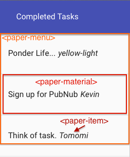
<paper-menu class="list">
     <template is="dom-if" if="{{!done.length}}">
         <paper-material>
             <paper-item>Completed tasks will appear here!</paper-item>
         </paper-material>
     </template>
     <template id="done" is="dom-repeat" items="{{done}}">
         <paper-item>{{item.task}}<i style="margin-left: 5px;">{{item.user}}</i></paper-item>
     </template>
 </paper-menu>
Conditional Templates
This snippet covers a lot of Polymer’s new features so follow carefully. Templates are used internally to add functional properties such as loops and conditionals to your elements. <template is="dom-if" if="{{!done.length}}"> means that it is functioning as an if statement, on the condition of the array done‘s length. If done is empty, this reads not 0 which evaluates to true, and thus it will only display when the array is empty, and disappear as soon as the array is populated.
Looping Templates
<template id="done" is="dom-repeat" items="{{done}}"> is an effective way to loop through and display an array’s contents. The dom-repeat means it will loop through every element of items (the done array in this case), much like a for-each loop. It names each element of the array item so if item is {task:"SIT", user:"lazy-cat"}, you can access properties as {{item.task}} and {{item.user}}. There is an option to set as="myTask" in the template tag to name elements, and then you can use {{myTask.task}};
3.4 Main Body Content
Now onto the Main Body of the Element. This can be styled or structured however you would like, but I tried using as many paper-elements as possible since my eye for style is blind.
<div style="border-left: 1px solid #ccc;">
 <!-- To create a new Todo -->
 <paper-material id="todoEntry" elevation="2"><paper-input id="tTask" label="Task"></paper-input><paper-input id="tUser" char-counter label="Username" maxlength="16"></paper-input><paper-fab icon="icons:add" on-tap="postTask"></paper-fab></paper-material>
 <div id="todos">
 <template is="dom-if" if="{{!todo.length}}"><paper-material><paper-item>No Tasks remain. Updates are Real-Time so stay tuned!</paper-item></paper-material></template><template id="tasks" is="dom-repeat" items="{{todo}}"><todo-element user="{{item.user}}" task="{{item.task}}" rid="{{item.rid}}"></todo-element></template>
 </div>
</div>
This looks somewhat similar to the side menu. There are still conditional and repeating templates to display all tasks in the todo array. There is a function that we will need to define called postTask that is triggered on-tap of the add action button. The paper-input element uses a char-counter to display number of letters typed. See more custom properties of this element in the element catalog. Again, to view all possible icon choices for the <paper-fab> look here.
3.5 Implementing Your Element
Polymer({     is: "todo-app",
     properties: {         todo: {             type: Array,
  // Default with one value             value: [{user:"Coder",task:"Learn Polymer",rid:0}]         },
         done: {             type:Array,             value: []         },
     },
     postTask: function(e) {  // Add a new task
         var tsk = this.$  .tTask.value;
         var usr = this.$  .tUser.value;
         if (tsk==""){             alert("Task is Empty!");
             return;         }
         if (usr==""){              usr = "Anonymous";         }         this.$  .tTask.value = "";         //Will need to publish the task in Part 4     },
     handleComplete: function(e){         var idx = findWithAttr(this.todo, 'rid', e.target.rid);
         var itm = this.todo[idx];
         itm.task = e.target.task;
       //Task of the fired event         itm.user = this.$  .tUser.value; //User who completed task         itm.type = "done";
              //Change to completed         // Will Publish completed item in Part 4     },
     ready: function(e){         this.addEventListener('complete', this.handleComplete);     }
}); function randID(){  // RandID is just a large number, could be better.     return Math.floor(Math.random()*10000); } function findWithAttr(array, attr, value) { //Finds object index in array by its random ID     for(var i = 0; i < array.length; i += 1) {         if(array[i][attr] === value) {             return i;         }     } }
This is the first we have see how to access the value of something in your element’s Shadow DOM. After declaring our task and done arrays, we get the value of our <paper-input id="tTask"> using var tsk = this.$ .tTask.value;. Pretty simple! We will publish our task with PubNub in part 4, but for now take a look at the ready function. This is called once our element is loaded and ready to be rendered. We add an event listener for the completed which we fired from our custom todo-element. We handle it by updating its fields for who completed the task, and we will then publish to all collaborators.
4. Making It All Collaborative
Welcome to my favorite part, the real-time collaboration! In order to start streaming tasks and completions, you will need a publish and subscribe key. To get your pub/sub keys, you’ll first need to sign up for a PubNub account. Once you sign up, you can find your unique PubNub keys in the PubNub Developer Dashboard. The free Sandbox tier should give you all the bandwidth you need to build and test your Collaborative To-Do Application.
4.1 The PubNub Element
PubNub has a Polymer element pre-made. The <pubnub-element>. Once you have your keys the <pubnub-element> can be downloaded using Bower.
$ bower install --save pubnub-elementTo import this element in your todo-app.html, using the following line:
<link rel="import" href="http://feeds.feedblitz.com/~/t/0/0/scotch_io/~https://scotch.io/bower_components/pubnub-polymer/pubnub-element.html">4.2 Using the PubNub Element
You can initialize the PubNub client using the <core-pubnub> element with your keys. Inside the <core-pubnub> we will use a <core-pubnub-publish> element to stream new and completed todo objects.
Note: this element should be the last tag in the <template> of your <todo-app> element.
<template>
 ...     <core-pubnub          publish_key="your_pub_key"          subscribe_key="your_sub_key">
         <core-pubnub-publish id="pub" channel="todo" message="Test"> </core-pubnub-publish>
         <core-pubnub-subscribe id="sub" channel="todo" messages="{{messages}}" presence="{{present}}" on-callback="subscribeCallback"></core-pubnub-subscribe>
       </core-pubnub>
 </template>
<core-pubnub-publish> is used to send messages to all subscribers of a channel. We set the channel to “todo”, so all subscribers of todo will receive tasks. Then, to publish a message, we need to access the <core-pubnub-publish> as follows.
this.$ .pub.message = {"task":"<task>", "user":"<user>", "rid":<rid>}; this.$ .pub.publish(); We can go back and update handleComplete and postTask as follows so that they will publish their updates:
handleComplete: function(e){ ... this.$ .pub.message = itm; this.$ .pub.publish(); }, postTask: function(e) { ... this.$ .pub.message = { type:"todo", task:tsk, user:usr, rid:randID() }; this.$ .pub.publish(); } The <core-pubnub-subscribe> will subscribe us to channel todo so we are receiving all those publishes, but notice that it takes two values of messages and presence. These are arrays. When the PubNub Element receives a message or presence update, it will put it in the array and fire a message or presence event respectively. It also takes a on-callback which is triggered any time a subscribe event occurs. We can implement that like so:
properties: { ... messages: { type: Array, value: [] }, present: { type: Array, value: [] } }, ..., subscribeCallback: function(e){ while(this.messages.length > 0){ // Get all messages var item = this.messages.pop(); switch(item.type){ case "todo": this.unshift('todo', {task:item.task, user:item.user, rid:item.rid}); break; case "done": var idx = findWithAttr(this.todo, 'rid',item.rid); var itm = this.splice('todo', idx, 1)[0]; itm.task = item.task; itm.user = item.user; this.push('done',itm); break; default: continue; } } } This will check if a new todo is being broadcasted, or an old one is being completed. Polymer uses its own methods to update arrays. Array.pop() will not notify Polymer that a change has occurred, so the elements you see won’t be updated. Therefore it uses this.pop('arrayName') (also push, shift, unshift, etc). So we use this.unshift('todo', ourJSON); to add a task to the beginning of the todo array, which is then updated from our dom-repeat in Step 3.
4.3 BONUS: Real-Time Presence
Go to your PubNub Developer Dashboard and enable the free 30-day trial of Presence for this part, trust me it’s worth it. We now have subscribe and publish working perfectly! Anywhere in your paper-toolbar, (I chose before the Main Body Title), add an icon and a number to indicate how many people you are collaborating with.
<paper-item> <iron-icon icon="icons:face"></iron-icon> <span id="here">0</span> </paper-item> Take a look at how simple it is to update the number of real-time users in your Polymer app:
this.addEventListener('presence', presChange); function presChange(e){ var pres = this.present.pop() this.$ .here.innerHTML = pres.occupancy; } Done. The number will update live and show you how many users are currently using your application.
That’s all I have this time, we can check that one off the to-do list, **bad joke drum sound*. I’ll be back soon with another cool PubNub demo and better jokes!
Whew! Time for a break!
![]()
