Behind the color of black there are lot of different emotions. Some think it is the color of evil. Some think it is the color of emptiness. Some think it is the color of love. Black is all of those things.
Today we are talking about pre-made Joomla templates that are designed in black and dark colors. Those are 20 best themes that will completely redefine your understanding of what could be done with black and dark.
Some of those themes are fun. Some of them are serious. All of them are beautiful. With all the talk about black, it is important to remember that first and foremost black is the basis of everything. The universe is black. The one secret of life that is both hidden and obvious goes like this: darkness gives birth to everything. And guess what — your success and the success of your website begins in darkness, too.
All of the important things in life are connected through the black color. That’s why websites that use the palette consisting of dark colors attract so much attention. There is something primeval to that, something that appeals to people on the most basic level and connects with directly to the subconscious. Using dark colors on your website is both stylish and profound and a good way to stand out.
In addition, designing websites around dark colors proved to be a great task that leads to more creative decisions and outcomes. All in all, our list today is a very interesting one.
In case you don’t know why you should use pre-made templates, here’s a short reminder:
– Ready-made templates are easy to install and easy to use
– They cost less than a hundred dollars
– They were designed by a team of professionals
– They are built on the pillars of modern web
– They look good both on your PC and on your mobile device
– There’s a great variety of choice
We also recommend using the help of an established template provider. In that case you will have access to a 24/7 support team and a few nice bonuses. Today’s list is compiled with the examples from TemplateMonster.com.
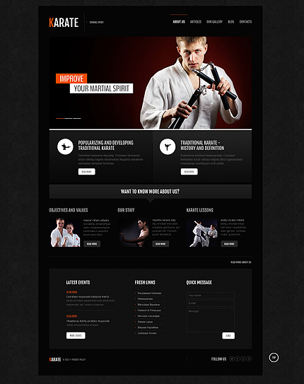
Joomla Blackness #1: Template for the Karate Website
The great power of the karate martial art lies in one blow — that one successful blow that foreshadows the outcome of the fight. This responsive Joomla layout in many ways is similar to that blow: it is condensed, focused and powerful.
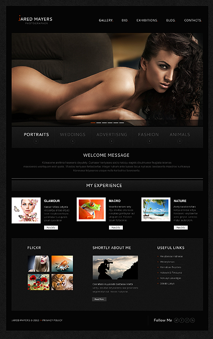
Joomla Blackness #2: Theme for the Photographer
Black color is the photographer’s greatest helper. It is both glamorous and classic, it is always trendy and never out of fashion. A website designed mostly in black will not only highlight the essence of your work, but also will provide your work with a deeper tone of beauty.
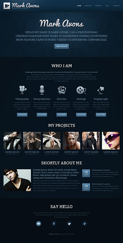
Joomla Blackness #3: Layout for the Portfolio Website
There is a method to becoming successful. That method is turning your name into a personal brand. For that you will need a portfolio website that looks and feels astonishing. This layout was designed around dark blue colors and uses simple level structure to provide your audience with all the information about you: who you are, what you do, why you exist.
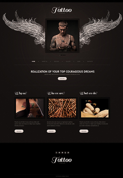
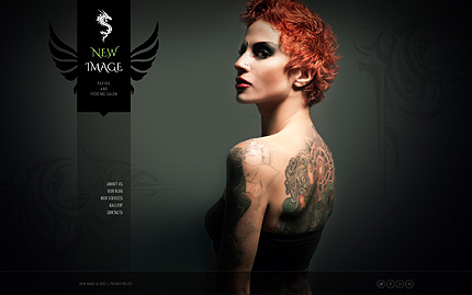
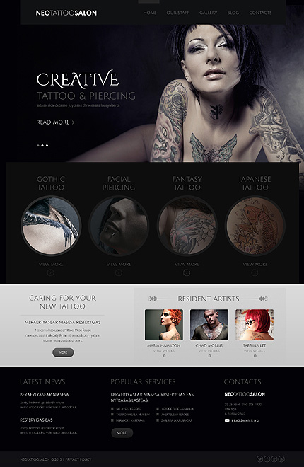
Joomla Blackness #4: Design for the Tattoo Website
This is a simple design that shows only the essentials on its front page. What’s more important, it was designed to be memorable. With clean fonts, dark contrast and powerful wings imagery, your tattoo website wil be similar to a great tattoo.
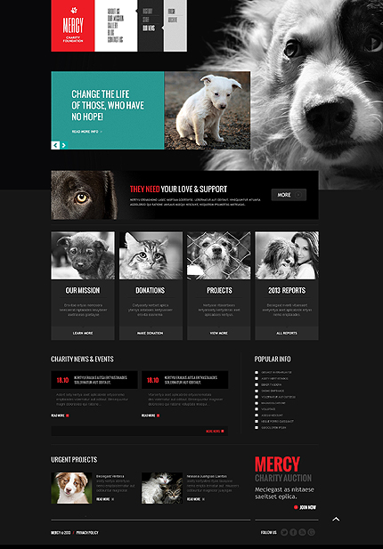
Joomla Blackness #5: Template for the Pet Lovers
An original design that is completely its own thing. It would be an ideal choice for a pet charity or something similar. Confident usage of contrasting colors helps the layout speak urgency, while the great usage of black and dark gray provides it with the sence of importance.
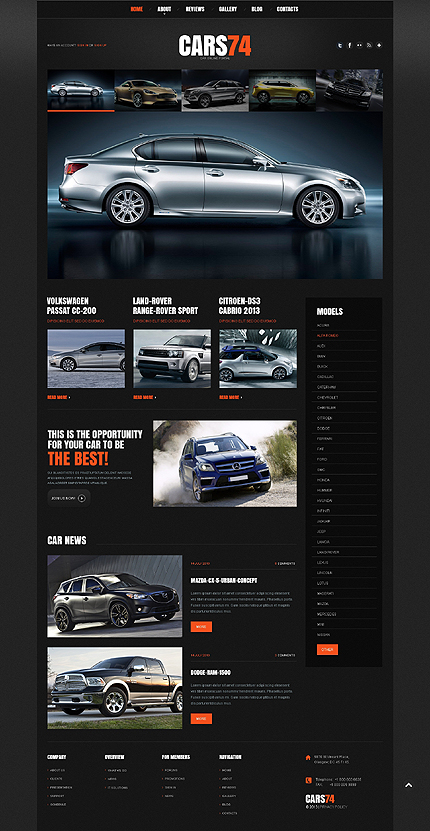
Joomla Blackness #6: Theme for the Website on Cars
Black color was always a great fit for everything even remotely connected with cars. There’s an energy to black that no other color can match. This template will be a great fit for a website on cars — it is confident, handsome and straightforward. There’s a lot of place for images in it, too.
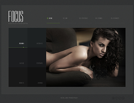
Joomla Blackness #7: Layout for the Beauty
Different shades of dark gray and black sum up very nicely in this gorgeous template. It is very minimalistic, very simple and indeed stunning. A bright example of how the most simple of things often are the most beautiful.
Joomla Blackness #8: Design for the Tattoo Beauty
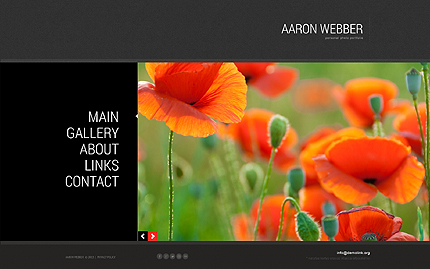
The interplay between the photo in the background and a simple menu on the left makes this template very interesting. There’s some sort of mesmerizing curiosity to it, something magical, like fantasy. Perhaps the dim green in the background or maybe the whole atmoshphere.
Joomla Blackness #9: Theme for Professional Solutions
For a website that provides professional service of management consulting and market assessment, it is importan to be several things at once. It has to look good, to be user-friendly and to provide all the necessary information on the spot. This template is an example of the website that is all of that things.
Joomla Blackness #10: Template for Creative Beauty
An outstanding design that combines black and white colors to create something original and powerful. The structure here is simple but the website environment looks rich nevertheless. What’s important, it is very easy to find what you are looking for here. What’s more important, the website will look stunning while your customers do it.
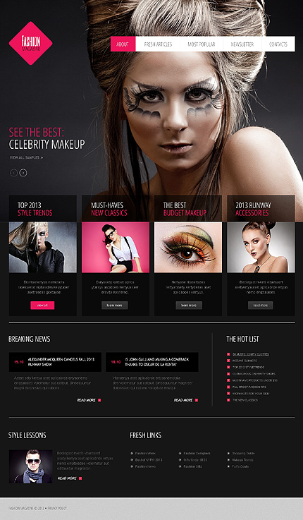
Joomla Blackness #11: Template for Celebrity Makeup
This design catches the eye with a brave combination of dark colors with bright pink elements. It’s a template about fashion, really: the notion of being different and looking for new ways of achieving beauty is embedded really deep inside it.
Joomla Blackness #12: Layout for the Spirit
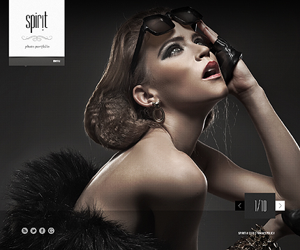
One of the simplest theme in our today’s list is also one of its most energizing. The outstanding simplicity of the Spirit template is both good-looking and inspiring.
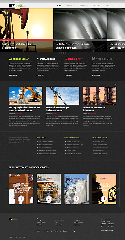
Joomla Blackness #13: Design for the Industry
This theme looks very professional: in the industry it is responsibility that counts and this kind of website speaks responsibility. A few touches of color added to the black-gray palette mix up the environment and makes this template stand out.
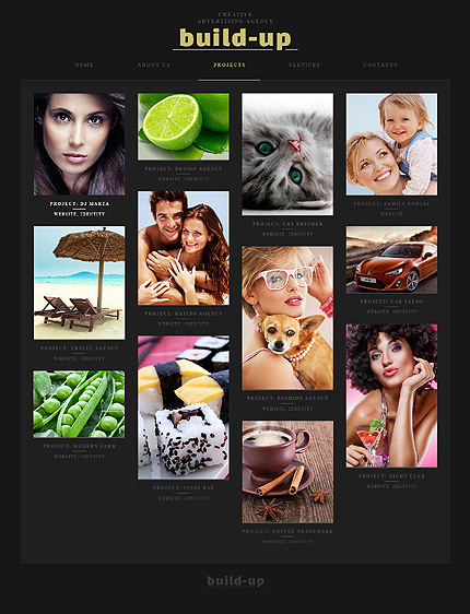
Joomla Blackness #14: Template for the Curious
The dark colors serve as a great background for pictures, highlightning their brightness and beauty. The Build-Up layout is all about that. It shows your pictures in a grid over a dark background and the whole thing adds up to a very interesting result.
Joomla Blackness #15: Theme for the Simple Portfolio
Sometimes there’s no need to explain who you are in details. There’s no need to repeat over and over again what is your name and what do you do. If you have the confidence, let your work speak for you. This template is a good way to go for that choice.
Joomla Blackness #16: Layout for the Perfectionists
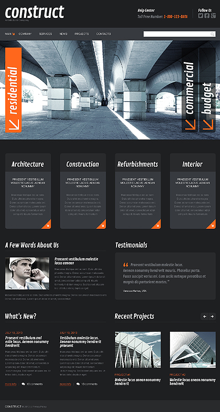
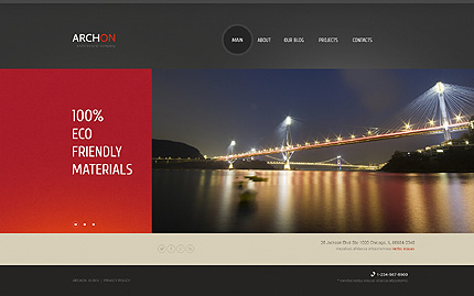
In the world of architecture, achieving perfection is what makes you different. And with that difference comes success. So go for it and use a website template that will highlight your desire to build perfection. This layout is a nice illustration of that desire: clean fonts, original combination of colors, user-friednly design.
Joomla Blackness #17: Design for the Music Website
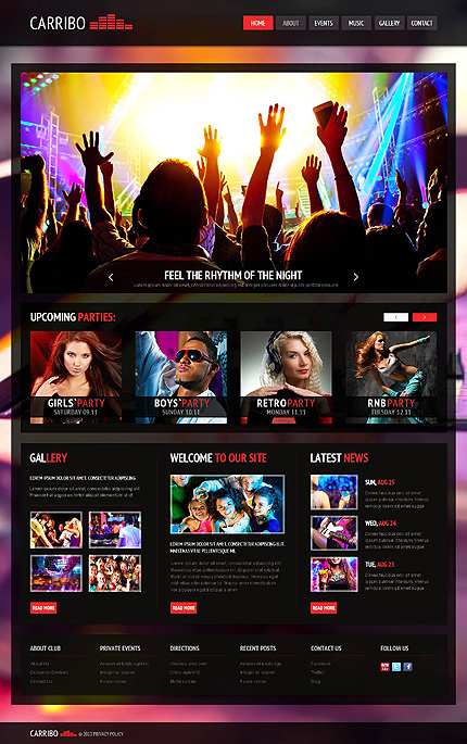
This is a different kind of dark colors that are used in this layout. Those are the dark colors of the best night of your life, the night that changed your life and will be forever remembered. The brightness of this template, the feel of it — it’s all about the fun that comes with the music.
Joomla Blackness #18: Template for Business Company
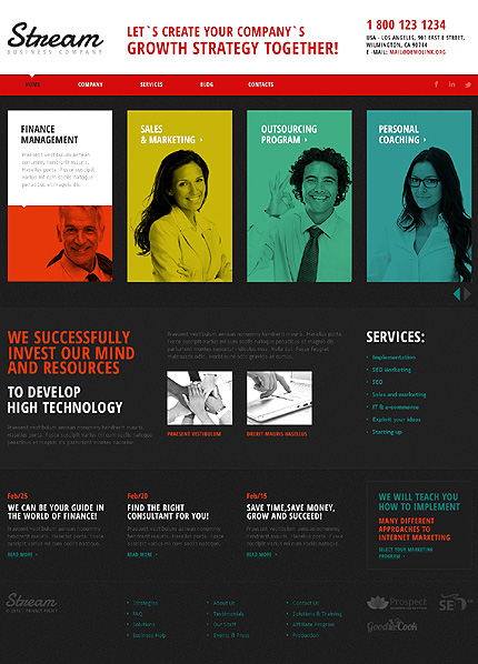
Notice how colors are combined in this theme. The white header is underlined with a red menu, the main part of the page is gray, while the fonts and pictures are orange, yellow and blue. Looking like that, your business company website will be a statement of your creativity, inspiration and ability to seek different solutions.
Joomla Blackness #19: Theme for Dancers
Dance is the eternal energy condensed into the motions of human body. This template uses a variety of colors superimposed on dark background to achieve the feeling of that energetic motion. A beautiful thing to look at.
Joomla Blackness #20: Layout for Dreamers
Use this minimalistic template for your building company website only if you have an idea inside your head. If that idea is so powerful, that you are completely devoted to it. If that idea is the idea of the better world, one where life would be easier and more pleasant. This is the layout about that world.

