warning
This article covers vibrating colors, which may be difficult to read for people with visual and sensory processing issues.
There are very few color illusions as visually striking as vibrating boundaries. This optical phenomenon is a kind of simultaneous contrast that occurs when two highly saturated, complementary colors are close to each other in a design.
The effect can make your designs pop with energy, drawing attention and adding dynamism to your work. At the same time, it can also make text extremely hard to read and make designs difficult to see. Using vibrating boundaries effectively can elevate your work, making it more engaging, but implementing it can be tricky.
In this article, we’ll explore the psychology and physiology behind the effect, as well as the practical applications and considerations when using it in a design. In the previous articles of the Advanced Color Theory series, we covered why the color wheel is wrong and why we see ghost images: after-images and successive contrast.
1. The science behind vibrating boundaries
1.1 How vibrating boundaries work
In an earlier article, we touched on the trichromatic and opponent process theories, as well as the physiology of our visual system. The key to understanding why the vibrating boundaries effect exists is rooted in the trichromatic and opponent process theory, so I strongly recommend you read the article on advanced color theory.
1.1.1 Complementary colors
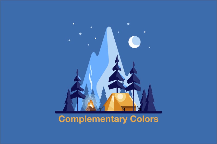


Complementary colors exist on opposite sides of the color wheel, but it’s more important to understand that complementary colors should be each other’s after-image colors. We discussed after-images in an earlier article, so I encourage you to read that one too.
For now, though, suffice it to say that not all color wheels model complementary colors accurately. When implementing vibrating boundaries, it’s most effective to use the additive primary colors red, green, and blue if working on a screen, or use the CMYK or Munsell model if working with subtractive primary colors in paint or ink. It’s particularly important to pay attention to the discrepancy between additive and subtractive color models when setting up vibrating boundaries.
When complementary colors are placed side by side, the after-image of each color overlaps, leading to a visual “tug of war” that creates the illusion of vibration or movement. The higher the saturation of each color, the stronger the effect. Since we use value to determine shape and form, the effect is even more pronounced when the colors are not only complementary but also of equal value (brightness).
This balance of color properties forces the viewer’s eyes to work harder to interpret the boundary between the two colors, which appears to pulsate or shimmer, creating a dynamic and vibrant visual experience.
1.1.2 Psychological impact


Beyond the physiological response, vibrating boundaries also have a strong psychological impact. The visual intensity of these boundaries can evoke excitement, urgency, and energy. This makes them particularly effective in designs that aim to grab attention or convey a sense of movement and activity.
However, the effect can also be overwhelming if overused, leading to visual fatigue, and it can make it nearly impossible to read text. Using similar values in both colors can also make it difficult for users with color blindness to see, and thus should be used sparingly in UI designs. Understanding how to apply vibrating boundaries strategically is key to harnessing their power without detracting from the overall design.
2. How to use vibrating boundaries in design
2.1 Choosing the right colors
2.1.1 Choosing the right hues
At full saturation, complementary colors still have too much value contrast to see the vibrating boundaries, as you can see from the image below.
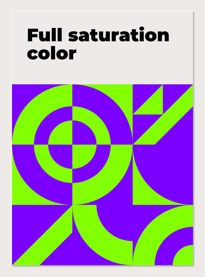


The first step in creating vibrating boundaries is selecting the right colors. Complementary colors are essential. We can check the RGB color wheel and see that complementary pairs include red and cyan, blue and green, and magenta.
These combinations naturally create a strong contrast that can be amplified through the vibrating boundary effect. If your base color isn’t primary or secondary, though, you can always use after-image and stare at the color for at least 30 seconds before looking at a white background to see the complementary color after-image.
2.1.2 Choosing the right value
Since purple is a naturally dark color at full saturation, tinting it to match the value of the green loses a lot of saturation but gains the vibrating boundaries effect. The image below shows an optimal choice for this color pair.
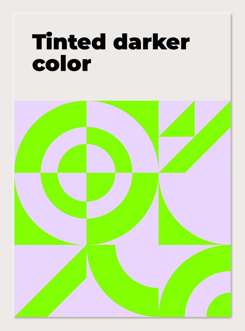


For maximum impact, you need to balance value and saturation while keeping in mind the relative strength of the colors. This means that the colors should be bright and intense, with neither one significantly darker or lighter than the other. Any time you lighten or darken a pure hue, it will lose saturation. Using blue and yellow, for instance, is more difficult than other colors since blue is naturally darker at its maximum saturation than yellow, which is the brightest color at full saturation.
In this case, adding white to blue will be more effective than making the yellow darker, since yellow will lose both saturation and brightness when darkened, while blue will only lose saturation when brightened.
2.1.3 Balancing value and saturation
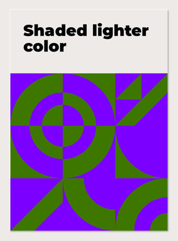
Darkening, or shading the lighter color to match the value of the darker color, also works, but you lose the intensity of the brightness. There is also a technical issue involving the compression of JPG images. With some color pairings like the one below, you may find that compression algorithms add outlines to the shapes in certain conditions.


A useful trick when trying to get the right balance of saturation and brightness is to squint your eyes so that the design is barely visible. Having less light coming into your eye will force you to rely on just the rod cells, which are more sensitive than the cones but don’t distinguish between colors.
You can also switch the document to a grayscale color mode, but unfortunately simply using a black and white adjustment will not work. You can use a hue saturation and lightness adjustment layer to adjust the lightness of the color, though. Apply it only to the area with the darker color, and then maximize the saturation. Finally, squint your eyes and fine-tune the lightness of the darker color until the dark and light areas are indistinguishable. When you stop squinting, the vibrating boundaries should intensify the longer you look at the design.
2.2 Choosing the right content


While vibrating boundaries are great for getting attention, they’re not a good choice for content that you want viewers to pay close attention to. Setting value contrast to be very close makes it hard to read text and discern finer detail in an image. When you add color and overlapping after-image to that, it may make it impossible.
User interface designers need to be particularly careful about using vibrating boundaries. The World Wide Web Consortium provides guidelines for contrast and color selection. In most cases, designers have to go directly against those guidelines to implement vibrating boundaries.
2.3 Strategic placement
The placement of colors in a design is crucial to the success of the vibrating boundary effect. The closer the colors are placed to each other, the stronger the effect will be. The amount of contact between the colors will also increase the effect. Lots of thin lines or closely spaced shapes can maximize the illusion of vibration. Too much proximity without variation, however, can optically mix and cause the colors to cancel out, so it’s important to experiment with spacing to achieve the desired effect.
2.4 Balancing vibrating boundaries with other design elements
Vibrating boundaries can easily dominate a design if not used carefully. To avoid overwhelming the viewer, it’s important to balance these effects with other design elements. For instance, you might use vibrating boundaries to highlight key areas of a design while keeping the surrounding areas more neutral. This creates a focal point that draws the eye without causing overall visual fatigue.
Another approach is to combine vibrating boundaries with textures, patterns, or gradients that can soften the intensity. You can fine-tune the intensity of vibrating boundaries with tremendous detail by adjusting the value contrast and saturation of the colors you choose as well. By integrating these elements, you can control the flow of the design, guiding the viewer’s eye where you want it to go without sacrificing visual impact.
3. Practical applications
Vibrating boundaries are particularly effective in a variety of design contexts:
- Advertising and Branding: Use vibrating boundaries to make logos, headlines, or key messages stand out. The effect can convey excitement and urgency, making it perfect for promotions or special offers.
- User Interface Design: In digital interfaces, vibrating boundaries can highlight interactive elements, such as buttons or call-to-action areas. However, use them sparingly to avoid distracting from the overall usability of the interface.
- Art and Illustration: Artists can use vibrating boundaries to create a sense of motion or depth in their work. This technique can make static images feel more alive and dynamic. It is important to use the appropriate color complements, though. While subtractive primary colors red yellow and blue are commonly used, they don’t give accurate complementary pairs.
- Packaging Design: The intensity and saturation possible in additive color vs. subtractive color makes it hard for printed packaging to compete with RGB screens. Strategic use of vibrating boundaries on product packaging can catch the consumer’s eye on the shelf, making the product stand out among competitors and draw people’s eyes away from their phones.
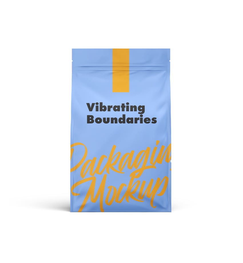

Now you know more about simultaneous contrast
Vibrating boundaries is a powerful tool in the designer’s arsenal, capable of transforming a simple design into something visually compelling and energetic.
By understanding the science behind this phenomenon and applying it strategically, you can make your colors pop, creating designs that not only attract attention but also leave a lasting impression. Whether in advertising, digital media, or art, vibrating boundaries offer a unique way to enhance the visual impact of your work.
Thanks for reading! Now that you know how powerful vibrating boundaries can be, check out this article on website accessibility and make sure you’re using them in the right way to maintain accessibility on the web.