Design systems can actively make life easier for designers and developers alike. They’re like your favorite recipe book, but instead of lasagna and chocolate chip cookies, it’s packed with color palettes, typography, and UI components that everyone on the team can whip up into stunning interfaces.
Having everything related to design in one place — where everyone knows where to find them — means no more hunting through emails for that specific shade of blue or the right button style. It’s all there, in one spot, saving time and headaches.
We’ll explore how to put together a repository for yourself today. But let’s get some key explanations out of the way first.
What is a Design System Repository?
You can think of a design system repository as the backbone of all your design and development work. This is where you store the core information about product’s design — whether it’s a tangible good, a website, or an app. It’s a blueprint and a source of truth that everyone from designers to developers relies on. So, when we talk about defining the scope, we’re really diving into what makes your product unique and ensuring those elements are accessible and standardized.


A design system repository isn’t just a fancy term for a shared drive though. It’s the central hub where your team finds everything they need to build consistent and beautiful user experiences. It houses your:
- Design guidelines: the dos and don’ts)
- Assets: like logos and images)
- UI components: buttons, widgets, etc.
Basically, all the bits and pieces that make your product look and feel like yours.
Now, the heart of your system is made up of a few key components:
-
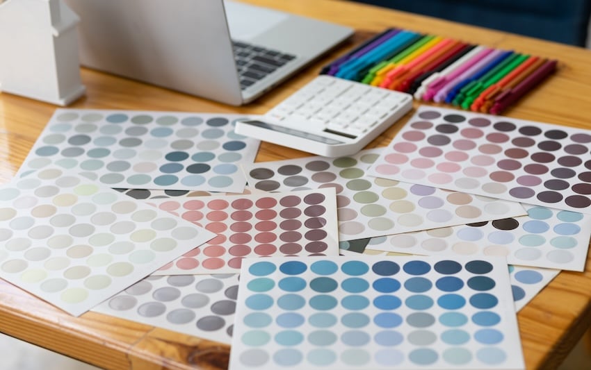
Visual Assets: These are your brand’s visual signature, i.e. the colors, typography, logos, and images that make your product or website recognizable at a glance. It’s what sets the visual tone.
-
Coding Standards: These standards ensure that everyone’s writing code in a way that’s clean, understandable, and, most importantly, consistent. This is how you avoid those “why does this look different here?” moments.
-
Usage Documentation: Ever tried assembling furniture without the instructions? Usage documentation is the guidebook for your design system. It tells your team how to use those visual assets and code standards correctly.
To bring it back to our recipe book analogy earlier, you can think of these components as the ingredients in your favorite recipe. Each one is essential, and when used correctly, they come together to create something that’s not just functional, but also delightful.


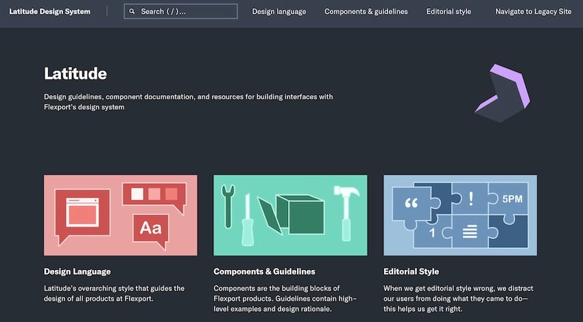
Flexport offers a great example of a design system repository in action. It’s called the Latitude Design System and includes the design language, components and guidelines, editorial style, and many other resources contributors would need to have on hand.
Building a solid design system repository is about more than just throwing these ingredients into a folder and saying, “Here!” to your team. It’s about organizing them in a way that makes sense, is easy to use, and evolves with your product, website, or app.
Planning Steps
Before jumping headfirst into creating a design system, taking a step back to see the big picture is a must. This can broken down into two steps:
1. Evaluating Your Current Design Methods
This step is all about taking stock of what’s working, what’s not, and where you’re just winging it. It’s a chance to identify the gaps in your design practices and spot opportunities for standardization and efficiency. Think of it as a health check-up for your design process.
2. Thinking About How to Present Your Brand Visually and Verbally
The visuals and text related to your brand lays the foundation for your product or site’s personality and how it communicates that with the world. This involves picking colors and fonts, sure, but it’s about creating a language that reflects your brand’s identity and values. It’s the story you want to tell through your design.
Building a Design System Repository
Now let’s get to the heart of this article: actually building a design system repository. In doing so, you are setting up your ultimate toolkit for design and development.
1. Cataloging Existing Design Elements
First things first, you gotta know what you’re working with. Take a good, hard look at your current design assets. This means digging through every logo, button, and font you’ve got stashed away. You’re on a treasure hunt to spot any duplicates and fill in any missing pieces. Make sure you’ve got a full set of tools before you start building anything new.
2. Securing Support Across the Board
Building a design system isn’t just a designer or developer project — it’s a team sport. That is, you’ll need to get buy-in from all corners of the company, from the folks in the C-suite to the ones writing the code. Share the vision, highlight the benefits, and get everyone excited about how much easier and more efficient their work lives are about to become.
3. Forming Your Dream Team
Speaking of team sports, putting together your dream team is key. You need a mix of skills here, including designers, developers, product managers, and content creators. Each brings a unique perspective to the table, ensuring your design system covers all the bases.
4. Setting the Standards
Setting the standards for your design system is about deciding on the core principles and guidelines that everyone will follow. This isn’t about stifling creativity or anything like that though. Rather, it’s about creating a common language so everyone can work together seamlessly. Whether it’s how you use color, the way buttons are designed, or the tone of your copy, these standards ensure consistency across every project.
5. Designing the Visual Language


Here’s where you get into the real details of your brand’s visual identity. Selecting a color palette and typographic practices isn’t just about what looks good, however. You need to create a visual language that speaks to your audience. You’re painting a picture that needs to resonate at every touchpoint, whether it’s a website, app, or email.
6. Curating a Comprehensive Icon and Style Guide
Choosing a set of icons and defining your style elements — like spacing and grids — is about more than just aesthetics. It’s about creating clarity and enhancing usability.
7. Assembling a Modular Component Library
You’re building a library of reusable design elements that can be mixed and matched to create new designs quickly and efficiently. This modular approach allows for flexibility and innovation within a consistent framework, making sure everything you build feels like part of the same family.


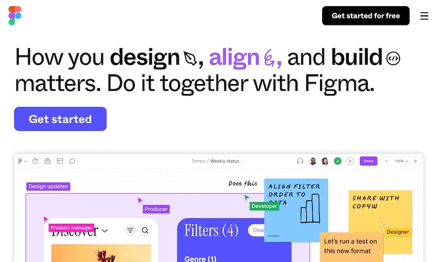
You can store these assets in a collective drive like Google Drive or Dropbox. Or, you can use something like Notion or Figma to keep everything in one place.
8. Crafting a Flexible Governance Model
Last but not least, you need rules for how this all evolves. A governance model is your strategy for managing the design system over time. It will need to balance creativity with consistency, allowing your system to grow and adapt without losing its core identity. You’re setting up the guardrails that keep everything on track, ensuring your design system remains a reliable and valuable resource for everyone — over the long-haul.
Putting Your Design System Repository to Work
Now, let’s talk about getting your design system off the shelf and into the hands of the people who’ll make it come to life — or put it to work, to say it more accurately.
Promoting Adoption and Integration
First up, weaving this system into your team’s daily grind is a must. To make it as easy and intuitive as you can start by getting your team familiar with the system. To do this, you could:
- Run workshops
- Share tutorials
- Have open Q&A sessions
Under any of these scenarios, make it clear how the design system simplifies their work, rather than adding another layer of complexity.
Encourage everyone to give it a try for their next project. Working to integrate it into the tools and platforms your team already uses can help a lot, too. If it fits seamlessly into their workflow, adoption will be a no-brainer.
Managing Ongoing Maintenance and Updates
Now, for the system to not just survive but thrive, you’ve got to keep it fresh and relevant. To do this, you can:
- Make regular updates: To do this, you need real feedback from the people using it. Create a feedback loop where everyone — from designers to developers to product managers — can contribute their ideas.
- Schedule regular check-ins to review what’s working and what’s not: This is your chance to tweak and improve. Maybe a certain component isn’t as user-friendly as you thought, or there’s a new need that your system doesn’t yet cover.
Iterative enhancements are the name of the game. It’s about evolving with your team’s needs, ensuring the system remains as relevant on day 1000 as it was on day 1.
Seeing Your Design System in Action
Building and implementing a design system isn’t just about making things look pretty or streamlining workflows. It’s about creating a culture of collaboration and consistency. A space where creativity meets efficiency head-on.
Your design system repository is a set of guidelines and components, yes, but it’s also a sign of your team’s commitment to excellence. So why not put together a repository that works for your team?