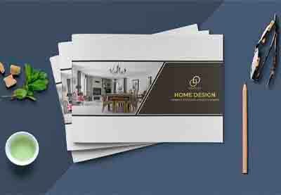
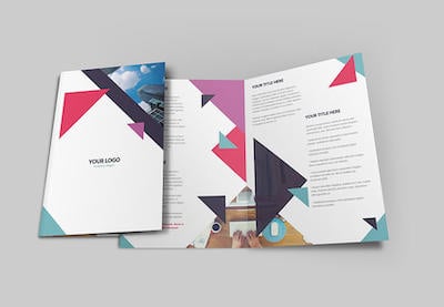
Let’s discover the different brochure styles and learn how to tell the difference between a brochure vs. a flyer, leaflet, and pamphlet design.


In this article, we’ll give you a better understanding of brochures by explaining:
- What is a brochure?
- What are the sizes of traditional brochure designs?
- What are brochures used for?
- What are the different kinds of brochure folds?
- What are the different types of brochures?
- How do you distinguish between a brochure vs. a flyer, pamphlet, and leaflet design?
If you’re looking for some great brochure mockups and template samples, please check out what’s offered at Envato Elements and GraphicRiver.
1. What Is a Brochure?
To define a brochure, it is a piece of paper that is folded to create multiple pages and distributed for advertising and promotional purposes. One unique aspect of brochures is the fold or multi-fold pages.
Brochures are initially used by businesses as an informative marketing handout. They are distributed either to advertise or showcase an existing or new product, business service, or provide information about a related subject. Brochures are either handed out in person, delivered by mail, or distributed locally to customers.


2. What Are the Traditional Brochure Design Sizes?
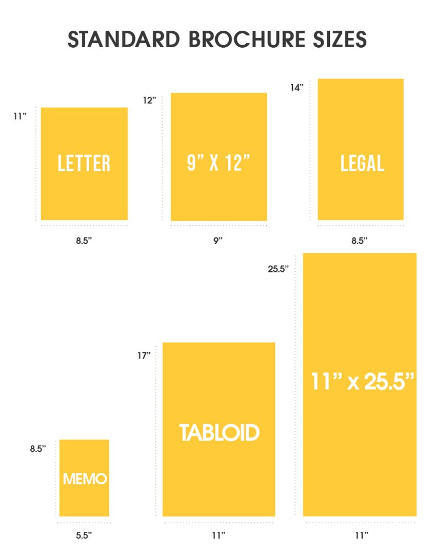
So what is a traditional brochure size? Well, there are lots of standard brochure sizes, and the size you choose depends on your content. The most common brochure sizes before folding are 8.5” x 11”, 9” x 12”, 8.5” x 14”, 5.5” x 8.5”, 11” x 17”, and 11” x 25.5”:
- Letter size: 8.5” x 11”. Letter size is the most popular brochure size for product and service information as it has a perfectly balanced design area.
- 9” x 12”. This size is slightly bigger than the Letter size. It is typically used when you need to create more detailed designs and text,
- Legal size: 8.5” x 14”. This size is slightly larger paneled than the Letter size. If your design seems like a tight fit in 8.5” x 11”, use the Legal size to give it more white space around the design, so it won’t look crowded.
- Memo size: 5.5” x 8.5”. Memo size is half the size of Letter size. It is the smallest brochure size.
- Tabloid size: 11” x 17”. This size works best with large content areas and for creating multi-page folds.
- 11” x 25.5” is the biggest brochure size standard. Perfect for businesses who have a wide range of products and services to showcase, or to create step-by-step guides.

3. What Is the Purpose & Benefit of a Brochure?
If you’re a business owner or designer and are wondering what the purpose of a brochure is and why to invest in brochure design, let me explain.
The first and foremost advantage of brochures is that they are a form of one-on-one tangible communication with your audience. Basically, they are pocket-friendly and make it easy to hand out information to new or existing customers. This is why you find brochures displayed in reception areas, stands, stalls, or where customers can pick one up and take it away with them.
Brochures are categorized according to the brand/company’s intended use, as listed below:
Responsive / Sales Oriented
Responsive brochures are used when you wish to answer company details, customer FAQs, or inquiries. It is a great tool for marketing in-shop to customers who have shown interest and are looking for additional information about the product or service provided. The aim of these brochures is to confirm the customer’s decision in choosing the product/service, and is more of a sales-oriented approach rather than customer attraction.


Check Out / Attraction
These types of brochures are typically on retail countertops to attract first-time customers. They provide information on products and services or promotional material that the store offers. Typically these brochures are visually eye-pleasing and attention-grabbers, so the front page of the brochure design tends to include attractive graphics or images that catch the attention of customers.


Direct Information / Credibility
For customers who inquire about new products/services or additional details of a brand or company, a direct informational brochure is used. This form of brochure builds business credibility in the market and is good for making customers feel confident in making a purchase. It typically contains product/service information and the company details. These brochure types help brands to portray a serious image of their business practices and build trust with their target audience.


4. What Are the Different Types of Brochure Folds & Usage?
How many types of brochures are there? When designing a brochure, there are several brochure types to choose from in regards to size, to the way it is folded. So what are the different kinds of brochure fold types? Let’s have a look at some common brochure folds:
Single Fold (Half-Fold or Bi-Fold)
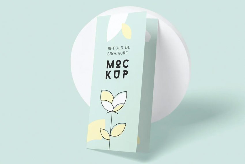
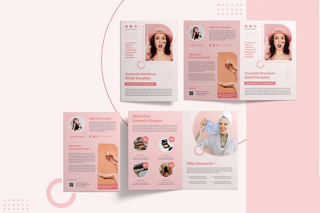
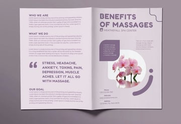
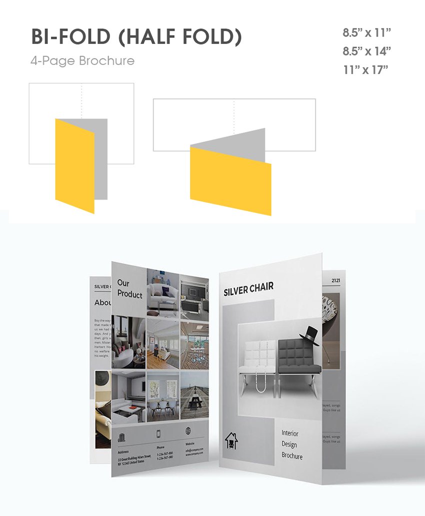
The single fold brochure, also called a bi-fold or half-fold brochure, is the simplest brochure type to create. Its name is self-explanatory: it is a paper size (legal, letter or tabloid) folded in half. The half-fold layout consists of four panels to add information: two internal panels, with a front and back cover. Although the number of pages is limited, this option provides better readability and enough room to place images and text, which makes it a great option for marketing. The front page is perfect for applying attractive visuals to the design.
This popular type of single fold brochure works well for informative content, greeting cards, product presentations, tradeshows, invitations, price lists, restaurant menus, programs, bulletins, etc.


Tri-Fold (Letter Fold)
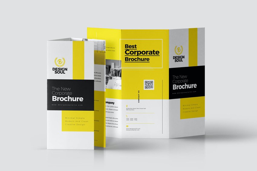
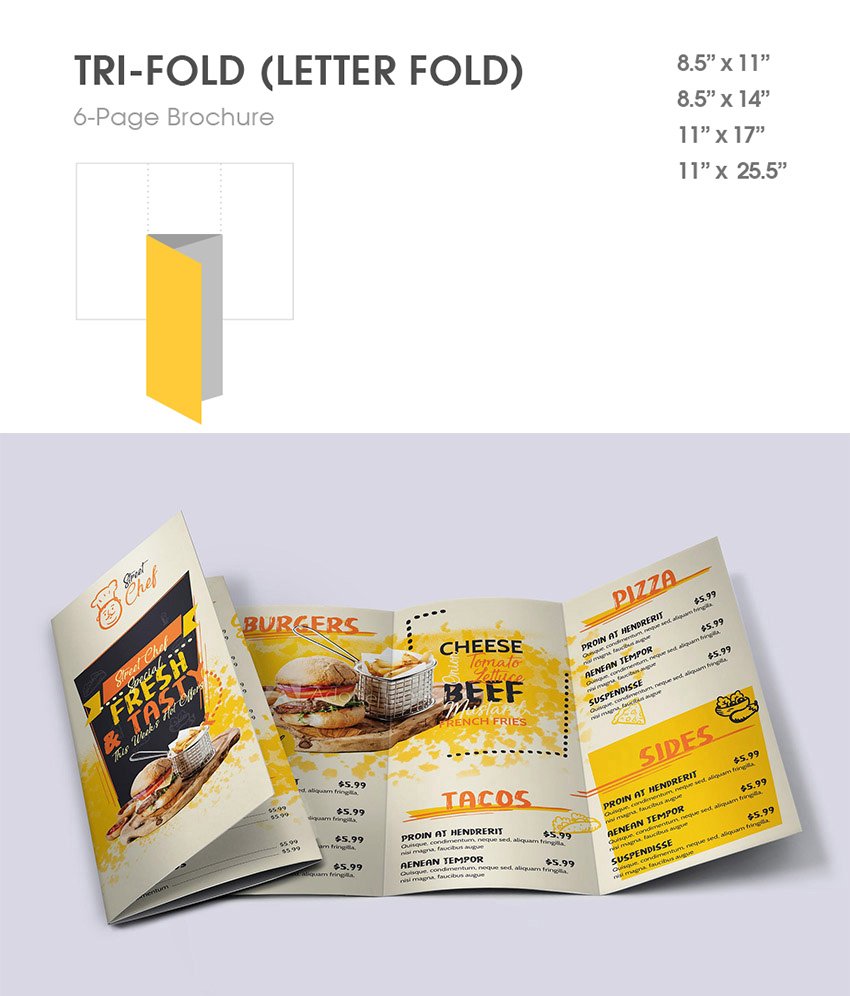
The tri-fold brochure, also known as a letter fold, is one of the most popular brochure fold types for businesses and companies. Commonly used for product marketing, this classic fold has three equal panels. One fold tucks the middle panel inside the other two panels, by folding the right panel inwards first, and the left panel folds on top. Apart from using the standard 8.5” x 11”size, you can also design tri-folds using the 11” x 17” size or bigger, up to 25.5”.
Tri-folds adapt to any size, and the six-panel format offers lots of flexibility, so you can exercise your creative imagination to design any type of layout. These letter fold brochures are eye-catching and tempting to open, which makes them suitable for menus, marketing, and high-impact designs.


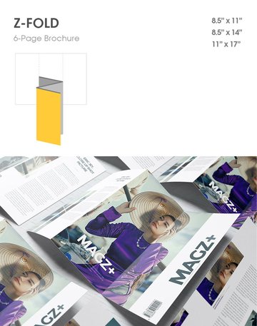
Z-Fold
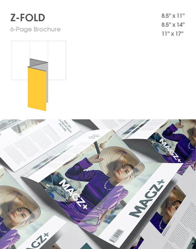
The Z-fold brochure is also a single piece of paper divided into three panels, similar to the trifold, except it gets its name from its distinctive Z-shape fold. The Z-fold has each panel on top of each other to make a Z-shaped outline. Also note that the cover is on the right-most panel, rather than the left.
This type of brochure fold has a classy look. It opens left to right and can be placed in a standard envelope, which makes it a great choice for promotional or sales material, events, letters, invoices, special offers, product presentations, and price lists. The Z-fold is a good alternative to the tri-fold, and it’s useful for direct mail marketing. Make sure to use every panel to draw your customers’ attention.

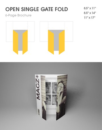
Open Single Gate-Fold
The open single gate-fold brochure is similar to tri-fold brochures; however, the gate-fold divides the paper into three unequal panels, unlike the equal panels in tri-folds. It is a presentation-style format that gives the impression of a door that opens to reveal a bigger central panel. To make the side panels fold like a gate, the side panels measure one-half of the width of the central panel.
What makes this type of fold eye-catching is the fact that the central panel is larger than the side panels, which acts like a focal point and draws the viewer’s attention inwards to the center. So for the perfect design, you can emphasize any major piece of content in the center and display the supplementary information on the sides. The gate-fold holds almost the same amount of information as a bi-fold brochure and works well for heavy design work, showcasing a single product, or large presentations.


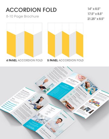
Accordion Fold
Like an accordion, the Accordion Fold divides the brochure into four or five panels that fold on top of each other in a zigzag formation. It is similar to a Z-fold but with more panels to fold. This brochure type has more sections, about 8–10 panels for you to add the text info and images, and it’s typically designed larger than the standard size of 8.5” x 14”.
Choose the Accordion Fold if are designing something with a lot of information, like tourism guides, maps, step-by-step tutorials, or menus, or if you have a list of products or services to display.


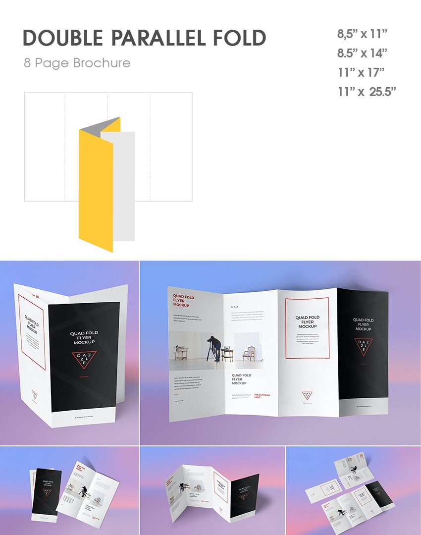
Double Parallel Fold
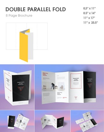
The Double Parallel Fold divides your paper in half to form two panels, and those panels are folded again in half to create two parallel folds that are aligned in the same direction. This fold layout is great for detailed presentations like product listings, services, and general information.
The standard brochure size for a Double Parallel Fold is 8.5” x 14”. It holds more content than a tri-fold brochure, and it has up to eight panels for print. The layout is ideal for reference material, listing products or services, statements, maps, sales content, and any kind of general information that might be found at a point of sale.

Quarter Fold (French Fold)
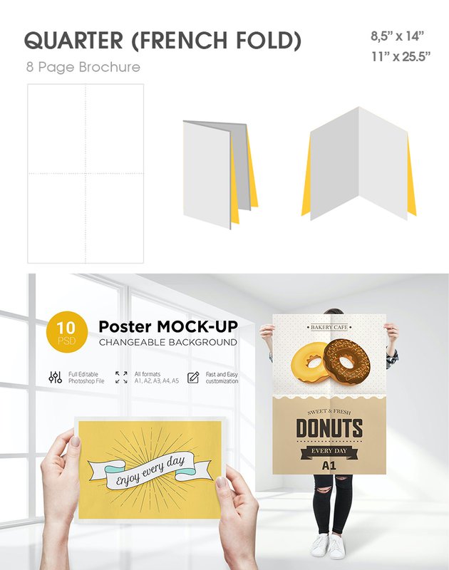
The Quarter Fold, also known as the French Fold, is unique in style. It is folded in half twice: once vertically, then again horizontally to create four panels. The French Fold is poster-like, as it can hold one large image on the inside of the four panels, and it’s normally used when you wish to minimize the total size of a project.
The standard brochure size for a French Fold is 17” x 11”. Use this fold for posters, advertising, maps, menus, event programs, invitations, and any graphic-heavy designs.


Roll-Fold
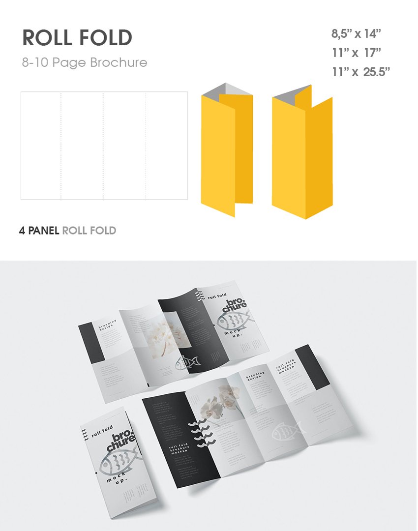
The roll-fold brochure is a half-fold tucked into another half-fold that folds inwards, so basically the folds roll inwards onto themselves. The roll-fold brochure folds in a few times, so it has eight to ten panels available for content and images, which makes it thicker than most brochures.
The standard size for this roll-fold brochure is 8.5” x 14”. Use the roll-fold if you have material that needs to be placed at a point-of-sale location, or when showcasing sales content, instructional booklets, tutorials, or step-by-step guides.


5. How to Distinguish Between Brochures vs. Flyers, Leaflets, and Pamphlets
While flyers, leaflets, and pamphlets have similar functions to brochures, they are used differently when it comes to marketing. How do we differentiate between these brochure formats? Let’s go through them one by one.
What Is a Flyer? Flyer vs. Brochure
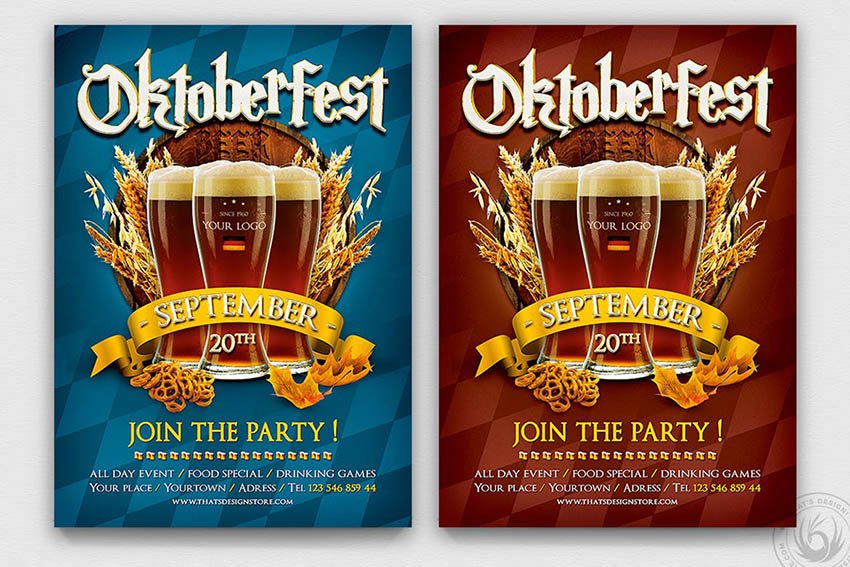
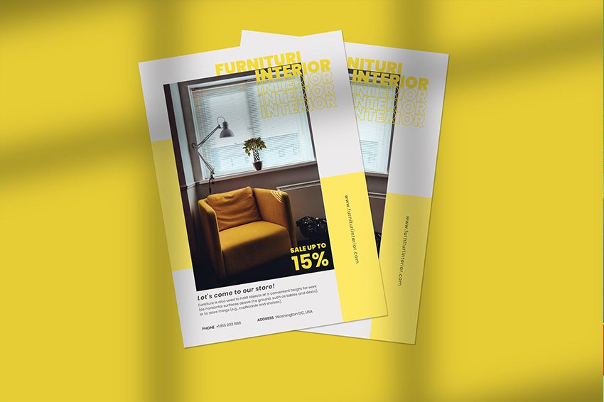
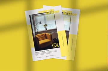
What is a flyer? A flyer is a single sheet of paper without any folds, and typically it has a small amount of information compared to brochures. It is designed in a cost-effective way for mass distribution, so usually flyers are printed in one or two colors double-sided or full color single-sided to keep the costs within budget. Flyers are the most popular marketing material and are often used when there are discount coupons, promotions, upcoming events, new shop openings, or new product releases. The differences between brochure and flyer attributes are:
- Flyers are printed on 8.5″x 11″ or A4 paper, or any size approximate to an adult hand.
- Flyers have short, concise messages targeted at a localized audience, to grab interest within seconds.
- Typically a one-sided page design that offers information on a promotion, event, or announcement.
- Flyers have a shorter lifespan than brochures, as they are often used for quick impact, short-lived promotions, or campaigns.
- Cost-effective to produce.
- They are colorful, containing fewer words and more images than brochures.
- They are often distributed on streets, events, or exhibitions, and political campaigns.
- Generally flyers are less effective when promoting products or services as people generally spend less time reviewing information than on a brochure.
- Also known as handbills, posters, and circulars.
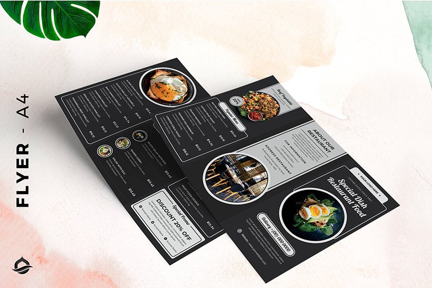
See the flyer example below:

What Is a Leaflet? Leaflet vs. Flyer
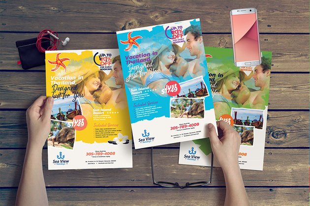
What is a leaflet? A leaflet is also a loose sheet of unfolded paper, quite similar to a flyer, and sometimes the terms leaflet and flyer are used interchangeably. The differences between the two are minor. Typically leaflets are a bit smaller than flyers and are printed in better quality, which makes them slightly pricier. To help you distinguish between leaflets and flyers:
- Leaflets are made of higher-quality materials than flyers.
- Leaflets have a longer shelf life than flyers, as people tend to hold onto leaflets to refer back to the information on them.
- They target a specific group of people by promoting a product or service with higher value.
- While flyers target one-time events, promotions, and sales, leaflets are used for long-term content.
- Use leaflets to promote a product or service, or as a tool to educate current or new customers.
- They may be distributed as inserts into menus, newspapers, and magazines, unlike flyers, which are typically distributed in public places.
- Leaflets are usually placed in restaurants, shops, offices and other places for potential customers.
Check out the leaflet example below:


What Is a Pamphlet? Pamphlet vs. Brochure
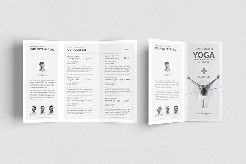
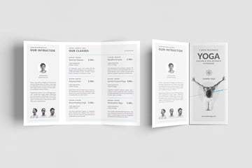
What is a pamphlet? Pamphlets are easily differentiated from flyers and leaflets because they are folded like brochures and not flat. The difference between brochures and pamphlets is loosely defined, but it is in the content or subject matter.
Pamphlets are used for educational or non-commercial marketing. Their purpose lies in brand awareness instead of selling the products/services of a brand, while brochures are used to advertise services and products. Another difference is that brochures would usually have more pages and images, while pamphlets contain fewer pages and more words than images.
To summarize the main difference between pamphlets and brochures:
- Pamphlets are educational, not promotional.
- Pamphlets tend to provide less information than a brochure.
- The content is focused information on a single subject.
- A pamphlet is an effective tool for informing readers on a specific event or service; it educates readers by raising awareness about a specific topic.
- Pamphlets are not a selling or marketing tool, while brochures promote a specific service.
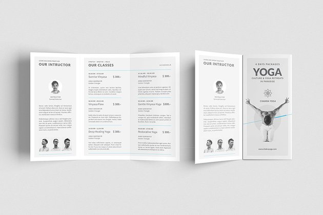
See the pamphlet example below.
More From Envato Elements and GraphicRiver
In this article, I’ve covered your questions on how to define a brochure, the characteristics of brochures, and when to use a brochure. I’ve also given you insight on how to differentiate between the different folds and types of brochure formats available. There is much more than what we’ve covered here, but this should give you a good idea of the diversity available and help you choose the best fold and size to fit your designs.
Choosing the best brochure type requires a knowledge of the products or services being promoted, what you wish to express, and how you can best present it to create your most effective brochure. You can either keep it simple using a classic tri-fold or if you have a lot of information try a parallel fold. And if you are working on an impactful promotional response, skip the brochure design and opt for flyer handouts.
If you’re pressed for time and are looking for a brochure and flyer option, do check out Envato Elements. It offers thousands of great brochure types, mockups, templates, and premium digital assets like fonts, logos, photos, and more to help you design the brochure you need.
If you have any questions, comments, or you want to share your favorite fold or brochure format, do share in the comments below!
And finally, for more information related to the subject, check out these really helpful articles below:


 Digital Brochure42 Best Digital Brochure Templates (For InDesign, Word, PDF, PSD)

 BrochureHow to Make a Digital Brochure

 Adobe Photoshop25 Best Photoshop Brochure Design Templates (PSD Downloads 2021)

 VectorHow to Create a Brochure Template in Illustrator

 BrochureHow to Make a Trifold Brochure Pamphlet Template
