
Looking back at 2014, we can see some spectacular trends emerging in the web design landscape: code-free design platforms, parallax effects, single-page websites, and many more.
While many design trends are fleeting, a select few are natural evolutions of the industry. As the range of devices on which we view websites continues to grow, designers must constantly adapt their workflow to meet the dynamic changes that are occurring in web design.
To discover which trends will flourish over the next year, I asked members of the design team at Webydo, a professional website design platform, to share their top 7 killer web design trends for 2015.
1. Typography Will Be Flexible
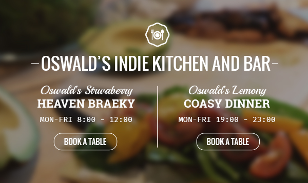
Part of this content focus is a stronger effort to present the written word according to emerging typographic principles.
The reality is that type on the web is very different from type in print, and in 2015 we’ll finally shed the last of the old-fashioned thinking that’s kept text looking too small and squeezed together on many major sites.
This is nothing new, as the concept has been discussed since 2006, but the design community has been slow to adapt. It’s hard to let go of principles that have guided design for many years.
There are three major aspects that affect the readability of type on the web:
- Type Size
- Column Width
- Line Height
Research has repeatedly demonstrated that larger text sizes are conducive to easier reading on the web. Designers have already begun to implement responsive typography alongside responsive images and structures in their designs. It is crucial for text to always look its best, regardless of platform.
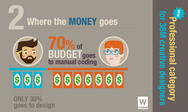
2. The Decline of Web Coding
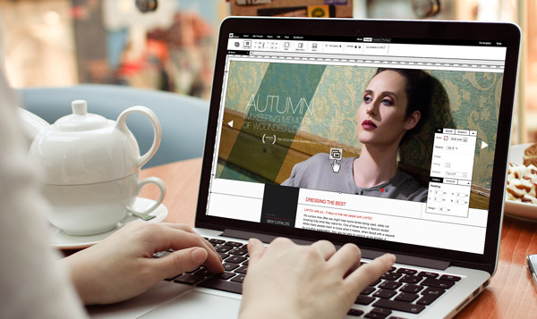
There’s always been a division of labor in web development: designers craft the look and feel, then coders step in to make it work. This process is changing as the tools for web design become smarter, more capable, and more ambitious.
Today, designers can create websites without touching a single line of code, taking advantage of the same powerful features of their graphic design software and outputting W3C validated, clean code.
This marks a huge paradigm shift, one that lowers the barrier to entry for designers who now have a streamlined option for building and deploying modern, professional websites for their clients.
As they focus on the quality of their design, the evolving algorithms behind their platform of choice evolve to ensure that all their work remains current. There will always be a place for dedicated web coders, but that place is transitioning away from the realm of front-end work.
3. The Evolution of Responsive Design
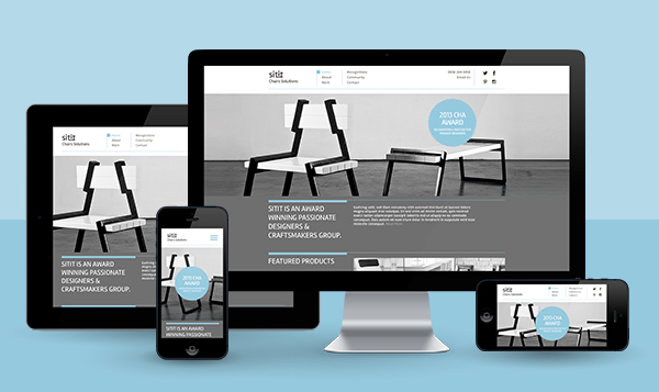
Only a few years ago, making a site “responsive” merely required that it work on desktops, tablets, and smartphones. With smart watches, TVs, and home appliances booming, the definition of responsive design is expanding rapidly.
While each platform has its unique challenges, tablets and smartphones have very familiar interaction systems and the main problem has been ensuring that content is appropriately sized and easy to navigate.
But on a smart watch, for example, even the navigation system has to be completely rethought to accommodate how we use the device. Watches won’t be able to use smartphone site designs, and a site optimized for desktops won’t necessarily work when viewed on a smart TV.
Solutions to these new problems will take some time to emerge, but, by the end of 2015, the sheer breadth of the smart device market will force web designers to adapt their techniques.
4. Flat Design will Conquer Every Pixel

After emerging in separate parts of the industry—in Microsoft’s UI language, in Google’s new Material Design guidelines, and in Apple’s new aesthetic direction—the flat design trend is in full bloom.
While some have argued that there are issues with flat design in the realm of user interfaces, the general consensus is that it’s a favorable technique for web design.
This has to do with the way we consume content on the web, as well as the technology behind serving webpages. Flat design lends itself to minimalist principles, which in turn results in sites that are lean, clutter-free, fast, and content focused.
This is not only an attractive aesthetic, it’s also a very practical one, allowing visitors to engage with content and appreciate it without distractions.
5. Bigger = Better for Images
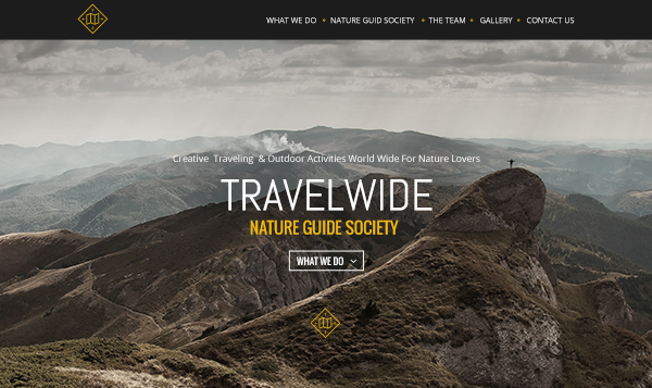
It’s not only text that’s getting larger on the web: images are too!
There used to be important limitations to keep in mind for serving images because of limited bandwidth, but this is less and less of a problem as time goes on. As a result, large images have taken the internet by storm.
In 2015, images will take centre-stage in interesting new ways. Fascinating techniques will emerge for responsive resizing, extracting dominant colours for backgrounds, and optimizing images for minimum server load.
Additionally, a major trend in 2015 will be the use of images as backgrounds. Blur and colour filter overlays will allow text to “float on top” without compromising usability.
As designers come to terms with being able to use huge images in their designs, you can expect to see them making an appearance more and more often!
6. Revamped Scrolling Animations, Parallax Effects and Microinteractions
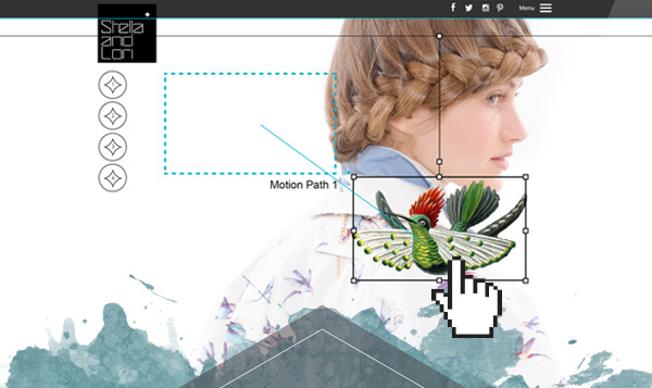
Perhaps the most impressive trend is, of course, parallax scrolling animation.
We encounter it everywhere, even on major sites like some of the product pages of Apple and Google. The results speak for themselves: engagement on sites with parallax scrolling effects can improve by as much as 70%!
Using scrolling instead of clicking as a navigation technique is brilliant on several levels. It requires less page loading, but more importantly, it makes it easy to craft smooth transitions from point to point with no jarring refreshes. Information keeps flowing.
In 2015, we can expect to see more designers taking the parallax plunge and incorporating this element into their designs.
7. The Dawn of Webgraphics
As a visual species, we tend to internalize information better when we see it presented in a graphical manner, which resulted in the popularity of infographics. Infographics provided an easy way to convey large amounts of information with a high degree of retention.
A new trend has emerged. Webgraphics! Much like infographics, webgraphics convey large amounts of information, but involve elements that allow the user to physically interact with the information. They are more visually appealing than infographics and significantly increase retention with the user.
In 2015, designers will find that more clients will demand interactive webgraphics as part of a personalized design. You can expect to see webgraphics rise in popularity and establish themselves as a major component of modern web design.
Looking to the Future
Web design trends come and go, but the creative ingenuity of designers is what propels change in web design standards. Designers are responsible for transforming ideas into trends and trends into standards.
The design trends, listed here, are rapidly becoming commonplace in web design and will find an even greater acceptance in the coming year.
Websites not utilizing these elements will surely be left for dead in 2015!
Let us know, in the comments, any additional trends that you believe should be included and will be prominent in 2015!