Although many designers have written on this topic, I want to share my thoughts on the future of web design as we forge ahead into 2015. The new year is always an exciting time and I love to contemplate the potential for young new web designers just entering the field.
I do think these trends will resonate with most web designers who have kept their pulse on the changing tides of digital interface design. But although these trends are quite noticeably gaining momentum, it’s impossible to tell with absolute certainty what the future will hold. Looking onward into 2015 I expect to see lots of growth and ingenuity from older trends, along with some newer ideas finally coming into the spotlight.
Thin Line Icons
One of the more popular emerging trends is the effect of thin line icon styles. I first noticed this meteoric rise in popularity from Dribbble posts. Flat UI design has been a popular trend growing alongside line icons. But I like to make the distinction that not all line icons must be placed into flat layouts.
What I find most appealing is the simplistic nature of these icons. Any designer regardless of his skillset should be able to learn this technique. Line icons also lend themselves to the vector world where pixel limitations are not a problem. This has become a popular adaptation with newer programs like Sketch.
The single-page design for W3.co demonstrates simple line icons in the way they were meant to be used. Each section in the page has a slew of icons which match in style, size, and color. It’s even more impressive because the site follows such a minimalist approach that each icon feels right at home.
Notice how most of these thin line icons are built around an outline. So when constructing a shape layer the fill is typically left transparent, and the stroke color is used to create the icon.
Another cool example can be found on Virtual Insanity. It has some dynamic features for navigation based around simple line icons. This is another prime example of relying on graphics to further expand upon page content.
If you’re not the best designer it’s definitely worth following some tutorials on how to build line icons. However I understand there are developers and copywriters who wish to just build simple website layouts with existing resources. In this case check out any of the numerous freebie sets like Linea.
All of these icons are open source and built as SVGs & PNGs. There are many different iconsets like e-commerce, music, or weather. But all of the sets can be downloaded in one big pack at the top of the page. Linea is a great iconset to start with because it contains so many examples, it’s free to use, and the styles match harmoniously.
Website Animation
Another trend with a growing popularity is the use of website animation. JavaScript has always reigned supreme in this department but CSS3 has slowly taken a chunk of the market share. In this way it’s possible to create any type of animation you desire – from button hover effects to stylized dropdown menus.
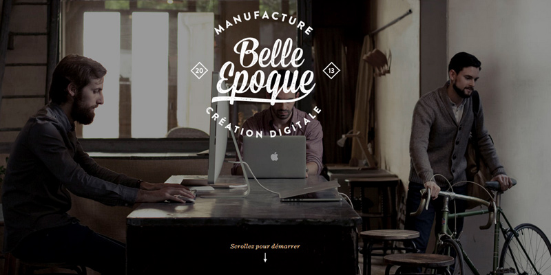
The French design agency Belle Epoque uses a fantastic slew of animated effects on each part of their website. Every section on the homepage applies animation to typography, graphics, and page transitions. Even the website’s hamburger navigation menu uses a fantastic animated sliding effect.
But aside from content-focused animation I also expect to see a whole lot more animated graphics. These used to be created with Flash but have since adapted into JavaScript or even SVG animation. For example, take a peek at the homepage for Vizua studio.
Each section of the page has a small vector graphic animated to expand upon the content. Visual graphics combined with text often promote the best ideas in a very solid environment. But I also really like the animation found in their top-right hamburger menu. Vizua is just another great demonstration of making a website come alive through animation.
For a more balanced example take a look at the Canal TP website. This has a nice mix of parallax scrolling effects combined with animated imagery & colors. Their top navigation links also incorporate animation on the hover state. My only quip is with the slow-scrolling functionality which I think could be improved. But just the animation alone is simply fascinating.
Parallax Layouts
What could be said about parallax web design that hasn’t already been covered? It’s certainly popular, it has rhythm, and it uses lots of cool animation. So where could it all go from here?
It is my hope that more designers will understand the purpose of parallax design and how it can fit into a layout scheme. Not every website project should use parallax scrolling because it’s a special effect meant for special purposes. But the growing trend of parallax design is not just unavoidable, it’s incorporable.
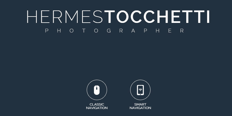
The photography portfolio of Hermes Tocchetti uses a parallax effect on each piece of the layout. Every section is split up into pieces using background images and well-managed content. I really like the design style because it feels natural and fun to use. But even more so the parallax effect is scalable for any device, which is important in today’s mobile-responsive era of web design.
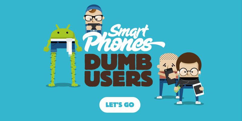
Perhaps an even better example can be found on Smart Phones Dumb Users. This is almost like a web-based infographic written and coded using a parallax style. I truly enjoy this example because it demonstrates the value of a horizontal parallax effect.
By looking at parallax design as a trend you’ll start to notice many different concepts within the parallax style. Some designers like animated elements, some like horizontal scrolling, others like dot-navigation or even fixed-sliding elements. The phrase “parallax design” has grown into a very wide interpretation of the trend as a whole. I expect this to continue well into the new year.
Flat Material Design
In late 2014 Google announced their new style language named Material Design. It combines actual design concepts with user experience effects such as touch-based motions. Material design was created for Android, but has since adopted into a full-blown design language.
Web designers who focus on flat design love this new language. Google is a company which seems to understand how trends change. Their new Material design language places heavy emphasis on flat design in regards to colors, effects, and icon styles.
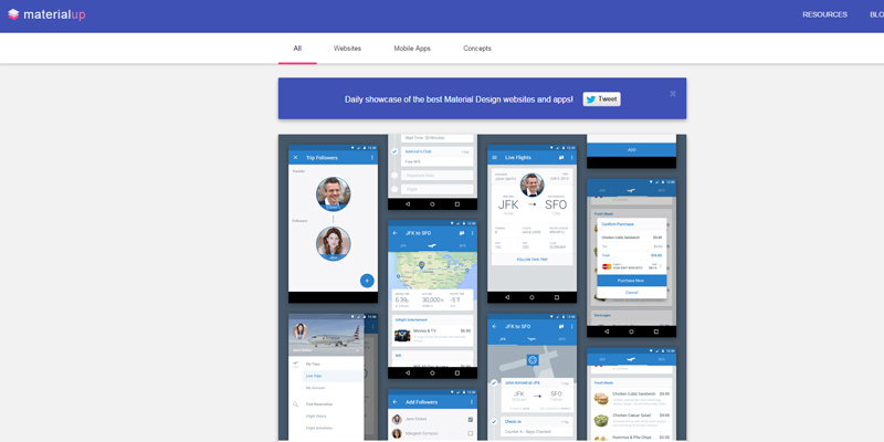
The website MaterialUp is a dedicated inspiration gallery for flat Material design resources. The majority of entries are screenshots pulled from Dribbble built either for the web or Android apps. Many of the shots use animation constructed with After Effects.
If you’re trying to understand Material design through example then definitely take a look at MaterialUp. It’s a fantastic resource for designers who are unfamiliar with the flat style. Plus there’s a lot to be said about the unique animation and design construction of Material interfaces.
Hero & Background Images
One of my absolute favorite trends relates to the use of hero images in web design. These are specifically banners or backgrounds with large images spanning a good portion of the screen. Hero images can be photos or illustrations meant to directly into the page content.
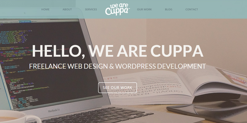
We Are Cuppa is a fantastic example of well-styled hero image placement. The homepage photo is directly relevant to their site and their services. It brings attention to the type of work they do while adding a bit of whitespace into the overall composition.
Browsing onto other pages of their website you’ll notice each one has a smaller hero image. Although in this example it does span the entirety of the screen, this isn’t always the case. Hero images can be placed within the content or they can be used as backgrounds. The extreme position of this trend is a fullscreen background image or video.
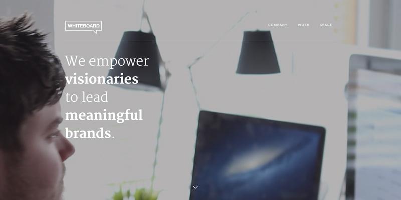
The homepage of Whiteboard uses a large fullscreen background video effect to its fullest potential. I love their design style because it all feels very minimalist yet contemporary. Also the video content feels adeptly relevant to their studio’s portfolio. It’s an excellent example of distributed media in web design.
Both hero images along with fullscreen backgrounds are trends catching fire. They’ve already proven immensely popular throughout 2014 and I expect that popularity to continue all the way through 2015.
Powerful JavaScript FX
Along with typical web design trends there’s also a lot to consider in the realm of web development. My primary interest lies in frontend development which is a vitally important field. Regardless of how beautiful a mockup is designed, it means very little unless it can be coded into a working website.
One of the biggest trends I’ve noticed is a growing community of jQuery and JavaScript developers. I’ve seen an amazing number of plugins released over the course of 2014 with a whole lot more on the horizon.
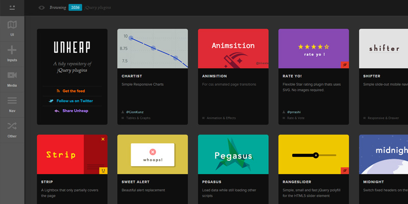
Passionate developers are getting into the community by publishing galleries full of these outstanding jQuery plugins One such example is Unheap which catalogs numerous jQuery plugins from every category under the sun. In my opinion this helps plugin developers to bring attention to their work, and it helps general devs who need to find great plugins.
With an ever-growing market of developers I think JavaScript is going to see an enormous growth cycle in 2015. New JS libraries, new plugins, and new websites showcasing all of these features.
Final Points
In closing I hope these trends can prove useful enough to guide designers into 2015. It seems that time never slows and to stay ahead of the curve often means looking back to the past. Successful designers are able to keep up with the times by analyzing the most beloved design trends and incorporating them into future project work. I don’t hold any prescient abilities but I do hope some of these trends are proven correct as we move forward into the new year.

