
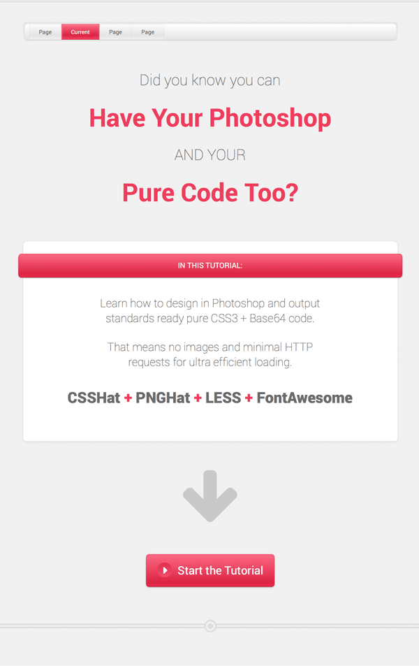
During this tutorial I’m going to walk you through the process of creating sophisticated web element styling in Photoshop, but without employing a single image file in your finished website. When we’re done, you’ll have a single page layout with all the UI elements you see in the preview image above, using nothing but CSS3, Base64 code and font icons.
By creating a “no image” design you can keep your load time and HTTP request count to an absolute minimum, whilst achieving the highest possible level of flexibility in your UI elements. Pure code UI elements can be quickly and easily tweaked via CSS in ways static images can’t without being manually edited and re-exported.
To make this all happen we’ll be employing four key resources:
- CSSHat
Photoshop plugin made by Source which generates CSS3 directly from Photoshop layers. - PNGHat
Photoshop plugin, also made by Source, which converts any image into Base64 code. - LESS
CSS preprocessor that makes coding a bazillion times easier *. - FontAwesome
A popular collection of font-based icons.
* You can use a different preprocessor if you prefer.
By bringing these elements together it’s possible to generate a pure code design that is virtually identical to the original PSD:
This tutorial will be broken into two parts:
- The design.
- The code generation.
During this first part we’ll be demonstrating the types of techniques you can use in Photoshop when creating a CSS3 and Base64 friendly design. While we can achieve a lot with pure code these days, we can’t yet translate absolutely everything you might find in Photoshop. So it’s important to have the “dos” and “don’ts” in mind when you set out.
Let’s get started with a brief overview of CSSHat and PNGHat, the Photoshop plugins we’ll be using to generate our CSS3 and Base64 code.
Intro to CSSHat & PNGHat
CSSHat
With the CSSHat plugin installed you can click any layer in your Photoshop document and the CSSHat window will instantly output production-ready code for you.
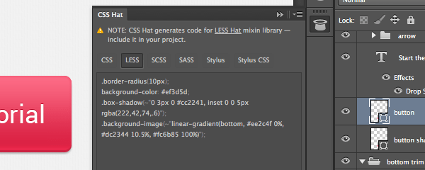
CSSHat interprets primarily from your layer style settings, so you should aim to add your gradients and borders via layer styles rather than any of Photoshop’s alternative methods.
Photoshop properties which CSSHat can interpret:
- Gradient/Solid color fill layer
- Gradient overlay
- Drop shadow
- Text layers
- Inner shadow
- Inner glow
- Outer glow
- Color overlay
- Stroke
- Border radius
- Opacity
Code which CSSHat can output
- Standards compliant CSS3 including gradients, drop shadows, text shadows etc.
- Vendor prefixes (optional)
- Width and height in
px(optional) - Font properties:
font-family,font-size,font-weight (bold/normal),font-style - LESS with LESSHat mixins
- Sass/SCSS with Compass mixins
- Stylus with Nib mixins
- SVG gradients for IE9
- Wrap into class named after Photoshop layer (optional)
- CSS circles
- Both box shadows and text shadows
Things CSSHat can’t work with:
- Blending modes like multiply and overlay – always set the blending mode for drop shadows and so on to normal.
- Pattern overlay – we’ll be handling background image code generation with PNGHat instead.
- Separate border properties per side – due to the fact Photoshop can only set all sides of a border uniformly.
- CSS triangles
- Numerical font-weight settings like 100, 700 etc.
PNGHat
PNGHat can do many things. Check out How to Export Photoshop Assets For the Web With PNGHat for a full rundown on the plugin.
In the case of this tutorial we’ll be using it to generate Base64 code which will form the background image of the design. You’ll see how this works in practice shortly.
When an image is converted into Base64 you get a text string that can then be incorporated directly into CSS. The more data is in the image, the longer the string, so for that reason Base64 is best suited to simple tiling images with few colors.
Getting Started
To get the ball rolling you’ll need a few things.
Photoshop Plugins
To begin with, you should have the CSSHat and PNGHat plugins installed.
If you’re unable to purchase a copy of CSSHat you can still follow along and use Photoshop’s in built “Copy CSS” functionality, which can be selected from the context menu after right-clicking any layer.
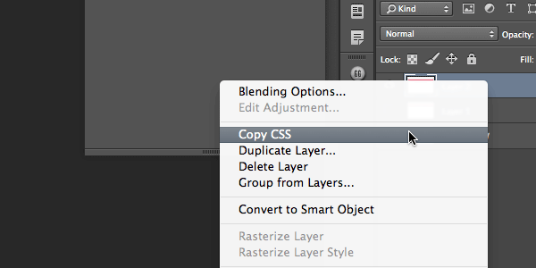
However, in this case, you’ll have to manually remove unwanted default code for things like absolute positioning, z-index, dimensions and class names. It also doesn’t handle generation of multiple shadows and gradients as well as CSSHat, and it cannot produce LESS, Sass/SCSS or Stylus ready code.
If you can’t purchase PNGHat you can manually export your background image then put it through an online converter such as: http://webcodertools.com/imagetobase64converter
I also highly recommend a third plugin from Source named Subtle Patterns. This plugin added adds a library of hundreds of patterns to Photoshop, each of which can be instantly applied as a pattern overlay to any layer.
As an alternative to using the Subtle Patterns plugin, you can just browse the patterns and download them for free.
Note: I know what you might be wondering – that’s a lot of stuff by Source, is this a sponsored post? No. The truth is, I purchased Source’s whole product range long before I started writing for Tuts+ and I love every one of them due to the sheer number of hours they’ve added back into my day. I recommend these plugins because I’ve been so super impressed by my own experience of the entire suite.
Font Awesome & Roboto
We’ll be placing some icons into your design via Font Awesome, so you’ll need to go and download the font and install it onto your system.
The font of choice for our regular text will be Roboto so you’ll need to install that also. You can grab it from Google Webfonts.
New PSD and Background Image
Create a new Photoshop document at a size of 1600px x 2180px. Double click the default “Background” layer to unlock it, then save your PSD.
In the Subtle Patterns window, (or website), search for satin weave. When you find it, with your Background layer selected, click the pattern’s tile to automatically apply it as a pattern overlay.
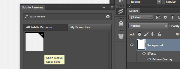
You should now see some subtle grayscale vertical lines on your canvas. We’ve selected this pattern as a good fit for conversion to Base64 as it uses very few colors and is only 24px by 12px in size, meaning it will produce a relatively small code string.
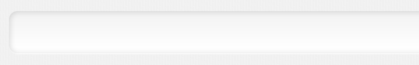
Add the Top Trim
To help frame the page create a rectangle at the top of your canvas, running the full width and 8px in height. Give it these properties:
Fill color: #dddddd
Opacity: 50%
Layer style > Inner Shadow:
- Blending Mode:
Normal - Color:
#c8c8c8 - Opacity:
100% - Angle:
-90 - Distance:
2 - Size:
4
Layer style > Drop Shadow:
- Blending Mode:
Normal - Color:
#ffffff - Opacity:
100% - Angle:
90 - Distance:
2 - Size:
1
Your “top trim” should look like this:

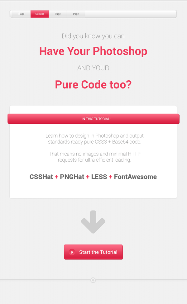
Create the Menu
Through creating this menu we’ll get to see some of the effects that can be created with gradients, shadows and strokes. We’re going for a clean-looking raised menu that is seated in an inset wrapper.
1. Menu Wrapper
To begin with we’ll create the inset wrapper that will hold the menu. Create a center aligned, rounded corner rectangle on your canvas at 1200px wide by 61px high. Set the following properties:
Fill color: #f9f9f9 – note that even though there will be a gradient on this rectangle, we still want to set a fill color as a fallback.
Properties > Live Shape Properties > Corner radius: 12px
Layer style > Inner Shadow:
- Blending Mode:
Normal - Color:
#000000 - Opacity:
15% - Angle:
90 - Distance:
1 - Size:
10
Layer style > Gradient Overlay:
- Color > Location, 0%:
#ffffff - Color > Location, 100%:
#f3f3f3 - Style:
Linear
Layer style > Drop Shadow:
- Blending Mode:
Normal - Color:
#ffffff - Opacity:
100% - Angle:
90 - Distance:
1 - Size:
2
Your menu wrapper should now look like:
2. Menu Background
Create a second rounded corner rectangle above your menu wrapper, at 1190px wide by 50px high, with its top left corner 5px further right and down than the menu wrapper’s top left corner. Add these properties:
Fill color: #ffffff
Properties > Live Shape Properties > Corner radius: 10px
Layer style > Stroke:
- Size:
1 - Position:
outside - Color:
#e4e4e4
Layer style > Gradient Overlay:
- Color > Location, 0%:
#e5e5e5 - Color > Location, 100%:
#ffffff - Style:
Linear
Layer style > Drop Shadow:
- Blending Mode:
Normal - Color:
#c1c1c1 - Opacity:
100% - Angle:
90 - Distance:
3 - Size:
4
You should now have:
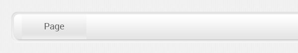
3. Add Menu Items
Create another rectangle, this time at 130px wide by 51px high, directly over the top of your “menu background” bar. Give it this gradient overlay:
Layer style > Gradient Overlay:
- Color > Location, 0%:
#efefef - Color > Location, 25%:
#e4e4e4 - Color > Location, 100%:
#fcfcfc - Style:
Linear
Now add some placeholder text: type out the word “Page” and position it over the middle of your menu items with the following settings:
Character > Font: Roboto, Regular
Character > Font size: 18px
Character > Color: #5c5c5c
Layer style > Drop Shadow:
- Blending Mode:
Normal - Color:
#ffffff - Opacity:
100% - Angle:
90 - Distance:
1 - Size:
0
Your menu item should look like this:
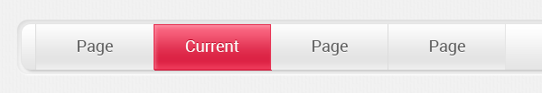
4. Create “Current” Menu Item Style
Make a duplicate of your menu item rectangle and text, then move it to the right so it sits just next to your original. Edit the text to read “Current”.
Set the rectangle’s layer style properties to:
Layer style > Stroke:
- Size:
1 - Position:
outside - Color:
#e62d4ee4e4e4
Layer style > Inner Shadow:
- Blending Mode:
Normal - Color:
#faabb9 - Opacity:
60% - Angle:
90 - Distance:
3 - Size:
5
Layer style > Gradient Overlay:
- Color > Location, 0%:
#ef3d5d - Color > Location, 25%:
#dc2345 - Color > Location, 100%:
#fc6c86 - Style:
Linear
Layer style > Drop Shadow:
- Blending Mode:
Normal - Color:
#cc2241 - Opacity:
100% - Angle:
90 - Distance:
1 - Size:
0
Then change your text color and drop shadow settings to:
Character > Color: #ffffff
Layer style > Drop Shadow:
- Blending Mode:
Normal - Color:
#b50020 - Opacity:
100% - Angle:
90 - Distance:
1 - Size:
0
When you’re done with the above, make some more duplicates of the original “menu item” and place them to the right of the “current menu item”. We do this to see how the menu item styles look when sitting flush against each other, to ensure there is adequate visual separation from one item to the next.
Unfortunately, Photoshop has no way of setting something like “border-left” so we can’t set left or right borders directly on our menu item rectangles. However we still need to simulate the effect so we can create separation between each item. Use Photoshop’s line tool to draw some 1px wide vertical lines between the menu items, and set their fill color to #dddddd
With all these elements in place you should have:
Add the Main Text
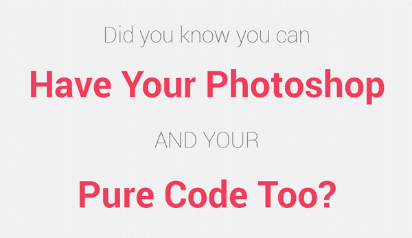
If you were using this layout for a client, this is the area in which you would add their main interest hook or call to action. For the purposes of this tutorial, add the following four lines, all centered on the page:
- Did you know you can
- Have Your Photoshop
- AND YOUR
- Pure Code too?
Give the first and third lines the following settings:
Character > Font: Roboto, Thin
Character > Font size: 48px
Character > Color: #6b6b6b
Then give the second and fourth lines these settings:
Character > Font: Roboto, Bold
Character > Font size: 80px
Character > Color: #ef3d5d
Your text should now look like this:
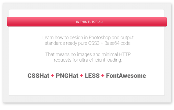
Add the Info Panel
1. Create the Panel Background
Below the main text, create a rounded corner rectangle 1200px wide by 665px high. Give it these settings:
Fill color: #ffffff
Properties > Live Shape Properties > Corner radius: 15px
Layer style > Stroke:
- Size:
1 - Position:
inside - Color:
#d8d8d8
Layer style > Drop Shadow:
- Blending Mode:
Normal - Color:
#c1c1c1 - Opacity:
27% - Angle:
90 - Distance:
3 - Size:
4
2. Create the Panel Header Background
Then, 60px below the top of the panel background, create another rounded corner rectangle. It should be 1230px wide and 70px high. Center it on the canvas so it sticks out by 15px either side of the panel background. Give it these properties:
Fill color: #ef3d5d
Properties > Live Shape Properties > Corner radius: 10px
Layer style > Inner Shadow:
- Blending Mode:
Normal - Color:
#de2a4a - Opacity:
60% - Angle:
90 - Distance:
0 - Size:
5
Layer style > Gradient Overlay:
- Color > Location, 0%:
#ef2c4f - Color > Location, 10%:
#dc2345 - Color > Location, 100%:
#fc6c86 - Style:
Linear
Layer style > Drop Shadow:
- Blending Mode:
Normal - Color:
#cc2241 - Opacity:
100% - Angle:
90 - Distance:
3 - Size:
0
3. Create the Panel Header Background’s Second Shadow
We already have a drop shadow set on the rectangle we just created, which will give it a subtle 3D effect. But we also want to have a second drop shadow that will look like an actual shadow cast by a downlight. Because we’ve already “used up” the drop shadow property of the existing rectangle, we’ll need to create a second rectangle to apply a second shadow to.
Duplicate your panel background rectangle and drag it below the original in your layers panel, then clear its existing layer style. Name it “panelheadershadow” so you can tell the two layers apart easily. Give it these drop shadow settings:
Layer style > Drop Shadow:
- Blending Mode:
Normal - Color:
#000000 - Opacity:
27% - Angle:
90 - Distance:
5 - Size:
3
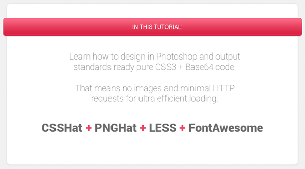
4. Create the Panel Header Text
Directly over the middle of the panel header background type out “IN THIS TUTORIAL:” and give the text these settings:
Character > Font: Roboto, Regular
Character > Font size: 24px
Character > Color: #ffffff
Layer style > Drop Shadow:
- Blending Mode:
Normal - Color:
#b50020 - Opacity:
100% - Angle:
90 - Distance:
1 - Size:
0
5. Create the Panel Text
Finally, add these lines of text:
- Learn how to design in Photoshop and output
standards ready pure CSS3 + Base64 code.
That means no images and minimal HTTP
requests for ultra efficient loading. - CSSHat + PNGHat + LESS + FontAwesome
Set the first lot of text to:
Character > Font: Roboto, Thin
Character > Font size: 36px
Character > Color: #6b6b6b
And the second lot of text to:
Character > Font: Roboto, Black
Character > Font size: 48px
Character > Color: #6b6b6b
Then highlight each of the “+” symbols and set their color to: #ef3d5d
You should now have an info panel that looks like this:
Add the Big Down Arrow
This is where we’ll start using Font Awesome. We’re going to place the “fa-down-arrow” icon and use that instead of an image.
The easiest way to do this is to get the appropriate “letter” into your cache by going to the Font Awesome cheatsheet. Locate the “fa-down-arrow” icon, then highlight the little image preview and press CTRL / CMD + C

Go back to your canvas, place a cursor with the text tool, and paste in the character you just copied. At first you’ll just see a funny little rectangle with a cross in it, so change your settings to this:
Character > Font: FontAwesome
Character > Font size: 200px
Character > Color: #6b6b6b
Make sure the arrow is centered on the canvas, and set the layer’s opacity to 30%. You should now have this cool looking arrow:
Add the “Start” Button
1. Button Background and Second Shadow
Create a new rounded corner rectangle, 420px wide by 105px high. The button will use the exact same layer style properties as the “Panel header background” so you can simply copy over those layer styles. Right-click the layer of your panel header background and select “Copy Layer Style”, then right-click your new button layer and select “Paste Layer Style”.
As we did with the panel header background, we want to create a second rectangle for this button that can have a second drop shadow applied to it. Duplicate your button layer and drag it below the original in your layers palette, then rename it “button shadow“. Copy the layer style from the “panelheadershadow” layer you created earlier and paste it onto your new “button shadow“ layer.
2. Button Circle and Right Arrow
We’re going to add a little circle to the button that will look like a small depression, and we’ll then set a right pointing white arrow on top of it.
Create a circle (ellipse) above the button at 47px by 47px. Position it so it is equal distance from the top, left and bottom edges of the button background, then give it this gradient overlay:
Layer style > Gradient Overlay:
- Color > Location, 0%:
#f04f6c - Color > Location, 100%:
#e32d4f - Style:
Linear
To create the right pointing arrow we’re again going to use FontAwesome. Head back over to the cheatsheet and this time copy the fa-caret-right icon. On your canvas, use the text tool to place a cursor over the circle you just created and paste in the Font Awesome icon/character. Give it these properties:
Character > Font: FontAwesome
Character > Font size: 36px
Character > Color: #ffffff
Position the newly created white arrow in the center of the circle it sits above.
3. Create the Button Text
Over the top of the button, to the right of the circle and arrow, type “Start the Tutorial” and give the text these settings:
Character > Font: Roboto, Regular
Character > Font size: 36px
Character > Color: #ffffff
This text uses the same drop shadow as the “Panel header text”, so you can copy the style from that text and paste it onto this layer.
You should now have a button that looks like this:

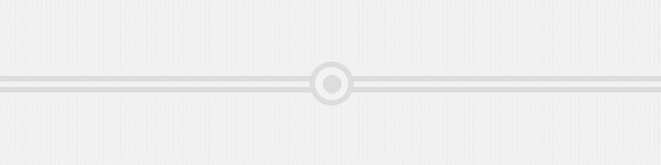
Add the Bottom Trim
We’re now going to add the final element of the design, some trim at the bottom to finish framing off the space. When this element is coded up we’ll be using separate top and bottom border settings, but as Photoshop can’t facilitate this we’ll again use shape tools instead so we can get the right colors in place.
Below the start button, create a rectangle with a fill color of #dddddd that is 5px high and stretches the full width of the page. Duplicate the new rectangle and move it down 10px so there is a 5px gap between the two rectangles.
In the center of your canvas and above the two grey lines/rectangles, draw a circle that is 40px by 40px and give it these properties:
Fill color: #f2f2f2
Layer style > Stroke:
- Size:
5 - Position:
inside - Color:
#dddddd
Layer style > Gradient Overlay:
- Color > Location, 40%:
#dddddd - Color > Location, 45%:
#f2f2f2 - Style:
Radial
Pay special attention to the gradient overlay settings as they are different to those we’ve used before. The color stops are placed at 40% and 45% rather than 0% and 100%, and we’re using a radial gradient instead of linear. Along with the border/stroke, this gives the effect of small grey circle surrounded by a larger one.
Your bottom trim should look like this:
All Done!
You should now have a completed PSD design, 100% ready for translation into pure CSS3 and Base64 code:
Coming up
In the following part of this tutorial:
- You’ll setup the HTML for your design.
- You’ll also setup an easy, autocompiling LESS project (with no command line) using the free Windows & Mac app Prepros.
- We’ll incorporate LESSHat and Normalize.less
- then also Font Awesome via FontAwesome.less.
- You’ll convert your background image to Base64 and incorporate it into your LESS code.
- After that, you’ll convert all your design elements to CSS3 and add them to your LESS code.
- Finally, you’ll be able to lean back in your chair and feel very impressed with yourself
I’ll see you then!