Animation on the web has transformed radically over the past 5 years. SVG animation is one of the newest techniques to manipulate graphics on a webpage. Although SVG has been supported for a long time, it only recently gained support in a majority of web browsers.
With greater support comes a greater audience and more safety for developers to test out cool ideas. Over time these ideas turn into common trends as they’re adopted by hundreds of designers. I’ve picked out a few examples that best demonstrate these SVG animation effects and how they can be applied to website layouts.
Navigation Effects
Website headers & nav menus are the perfect areas for dynamic SVGs. Vectors can work as both icons and text which leaves plenty of room for improvisation.
Most designers would agree that usability comes before aesthetics. Form follows function. This means you shouldn’t go crazy with the effects, but if you can enhance the interface it’s worth the effort.
One of my favorite examples can be found in the Bjango navigation. Each link including the logo is designed as an SVG. When hovering the links you’ll get a nice bounce effect coupled with a unique color. The logo actually displays a unique gradient to capture more attention.
While some developers may be against the use of SVGs for text-based elements, the effect really does add a snap into the design. Even though it’s pretty simple the animation clearly stands out.
Navigation icons are another use for SVGs. Some designers incorporate unique icons above links while others use icons to connect with the navigation. One example is the popular hamburger 3-bar menu icon connected with sliding drawer menus.
This CodePen snippet exemplifies the beauty of an SVG animation. It turns into an X with a circular ring around the icon. It not only captures attention but also delivers a message without using any words.
If you want more dynamic icons you could fit them into sub-headers or internal navigation sections. For example Zoook’s musicana page uses music icons to delineate product categories.
Notice that the primary music icon is an SVG with subtle animation effects. Music notes play out of the speaker and give a sense of life to the page.
There’s no need to force unwanted SVGs into a page header – but when used appropriately they can add a certain vibrancy to the layout.
Custom Vector Backgrounds
We’ve all heard about fullscreen images and video backgrounds on the rise. Both trends have become widely adopted to bring attention into certain areas of a webpage.
Custom graphics have always been popular as background features. Unfortunately not all designers have the skillset to implement custom-designed graphics. But with the rise of free tutorials and vector editing tools it’s never been easier to create animated vector backgrounds.
Some graphics are meant to blend with the company branding while others are designed to be more “realistic”. Take a look at the homepage for Cleverbridge.
The top page section uses a bright orange map with fractal elements jumping along to different countries. The animation is meant to represent eCommerce and how the Internet makes it easier to purchasing anything from anywhere in the world.
Some folks go for the more aesthetic background to give off a certain mood. On the booncon PIXELS homepage you’ll find a block featuring motion graphics in the form of flat vector shapes.
If you inspect the code you’ll realize this isn’t a single image, but rather a full SVG element in HTML code. Animated elements are contained in separate groups like the ferris wheel & hot air balloon.
You can imagine how much work is required to both design and code this animation. Since booncon is a digital creative agency it fits nicely in their portfolio. It also matches up with their slogan “pretty code – smart design”. Definitely worth the effort(in this designer’s opinion).
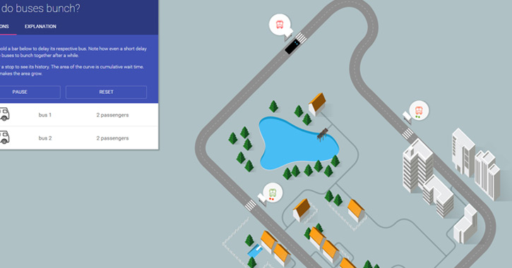
One other example isn’t technically fullscreen but it is part of the background. Setosa is a data visualization site and one page is dedicated to explaining why buses bunch up. There’s a small area for content along with an animated track to display how buses move.
As you can tell from these examples, SVG animation can be aesthetic or even educational. And backgrounds are the perfect way to add graphics without taking up more space on the page.
App Demos and Sample Previews
Every so often you’ll find a landing page with live previews of the software. Many of these demos take the form of videos or screenshots while others are created using SVGs.
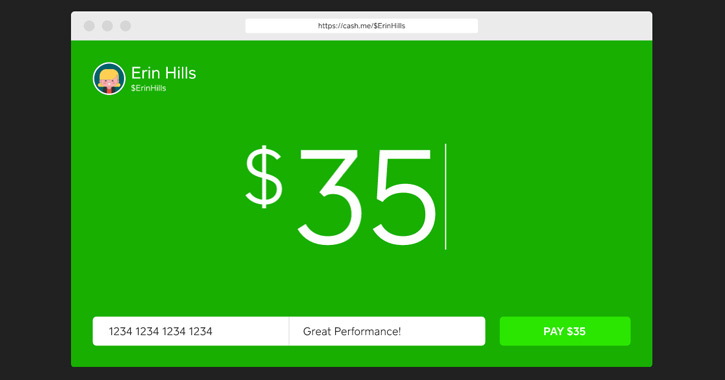
The purpose of an SVG demo is to show how the program works. Obviously SVGs can’t include a lot of detail, so the interfaces are slimmed down and more straightforward. Square Cash has a great example on their homepage.
An SVG browser appears with some basic features of the site. This animation explains the purpose of their software and why you might use it. Plus you’ll find other animated SVGs in different areas of the page that tie into this same design style.
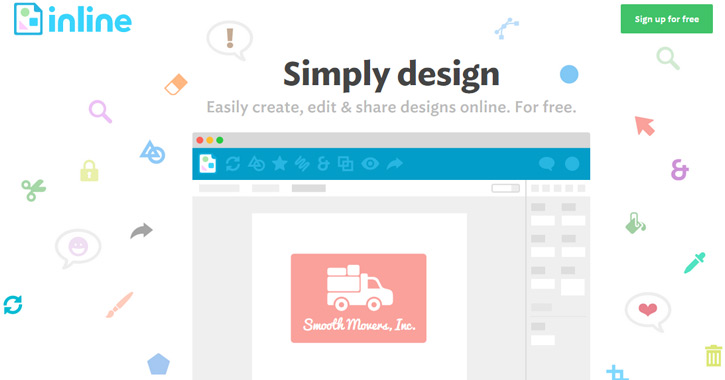
Inline is an online design tool kinda like a simplified version of Photoshop. You can share your designs with others and keep them stored in the cloud for easy access.
On their homepage you’ll see a quick demo mockup created using SVG animation. Everything from the mouse cursor to the browser interface are separate SVG elements.
This effect primarily works on landing pages made for desktop or web software. It’s definitely not ubiquitous but it’s a trend growing in popularity.
Featured Icon Animations
SVG icons have been around for a while and recently gained support from a majority of web browsers. But featured SVG icons can also be animated either by themselves or by user interaction like a mouse click or hover.
On the homepage of Threader you’ll find three SVG icons lined up with features. As you hover over each icon you’ll notice an interesting animation. In this case they only animate once but you can set the animation to behave any way you like.
Authentic Form & Function has a different approach to SVG icon animation. Take a look at their services page and scroll down to each section.
A few illustrations are animated to describe features or particular services provided by the agency. The animations are triggered by scrolling into view which is also a unique effect.
SVG & Canvas Icons
Advanced web developers have been testing out the canvas element in conjunction with SVG animation. HTML <canvas> is like a container which can hold multiple SVGs or even bitmap images.
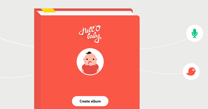
This allows developers to animate multiple elements on the page in many different directions. Take for example the landing page for Hell’o Baby. Each SVG is contained within a canvas element for greater control over the icons.
For most designers this would be going too far. Canvas is primarily useful when designing HTML5 games for 2D/3D graphics. But as this spec evolves I think we’ll see a lot of great animation tricks that rely on canvas.
For now it’s just another tool in your SVG animation toolbelt.
The Future of SVG
Even though most browsers support SVG it’s still a trend that’s gaining momentum. Designers who learned to build websites 10+ years ago may not have time to learn about these newer methods.
Typical CSS3 animation is still gaining traction so you can imagine CSS3/SVG animation has a few years before really going mainstream. But with increased browser support and emerging design trends there’s no doubt that SVGs are the future of motion graphics for the web.


