
Typekit recently redesigned their homepage with some new services in mind. When Typekit joined Adobe, they set out to bring us a new way to handle fonts on the web. Not only did they create a fairly simple way to embed fonts on the web, but they have now officially launched a desktop sync option, which allows Creative Cloud subscribers to sync fonts to their computer directly from Typekit. This has been in a beta form for a while now, and provides a much easier route to local fonts than finding them elsewhere!
Disclaimer: this article was in no way endorsed by Adobe or the members of the Typekit team (we still hope they like it though).
This article is going to talk exclusively about the new Typekit homepage, and give you some details of the implementation used to create the marketing elements.
As is par for the course in our How They Did It series, we will also provide some commentary around the artistic and technological decisions, and open the conversation for constructive critical conversation.
We will also try to avoid any alliteration.
Context of the Site
Typekit has been around for a while, and was fairly overdue for a refresh. Here’s what it looked like before:
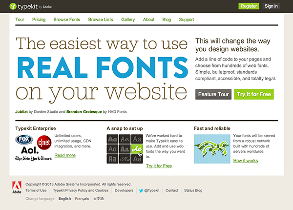
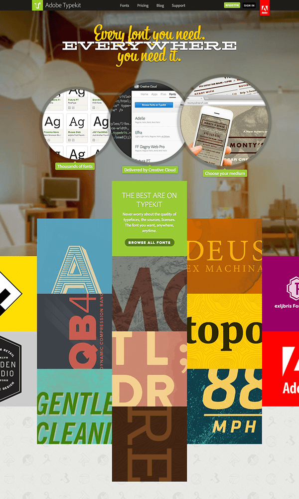
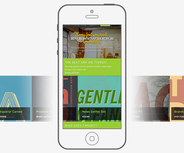
While this is a perfectly fine homepage, it was slightly dated. With the new design, Typekit employs a graphically centered context to display fonts alongside the people and companies using the service. Using media queries, the landing page largely retains most of its primary design and content elements all the way down to mobile. Here’s what it looks like now.
Desktop: Circles, Panels, Staggering, and Curtains
A few important design decisions characterize the desktop version of this design. The resulting effect offers visitors a sense that the design is, quite literally, out of the box. We see evidence of this throughout the site.
Circles
First, we see the screenshots of the app in the header of the page under the headline “Every font you need. Everywhere you need it.” (By the way, we’ll talk about that headline later.) The circle pngs give us three marketing points that are directly related to the service: “Thousands of fonts”, “Delivered by Creative Cloud”, “Choose your medium”. These three ideas are immediately accessible to most designers, as most designers are familiar with the Creative Cloud by now, and most certainly all designers are familiar with fonts and devices.
The choice of circles immediately establishes the avoidance of a boxy interface. The circles increase in size from left to right, giving a sense of motion and progress. None of the circles are actionable. It should also be noted that this is also the only presence of circles as a graphical shape on the page.
Staggered Panels
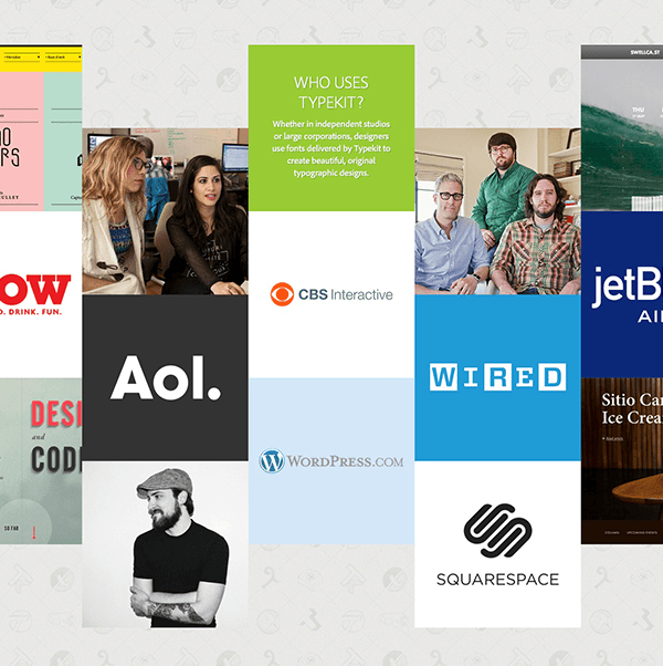
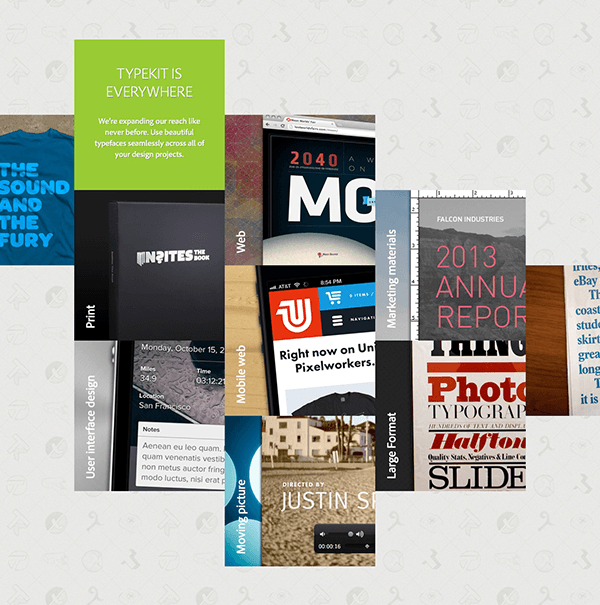
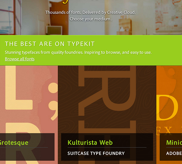
There are many trends to monitor over this year, and the use of panels is one of them. We saw the rise of this interface when plugins like jQuery Masonry hit the scene, and when Pinterest popularized them as a primary interactive element. Typekit uses panels in six distinct “clusters” on the page, each cluster having its own content purpose.
The first cluster shows off the typefaces themselves and the second cluster shows customers who use Typekit:
The third cluster shows off what types of work you can use Typekit with now that you can sync to your local desktop.
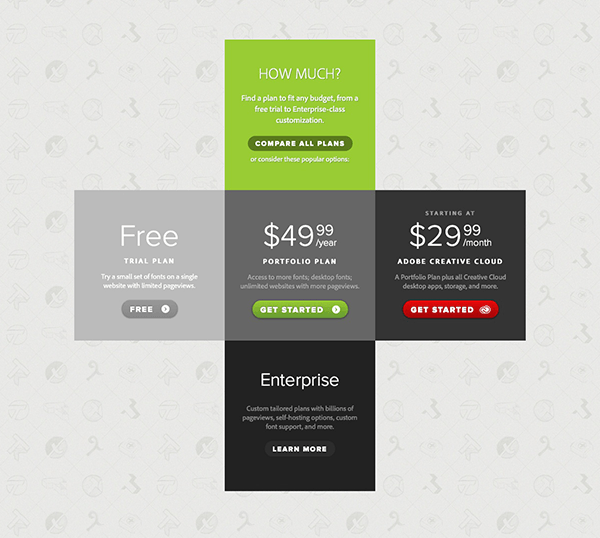
The fourth cluster explains the pricing of Typekit.
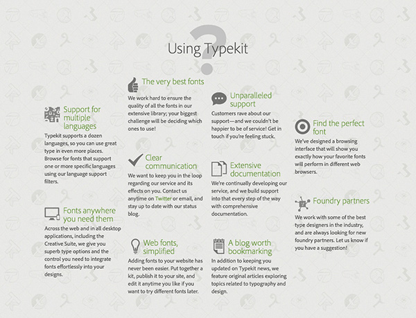
The fifth cluster actually contains an FAQ selection of panels that don’t use a background color, and instead only employ typography and iconography.
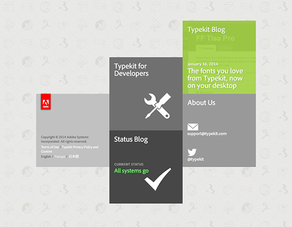
Finally, the sixth cluster acts as the “footer” of the website, with copyright information and links to common destinations related to Typekit.
These clusters make up the primary layout interest items, and have a uniquely staggered alignment that provides clarity and separation between them, while also furthering the breakaway from a more common layout consisting of elements that naturally are vertically aligned. All of the panels that have a background are staggered by half of the height of a panel, using a predictable symmetry. (The only exception to this staggering is the pricing cluster, which forms a + shape.) This predictability functions to allow these blocks to form a shape; for instance, the first set of blocks forms a diamond, while the third set forms a diagonal line from the top left to the bottom right.
Let’s look into how this particular effect is achieved.
Here is the markup for the first cluster:
<section id="best"> <header> <h3>THE BEST ARE ON TYPEKIT</h3> <p>Stunning typefaces from quality foundries. Inspiring to browse, and easy to use.<br><a href="/fonts">Browse all fonts</a></p> </header> <div class="container"> <div class="blocks group"> <ul class="offset-full overflow-left"> <li> <a><img alt="Font_font" src="/assets/newhome/best/font_font-699ab534bf803ab539d41b9b8d771687.png"></a> </li> <li> <a><img alt="Darden" src="/assets/newhome/best/darden-57fb7506c8743823c0e62de84e5745b2.png"></a> </li> </ul> <ul class="offset-half"> <li> <img alt="Specimen-a" src="/assets/newhome/best/specimen-a-cd3bee6296081ba6dbde5ef6fe43f3c7.gif"> <div> <h4><a href="/fonts/aw-conqueror-carved">AW Conqueror Carved</a></h4> <h5><a href="/fonts?collection=foundry-porchez-typofonderie">Typofonderie</a></h5> <p>Available in multiple styles including inline and “Carved,” AW Conqueror is a multitalented titling face whose chromatic components respond powerfully to layering.</p> <p class="more">See: <a href="http://blog.typekit.com/2012/11/06/hwt-american-chromatic-from-hamilton-wood-type-foundry/">Layering chromatic web fonts</a></p> </div> </li> <li> <img alt="Specimen-qb4" src="/assets/newhome/best/specimen-qb4-0ee0b94e60b0e2570729015839339baa.png"> <div> <h4><a href="/fonts/proxima-nova">Proxima Nova</a></h4> <h5><a href="/fonts?collection=foundry-mark-simonson-studio">Mark Simonson Studio</a></h5> <p>Combining geometric features with humanist proportions, Proxima Nova works across many different contexts thanks to its variety of weights and widths.</p> </div> </li> <li> <img alt="Specimen-h" src="/assets/newhome/best/specimen-h-eb1414cdab5913e7c5b919cc0aebbf40.jpg"> <div> <h4><a href="/fonts/news-gothic-std">News Gothic Std</a></h4> <h5><a href="/fonts?collection=foundry-adobe">Adobe</a></h5> <p>A classic for newspaper headlines, advertising, and packaging, the original News Gothic was designed in 1908—and dresses up neatly on the web today.</p> <p class="more">See: <a href="http://blog.typekit.com/2011/07/19/shading-with-css-text-shadows/">Shading with CSS</a></p> </div> </li> </ul> <ul> <li class="header"> <h3>THE BEST ARE ON TYPEKIT</h3> <p>Never worry about the quality of typefaces, the sources, licenses. The font you want, anywhere, anytime.</p> <p><a class="btn" href="/fonts">Browse all fonts</a></p> </li> <li> <img alt="Specimen-mo" src="/assets/newhome/best/specimen-mo-7df64ca580bd5269afdd2dc5341864f0.jpg"> <div> <h4><a href="/fonts/futura-pt">Futura PT</a></h4> <h5><a href="/fonts?collection=foundry-paratype">ParaType</a></h5> <p>Futura, the quintessential geometric sans, has inspired generations of designers with its bold features, and now has been expertly prepared for the web by ParaType.</p> </div> </li> <li> <img alt="Specimen-tldr" src="/assets/newhome/best/specimen-tldr-a7000712ce0585e055939bd73d377bad.jpg"> <div> <h4><a href="/fonts/brandon-grotesque">Brandon Grotesque</a></h4> <h5><a href="/fonts?collection=foundry-hvd-fonts">HVD Fonts</a></h5> <p>Brandon Grotesque is elegant and warm, with long descenders and rounded stroke endings—a great performer at display sizes, or for eye-catching copy.</p> </div> </li> <li> <img alt="Specimen-re" src="/assets/newhome/best/specimen-re-3df45f289fc99df6ce57228d27f33f0e.png"> <div> <h4><a href="/fonts/kulturista-web">Kulturista Web</a></h4> <h5><a href="/fonts?collection=foundry-suitcase-type-foundry">Suitcase Type Foundry</a></h5> <p>Kulturista Web is a sturdy slab serif appropriate for headings, subheads, and navigation, available in five weights with italics.</p> </div> </li> </ul> <ul class="offset-half"> <li> <img alt="Specimen-deus" src="/assets/newhome/best/specimen-deus-f9b26d34558d0b133087b7461a2ff1a1.jpg"> <div> <h4><a href="/fonts/minion-pro">Minion Pro</a></h4> <h5><a href="/fonts?collection=foundry-adobe">Adobe</a></h5> <p>Minion is an Adobe Originals typeface inspired by classical designs of the late Renaissance, a period of elegant, beautiful, and highly readable type.</p> <p class="more">See: <a href="https://typekit.com/lists/good-for-longform">List: Good for longform</a></p> </div> </li> <li> <img alt="Specimen-topo" src="/assets/newhome/best/specimen-topo-9f237936bbb185d3193d3be27f1872da.jpg"> <div> <h4><a href="/fonts/ff-meta-serif-web-pro">FF Meta Serif Web Pro</a></h4> <h5><a href="/fonts?collection=foundry-fontfont">FontFont</a></h5> <p>FF Meta Serif is lean and legible, with excellent balance and charming idiosyncrasies. It sets nicely alone, or with a variety of other typefaces.</p> <p class="more">See: <a href="http://blog.typekit.com/2012/05/23/type-study-pairing-typefaces">Pairing typefaces</a></p> </div> </li> <li> <img alt="Specimen-88" src="/assets/newhome/best/specimen-88-a49beba3d9da688ba60f1d43b04700ab.jpg"> <div> <h4><a href="http://processtypefoundry.com/fonts/klavika/">Klavika</a></h4> <h5><a href="http://processtypefoundry.com/">Process Type Foundry</a></h5> <p>Available directly from Process Type Foundry, Klavika demonstrates infinite flexibility and a blend of humanist and geometric influences.</p> <p class="more">See: <a href="http://help.typekit.com/customer/portal/articles/6783-bring-your-own-license-to-typekit">Bring your own license</a></p> </div> </li> </ul> <ul class="offset-full overflow-right"> <li> <a><img alt="Exljbris" src="/assets/newhome/best/exljbris-cfaf5dce142ef3f4b09fad61306542d3.png"></a> </li> <li> <a><img alt="Adobe" src="/assets/newhome/best/adobe-b0af0db305e1ae2c5fd82f14b73589cb.png"></a> </li> </ul> </div> </div> </section>
Aside from the obscured asset library urls (generated by the Ruby on Rails assets pipeline), the markup is fairly straight-forward. Here’s a condensed example:
<section> <header></header> <div class="container"> <div class="blocks group"> <ul><!-- block column --> <li></li><!-- block --> </ul> <ul><!-- block column --> <li></li><!-- block --> </ul> </div> </div>
The header element only shows up only below 980px. Using a container width of 940px, the blocks are 300×300 px squares. Using <li> elements for the blocks, the offset is accomplished by adding a margin-top to the <ul> element. But we don’t want to add the same margin to all of the columns; instead, this is accomplished through some offset classes.
.blocks>ul.offset-half { margin-top: 150px; } .blocks>ul.offset-full { margin-top: 300px; } .blocks>ul.offset-three-halves { margin-top: 450px; }
There are also a few offset classes which pull the columns off the edge of the grid.
.blocks>ul.overflow-left { position: absolute; left: -280px; }
The exception to this is the FAQ, which has four columns instead of three.
Curtains
On many of the actual panels themselves, we see the use of a “curtain”. When hovering on the item, a curtain either moves or appears, revealing content relevant to the panel itself. This results in an interface that invites exploration and investigation. These interactions rely on CSS transitions triggered by hovering and absolutely positioned elements inside of relatively positioned elements.
Let’s look at how we might achieve this.
We have two basic kinds of curtains: the overlay curtain and the slide-reveal curtain.
We see the following markup for a single panel of each kind.
<!-- Image slide reveal --> <li> <img alt="Specimen-deus" src="/assets/newhome/best/specimen-deus-f9b26d34558d0b133087b7461a2ff1a1.jpg"> <div> <h4><a href="/fonts/minion-pro">Minion Pro</a></h4> <h5><a href="/fonts?collection=foundry-adobe">Adobe</a></h5> Minion is an Adobe Originals typeface inspired by classical designs of the late Renaissance, a period of elegant, beautiful, and highly readable type. <p class="more">See: <a href="https://typekit.com/lists/good-for-longform">List: Good for longform</a></p> </div> </li> <!-- Overlay curtain --> <li class="paravel"> <div> <h4><a href="http://paravelinc.com">Paravel</a></h4> <h5><a href="/plans/enterprise">Typekit Enterprise</a></h5> <p>The designers at Paravel focus on bringing quality responsive design to their clients’ websites with solid code, deep attention to visual detail, and excellent type.</p> </div> </li>
We’ll then set up our different transitions on hover.
/* Slide Curtain */ #who li.paravel { background-image: url(/assets/newhome/who/paravel-ce782f6791c64eee5bf74b72986bceb9.jpg); } #who li div { height:220px; text-align:left; background-color:rgba(0,0,0,0.8); filter:progid:DXImageTransform.Microsoft.Alpha(Opacity=0); opacity:0; -webkit-transition:opacity .15s linear; -moz-transition:opacity .15s linear; -o-transition:opacity .15s linear; transition:opacity .15s linear; padding:40px; } #who li:hover div { filter:progid:DXImageTransform.Microsoft.Alpha(Opacity=100); opacity:1; } /* Fade Curtain */ #best li { position:relative; background-color:#323232; overflow:hidden; text-align:left; } #best li img { left:0; position:absolute; z-index:1; -webkit-transition:left .1s cubic-bezier(0,0,0.4,1); -moz-transition:left .1s cubic-bezier(0,0,0.4,1); -o-transition:left .1s cubic-bezier(0,0,0.4,1); transition:left .1s cubic-bezier(0,0,0.4,1); } #best li:hover img { left:-280px; }
The hovers on the li panel elements trigger the transitions on children elements of the li itself.
Mobile: Side-scrolling, Stacking, and a Footer
At mobile size, the layout changes significantly. We see a slight change in the nav, bringing the Adobe badge up and dropping the primary elements down to the second bar to allow them to move underneath the Typekit logo. We lose the circles in the header, and instead are left with the three marketing points as a subheader. We then see our content broken into six separate sections, including the footer. These sections each have a green header attached to them, followed by what previously were our panels. The panels have now been shifted into a side-scrolling list. This of course means that the staggered effect doesn’t appear on mobile.
Next, we’ll look at how the CSS is written for the side-scrolling panels, in contrast to the staggered panels.
Remember, we are showing the header on mobile, and the panels themselves should scroll horizontally. We achieve this with just a few lines of CSS:
@media (max-width: 979px) section#best .blocks { width: 2700px; } section header { display: block; } section .container .blocks>ul { float: left; margin-top: 0 !important; width: auto; } section .container .blocks>ul>li { float: left; } }
This pattern essentially aligns all of the block panels horizontally, with a total width of 2700px for this section.
We also set the containing element (#content) to overflow hidden.
#content { overflow: hidden; }
This allows for the .blocks element to be wider than the screen without causing the body of the document to expand past the natural 100% screen width, making the horizontal scrolling happen discretely from the rest of the page.
On mobile and at tablet widths, we also see a more traditional footer taking the place of the panel-drive footer.
Further Notes
It’s interesting to note that there is hardly any JavaScript whatsoever running on the page. The bulk of the JavaScript running is related to the Typekit fonts used on the page.
No scrolling triggers
Breaking from a massive number of marketing pages that have surfaced in the past few years, Typekit chose not to use scrolling for animation triggers or parallax-like triggering. While we can’t specifically say why this decision was made, it could signal a return to less busy interaction based on direct mouse pointing, and a shift into a new trend.
Some critiques
The headline font choice. The headline fonts seem to be an odd choice, given the choice of typefaces throughout the rest of the page. The slab and cursive typefaces are imbued with a considerable amount of display characteristics that one might expect to find in an interactive op-ed or a movie promotional site.

Having them at the top of Typekit is only acceptable because of the nature of the product Typekit offers. Still, this seems to be the most questionable design element.
Retina issues. While much of the imagery appears sharp, the circle PNGs in the header are very clearly pixelated on retina screens. This makes the product feel less refined than would be expected from an Adobe product, and is a reminder of Adobe’s late-to-the-game adoption of retina graphics for Photoshop and their other desktop applications as well. The icons in the FAQ section are another missed opportunity for using vector, though this is much less noticeable.
Conclusion
All in all, the new Typekit landing page is a polished and unique execution of a refresh in web presence that accompanies a shift in product offerings. With a compelling content flow and well executed artistic direction, the simplicity of the interactions for this site enhance the effectiveness of the sales pitch.
What did you find to be particularly compelling with this page? What parts of the project would you want to know more about? Let’s discuss it in the comments!