Trends seem to ebb and flow much like the ocean tides – and opinions are just as critical. While you might prefer high tide for a little water adventure, old granny might be waiting on low tide to shrivel up and dry out on the sandy beach. Some people might not even like the beach at all! But nevertheless design trends have their place and will always flow where attention goes.
Flat design has risen to popularity in a few short years. Modern operating systems like Win8 have begun switching over to this design style without hesitation. I’ve also seen this effect in modern websites that flatten their colors, icons, even buttons. And I know what you’re saying – but Mr. Jake writer person, wouldn’t flat buttons just look like regular hyperlinks? And how could a flat UI design work for so many different layouts? Also can I flatten my mother-in-law and toss her onto a website?
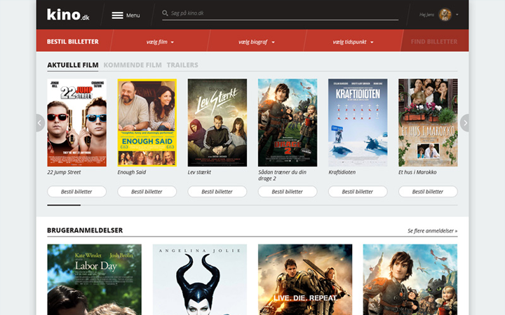
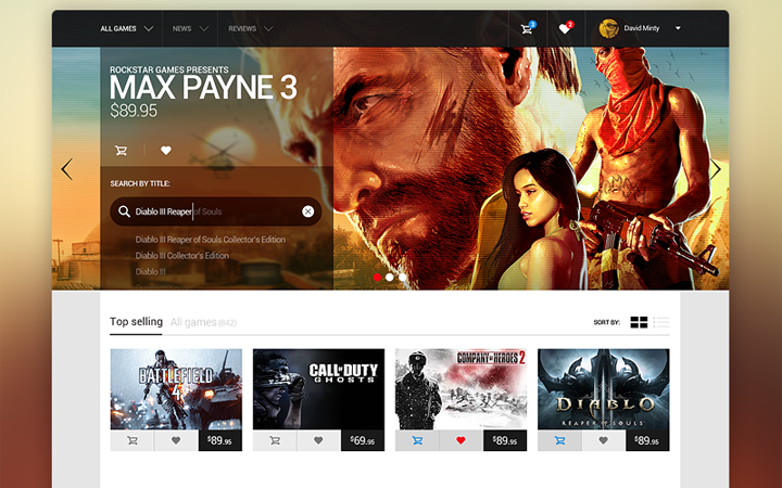
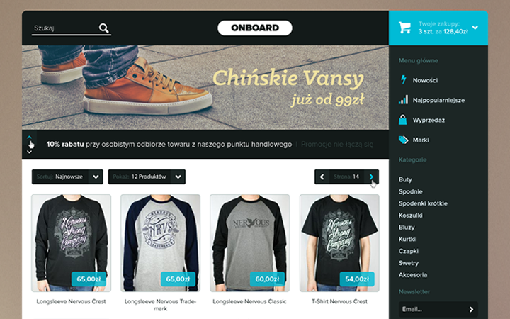
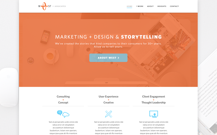
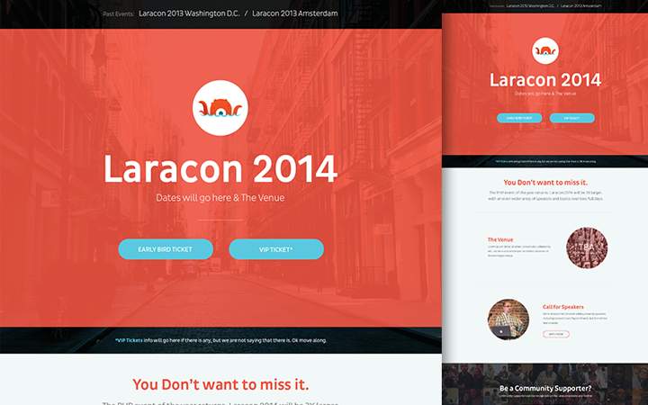
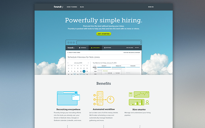
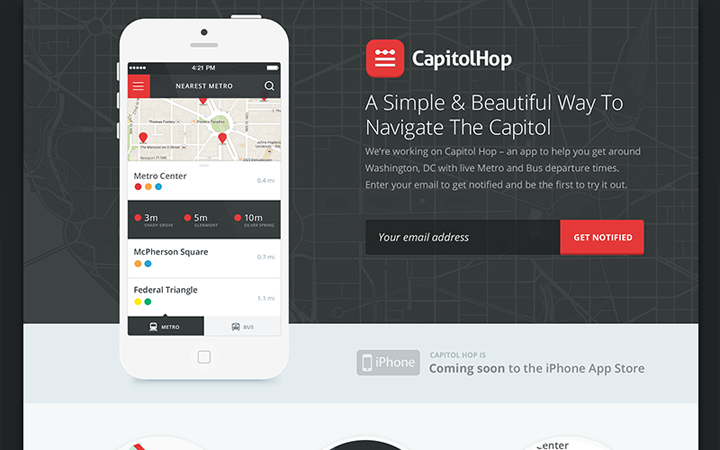
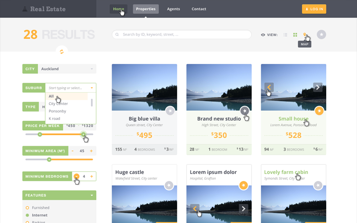
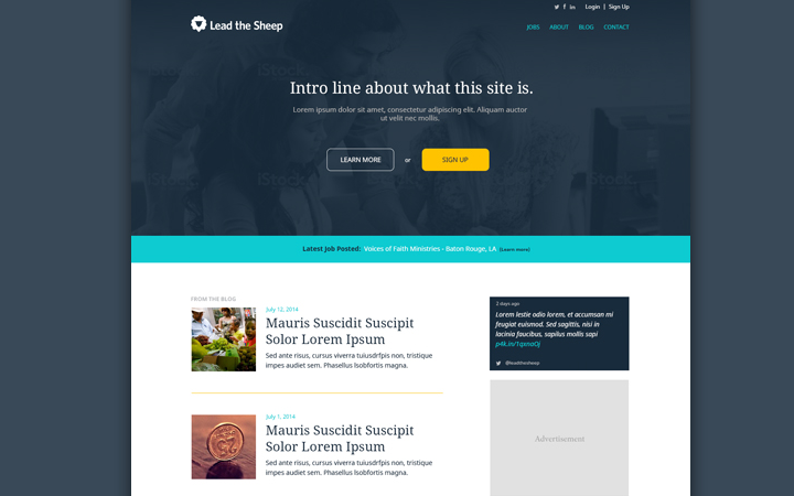
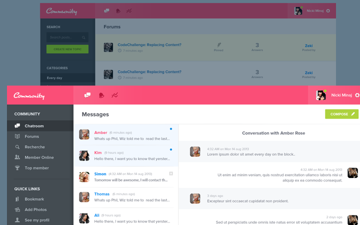
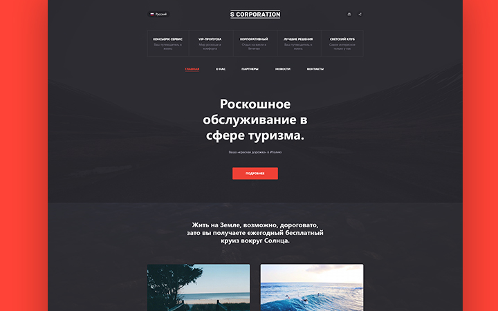
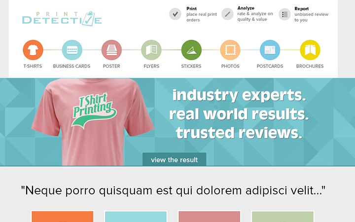
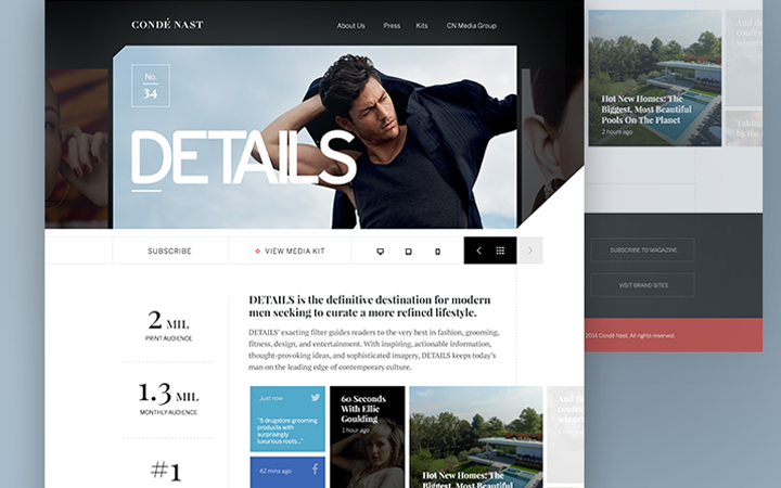
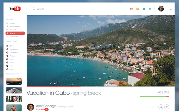
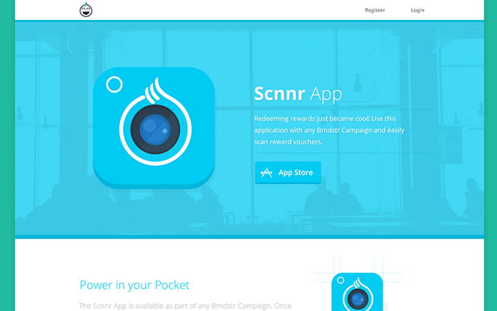
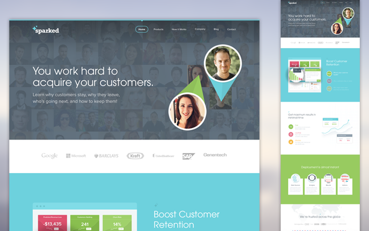
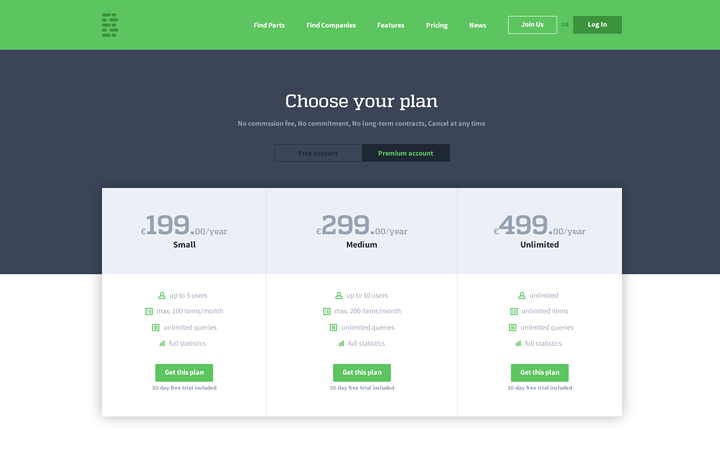
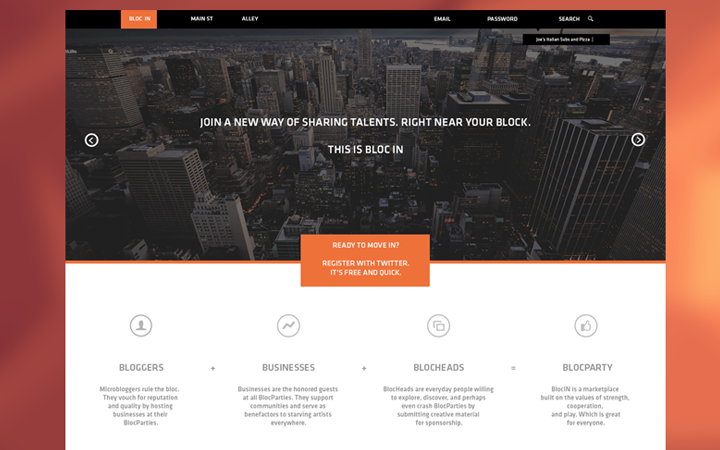
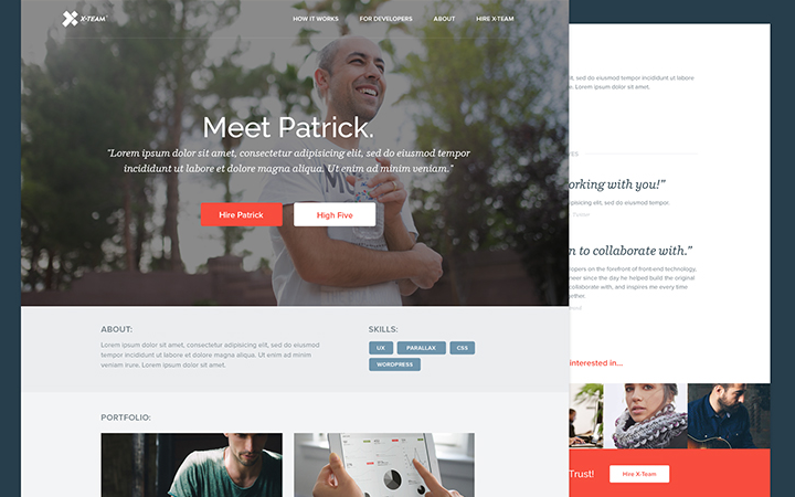
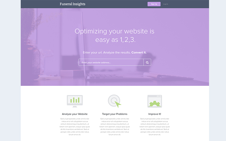
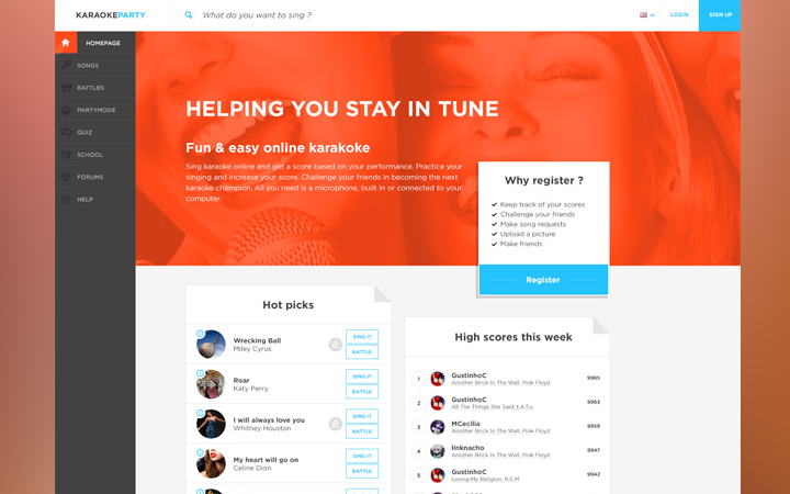
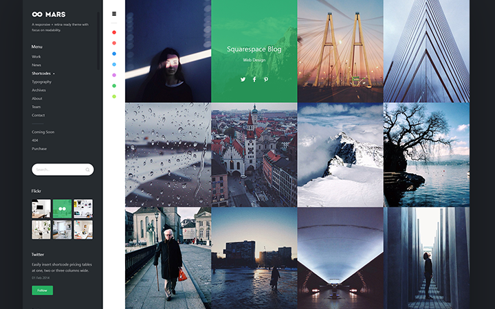
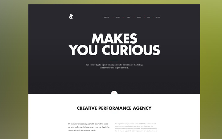
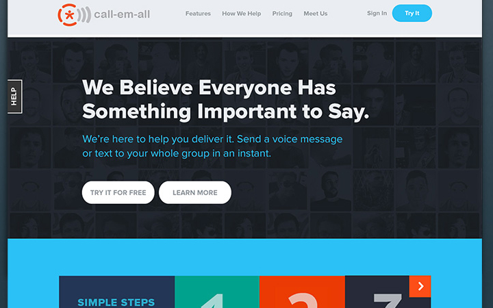
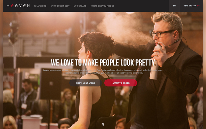
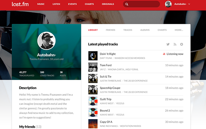
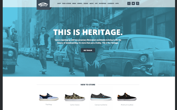
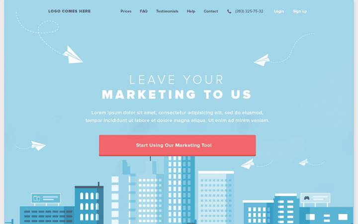
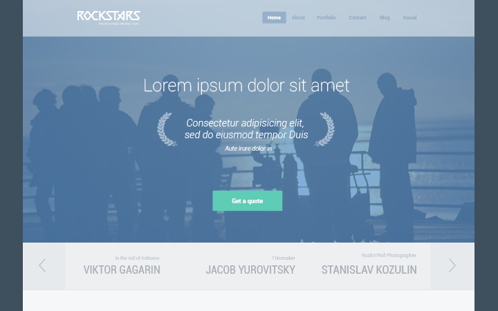
Well I say we should delve into the world of flat design and see exactly how this trend behaves on the screen. Take a peek at some of these website mockups created with flat UI design. This gallery is perfect if you’re trying to understand how to create your own flat elements and how to match everything nicely on a single webpage.

