The current trends that have really changed the whole concept of website design during the last few years seem to be set to stay at least for the coming year. We have seen the rise of trends such as vertical scrolling, flat design, retro or minimal color schemes, slideshows including animation or video and, of course, responsive or mobile first design.
More recently we are seeing transparency and long shadows making a move into website design. In this round up of award winning portfolio design, we can see how these trends have made a big impact and a huge difference from the skeuomorphic designs of a couple of years ago and the busy, glossy designs that were popular not so very long ago. The continually growing use of mobile devices is pushing design in a direction that is really being forced on designers. Now it is their remit to inject as much creativity as possible into these somewhat restraining trends.
Award Winning Portfolios
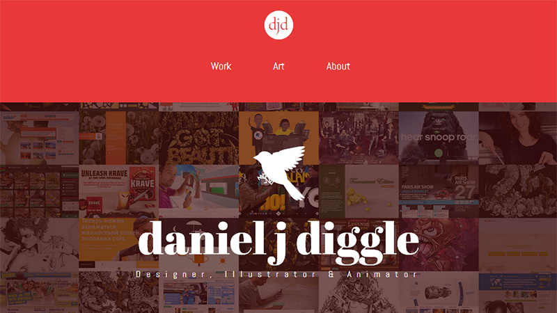
Daniel J Diggle
CSS Design Awards Site of the Day January 5th, 2013
This portfolio incorporates many of the current trends and it does so seamlessly. There is a grid-based layout on the landing page, clicking on the Work link takes you to a horizontally scrolling slider, and the About page is very clean and minimalist. Many good reasons for this portfolio winning the Site of the Day award.
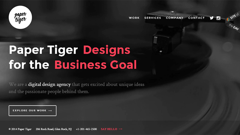
Paper Tiger Agency
Awwwards Site of the Day January 1st, 2013
The typographic message on the landing page of this site has 2 lines of text, and the red text changes. The first line has white, static Paper Tiger, and the red text cycles through the words: Develops/Consults/Designs. The second line has white, static: for the, and the red text cycles through the phrases: Brand Message/Business Goal/User Experience, so the whole sentence makes sense with any combination. There is an animated vinyl record playing in the background image – very retro indeed! Overall, a well thought-out home page, designed with a minimal and smart black, white and red color scheme.
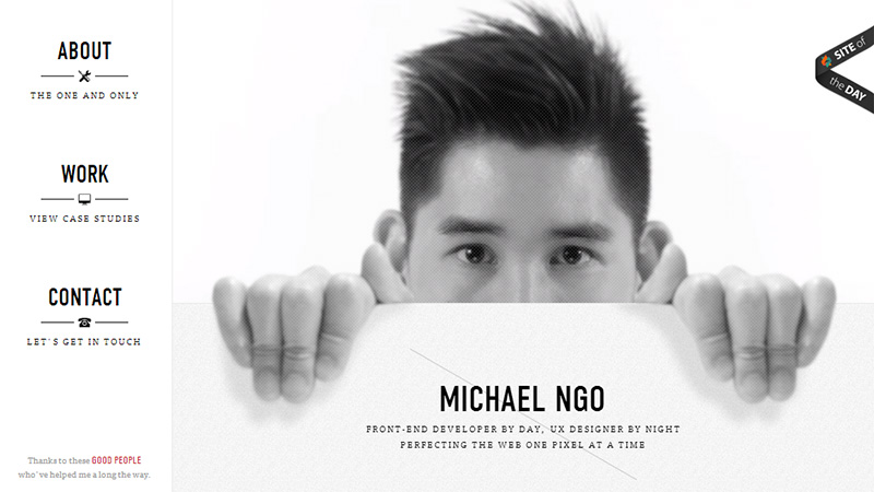
Micheal Ngo
Awwwards Site of the Day December 31st, 2013
This is a single page, vertical scrolling portfolio. The image of the designer on the landing page is animated – he moves a little and blinks his eyes. As you scroll down the portfolio itself is presented in a black and white grid-based style, and after the contact form at the end of the page, the designer’s legs and feet appear, giving the overall impression of him holding up his single page site! A worthy Site of the Day winner.
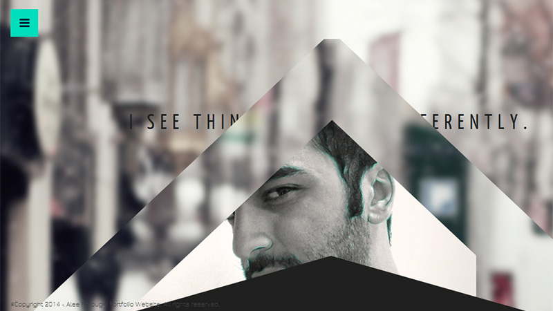
Alee Foroughi
CSS Design Awards Site of the Day December 26th, 2013
This portfolio site has some beautiful vertical scrolling effects, and includes a grid-based layout in triangular shapes. The whole site is really quite minimalist in presentation, and very nicely put together.
Etec Minds
CSS Design Awards Site of the Day December 12th, 2013
The landing page of this site is a slightly animated image of the Etec Minds office. The home page has some nice vertical scrolling effects and has a pleasant, flat design. It is not a responsive design, but there is a mobile version of the site.
Fixate
CSS Winner Site of the Day December 9th, 2013
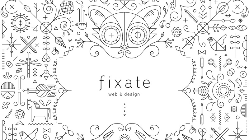
The Fixate home page design has the ‘wow factor’ in spades! Line drawings cover the landing page, and as you scroll down the page there is more line drawings, a thin sans serif font fits beautifully with the theme, and although busy, it still manages to appear quite minimal. Totally flat and completely responsive. It really deserved it’s Site of the Day award.
Departement Creatif
Awwwards Site of the Day December 8th, 2013
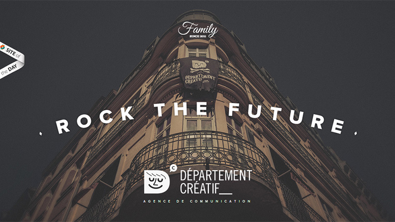
This is an infinite scrolling site. It is flat in design and responsive. It has a grid-based layout for their work showcase, and is a very well constructed portfolio.
Antro
Awwwards Site of the Day November 27th, 2013
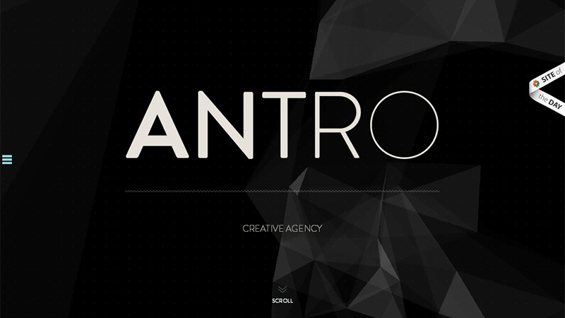
This site has an animated landing page with flying geometric shapes. As you scroll down, the design is very minimal and flat. There are 4 slideshows, and if you click on any of the slider arrows, the slideshow expands to full page size. As soon as you scroll again, the slideshow returns to it’s original size. Beautifully presented and creatively constructed portfolio.
Elegant Seagulls
Awwwards Site of the Day November 20th, 2013
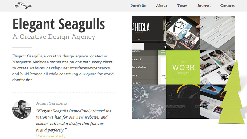
Yet another vertical scrolling site with some animations on the landing page, although the transitions are not perfectly smooth. As you scroll down, once again, the design is flat and includes some grid-based presentations. This portfolio is fully responsive.
Teamgeek
CSS Design Awards Site of the Day November 16th, 2013
The Teamgeek portfolio is a showcase of everything that is currently trending: vertical scrolling, flat design, retro/pastel color scheme, minimal, grid-based layout but not responsive although there is a mobile version of the site.
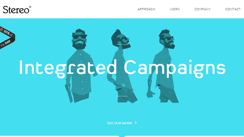
Stereo Creative
Awwwards Site of the Day October 13th, 2013
This portfolio is again a vertical scrolling site. The landing page has a slideshow, and as you scroll down there are large blocks of retro colors that are presented in a flat design. Not responsive, but there is a mobile version of the site.
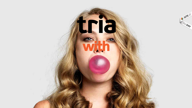
Tria
Awwwards Site of the Day October 12th, 2013
When you land on this site you have to ‘set it in motion’ by hovering you mouse over the page. Then you see an animation of a girl blowing bubbles with bubble gum. Click anywhere on that page and you are directed to their About page which is white text on a black background. This site is very creative and different and a worthy Site of the Day winner.
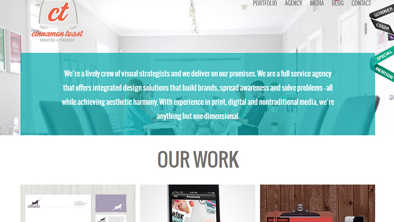
Cinnamon Toast
CSS Design Awards Site of the Day September 21st, 2013
The landing page of this site has a kind of manic video clip of the office workers. This is a parallax scrolling site, where the video at the top remains in place and the content below moves up and over it. A quite different design and a refreshing change from the current trends! But the site is fully responsive.
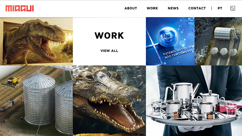
Miagui
Awwwards Site of the Day September 12th, 2013
Another site incorporating many of the current trends such as vertical scrolling, grid-based layout, flat design – but not responsive, and the site is not available for mobile, only PC or tablet.
Abbey Putinski
Awwwards Site of the Day September 7th, 2013
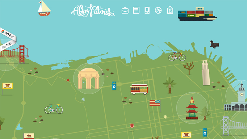
This portfolio is presented as a series of Adventures – which is a nice way to look at your projects! The design incorporates flat design and transparency. If you close the panel on the landing page, you find yourself on a map that you can move around… I’m not quite sure if this is a map of a country, and area or in fact, the world – but it goes on forever! This site is responsive.
The Big Bad Wolf
CSS Design Awards Site of the Day September 7th, 2013
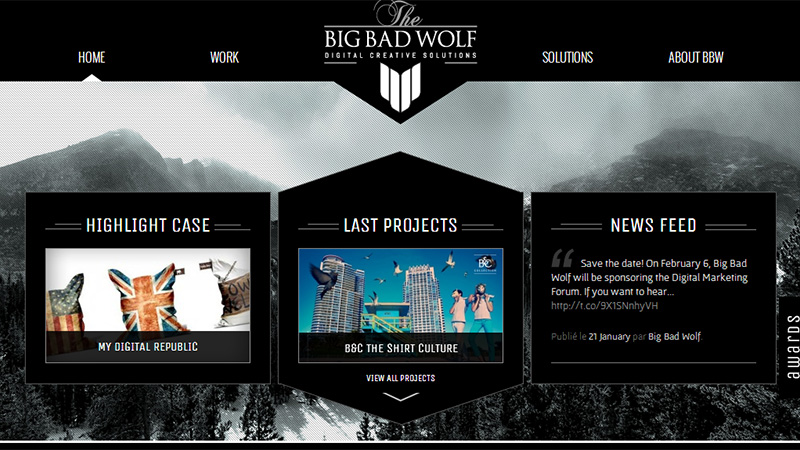
Grids, grids, grids for this website design – every page has some form of grid-based layout, and the site is presented mainly in a black and white color scheme. Very appealing indeed.
Moving Things Design
Awwwards Site of the Day August 31st, 2013
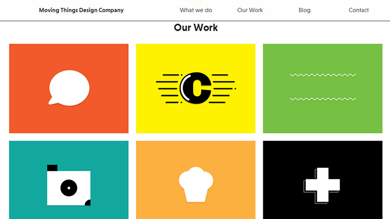
This site really is a showcase of the current trends… flat design, vertical scrolling, fully responsive, grid-based layout, large blocks of solid color… what more could a design need? A very well constructed portfolio and very worthy of its Site of the Day award.
Agence XY
CSS Design Awards Site of the Day August 19th, 2013
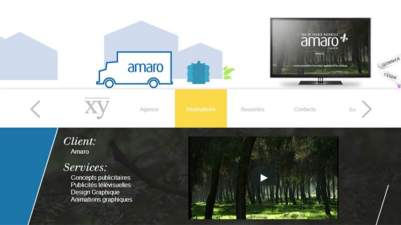
This site has some beautiful transitions on some of their pages. Although there are quite a few photographs included, the design is generally flat and is fully responsive.
Sixty FPS: Boris Etingof
Awwwards Site of the Day August 2nd, 2013
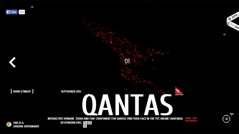
This is a Chrome experiment and needs to be visited to be appreciated. The slideshow has flying starfields that zoom in and finally make an image of the logo of the client. You can then view the project live online.
Nique Woodhouse
CSS Design Awards Site of the Day July 29th, 2013
The thing about this site is the very different navigation approach – you drag the screen around holding down the left button of the mouse, and there is a small navigation map in the top right corner to show you where you are. It takes a bit of getting used to, but is certainly very creative. This site is not responsive, but there is a mobile version of the site.
Lucas Nikitczuk
Awwwards Site of the Day July 28th, 2013
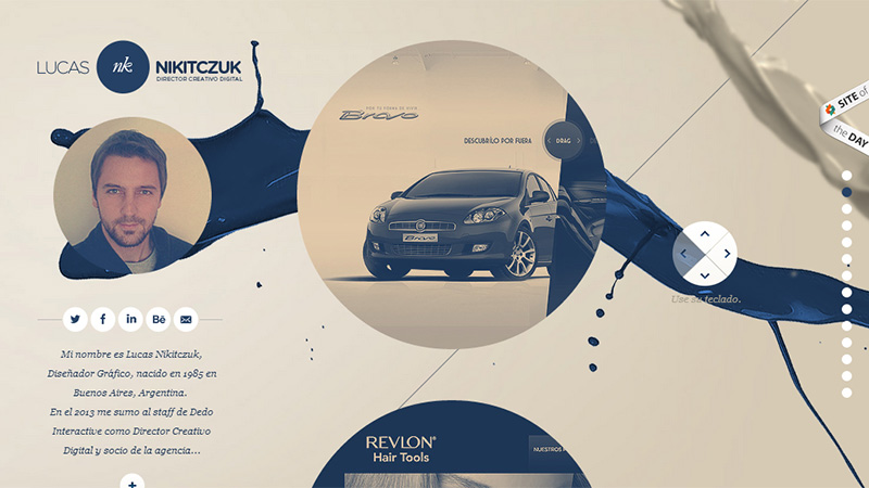
This is a parallax scrolling site, the image of the designer and his bio stay in place as the circles with his featured projects move on scrolling. A flat design, fairly minimal and fully responsive.
The Secret Handshake
Awwwards Site of the Day July 21st, 2013
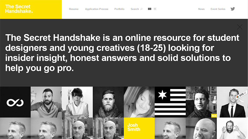
This portfolio site features a grid-based layout, large typography and flat design. It is also fully responsive.
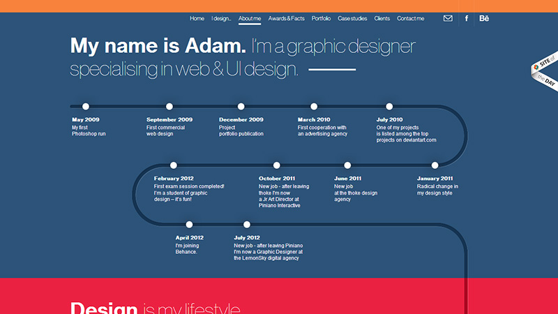
Adam Rudzki
Awwwards Site of the Day June 7th, 2013
Here is another site that features quite a few of the current web design trends: vertical scrolling, flat design, large blocks of color, grid-based layout – but not responsive, and no mobile version of this site.
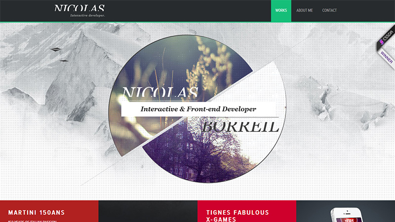
Nicolas Borreil
CSS Design Awards Site of the Day June 7th, 2013
This is a vertical scrolling site. The landing page image has a small amount of animation, with birds flying around the image. As you scroll down, the rest of the site is a grid-based layout. Flat design, but not responsive, but with a mobile version of the site.
Conclusion
We have seen these trends appearing over the last few years, some have been around for a while, others are quite new and may not survive the test of time. Creativity is actually becoming more difficult to inject into a website design with the increasing need for responsive and flat design. As we can see from some of the examples above, responsive design has been neglected in favor of the required presentation. Most do, however, have a mobile version of their sites, but if you want to keep it easier with mobile first or responsive design, some artistic creativity has to fall by the wayside.
Do you think the flat and responsive trends are here to stay? What do you think could be introduced to enhance such designs? Perhaps transparency and long shadows are steps in that direction. Please share your opinions on web design trends with us in the comments section below.

