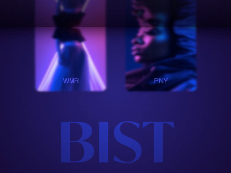
The other day I was marvelling over this amazing animation by Jurica Koletic that he made for Hot Type. It’s very much skeuomorphic and sorry, but I’m a total sucker for that! So I tried recreating this little effect on a grid where we show a reflection at the top of the page. It’s really just a small effect, anyway, I hope you enjoy it and maybe it sparks some new ideas 🙂
To do the reflection, we can use a clone that is mirrored using a negative scale value and then scroll that clone at the same time we scroll the page.
To create the shading, we overlay a pseudo element on the body, covering the reflection part:
body::before {
	content: '';
	position: fixed;
	top: 0;
	left: 0;
	width: 100%;
	height: calc(var(--rheight) + 1px);
	pointer-events: none;
	z-index: 2000;
	background-image: linear-gradient(0deg, rgb(0 0 0 / 68%), rgb(15 10 23 / 62%));
	box-shadow: 0px 0px 10vh rgba(0,0,0,0.8);
}
There’s a lot of cool things you can try when scrolling, like animating a filter (see demo 2) and translating in 3D.
This is how it demo 1 look like:
Hope you enjoy this! Thanks for having a look 👀
