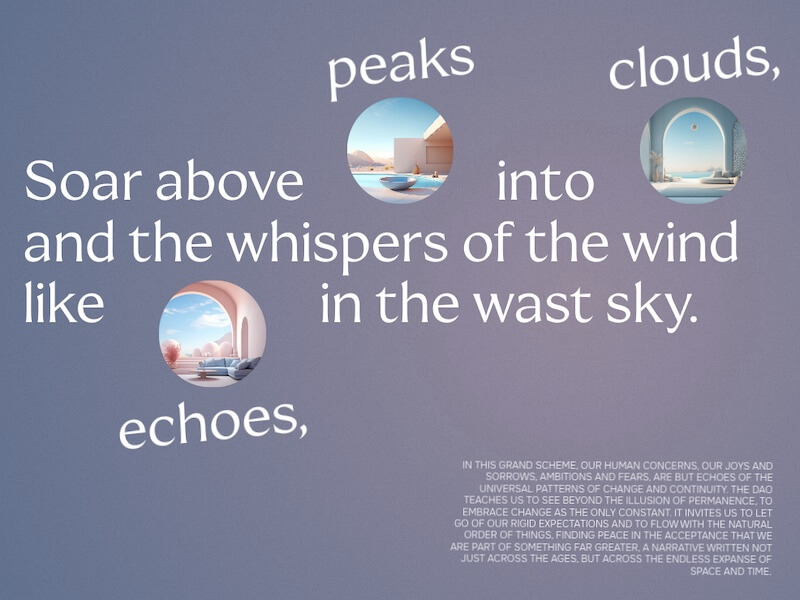
An animation experiment where we expand an image within some typographic element on scroll.
Today I’d like to share a little effect with you that got inspired by this video of a billboard ad:
A video expands and pushes some text away. I thought this would be fun to experiment with and try out different typographic layouts to push things around, on scroll.
So here’s my attempt (highly experimental). Of course, these kind of effects and layouts are kind of bound to how big the words are. Every layout is unique and depends on this context, so probably this would be interesting for big type that we can control with relative sizing. Responsiveness is quite tricky here.
Hope you like this little demo and draw some inspiration from it!
