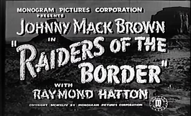
1. History of Movie Title Design
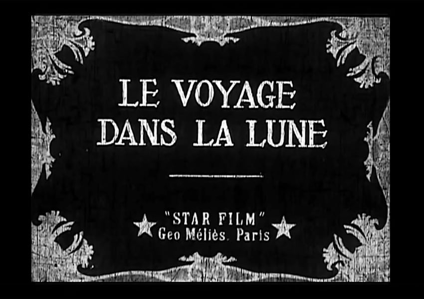
A Trip to the Moon was the first film to feature a logo in the title card. The original movie logo featured an Art Nouveau font, rightly so since it was released in 1902. Reinforcing the Art Nouveau style, the movie is a French science fiction film. While the logo doesn’t exactly say science fiction, it uses a font that for its time was a little out of the box.


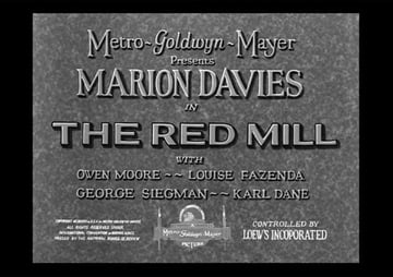
Movie title design was a central aspect of movies during the silent film era. The Academy first acknowledged the importance of this graphic element in 1929, honoring The Red Mill which impressed viewers with its readable typeface and Art Deco-style capitals, awarding the movie with Best Title Design.


With the introduction of sound, opening title sequences disappeared quickly. In the 1960s, however, Saul Bass brought back this graphic design skill with the introduction of color film, and graphic design was also hitting a new high in society/culture. North by Northwest and Dr. No changed the game forever.
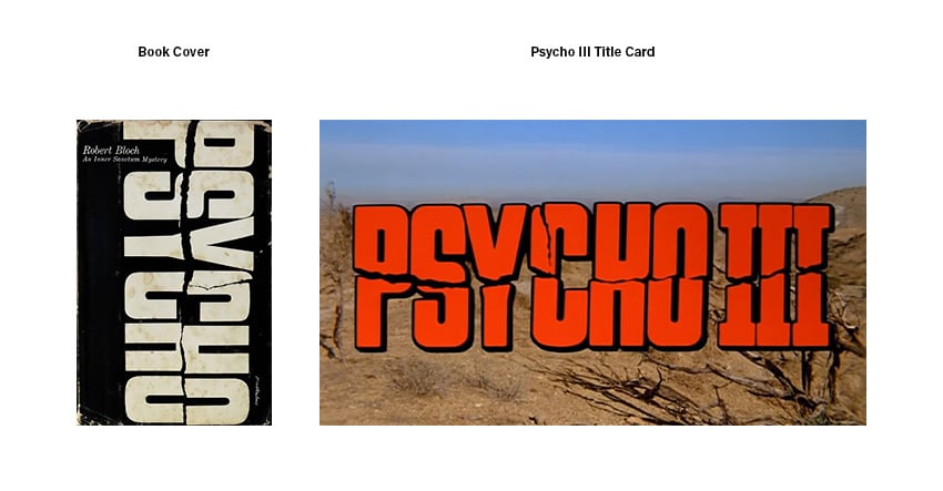
Psycho by Alfred Hitchcock has one of the most iconic logo designs, created by Tony Palladino. The lettering was first made for the book and later used for the sequel movies. The first movie title sequence was inspired by the slashed block lettering on the logo. The Psycho logo has been influential in the history of great movie logos. It’s simple, but it captures what the whole movie is about.


2. Logo Deconstruction
Compared to other commercial logos, logo designs for movies benefit even more from color psychology, classic design principles, and typographic rules. Encapsulating the energy and the story of a movie in a single logo can be a fun process. It’s about finding the balance between not giving everything away, working with cleverness, and appealing to the target audience. Let’s take a look at some great movie logos and deconstruct them.
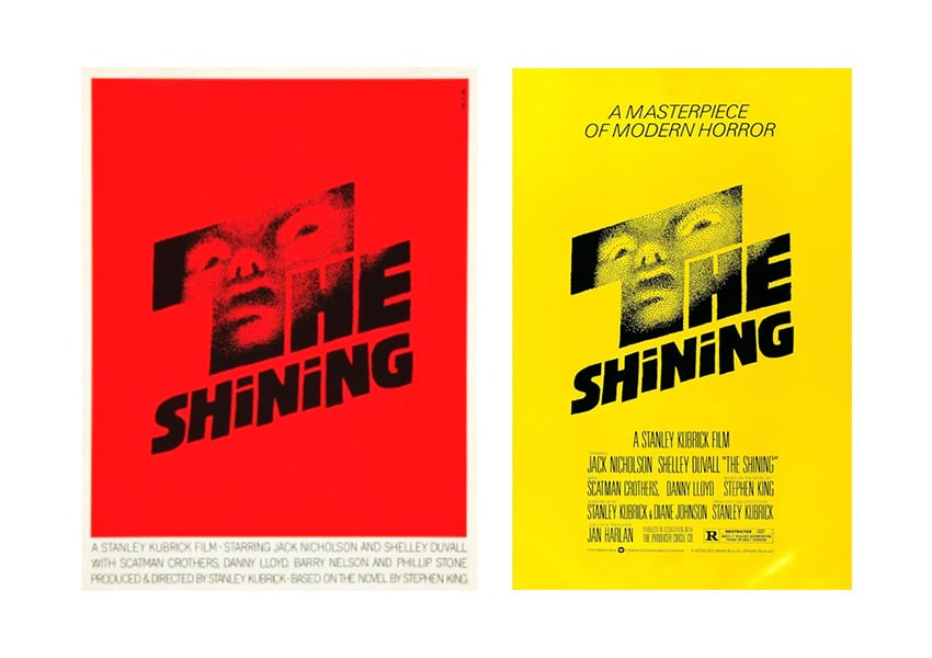
The Shining
This terrifying movie by Stanley Kubrick is regarded as a masterpiece. Saul Bass and his wife Elaine Bass designed the logo for one of the most terrifying movies of all time.
This is a great example of a conceptual logo aimed at evoking feelings of fear and curiosity. The font choice is blocky yet uneven—notice the two ‘N’s? By the looks of it, the logo was handcrafted, and the edges of ‘THE’ are fuzzy. It’s no coincidence that the two lowercase ‘i’s in the title look like eyes. They mimic the famous scene from the movie (“Here’s Johnny!”).
Remember how we said that a great movie logo should evoke the feelings of the movie? The slant also transmits sort of a shivering coldness, referring to the chilling atmosphere as well as the snow scene in the movie.
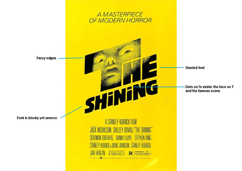


Saul Bass presented the poster with a red background, but Stanley Kubrick chose to go with a yellow background. It deviates from color psychology, but the poster still works.

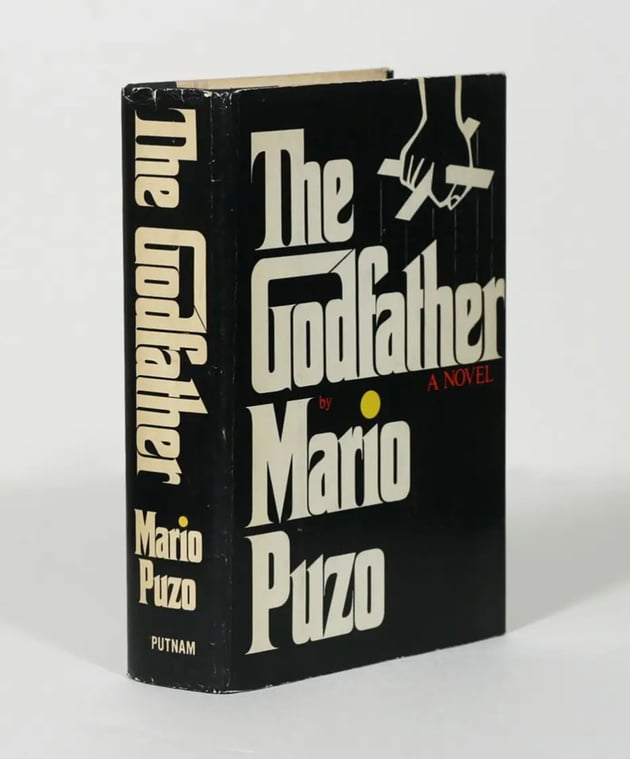
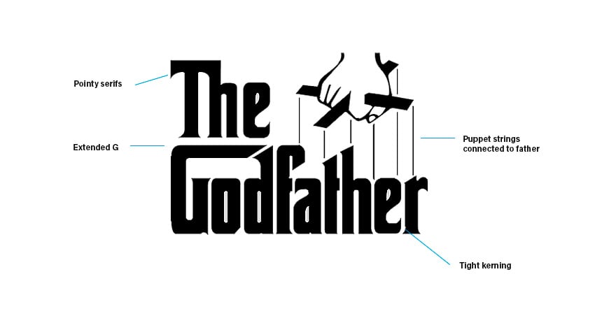
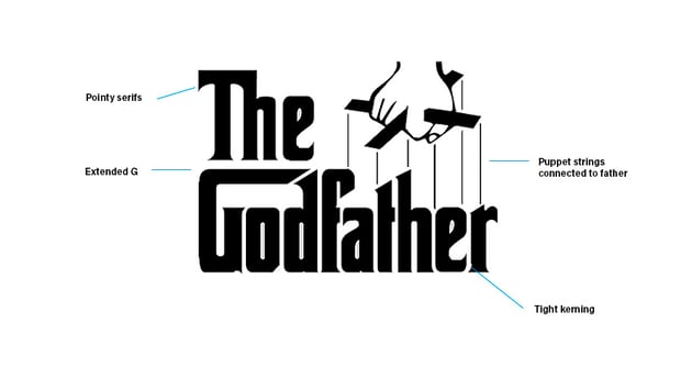
The Godfather
This is an iconic movie that had everyone talking about the cinematography and the characters. Neil Fujita designed the fonts used in the movie. Just like Psycho, The Godfather was a novel before being made into a movie, and Fujita designed the book cover.
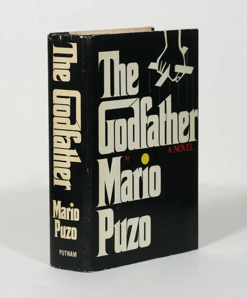

The designer extended the “G” to create a little house for God. For the rest of the logo, the font has sharp and pointy serifs, and it’s set with very tight kerning. The puppet strings indicate that Don Corleone is the puppet master. This is another example of a conceptual logo that shows cleverness and doesn’t give away the whole plot of the movie.
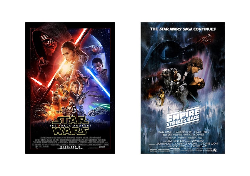
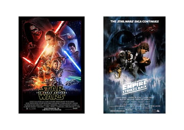
Star Wars
This space opera is one of the biggest franchises of all time, with plenty of sequels, and they’ve still managed to use the same logo since 1977. There were variations before the one logo we know today: the one on the left was designed by Suzy Rice before being slightly modified by Joe Johnston (right logo). Rice used techniques like a bold font, sharp lines, and sharp cuts to design the logo. The elongated ‘S’ and ‘R’ give the logo a futuristic look, which was later elongated by Joe Johnston. This feature brings to mind the long road ahead with the bend on both ‘s’s. Johnston also made other smaller but significant changes like dimensions and spacing.
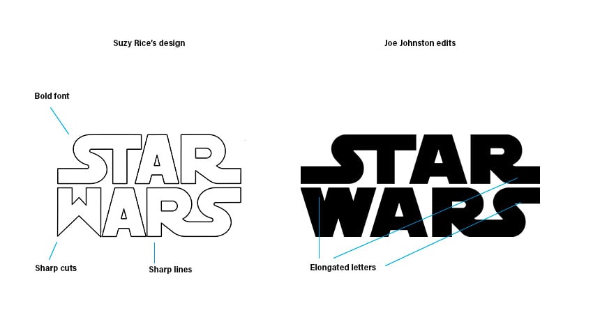
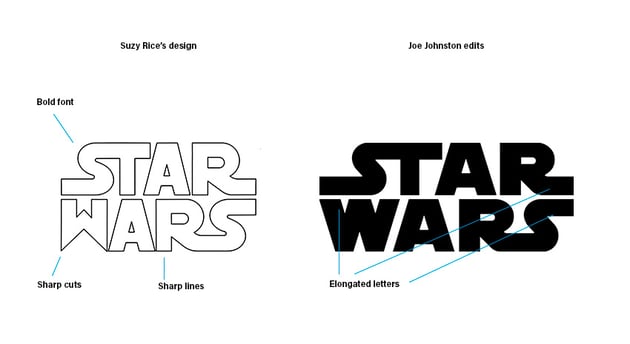
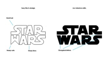
There have been quite a few variations of this logo, sometimes used only as a border or as a small feature but always maintaining the DNA. George Lucas requested that the logo have a more “fascist” look that evoked intimidation.

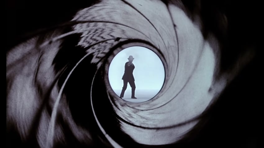
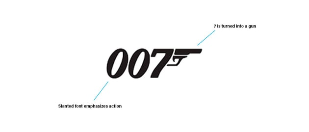
James Bond
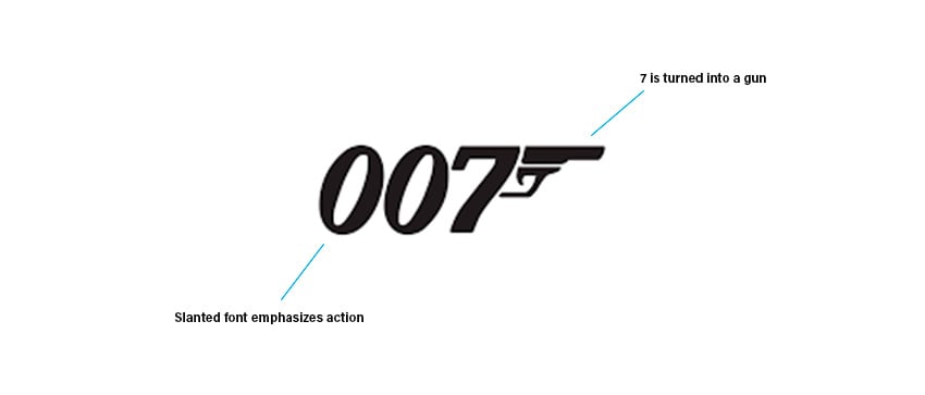
This iconic spy movie follows James Bond, a British secret agent operating under the codename 007. The design was conceived by Joe Caroff and has been interpreted in various sophisticated ways while still maintaining its DNA. The logo concept takes inspiration from the essence of all James Bond movies as the ‘7’ is turned into a gun.

The logo is simple and short but instantly recognizable. While the logo only shows “007”, it’s still recognized as the James Bond logo. As for the font, it has changed a few times from Roman to slanted—the difference between these two is that Roman-style fonts tend to look more stable. Using a slant or italic font emphasizes movement, and when it comes to spy movies, movement and action are everything.
Jurassic Park
This movie is the ultimate classic from the 90s. The T-Rex was designed by Chip Kidd, who was inspired by a visit to the museum when he came across a giant skeleton. He came across an illustration of a T-Rex on a souvenir book and photocopied it. Using pencil and tracing paper for the famous T-Rex silhouette, Chip Kidd gave life to this famous logo. Later on, Mike Salisbury and his team added a bit of jungle at the bottom to give a bigger scale to the dinosaur. The scale of the T-Rex emphasizes adventure and danger. The logo is quickly recognizable and shaped like a badge—perfect for explorer’s gear.
The font used for this logo is Neuland, which Salisbury redesigned in his own way. The font is quirky, fun, and almost looks like chiseled stone, which goes with the theme. The red inline helps bring emphasis to the title, which could have struggled to compete with the big red background. All of this is contained within a yellow outline that helps to make a visual statement.


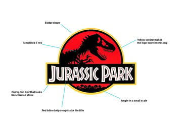
There are many small details on the illustration that could potentially get lost when printed, but it doesn’t take anything away from the iconic logo. This famous logo is not only the movie’s but also the theme park logo, so we can see it everywhere on souvenirs and merchandise throughout the movie.
Indiana Jones
This franchise is all about adventure. The font for the movie logo was designed by Mike Salisbury (who also designed the logo for the movies Halo and Moulin Rouge, as well as contributing to Jurassic Park above), and the logo was inspired by adventure films from the early 1900s and Western movies from the 40s and 50s. The logo was based on evoking a sense of adventure and mystery—reminiscent of early adventure films.
The logo is also meant to convey discovery, which is the heart of archeology and Indiana Jones movies. The logo is bold and set in block letters to represent the roughness that comes with adventure. The perspective on this logo is unlike any of the others we’ve seen—in this case, it helps achieve movement and action. Later on, designers David Willardson and Charlie White created the famous sunset gradient in the logo, similar to what you’d find on archeological expeditions.
Conclusion
So what makes a great movie logo? We’ve deconstructed several logos, so let’s take a look at the similarities that make a great movie logo:
- Excellent font choice: Choose a unique display font—one that conveys the movie plotline without saying too much. Display fonts are great for adventure movies, while many designers choose fonts like serifs for classic movies and sans serifs for movies that are more relatable to real life. Of course, these are just rules of thumb, and many designers break out of the box to create something unique.


- Exceptional typesetting skills are key in making a great movie logo: typesetting is the art of the detail. More specifically, we’re talking about arranging letters in a way that evokes the feelings of the movie. For instance, something as small as spacing can create an airy and expansive look, or type direction or slightly turning a letter can make a logo more playful.
- Type treatment and effects: Having a logo flat can create a strong impact, but adding effects can also reinforce the message or the plotline of the movie. This could be something as simple as a slash or glow, or over-the-top effects like the ones in superhero movies.


- Use simple design techniques and concepts to create a clever look. A slanted logo can create a sense of innovation and speed, for example.

Movie logos are a small window into a movie plotline without telling a full story. The best movie logos have made their mark in our culture and history by becoming some of the most famous and biggest franchises of all time. A great movie logo must be memorable, evocative, and clever. Franchise logos like James Bond, Indiana Jones, and even slasher movies have made their mark and are instantly recognizable.