In this tutorial, we’ll cover the challenges when working with the classic 100vh unit for making full-screen sections and discuss some great alternative CSS units.
Hero or full-screen sections are an integral part of UI design. They exist in different kinds of websites, from landing pages to portfolio websites, and aim to grab visitors’ attention in the first place. Common parts of a hero section are slideshows, images, videos, headlines, texts, call-to-action links, etc.
100vh
Over recent years, the easiest way to create a full-screen section has been to give it a height of 100vh, assuming its width is equal to the viewport width.


On desktop browsers, everything works as expected.
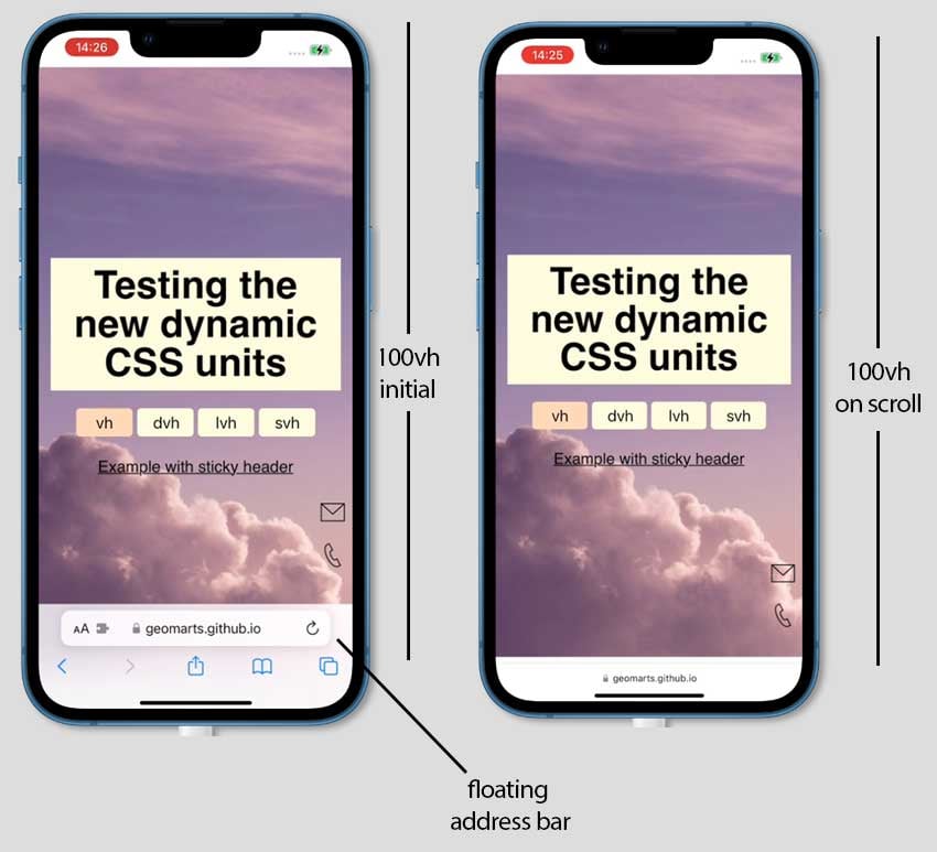
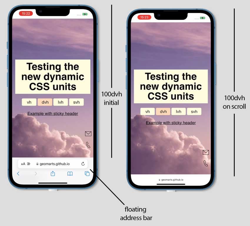
However, on mobile browsers, full-screen sections aren’t visible entirely by default. We can see them all only as we scroll, when the floating address bar of the user agent gets shrunk. Note that the address bar’s position can appear either on top or bottom.
This can lead to a bad user experience if, for example, our sections include vertically centered content or content like call-to-actions that sit at its bottom position and thus is initially semi-visible by the visitors.
To demonstrate that behavior, I’ve created a GitHub page that contains a full-screen section with a background image and vertically centered content.
Go ahead and visit that page from your mobile device. You’ll notice that the hero image isn’t fully visible by default.

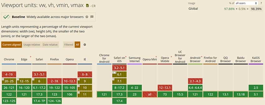
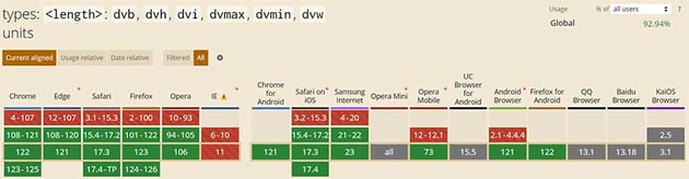
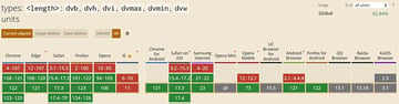
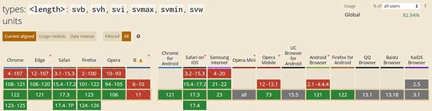
Thankfully, modern CSS provides some new viewport-relative units with great browser support (more than 90% at the time of writing) that help us solve this issue without relying on JavaScript solutions. Their behavior is the same as the 100vh on desktop browsers, as there aren’t any dynamic UA interfaces. Their behavior differs on mobile devices.
100dvh
The first of these units is the dynamic viewport height unit (dvh).
Here’s its definition in the W3C’s Working Draft document:
The dynamic viewport-percentage units(dv*) are defined with respect to the dynamic viewport size: the viewport sized with dynamic consideration of any UA interfaces that are dynamically expanded and retracted. This allows authors to size content such that it can exactly fit within the viewport whether or not such interfaces are present.
The easiest way to understand its behavior is to revisit our page and click on the dvh button to apply 100dvh to the hero section.

What you’ll notice is that, by default, the hero section will appear entirely. Then, as you scroll when the address bar collapses, it updates the section’s height and behaves like 100vh.
Nevertheless, as this unit always tries to match the viewport height regardless of the toolbar’s presence, it causes an instant jump/flash on the scroll and thus a repositioning on our centered content—that certainly doesn’t make it an ideal replacement for 100vh in most cases and can be disturbing to the user and/or costly in terms of performance.


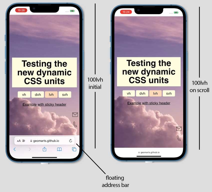
100lvh
Next, we have the large viewport height unit (lvh).
Here’s its definition in the W3C’s Working Draft document:
The large viewport-percentage units(lv*) and default viewport-percentage units (v*) are defined with respect to the large viewport size: the viewport sized assuming any UA interfaces that are dynamically expanded and retracted to be retracted. This allows authors to size content such that it is guaranteed to fill the viewport, noting that such content might be hidden behind such interfaces when they are expanded.
Again, the easiest way to understand its behavior is to revisit our page and click on the lvh button to apply 100lvh to the hero section.

What you’ll notice is that our section will behave exactly like when its height is set to 100vh. That said, by default, the hero section won’t appear entirely, but will do when the address bar gets shrunk.
In other words, this unit will always return the largest, visible viewport height that will occur on the scroll when the toolbar is the smallest one—that certainly doesn’t make it an ideal replacement for 100vh at the time of this writing as it doesn’t offer anything new.

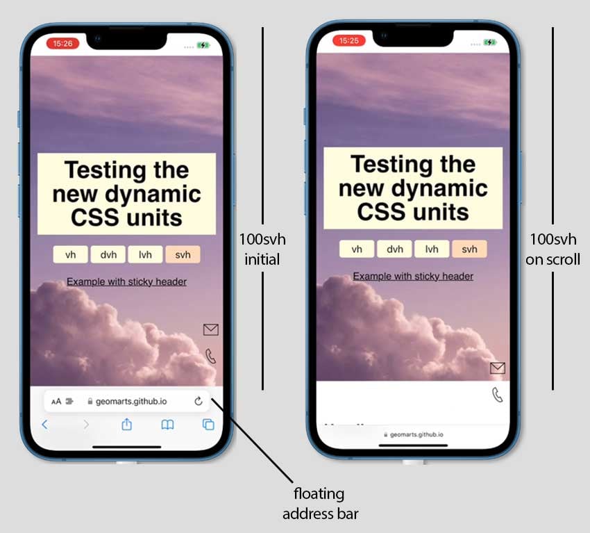
100svh
Finally, we have the small viewport height unit (svh).
Here’s its definition in the W3C’s Working Draft document:
The small viewport-percentage units (sv*) are defined with respect to the small viewport size: the viewport sized assuming any UA interfaces that are dynamically expanded and retracted to be expanded. This allows authors to size content such that it can fit within the viewport even when such interfaces are present, noting that such content might not fill the viewport when such interfaces are retracted.
Once again, please examine its behavior by revisiting our page and clicking on the svh button to apply 100svh to the hero section.

What you’ll notice is that our section will always be visible and behave like the initial state (before scrolling) of the 100dvh.
In other words, this unit will always return the smallest, visible viewport height that will occur when the toolbar is expanded—that certainly makes it an ideal replacement for 100vh at the time of this writing.


Fallback
If you’re satisfied with any of the previous units and want to use it but at the same time need a fallback to the 100vh unit just to be safer, try something like this old-school CSS:
1 |
.hero { |
2 |
height: 100svh; |
3 |
height: 100vh; |
4 |
}
|
In this way, non-supported browsers will ignore the first property value.
Conclusion
In this tutorial, we discussed the challenges of making truly full-screen sections across all devices when working with different viewport-relative units.
Let’s recap regarding the behavior on mobile browsers:
- Setting
100vhor100lvhto a section will produce the same result. The section will have a fixed height (unless we resize the viewport), but we won’t be able to see it entirely unless we scroll and the address bar gets shrunk. - Setting
100dvhto a section means that it won’t have a fixed height but will be recalculated as we scroll. As a result of that, elements inside that section might be repositioned. Its behavior can be useful under certain scenarios, but might be annoying for the user. - Setting
100svhto a section means that it’ll always have a fixed height (unless we resize the viewport) that will be equal to the initial viewport height (before we scroll)—when the address bar is expanded. The section will be fully visible by default just like the initial state of100dvh.
My recommendation, at this moment, is to create full-screen hero sections with 100svh and have a fallback to 100vh.
As always, thanks a lot for reading!