1. Test Your Site for Keyboard Accessibility
The most important goal of keyboard accessibility is to make every interactive element, such as links and form controls, available with the Tab key. This is how keyboard-only users navigate through a web page. Testing your website for keyboard accessibility is actually pretty easy: just press the Tab key and navigate from the top of the page to the bottom, highlighting active elements as you go.

Observe how easy or difficult it is to get to the main content with the tabbing keyboard method. Click a menu item, fill in a form, operate a slider, or follow your current position on the page. You can also test the reverse direction using the Shift + Tab keyboard shortcut.
2. Create Noticeable :focus Styles
CSS has a :focus pseudo-class that is triggered when a user clicks or taps on an item, or selects it with the Tab key. The :focus state only applies to focusable elements, namely <a>, <button>, <input>, <textarea>, <select>, and <area>.
Every browser comes with its own default :focus styles–usually a dotted black outline around the element, or a blurred glow, however many designers find it not to their taste and will completely remove it. This is actually the number one mistake that ruins keyboard accessibility on web pages. If you don’t like the default styles, use something that matches your website’s design.
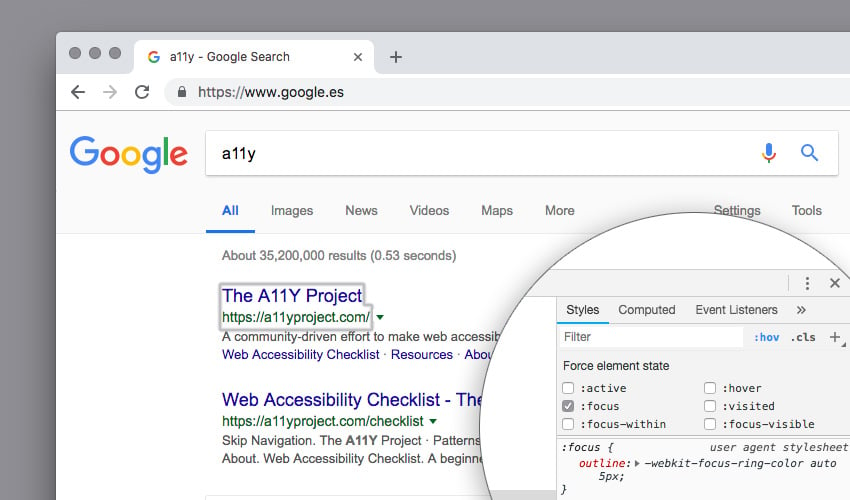
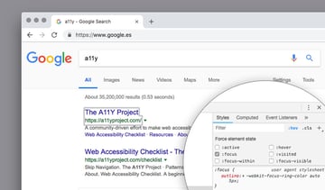
Choose a style that’s easily noticeable but doesn’t rely solely on colors. Here’s a possible example that can work well for keyboard-only users:
1 |
:focus { |
2 |
outline: 3px solid red; |
3 |
}
|
3. Create Keyboard Accessible Modals
Ensure that when a modal dialog opens, keyboard focus shifts to an element inside the dialog, typically the first focusable element or static element with tabindex="-1" if the content includes semantic structures.
Use Tab and Shift + Tab to navigate through elements within the dialog, ensuring the focus order is logical. Make sure the Escape key closes the dialog.
To configure this, you can use a <div> with role="dialog" for modals. Label the modal with aria-labelledby if it has a title, or aria-label for modals without a visible title. This aids screen reader users in understanding the modal’s content and purpose.
After closing the dialog, return focus to the element that invoked the dialog. If the invoking element no longer exists or if the workflow includes steps related to the dialog’s task, focus should be moved to an element that provides a logical workflow.
Keyboard accessibility shortcuts like these help those who use assistive devices navigate your website in a more logical way and without compromising their user experience.
4. Use Non-Color Designators for Links
Hyperlinks shouldn’t be distinguished only by color. This principle is usually mentioned in relation to visual accessibility, as people with low vision find the differences between certain colors difficult to discern. However, clearly visible links are also important for keyboard accessibility. Keyboard-only users should be able to spot links as quickly as possible. This helps them scan the page and figure out how to navigate to the part they are interested in.
Similarly to :focus styles, hyperlinks also come with default browser styling— blue underlines in most cases. However, designers frequently remove the underline and only use colors to indicate the presence of a link. If you remove the default underline always use another non-color designator that matches your website design, such as borders, icons, or outlines.

You can use the title attribute to describe a link’s content, but it only becomes visible when someone hovers the link. Keyboard-only users don’t have access to hover events, so never place crucial information in the title attribute. It also doesn’t count as a non-color designator. For example, never do this:
1 |
<a href="#" title="Important information"> |
2 |
Click here |
3 |
</a>
|
Instead, do this:
1 |
<a href="#" title="Repetition of Important Information or addition of some secondary details"> |
2 |
Important information |
3 |
</a>
|
WCAG 2.0 also warns about the accessibility problems of the title attribute. Either use it with care or don’t use it at all.
5. Use Native Control Elements
Forms are interactive elements, so they need to be accessible via the keyboard. Keyboard-only users should be able to fill in forms, press buttons, use range sliders, select options, and operate controls with ease. If you have any forms on your website you should test them one by one, using the Tab key. Think of signup forms, newsletter forms, login forms, comment forms, shopping carts, and so on.
The best way to create accessible forms is by using native control elements wherever it’s possible. Native control elements come with built-in keyboard accessibility, meaning they are focusable and respond to keypress events by default. They are as follows:
<button><input><textarea><select><option>
For example, you can create a keyboard accessible range slider with the following HTML:
1 |
<input type="range" min="0" max="10"> |
Keyboard users can first focus it with the Tab key, then move the slider up and down with Space.
If you need to use a non-focusable HTML tag for an interactive element for some reason, you can make it focusable with the tabindex="0" attribute. For instance, here’s a <div> turned into a focusable button:
1 |
<div role="button" tabindex="0"> |
2 |
Click me |
3 |
</div>
|
The role="button" attribute in the above snippet is an ARIA landmark role. Although keyboard-only users don’t need it, it’s indispensable for screen reader users and visual accessibility.
Even if the non-native button has been made focusable, it’s still inferior to its native counterpart in terms of keyboard accessibility. You’ll understand this immediately when you try to add an event handler to the button. Here’s what a click event listener looks like with the native <button> element:
1 |
<button onclick="alert('Hi, I am a native button!')"> |
2 |
Click me |
3 |
</button>
|
And, here’s the equivalent using the div button:
1 |
<div role="button" tabindex="0" onclick="alert('Hi, I am a non-native button!')"> |
2 |
Click me |
3 |
</div>
|
If you click the buttons using your mouse or touchpad you can see both alert messages. However, if you navigate to each button using the Tab key and hit Enter to process them, you will only see the first message, belonging to the native button. To make the non-native button process the keyboard input, you also need to define a keypress event handler separately:
1 |
<div role="button" tabindex="0" onclick="alert('Hi, I am a non-native button!')" |
2 |
onkeydown="alert('Hi, I am a non-native button!')"> |
3 |
Click me |
4 |
</div>
|
Now, when keyboard users hit Enter, they also see the message belonging to the non-native button. As you can see, it’s much easier and quicker to use the native version. So, unless you have a good reason for not using them, always use native control elements when working toward keyboard accessibility.
6. Add a “Skip to Main Content” Link
Adding a Skip to content or Skip navigation link to your web pages greatly helps keyboard-only users. In most cases, these users won’t want to jump through all the navigation links before they begin to read the content. This is especially true when they have a look at more than one page on your site. Just imagine, without a skip navigation link, they have to go through the same navigation links on the homepage every time. It doesn’t seem like a particularly entertaining activity.
To create a functioning skip navigation link, you need to bind it to the main content using the id and href HTML attributes in the following way:
1 |
<a class="skip-main" href="#main">Skip to main content</a> |
2 |
<nav>Navigation</nav> |
3 |
<main id="main" tabindex="-1">Main content</main> |
You also need to add the tabindex="-1" attribute to the container of the main content. This is the same tabindex we have used above to make the non-native button focusable. The tabindex attribute is used to modify the default navigation order. With a value of 0, it makes non-focusable elements focusable. With a value of -1, it also makes elements focusable but they become non-reachable with default keyboard navigation. Certain browsers, such as Chrome and IE, require the presence of tabindex="-1" on the target of the skip navigation link, so never omit it.
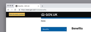
Reveal the Skip to Content Link Only to Keyboard Users
You can use CSS to make the skip navigation link visible only for keyboard users. In its default state, hide the link from regular users by positioning it out of the viewport. Then, reveal it for keyboard users by creating separate styles for the focus state that’s triggered when the user hits the Tab key.
You can see this effect in action on sites like webaim.org, www.w3.org, and (as usual) www.gov.uk:


The following CSS is a simplified version of the skip navigation code of NC State University’s IT Accessibility Handbook:
1 |
a.skip-main { |
2 |
left: -999px; |
3 |
position: absolute; |
4 |
top: auto; |
5 |
width: 1px; |
6 |
height: 1px; |
7 |
overflow: hidden; |
8 |
z-index: -999; |
9 |
}
|
10 |
a.skip-main:focus { |
11 |
left: auto; |
12 |
top: auto; |
13 |
width: 30%; |
14 |
height: auto; |
15 |
overflow: auto; |
16 |
margin: 0 35%; |
17 |
padding: 5px; |
18 |
font-size: 20px; |
19 |
outline: 3px solid red; |
20 |
text-align: center; |
21 |
z-index: 999; |
22 |
}
|
When the user hits the Tab key, the .skip-main element is given its focus state and the skip navigation link appears on the screen.
You can quickly test how it works if you click on the very top of the demo below and hit the Tab key. You may find it easier to open the demo below in full page view instead.
Next Steps
In this article, I shared some basic keyboard accessibility tips which you can implement using HMTL and CSS. There are other, more advanced things you could do for keyboard accessibility as well. For instance, you could:
In addition to these tips, avoid using CAPTCHAs where possible, as they have serious accessibility problems, both for screen reader and keyboard-only users. If you still need to use them, provide more than two ways to solve them, otherwise users with accessibility needs will struggle to process your forms. Let us know if you have any keyboard accessibility tips of your own!