Navigation menus are as important a part of a website design as any other. Instead of just throwing one into a site without considering what form it’ll take, designers should rightly take the time to consider the design of navigation menus, the space they take up on the page, and how users interact with them.
Popular for some time now, is the sticky menu. Sticky menus stay at the top of the browser window when the user scrolls down. This way, however far the user moves down the page, the menu will still be accessible, making it easier for people to navigate around the site.
When to Use Sticky Menus
Sticky menus aren’t always ideal. They’re best used on small, one-line menus that sit at the top of the page and have no submenus.
Here are some examples of effective sticky menus.
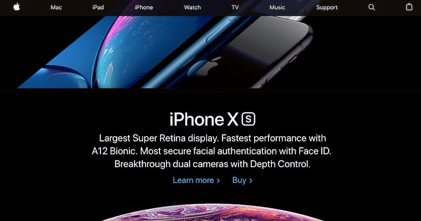
The Apple website has a simple menu with no drop-down elements. It takes up very little space at the top of the page so is an ideal candidate for a sticky menu.
The Ted Baker site also has a one-line menu which is sticky. In this case, the site uses a mega menu so it expands when you hover over one of the elements.

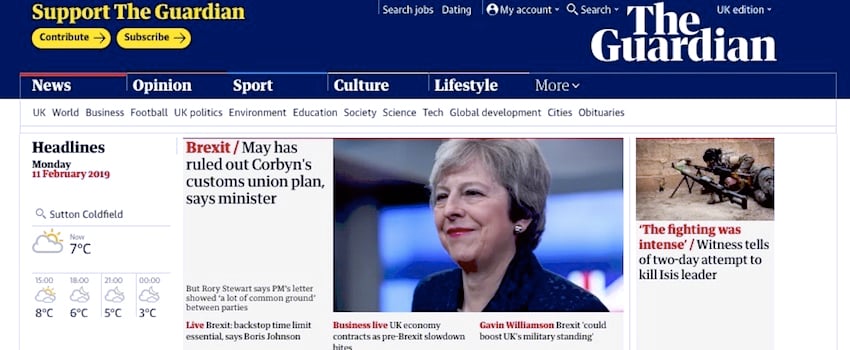
But there are cases where a sticky menu wouldn’t work. For example, the Guardian website has a large header with the menu below that. If the menu was made sticky, it would mean that it and the header took up way too much of the screen space.
The IBM site features a menu at the top of the screen with drop-down elements. This site doesn’t use a sticky menu, probably because of the drop-downs, which don’t always work well when added to a sticky menu.

The best time to use a sticky menu is when your navigation menu is at the top of the screen and is a simple, one-line menu. As you can see from the examples above, this can work with a mega menu, but you do need to handle that with care. If the user accidentally hovers over a sticky menu while scrolling down, and suddenly the mega menu appears, it won’t make for the best user experience.
Adding a Sticky Menu to Your Theme: Getting Started
Now let’s look at the code you need to use to make your navigation menu sticky.
You’ll need:
- A theme you can edit (see below).
- A development installation of WordPress—don’t try this on your live site!
- A code editor.
- Access to your theme files.
I’m going to be working on a theme I developed myself. If you’re using a third-party theme, make sure you create a child theme and add any edits to that. If you edit the third-party theme itself, you’ll lose your changes next time you update it.
The Starting Code
Here’s the site I’m going to be working on:

If I scroll down, the menu disappears:
I want to edit the CSS for the menu so that it stays at the top of the page when scrolled.
Here’s the code that adds my menu to the site, which is in the header.php file of my theme:
1 |
<div class="header-bg"> |
2 |
|
3 |
<header role="banner"> |
4 |
|
5 |
<hgroup class="site-name one-third left"> |
6 |
<!-- site name and description - site name is inside a div element on all pages except the front page and/or main blog page, where it is in a h1 element -->
|
7 |
<h1 id="site-title" class="one-half-left"> |
8 |
<?php if ( is_singular( array( 'rmcc_landing', 'rmcc_signup') ) || is_page_template( 'page-tripwire.php' ) ) { |
9 |
bloginfo( 'name' ); |
10 |
}
|
11 |
else { ?> |
12 |
<a href="<?php echo home_url( '/' ); ?>" title="<?php echo esc_attr( get_bloginfo( 'name', 'display' ) ); ?>" rel="home"><?php bloginfo( 'name' ); ?></a> |
13 |
<?php } ?> |
14 |
</h1>
|
15 |
<h2 id="site-description"><?php bloginfo( 'description' ); ?></h2> |
16 |
</hgroup>
|
17 |
|
18 |
<div class="right two-thirds"> |
19 |
<!-- This area is by default in the top right of the header. It contains contact details and is also where you might add social media or RSS links -->
|
20 |
|
21 |
<?php if ( ! is_singular(array( 'rmcc_landing', 'rmcc_signup' ) ) && ! is_page_template( 'page-tripwire.php' ) ) { ?> |
22 |
<a class="toggle-nav" href="#">☰</a> |
23 |
<?php } ?> |
24 |
|
25 |
<!-- navigation menu -->
|
26 |
<?php if ( ! is_singular(array( 'rmcc_landing', 'rmcc_signup' ) ) && ! is_page_template( 'page-tripwire.php' ) ) { ?> |
27 |
<nav class="menu main right"> |
28 |
<div class="skip-link screen-reader-text"><a href="#content" title="<?php esc_attr_e( 'Skip to content', 'compass' ); ?>"><?php _e( 'Skip to content', 'twentyten' ); ?></a></div> |
29 |
<?php wp_nav_menu( array( 'container_class' => 'main-nav', 'theme_location' => 'primary' ) ); ?> |
30 |
</nav><!-- .main --> |
31 |
<?php } ?> |
32 |
|
33 |
</div> <!-- .one-half right --> |
34 |
|
35 |
</header><!-- header --> |
36 |
|
37 |
</div><!-- header-bg--> |
This code contains a number of elements:
- the background to the navigation and header, which is full-width
- the header element itself, which has CSS for width
- the site title and description
- the navigation menu
It uses CSS from my theme for layout, floats, and colours, such as the .right and .left classes for floats.
Here’s the CSS for the main elements of that header banner:
1 |
.header-bg { |
2 |
background: #21759B; |
3 |
}
|
4 |
header { |
5 |
margin: 0 auto; |
6 |
width: 96%; |
7 |
max-width: 1200px; |
8 |
clear: both; |
9 |
padding-bottom: 1em; |
10 |
}
|
The elements that are floating next to each other (the site title and description and the menu) use CSS for floats and width that’s not specific to these elements:
1 |
.one-third.left { |
2 |
margin: 0 1% 0 0; |
3 |
float: left; |
4 |
}
|
5 |
.two-thirds.right { |
6 |
margin: 0 0 0 1%; |
7 |
float: right; |
8 |
}
|
Your styling will be different from this but will include styling for backgrounds, widths, and floats in some form. If you’re creating a child theme for a third-party theme, take some time to look over the existing stylesheet so you know what you’re targeting with your child theme CSS.
Making the Menu Sticky with Fixed Positioning
Now let’s add the code to make our menu sticky. The element I want to target is the .header-bg element, which contains everything else.
In your theme, find the element that represents the menu background or the menu itself if it isn’t wrapped inside anything else. There may well be a header element involved somewhere. This is why it pays to use a development installation of WordPress—you may need to experiment!
Once you’ve found the top-level element that needs to stick to the top of the page, add this to it:
1 |
.header-bg { |
2 |
position: fixed; |
3 |
top: 0; |
4 |
width: 100%; |
5 |
}
|
This does the job for fixing the menu to the top of the page, or making it sticky:

However, there is a problem. The menu is overlapping the content below it, at the top of the screen. When I scroll down this isn’t apparent, but when I scroll up to the top of my screen, the first line of text is hidden.
This is because the .fixed positioning for the menu has taken it out of the normal flow of the HTML as it’s rendered, meaning that the browser renders whatever HTML comes next at the top of the screen.
Let’s fix it. To do this, we need to add a margin to the top of the next element, which is a div with the class of .main. We also need to set a height for the sticky menu to ensure it will be equal to that margin.
To get this right, I need to interrogate the CSS for the elements inside the .header-bg element, so I can find out how the height is being computed.
The .header-bg and the header elements don’t have height set, and have top and bottom padding and margins of zero. If I drill down further, I can find the padding for list items within the menu:
1 |
#menu-navbar li { |
2 |
padding: 1em 5px; |
3 |
margin: 0; |
4 |
}
|
The font size for the text is the same as for the body element, so we can take that as 1em. This gives us a total height of the header bar at 3em.
Here’s the adjusted CSS:
1 |
.header-bg { |
2 |
position: fixed; |
3 |
top: 0; |
4 |
width: 100%; |
5 |
height: 3em; |
6 |
}
|
7 |
|
8 |
div.main { |
9 |
margin-top: 3em; |
10 |
}
|
Note that I’ve overqualified div.main instead of using .main. This is because this theme also uses the .main class on the main menu (nav.main). Whether this is necessary for you will depend on the way your theme’s coded.
The menu now appears above the content as it should:
And when I scroll down, the menu (and the rest of the header) stays fixed in place:
So that’s how you make your navigation menu sticky!
A Sticky Menu Can Enhance User Experience and Modernize Your Site
If your site has a simple menu at the top of the screen, making it sticky using this technique will make it easier for users to access it and navigate around your site, wherever on the screen they are.
But if your menu is very large, or it’s below header elements that will take up too much space, a sticky menu may take up too much space on the screen and detract from user experience.
It’s your call—but a sticky menu is easier to add than you might think.