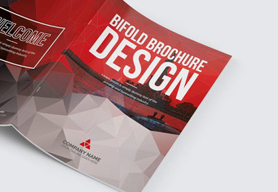
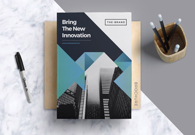
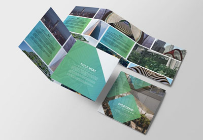
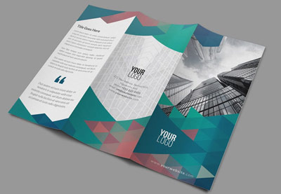
Brochures may be one of the oldest marketing tools, but they’re a tried and tested technique that all sorts of businesses use to reach potential customers.
A poorly designed brochure might be tossed in the trash, but a creative and beautiful one will be kept and pored over and can directly lead to sales for the business.
In this article, you’ll learn how to make a brochure that’s guaranteed to grab and hold someone’s attention. Read on to get to know your bifolds, trifolds, and everything in-between.
Looking for high-quality InDesign brochure templates that are ready to customize? You can find a huge range of stylish brochure design templates over on Envato Elements. If you need a single trifold brochure template for InDesign, check GraphicRiver.
Pick your favorite to download from these helpful roundups:
 Brochure45 Best Creative InDesign Brochure Templates (New for 2020)
 Resources25 Best Professional Brochure Templates
 Brochure27 Best New Brochure Templates for 2020 (Design Inspiration & Ideas)
 InDesign Templates23 Best Trifold Brochure Templates & Examples (Word, InDesign, & PSD)
1. How Many Types of Brochures Are There?
Here you’ll learn how to make a great brochure. But before you start designing, hit pause and think about the kind of brochure that will suit your brief best.
If you’re wondering how many types of brochures there are, the answer is that there are five main brochure designs: bifold, trifold, booklet, folders, and flyers. Here are some questions to help you choose the best:
- What industry is the company operating in?
- Are there particular types of marketing campaign that work best in this industry, such as door-to-door sales, attending conventions, or showroom presentations?
The format of your brochure should suit the marketing campaign perfectly. So, for example, a small, compact brochure design might work best for posting through front doors, but a more impressive booklet with a presentation folder might be more appropriate for conventions or showrooms.
Make yourself familiar with the huge range of brochure formats that you could choose from (yep, there are a lot!). These are just a few of the more common formats:
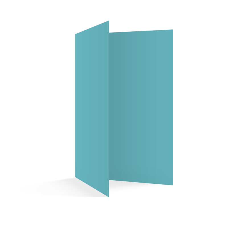
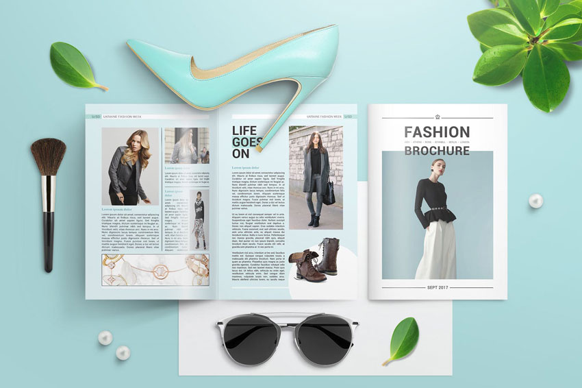
1. Bifold
A bifold brochure is folded just once, down the spine. They are easy to make, and have a formal feel to them as they mimic the design of books or booklets.
Great for: Pretty much anything!
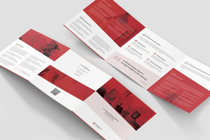
2. Trifold
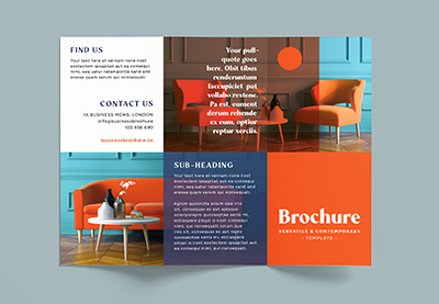
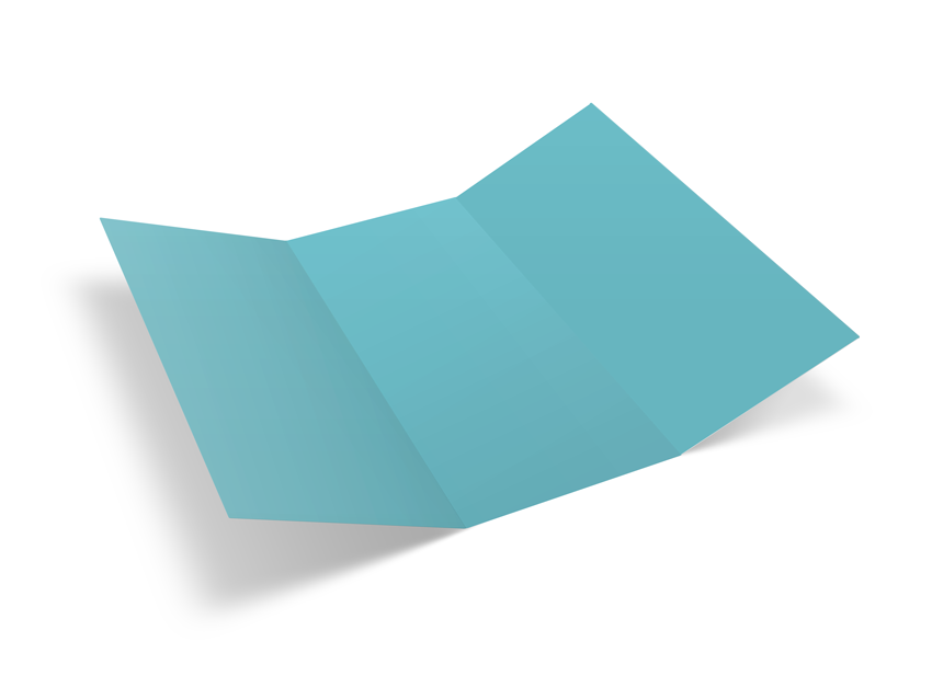
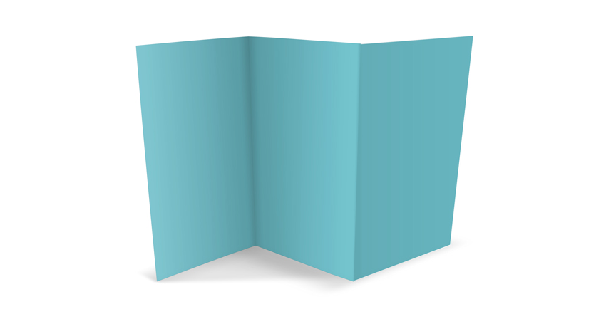
A trifold brochure has two parallel folds, splitting the brochure into three sections. Even when printed on low-weight paper, trifolds can stand up easily, making them a great choice for displaying at conventions. You can fold both folds inwards so that the left and right sections of the brochure sit on top of one another, or you can have one fold inwards and the other outwards to create an accordion effect, which looks very attractive.
Great for: Companies on small budgets who want a brochure that still looks great on display.
If you’re looking for a pamphlet template, why not check out our recommended InDesign pamphlet templates in the following article:
3. Booklets
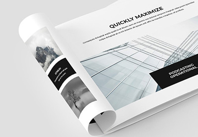
The big daddy of the brochure world, a booklet is really a group of multiple bifold brochures bound together into a larger book-like format. Booklets are more expensive to print, but they can make a big impression. You will need to choose how to bind your booklet from a range of options, such as saddle stitching, perfect binding, and spiral binding. Spiral binding is usually cheaper, but perfect binding or saddle stitching can make your booklet look much more polished and professional.
Great for: Big corporations who want a formal brochure design.

4. Folders and Inserts
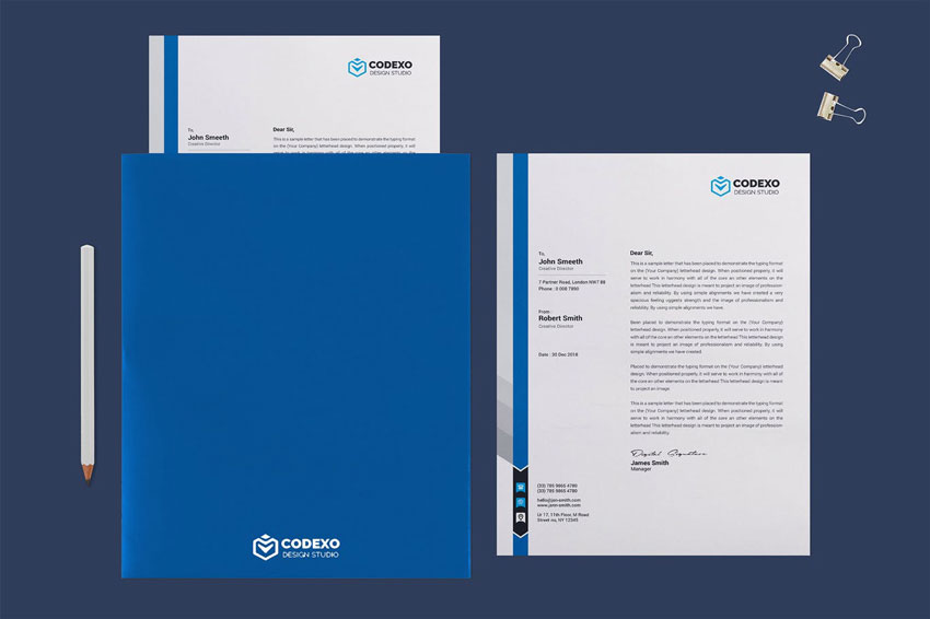
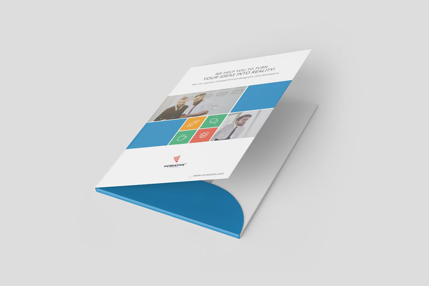
If you’re looking for something more formal without the bulk of a big booklet, consider creating a custom folder and an insert brochure, which is specifically designed to fit inside. This is a great choice for more corporate marketing events, and you can pop a business card inside too.
Great for: Educational organizations, like universities and schools, real estate firms, and companies attending conventions and industry events.
5. Flyers
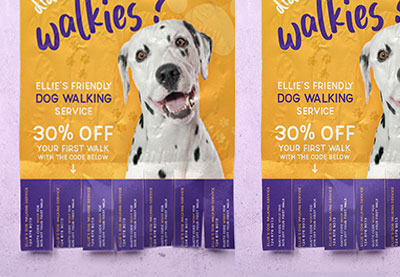
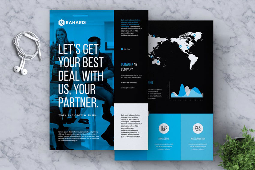
Flyers are the simplest form of brochure, and the cheapest to produce. Flyers are usually simple, one-sheet promotions printed on low-weight paper. They are ideally suited for reaching the maximum number of potential customers, but they are also the most likely type of brochure to be thrown away.
Great for: Events, like music gigs, club nights, festivals, and community meet-ups.
Above all, you need to remember that brochures are a marketing tool, so even if you’ve just been tasked with the design of the brochure, you need to have some idea of how the brochure is going to be used. Brush up on your marketing design skills with Nicki Hart’s course on Print Marketing Design.
2. How to Fold a Brochure
Unless you’re designing a one-page flyer, your brochure will have to be folded in some way, whether that’s as a bifold, trifold, or something more complex. Folds can be tricky to accommodate, but they can also enhance your design if you set them up in the correct way. That’s why it’s important to learn how to fold a brochure.
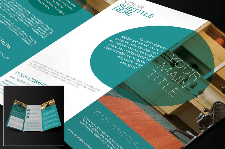
Because you’ll be initially designing your brochure as a 2D, flat layout, you need to make sure that the final brochure is going to look just as good when it’s printed and folded.
Before you start designing on the computer, it’s a great idea to put together a rough mock-up that you can scribble on and fold. This doesn’t necessarily need to be true to size—a smaller-scale version will still give you a good idea of where content should be placed.
If you’re going to be printing on a medium- or heavy-weight paper, like thick paper or card, you also need to consider that a fold can make the margins around it appear narrower, even if by just a millimeter or so. Experiment with folding different weights of paper to get a good idea of how the fold will behave—it may be a good idea to increase the margins around folds by an extra millimeter or two.
Tip: If you’re creating a trifold brochure (which has two folds on a page, effectively ‘splitting’ the brochure into three parts), make sure you double the margin space across a fold. If you include the same margin as you do around the edge of the page, the fold will slice the margin width in half, giving the layout a cramped, uneven appearance once folded.
Folds have the ability to conceal and reveal selectively. This means you can design a brochure that has multiple different ‘looks’, depending on how the brochure is folded, and whether it is open or closed.
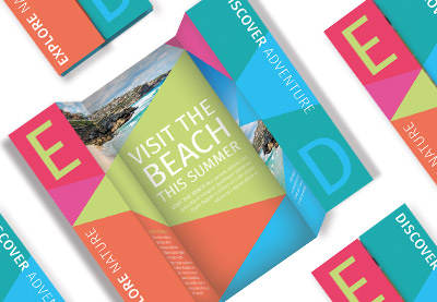
Take a look at the layout for this folded tourism brochure:
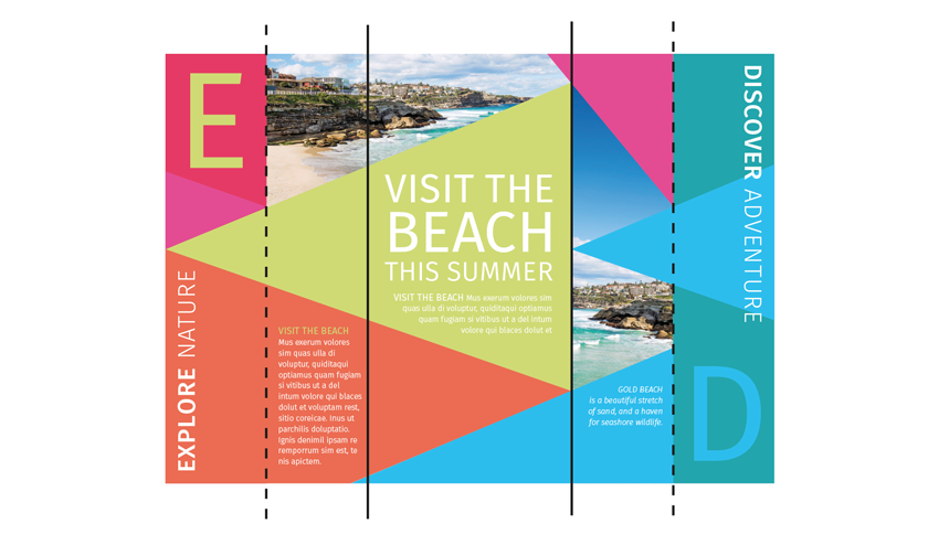
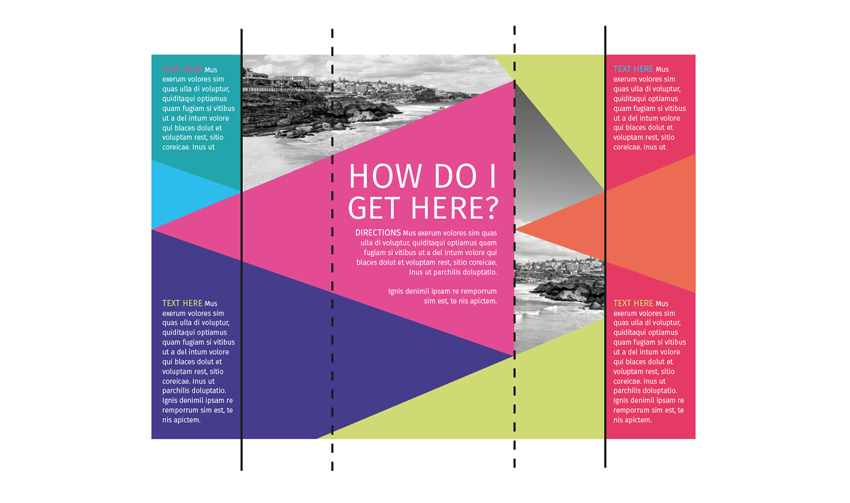
This brochure was created in CorelDRAW as a 2D layout. You can see how when the brochure is closed, the outside sections are drawn together, and the typography and triangular shapes have been designed to match each other.
When the brochure is opened up, the outside sections are drawn apart, revealing a different design. The triangular shapes still work together seamlessly, whether the brochure is opened or closed.
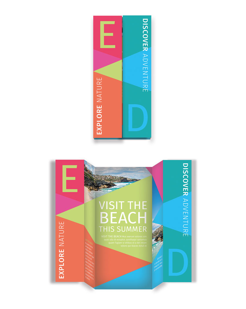
Creating a rough mockup will help you to visualize how these different fold combinations will affect the look of your brochure. Take my word for it, it’s well worth doing this before you begin designing on the computer!
Whether you’re using Adobe InDesign, Photoshop, or CorelDRAW, pull out guidelines from the workspace’s rulers to define the fold lines without the need to print them.
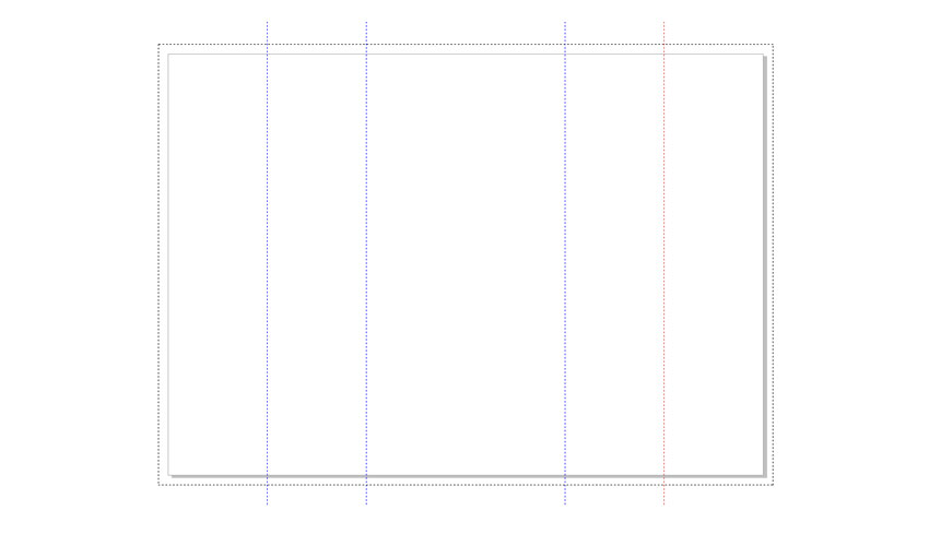
A printer might find it helpful if you also leave short lines on the bleed (if you’re supplying a print-ready PDF) or pasteboard (if you’re sending them the original artwork) to indicate where the brochure should be folded.
3. Think Outside the Box
Unlike other printed items like books, magazines, and posters, brochures are often seen as being instantly disposable by the reader. Because they are cheaply produced, brochures are rarely seen as something to be treasured, and more often than not end up in the trash soon after delivery to market.
How can you make sure that your flyer doesn’t instantly end up in landfill? Well, you need to think outside the box and make your design really creative and eye-catching.
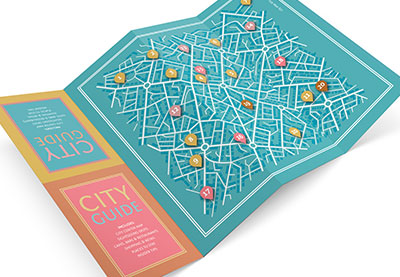
One way of doing this is to make your brochure into an unusual format or shape that people will want to keep. This folded city guide is a great example of how to condense a lot of information into a format that tightly folds up and can easily be slotted into someone’s back pocket.
It’s cute, practical, and non-obtrusive—great qualities to aim for in your own brochure designs.
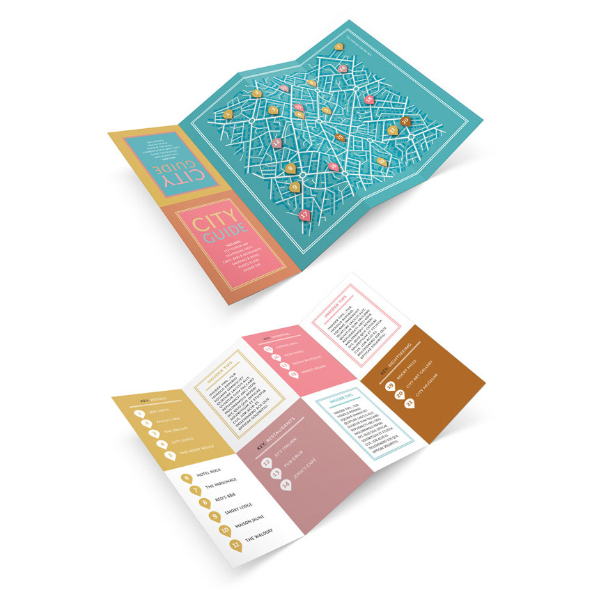
Why not try adapting the layout of this city map to your own brochure content? Giving your brochure an additional use, such as featuring a map or a calendar, is going to ensure that your brochure hangs around for longer in someone’s possession too.
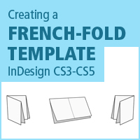
A simple fold technique to try that looks really effective is a French fold:

This results in a compact brochure that actually has a very simple one-sheet layout at its core. It’s the perfect way to get lots of information onto your brochure while keeping the design pocket-friendly.
You can also look into unusual print finishes to give your brochure an edge—metallic foiling or laser cutting might be more pricey, but they can be worth investing in to make sure your brochure translates into sales or attendees.
4. Be Bold!
A brochure is no place to be shy—to grab someone’s attention quickly, you need to create a bold, in-your-face design. Brochures may be smaller than posters, but headings and images should be blown up much larger than you would normally think.
Focus on making the cover of your brochure (the side that is visible when the brochure is closed) as bold as possible, and focus on formatting the graphics and typography for maximum impact.
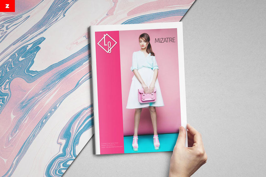
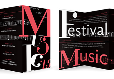
Take inspiration from this typographic brochure design—the event details inside the brochure may be at normal reading size, but the title of the event has been blown up to fill the whole cover.
Bright, bold color is also a great way to attract attention.
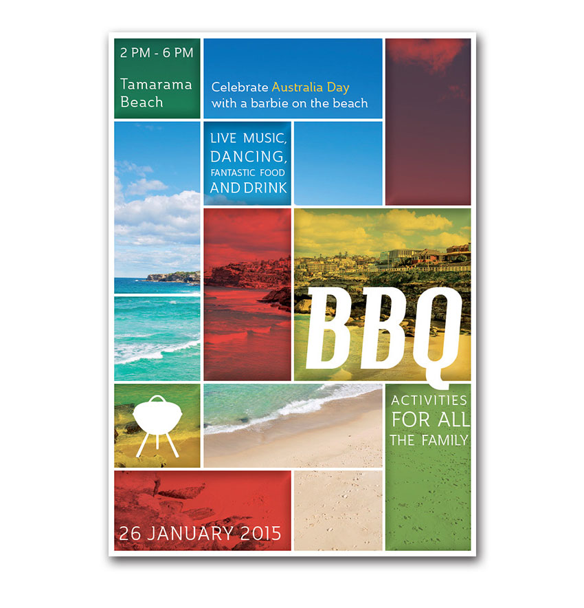
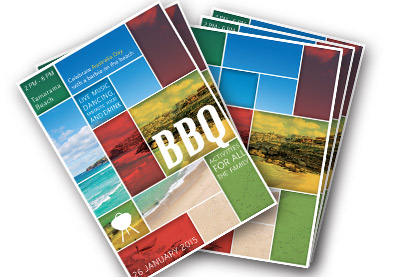
Rainbow-inspired colors, like the ones used on this BBQ flyer, are instantly optimistic, sunny, and cheerful, making the reader feel positive about the brochure.
A lit-up effect, made by contrasting pale or neon colors against a darker background, instantly draws the eye and has a glamorous, exciting look which is perfect for advertising after-dark events.

Think big and bold with your brochure designs. It might be useful to print out a draft of your brochure and place it 5 meters or so away from you—does it still stand out to the eye, or could you make some elements look even more striking? A successful brochure is one that will be spotted from afar, hold a reader’s attention, and be picked up, so maximizing the size and impact of your typography, colors and graphics will help your brochure to really stand out. Go big or go home!
5. Meet Your New Best Friend
Everybody has their own preference for the software they like to use for designing brochures, whether that’s Adobe Photoshop, Quark, or CorelDRAW. But if you really want to create an ultra-professional brochure layout, you need to make very good friends with Adobe InDesign.
As the resident InDesign writer here at Envato Tuts+, I am admittedly biased. But InDesign really does allow you to create any sort of brochure, and produce it to a very high standard. Here are just a few reasons why you should set up your brochure layout in InDesign:
- It’s optimized for print design—setting the Intent of your document to Print will allow you to design in CMYK color, and you can also use the Preflight function to identify low-resolution images or stray RGB swatches.
- You can do the fiddly stuff with ease—creating multi-page layouts, applying die lines and instructing them to Overprint, rotating pages… it’s all possible with InDesign.
- Printing mockups of your brochures is a breeze with the Print Booklet feature in InDesign. Discover how to use the function with this tutorial:
This isn’t to say that you can’t use other programs to set up your brochure layouts, but just to point out that InDesign is ideally suited to the task, and can make the whole job a lot easier and smoother.
If you want to get started with learning the basics of Adobe InDesign, check out our selection of 30 quick and simple tutorials:
Or why not let Nicki Hart guide you through the process of designing booklets in Adobe InDesign?
6. Let’s Get Practical!
Learning how to make a brochure in InDesign isn’t difficult. When you set up your brochure in InDesign, you also need to think carefully about the practical elements of the design.
We’ve already touched on the need to accommodate folds, but you also need to think about the rotation of content—will some sections of the brochure need to be rotated a different way to work in the right way once folded? If the brochure is two-sided, you also need to make sure that the sides will match up in the right way once the brochure’s been printed. As I’ve already stressed, a rough mockup is the best way to iron out these problems and get your head around the final 3D format of the brochure.

If you’re designing a lengthier brochure like a booklet, you also need to consider how your page count will work out. Booklets should be made up of groups of four pages, so your final page count should be divisible by four.
To avoid being left with extra blank pages at the end of your booklet, you need to remember that each sheet of paper will be folded in half, creating four actual pages—two on the reverse side and two on the front. This is very important when you’re thinking about how to write a brochure.
Adobe InDesign makes this easier for you as you can set up a Facing Pages layout, creating a sequence of reader’s spreads (these are how the reader will actually see the booklet once it’s printed and bound). The number of pages is easy to track using the Pages panel (Window > Pages).
You can also view how the Imposition process (whereby the printer rearranges your pages to make the printing and binding process easier) would play out by using the Print Booklet function (File > Print Booklet > Preview).
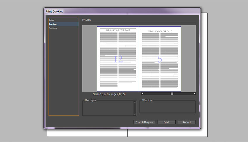
Still feeling confused about the practicalities of designing booklets and how to write a brochure? Take ten minutes to check out this helpful tutorial on page counts:
7. How to Print a Brochure
We’ve seen how to fold a brochure and how to write a brochure. Once you have your brochure artwork set up and refined, you’re ready to export it for printing.
You can provide your brochure artwork to a professional printer as either a print-ready PDF (make sure all Bleeds and necessary Printer’s Marks are included on a Press-Quality PDF) or as a ‘native’ file (this is the artwork in its original format, such as a packaged InDesign INDD file). Your printer may prefer one or the other, so make sure to ask them in advance.
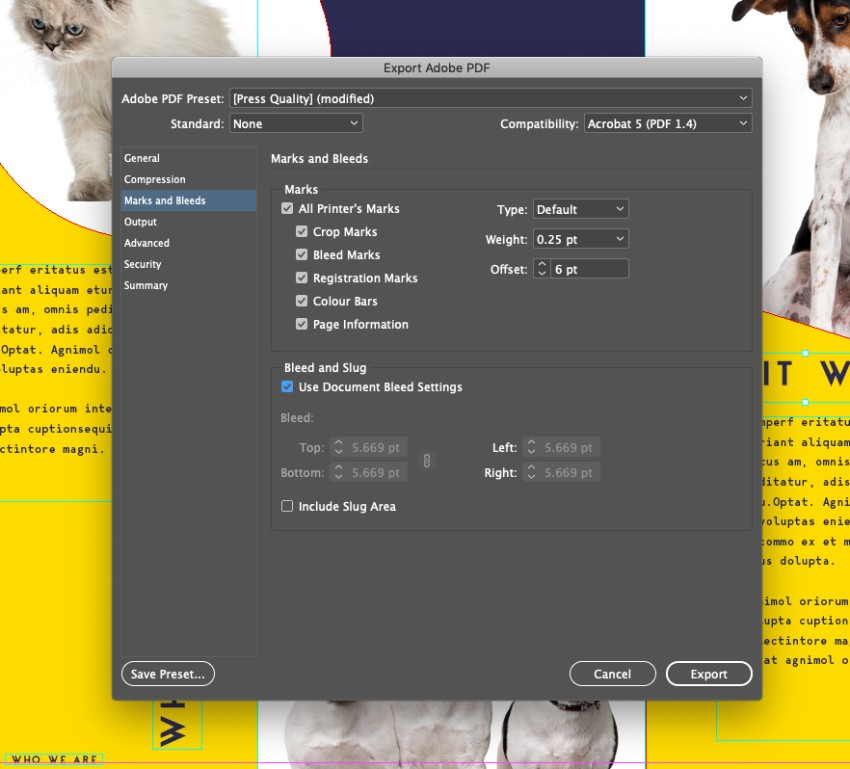
It’s a good idea to have a basic understanding of the print process. Think about what paper is best for brochures and the various finishes and techniques that can affect the final look of your brochure. Some important things to consider are:
- The Paper Weight—Brochures can be printed on a range of paper weights. Lower weights are cheaper, and they can look and feel lower quality as a result. For more formal brochures and booklets, heavier weights will look better, but they will also cost more. You can ask your printer for paper samples before you make a decision.
- The Paper Finish—Paper finishes fall into two main categories: Coated and Uncoated. Uncoated paper feels a bit smoother and stronger than standard copy paper. Coated paper falls into two sub-groups: Matte-coated and Gloss-coated. Matte-coated gives a smooth, non-glossy finish and can give your print documents a modern, pared-back look. Gloss-coated paper is smooth, with a slightly reflective finish, giving your documents a glossy, high-end look. Because the ink sits on the surface of the coating, rather than being absorbed into the paper, colors appear more vibrant and rich. You should choose the paper finish that’s going to be the most suitable for your brochure—keep in mind that even though gloss finishes can be pricey, they don’t always look as modern as matte finishes.
- Post-Print Techniques—If you’ve designed a brochure with many folds, multiple pages that need to be bound, or intricate die lines, you should expect the post-print process to be longer and costlier. Make sure you get a quote from your printer for both the print and post-print jobs before you hand over your artwork to avoid nasty shocks (or days of folding brochures by hand!).
If you have a basic understanding of how to print a brochure, you’ll feel much more confident that your final brochure will look as good in hard copy as it does on your screen. Read up on all the essentials of preparing your artwork for print with this useful beginner’s guide:
Go Forth and Design Fantastic Brochures!
In this article, we’ve looked at seven key steps to learn how to make a great brochure. Now you know how many types of brochures there are, what paper is best for brochures, and more.

Let’s recap this checklist, and keep it to hand for future brochure design projects.
- Decide on the kind of brochure you need—brochures are designed to be used as part of a marketing campaign, and the brochure format needs to be perfectly adapted to the sort of campaign. Would a flyer work better for door-to-door? Would a trifold look great on display? Would a booklet be more appropriate for a convention or conference?
- Allow for folds in your artwork—all brochures, except flyers, will need to be folded in some way. Because you’ll be designing your artwork in a 2D format, make use of mockups to test out how folds will affect your design.
- Think outside the box—Unusual folds or multi-purpose designs can make your brochure look unique and special, which will encourage readers to keep hold of it.
- Be bold—strong, large-scale typography and bright, eye-catching color and graphics will make your brochure more visible from afar and help it to stand out from the crowd.
- Adobe InDesign is your new best friend—for designing print-friendly multi-page layouts like booklets, you can’t go wrong with using InDesign.
- Think about the practicalities—take the time to adjust the page count of your booklet, or to switch the orientation of content on a brochure that’s going to be folded. Again, using a printed mockup can be really helpful to get your head around the tricky technicalities.
- Understand your printing choices—paper weights and finishes, and post-print techniques, such as binding and folding, will affect the final look of your brochure and will have a significant impact on the cost of producing it too, so make sure you know what to expect before you approach a professional printer.
5 Top InDesign Brochure Templates From Envato Elements
Now you’re an expert on how to make a brochure. If you need some professional brochure templates for your next design, I’ve got you covered.
You can find a huge range of InDesign brochure templates over on Envato Elements. With your subscription, you can enjoy unlimited downloads of brochure templates!
On the other hand, if you prefer to buy top InDesign brochure templates one at a time, visit our single-purchase marketplace, GraphicRiver. Now, let’s discover some of our favorite picks from Envato Elements below:
1. Travel Trifold Brochure (INDD)

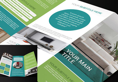
This trifold brochure template for InDesign is perfect for travel or holidays. It gives you plenty of space to add attractive images and typography.
Some features of this template for trifold brochure InDesign are:
- two sizes: US Letter (8.5×11 inches) and A4 (8.27×11.69 inches)
- CMYK color mode
- 300 DPI resolution
- print ready
2. Modern Architecture Brochure (INDD)
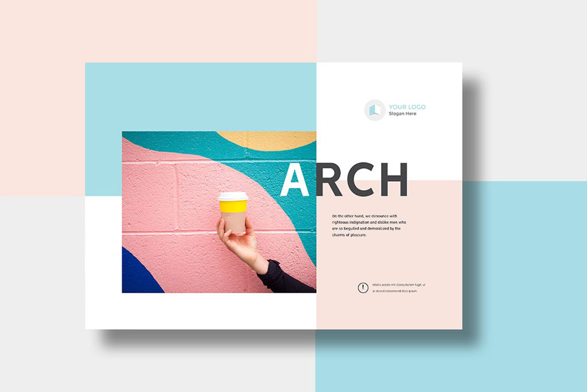
Looking for a bright and colorful brochure template design? This modern and funky style could be adapted for photographers, illustrators, or interior designers. This is way better than free InDesign brochure templates.
3. Creative Agency Portfolio Brochure (INDD)
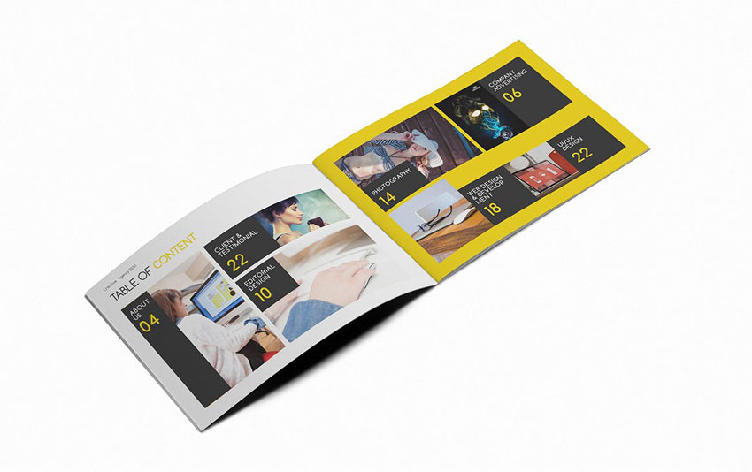
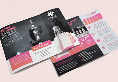
This landscape brochure template has a simple, punchy style with a single color accent. Perfect for showcasing portfolio work or photos to their best potential.
4. Minimal Brochure Template (INDD)
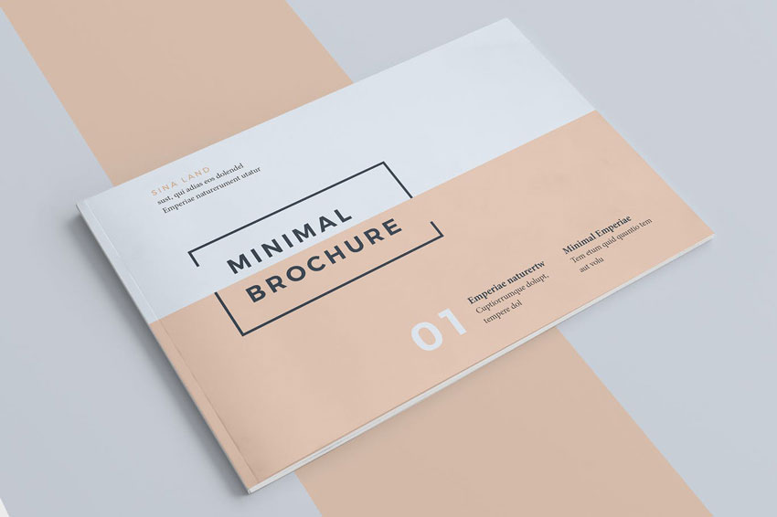
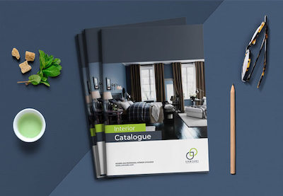
The pared-back, Scandinavian-inspired style of this simple brochure template makes it a versatile choice for a variety of industries and purposes. This design offers you more than any free InDesign brochure templates.
5. Company Profile Brochure Template (INDD)
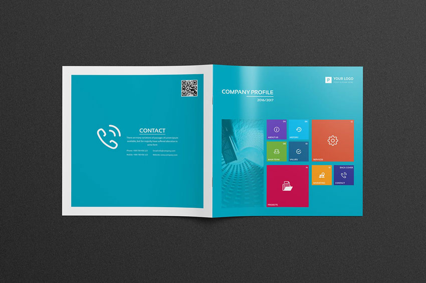
Looking for a fresh, colorful design for your brochure? This square brochure template has an app-inspired design which gives the pages an optimistic, youthful look.
Discover More Awesome Brochure Inspiration and Resources
You’ve learned how to make a brochure in this article. We reviewed how many types of brochures there are, how to write a brochure, how to fold a brochure, and what paper is best for brochures.
Now, I’m sure that after the selection of InDesign brochure templates, you’re looking for more inspiration. Why don’t you check out these cool resources below?
If you’d like more details on how to make a brochure in InDesign and learn more about this software, check out this comprehensive guide: Learn Adobe InDesign.
 Brochure20 Best Free Bifold & Tri-Fold Brochure Template Designs (Download 2021)
 BrochureHow to Make a Tri-Fold Brochure Template in Photoshop
 InDesign Templates15 Free InDesign Catalogue Templates With Creative INDD Layouts 2020
 Catalogs25 Best Product & Item Catalog Template Designs (InDesign & Word 2020)
 Affinity PublisherHow to Make a Tear-Off Flyer Template in Affinity Publisher (Free Flyer File to Download)
 Affinity PublisherHow to Create a Tri-Fold Brochure in Affinity Publisher (Free Brochure File)
- Marketing35+ Best InDesign Brochure Templates: Creative Business Marketing (2021)
 Brochure31 Best New Business Brochure Templates for 2020
 BrochureHow to Create a Product Brochure Template in Adobe InDesign
 Brochure10 Top Tips for Creative Brochure Design
