
The landscape of graphic design patterns is constantly evolving, with trends that pop up and fade out quite quickly. However, there are a few pattern design trends that have managed to endure the passage of time through their distinctive style.
You can learn to recognize these timeless graphic design patterns by grasping symbols and visual cues. It’s an ability that could even help you predict future graphic design trends.
In this article, we’ll quickly explore 15 iconic patterns that have gracefully traveled across time. We’ll examine each design trend’s defining features and explore their practical applications and significance.
15 pattern trends in graphic design
Let’s inspect these 15 diverse trend-based patterns in graphic design, from historical classics to contemporary design trends:
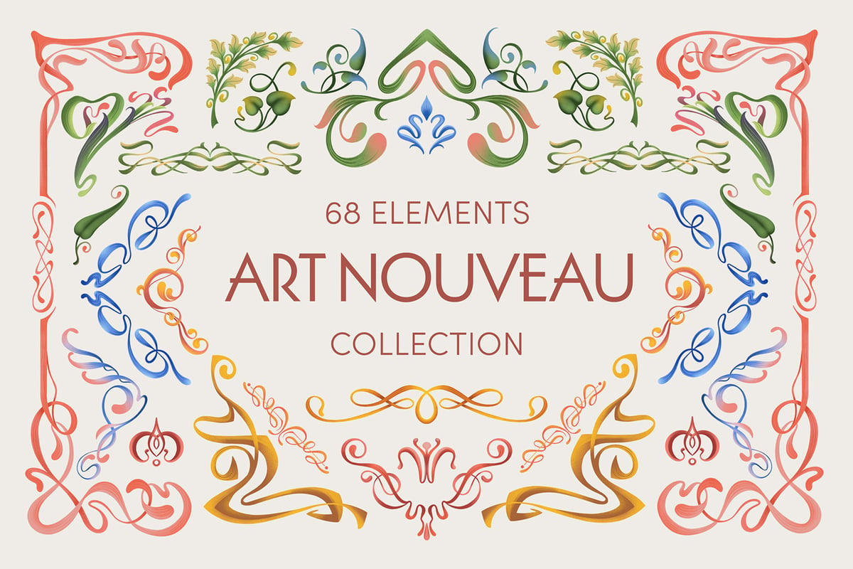
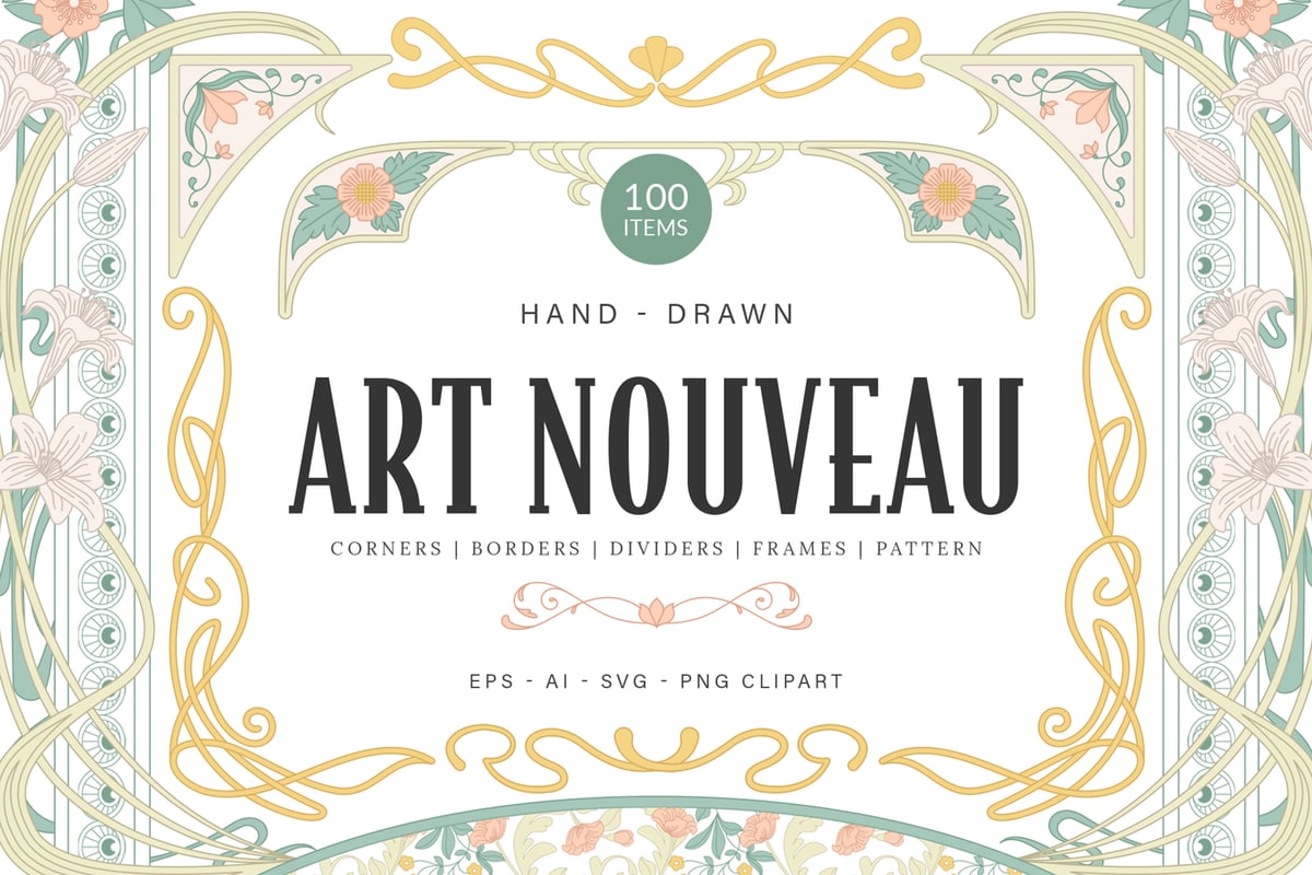
1. Art Nouveau patterns
Art Nouveau takes its name from the French words meaning ‘New Art’. It was an international art movement that emerged in the late 19th century and flourished in Europe and the US between 1890 and 1910. This ornamental vintage design style broke away from the era’s formal styles to embrace more organic, flowy elements: long, sinuous lines, natural motifs, and a decorative kind of craftsmanship.
Art Nouveau continues to influence decorative arts today. It is often seen on walls, tapestry, stained glasswork, advertising posters, architecture, interior design, artifacts, jewelry, and illustration.
Notable Art Nouveau designers included Gustav Klimt and Alphonse Mucha.
Defining features of Art Nouveau patterns
- Art Nouveau designs frequently display organic and botanical forms, so look for nature motifs with flowing lines and curves.
- Keep an eye out for decorative elements like exaggerated long curves that look like whips, vines, and intricate patterns. S-curved lines and ‘whiplash’ motifs are hallmarks of Art Nouveau.
- Art Nouveau designs often feature asymmetrical compositions to showcase a sense of dynamism and movement. This technique helped break away from the symmetry of earlier design styles.
- Art Nouveau also emphasizes traditional femininity, so many design patterns feature seductive forms.
- Pay attention to intricate details and craftsmanship.
- Flat compositions, bold lines, and organic forms make up the Art Nouveau style.
Color characteristics of Art Nouveau patterns
Art Nouveau’s color palette dances between two types of styles. The first involves muted and somber colors from nature, like sage, mustard, brown, lilac, and olive greens. These gentle hues of flora and fauna create a warm, inviting atmosphere.
The second palette embraces rich and bold colors like deep violet, red, and unnatural metallic accents. These are used to build the more dynamic visual appeal that defines Art Nouveau.
Symbolism and philosophy of Art Nouveau patterns
Art Nouveau used symbolic elements, ideas from nature, and the physical world to express spirituality.
The movement used flowing lines and plant and floral forms to symbolize growth, vitality, and a connection to nature. Feminine forms were used to depict elegance and grace, while the delicate craftsmanship signified sophistication and wealth.
Samples of Art Nouveau patterns in graphic design
2. Memphis Group patterns
The Memphis Group was a collaborative design group of Italian designers and architects in the early 1980s who created a series of influential products.
Also known as Memphis Milano, this post-modern movement defied conventional design with peculiar, oversized geometric shapes and bold color palettes. During that time, products were designed to be functional and not decorative, so the Memphis Group’s work was considered groundbreaking for its era.
The Memphis Group is associated with furniture, fabrics, glass and metal objects, textiles, carpets, and ceramics.
Defining features of Memphis Group patterns
- The Memphis Group is characterized by its abstract designs with colorful combinations of dots, circles, triangles, stripes, and squiggly lines.
- The Memphis style embraces clashing patterns, oversized elements, and scattered bright geometric shapes.
- The use of bright and contrasting colors along with black and white patterns is a key feature of Memphis Group patterns.
- Look for asymmetrical designs, irregularity, and haphazardly arranged textures and shapes.
Memphis Group’s medium and techniques
The Memphis Group’s work often used expensive materials with unconventional mediums, such as plastic laminate and industrial products for interiors and graphic designs.
The materials used included glass, ceramics, fabrics, paper, wood, resin, metal objects, ceramics, and textiles. Memphis basically adorns low-priced material with electric colors and bold patterns.
Color characteristics of Memphis Group patterns
This group embraces the use of a lot of saturated colors, often complemented with black, pale pastels, and mellow tones to create clashing combinations. Think electric pink, bright blues, neons, and pastels.
Flat, brash, bright, and bold colors: forget subtlety with the Memphis Group.
Symbolism and philosophy of Memphis Group patterns
Don’t take Memphis Group designs too seriously as they often carry a sense of humor and irony. The Memphis movement design style is a symbol of day-to-day objects, trend-chasers, the kitschy, tacky, and mass production.
Samples of the Memphis Group pattern in graphic design
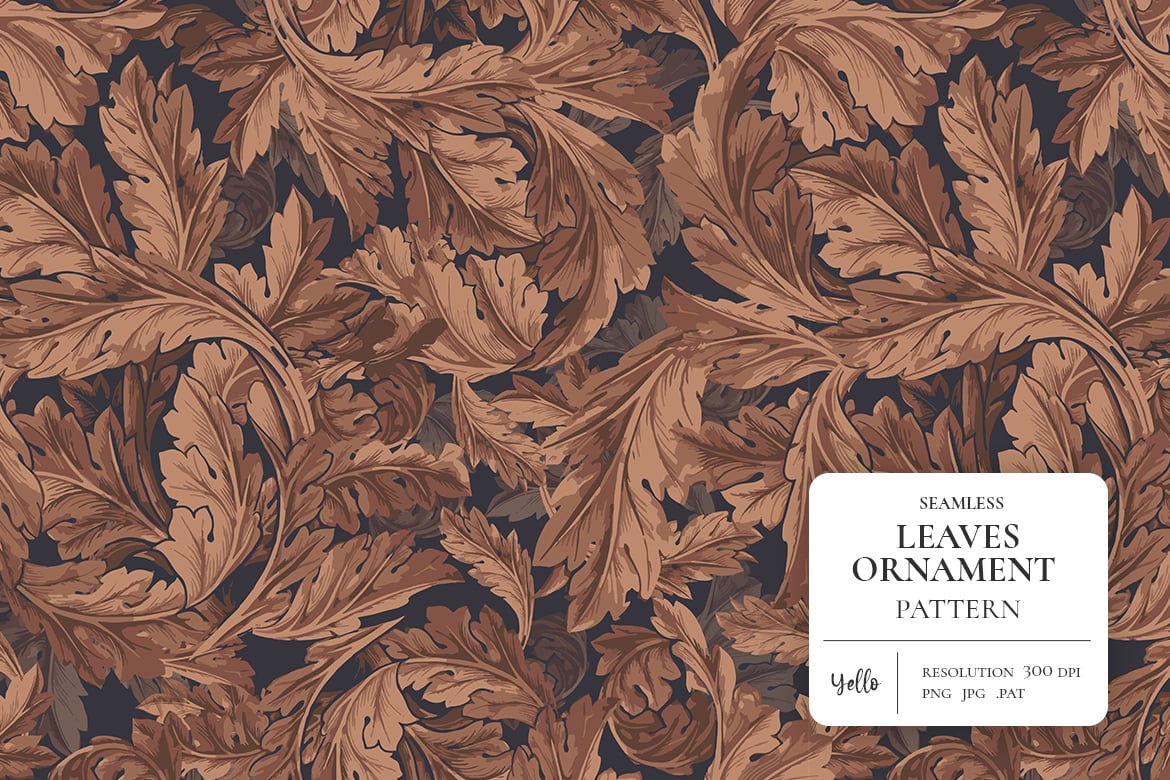
3. William Morris patterns
William Morris was a key figure in the 1860s Arts & Crafts movement. His elegant design style is all about craftsmanship, nature, and a rebellion against the mass production of the Victorian age of industrialism.
William Morris believed in high-quality, handmade goods and produced over 50 wallpapers, as well as designing textiles, tapestries, stained glass, and furniture. His designs focused on bringing natural beauty, warmth, and a handmade feel to everyday projects, without sacrificing ethical production or quality.
William Morris design can be seen adorning household goods, handicrafts, textiles, carpet-making, embroidery, literature, decorative designs, and other products.
Defining features of the William Morris patterns
- This style is identified by intricate and detailed floral patterns, organic shapes, geometric grids, and desaturated colors.
- Morris’s designs feature nature-inspired forms, like plants, birds, flowers, and other natural forms. They are recognized by the repetitive floral motifs.
- Morris’s design is more stylized and less realistic-looking.
- Patterns by William Morris are described as a Victorian-inspired aesthetic, rich in color and with a handcrafted feel.
Color characteristics of William Morris patterns
William Morris’s design style mainly focused on muted colors, with rich and earthy tones extracted from plants, flowers, and animals.
The color palette is also infused with flamboyant blues, greens, neutrals, pinks, and reds, inspired by medieval tapestries.
Symbolism and philosophy of William Morris patterns
Morris’s work symbolizes the return to tradition and the harmonious relationship between the universe and the beings inhabiting it. It’s very poetic and artistic, displaying the beauty in everyday objects.
Morris rarely used plain colors. Instead, he understood the power of juxtaposition and contrast and had an incredible sense of balance, pairing earthy colors with bold base colors.
Samples of the Willam Morris pattern in graphic design
4. Geometric design patterns
Geometric design appeared in the early 20th century and is linked to three aesthetic styles: Art Deco, Mid-Century, and contemporary art.
What is geometric pattern design? This graphic style is very broad, and it’s all about simple lines, shapes, and their relationship to create order and visual interest through geometric patterns.
Geometric design is commonly incorporated into art, branding, logos, interior design, fashion, architecture, and modern design trends.
Defining features of geometric patterns
- Geometric pattern design has a modern and structured design approach. Look for symmetry and repetitive geometric motifs.
- Flat shapes, lines, and patterns define geometric design. Squares, circles, hexagons, triangles and more shapes are all combined in different styles.
- This is abstract design that is non-representative of nature.
- Geometric design is balanced and harmonious.
Color characteristics of geometric patterns
This style features bold and contrasting color combinations. Basically, the trend follows the concept of keeping the same color family embedded, whether the palette is cool, warm, or neutral.
Monochromatic designs are influenced by Bauhaus and minimalism. They feature single colors in various shades to create a unified look. The high-contrast palette is more stimulating and dynamic. There is a lot of color theory exploration with this approach.
Also, you have earth tones or a neutral palette of beiges, browns, whites, and grey to bring out a sense of grounding and elegance. On the other hand, it can feature a more contemporary palette of vibrant and energetic colors, creating a joyful, childlike aesthetic.
Symbolism of geometric patterns
Geometric design is very subjective. It conveys a range of emotions, from a sense of structure and stability to a playful and energetic tone, depending on the composition and color palette.
The shapes can represent the building blocks of the universe, and the symmetry is associated with cosmic order. Or it can express a joyful unity and abstract ideas.
Geometric pattern samples
5. Organic patterns
The organic pattern in graphic design trend uses free-flowing organic shapes and elemental forms to produce a feeling of nature. This trend’s concept uses forms from nature to emphasize minimalism and the beauty of the natural world.
The organic pattern trend can be integrated into any medium and is common in home furnishing, architecture, eco-branding, and sustainable web design.
Defining features of organic patterns
- Organic pattern design is composed of flowy lines and irregular shapes inspired by nature’s beauty. It is a very harmonious and unified design.
- Organic design imitates shapes from nature like leaves, rock formations, waves, water, vibrations, and others.
- It is abstract, featuring minimalist design in irregular and asymmetrical compositions.
- Watch for earthy color palettes with soft gradient adaptations that are warm and inviting.
Color characteristics of organic patterns
The organic color palette commonly features earthy tones, such as green, beige, whites, greys, soft browns, and calmer color ranges. Also, neutral colors like faded greens, pink, and blues are popular.
Symbolism of organic patterns
Organic design reflects growth and harmony. It draws inspiration from the natural world to bring a sense of naturalness and feelings of serenity. It’s a style that calls to mind the sight and feelings of being submerged in nature.
Organic pattern design samples
6. Bauhaus patterns
Bauhaus (German for ‘building house’) was a German art school from 1919 to 1933. This influential 1920s movement aimed at bridging art with industry. It is the complete opposite of the organic design style.
Bauhaus will always be a trendy pattern. Its approach is all about functionality, clean lines, and the concept of ‘less is more’. With Bauhaus, every design element serves a purpose, and there is no unnecessary decoration.
The Bauhaus influence is integrated everywhere from applied arts to design, architecture, and more.
Defining features of Bauhaus patterns
- Bauhaus pattern design is identified by its clean lines, simple shapes, and abstract style.
- Bauhaus patterns are uncluttered and methodical, focusing on form, simplicity, and functionality.
- It is a modern, minimalist design with a geometric approach.
- Bauhaus is recognized by the use of sans-serif typography.
- It’s also characterized by its primary colors and grids.
Color characteristics of the Bauhaus pattern
Made up of bold pops of primary colors, often with white and black accents, Bauhaus is heavily influenced by color theory, featuring the application of the primary colors red, blue, and yellow, with neutrals as the foundation.
Symbolism of the Bauhaus pattern
Bauhaus makes a bold statement with a strong impact. It breaks away from traditional styles and reflects the changing world of the 20th century. It symbolizes a forward-thinking approach, innovation, and functionality.
Samples of the Bauhaus pattern in graphic design
7. Paisley patterns
Paisley patterns are known for their distinctive teardrop motif, called the ‘boteh’. It’s not a complete style in itself but more of an ornamental design. This timeless design print originated in the Kingdom of Kashmir in the 11th century and has cut through time and culture.
The Paisley pattern is popular in fabrics and textiles. It’s mostly seen on silk and cotton shawls but also expands to wallpaper, curtains, home furnishing, and more.
Defining features of Paisley patterns
- Inspired by Persian design, with teardrop shapes and curved motifs, Paisley is a versatile design that is used in many styles, including maximalism, Bohemian, vintage, and even minimalism.
- This is a rich and decorative design, with intricate and droplet-like patterns that come in different variations in size, color, and amount of detail.
- It’s characterized by floral elements, swirls, and embellishments to the tear shape.
- Paisley can be intricate, playful, or elegant in style, depending on the context.
Color characteristics of a Paisley pattern
Paisley pattern design often uses warm and earthy color palettes. However, its flexibility lies in its ability to adapt to various color palettes.
Traditionally, it uses bold and rich colors, but modern variations have softer interpretations too.
Symbolism of a Paisley pattern
Paisley symbolizes fertility, creation, abundance, prosperity, and the entirety of life within a drop. Depending on the origin and cultural context, it can be associated with luxury, religion, or creativity.
Samples of the Paisley pattern in graphic design
8. 90s Sun & Moon patterns
The 90s Sun & Moon design style is literally inspired by the sky. This graphic pattern trend is quite nostalgic and heavily influenced by celestial icons. Think constellations, the moon and sun, cosmic motifs, and a crisp night sky.
The 90s Sun & Moon pattern trends drew inspiration from the bohemian and grunge aesthetics popular in the 90s. It can be spotted on various mediums, from artwork to wallpaper, home decor, tattoos, fabrics, and more.
Defining features of 90s Sun & Moon patterns
- You can recognize this style by its tapestry of surreal and dream-like elements. This 90s culture pattern features stylized celestial shapes such as the sun, moon, and stars.
- The celestial elements are often simply stylized or very intricate in design. They often have exaggerated features like big smiles and large eyes to give them a whimsical feel.
- 90s Sun and Moon patterns use cosmic blue and yellow color palettes.
- It is a dreamy, fun, and magical design that captures the mystical night sky.
Color characteristics of 90s Sun & Moon patterns
Think bold, jewel-tone colors and cosmic blues. The 90s Sun and Moon style embraces fiery yellows, cobalt blue, and yellow, as well as metallic colors such as gold, silver, and chrome accents.
Symbolism of 90s Sun & Moon patterns
The 90s Sun & Moon style symbolizes playfulness, mystery, and nostalgia. The sun symbolizes strength, power, and stability, while the moon represents beauty, peace, and nurturing nature.
This style also calls up our childhood wonder and fascination with space, embracing cosmic energy.
Samples of the 90s Sun & Moon pattern in graphic design
9. Terrazzo patterns
Imagine a colorful mosaic made up of fragmented stone chips, glass, and marble. That’s Terrazzo. It’s an Italian flooring method that became popular in the 20th century and has since been reimagined into digital designs.
Terrazzo aesthetics can be seen across many design disciplines like website design, graphic design, social media, furnishing, fashion, and everything from digital assets to literature.
Defining features of Terrazzo patterns
- Original Terrazzo is composited from marble chips, glass, granite, and other materials in resin or concrete. Traditionally used for flooring, it then moved on to other home decor and digital uses.
- Terrazzo can be recognized by the colorful, speckled design that comes in various unique patterns. It’s a texture with patterning, dotting, speckling, and geometric influences.
- Terrazzo patterns come in neutral colors as well as vibrant tones.
- This design is asymmetrical, with clear imperfections.
- It’s a versatile style that blends into everything from actual material to abstract illustrations.
Color characteristics of a Terrazzo pattern
Terrazzo pattern design comes in a wide range of colors, from classical bichrome, polychromatic, and cinnamon-colored to bold and contemporary colors.
Mid-century design displayed bold colors, minimalist design opted for more subtle patterns and neutral tones, and bohemian design embraced vibrant and playful colors.
Symbolism of a Terrazzo pattern
Terrazzo patterns evoke an eco-friendly choice, recycling, and a home feel. Due to the endless possibilities of patterns, color, and material combinations, the pattern style can reflect self-expression and individuality.
Samples of the Terrazzo pattern in graphic design
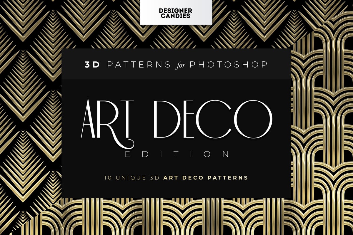
10. Art Deco patterns
Art Deco, short for the French Arts Decoratifs (‘decorative arts’), honored industry and technology through its motifs. This 1920s-30s design movement was known for its glamorous modern style that oozed with sophistication and reflected the advances of the era.
This design style embraced the future with luxurious craftsmanship and presented it through architecture, visual arts, and product design.
Art Deco pattern designs can be found in all decorative fields, from fashion and arts to industrial design, representing luxury and technological progress. It has influenced building structures, bridges, trains, furniture, and everyday objects.
Defining features of Art Deco patterns
- Art Deco can be identified by its sleek design, featuring geometric shapes with straight and bold lines. The pattern is often made up of chevrons, zigzags, sharp angles, pyramids, and sunburst motifs.
- Art Deco patterns shine with metallic accents of gold and silver, but jewel tones like emeralds and sapphire are also used for a luxurious feel.
- Think lavish, glamorous, and stylized depictions of fauna and flora.
- Art Deco features balanced and methodical compositions.
- Generally it uses streamlined, symmetrical arrangments, but sometimes asymmetry appears in strong, eye-catching elements.
Color characteristics of an Art Deco pattern
Common colors are black and gold, but jewel tones like emeralds and sapphire are used for a luxurious feel. The colors hold different symbolic weights depending on the context and surrounding elements.
Symbolism of an Art Deco pattern
The Art Deco pattern style projects an air of sophistication and luxury. The streamlined forms, geometric shapes, detailed refinement, and timeless beauty all present a sense of glamour.
Combinations of black and white are more dramatic, with a feeling of timeless sophistication, while blue and green symbolize tranquility and balance.
Samples of the Art Deco pattern in graphic design
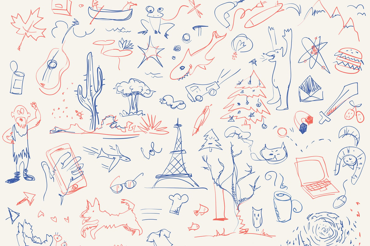
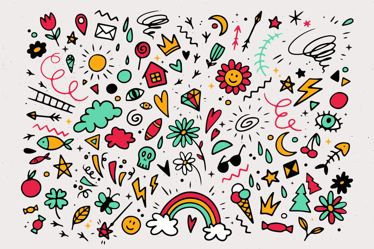
11. Doodle patterns
Identifying doodle art is a bit tricky because it’s often simple, random drawings based on impulsive self-expression. However, if we were to characterize it, we could call it a mix of styles: anything from playful and loose scribbles to zentangle patterns that are usually monochrome.
Doodling is like scribbling idly with a preoccupied mind or unconsciously expressing through symbolic sketches.
Doodling is often associated with young kids and is popular in comics, cartoons, and educational content.
Defining features of doodle patterns
- Doodle patterns are characterized by freeform, spontaneous linework, zigzags, and organic shapes.
- They could also include abstract repeated shapes or patterns like zentangles.
- Doodle patterns can include structured and recognizable objects like faces, eyes, rainbows, clouds, stars, hearts, etc.
- They also include random mixes of shapes like squares, circles, squiggles, triangles, and lines.
- Mandalas and circular patterns are typical
- They sometimes feature botanical elements like plants, flowers, and leaves.
Medium and techniques of doodle patterns
Doodling is all about freedom of expression, so various mediums can be used. The most common are pencils, pens, markers, or digital tools such as Photoshop or Illustrator.
Color characteristics of doodle patterns
Typically, doodle pattern art is monochromatic or muted, but it can also be any color you want.
Symbolism of doodle patterns
Doodle art symbolizes spontaneity, playfulness, sociability, and self-expression. It’s also a mark of boredom, frustration, and a personal state of mind. It varies depending on the individual and the doodles themselves.
Sometimes it might offer clues to an emotional state of mind, and other times it can represent a self-soothing or stress relief pattern.
Doodle art design samples
12. Pop Art patterns
Pop Art is a cultural statement and art movement that came out in the 1950s and 60s. The art style is not a single technique but an influence from everyday objects, advertising, commercials, and celebrities, used to create high-contrast art compositions.
Pop Art is a movement that turned mundane objects into attractive symbols and graphic works. It’s often seen on TV, comic books, consumer goods, screenprinting, photocollages, mass media, and everyday objects.
Famous Pop Art artists include Roy Lichtenstein, Andy Warhol, and James Rosenquist.

Andy Warhol ‘Campbell Soup Cans’ (1962) / Credit: Wikipedia
Defining features of Pop Art patterns
- These patterns are identifiable by recognizable pop culture objects.
- Think of mass media images, consumerism, comic book characters, celebrities, brand logos, and advertisements.
- The style often uses simplified shapes, strong outlines, and dots.
- It uses bold and vivid, bright colors
- This is art intended for popular appeal and to make a cultural statement.
- Pop Art sometimes uses comic book font styles in all caps.
Color characteristics of Pop Art patterns
Bold, saturated, flat colors, inspired by a comic book color palette. Common colors include red, yellow, and blue, with strokes of black.
Symbolism of Pop Art patterns
Pop Art doesn’t have a unified meaning. It can symbolize popularity, rebellion, skepticism, consumerism, and mass media, all depending on the context and the specific artwork.
For example, the portrayal of celebrities can be a simple observation of the impact of fame in modern society, while repeated motifs of popular consumer goods can be a humorous comment on the preconceived notions of popular culture vs. consumerism.
Pop Art design samples
13. Glitch Art patterns
Glitch Art is a 20th-century visual trend that uses digital errors or technical disruptions to create unique aesthetics. It’s an abstract art movement that brings out self-expression and celebrates imperfections. It highlights our delicate relationship with technology.
The glitch effect is sometimes used to create trippy effects, a psychedelic look, mystery, or technological and futuristic design.
Famous glitch artists include Nam June Paik, Rosa Menkman, and Len Lye.
Defining features of Glitch Art
- Glitsch Art is recognized by pixelation, intentional artistic distortions, and digital visual errors like light leaks, noise and grain, double exposure, and glitch-like lettering.
- There’s often a surreal and unsettling aesthetic with no perfection.
- Glitch Art has an experimental approach with corrupted images and the use of vibrant color shifts.
- It relies on technology to combine texture and patterns.
- Glitch Art pattern trends feature the repetition of motifs, patterns, or glitches.
Color characteristics of Glitch Art patterns
Glitch Art doesn’t have a single defining color scheme and can be diverse. It uses color degredations and high-contrast colors with oversaturated hues to create visually jarring scenes.
Symbolism of Glitch Art patterns
Glitch Art embraces the beauty found in distortion and imperfection. It’s a reminder that technology is not infallible and can be unpredictable.
Glitch Art pushes the boundaries of traditional art forms and reflects the future, a sense of unreality, expressionism, and unpredictability.
Glitch Art design samples
14. Op Art patterns
Op Art is a design trend that developed in the mid-20th century. It uses visual effects and mesmerizing patterns to create the illusion of movement. This international trend explored the relationship between reality and perception through the use of optical tricks.
The Op Art design is associated with graphics, posters, T-shirts, videos, and book art.
Notable artists include Bridget Riley, Victor Vasarely, and Julian Stanczak.
Defining features of Op Art
- This style features optical artwork that creates the illusion of movement, depth, and vibrations.
- Think wavy lines, visual tricks, shapes that swell or sink, and pulsating patterns.
- It includes bold color clashes or black-and-white color combos.
- Geometric shapes like squares, circles, and lines are the building blocks of Op Art.
- Op Art is an interaction between shapes and color, so look for repetitive patterns with high-contrast lines and shapes.
- This is an art form that engages the viewer’s perception and challenges us visually.
Color characteristics of an Op Art pattern
Op Art favors strong, bold color choices such as black and white or complementary colors like red and green to create a stimulating visual experience.
Placing the colors side by side helps the viewer to focus entirely on the shapes and lines, thus creating the illusion of movement and depth.
Symbolism of an Op Art pattern
Op Art isn’t known for directly symbolic meanings. Instead, it focuses on creating sensory experiences through the use of color and shapes. These interactions between color and shapes play tricks on the eyes, causing the illusion of motion, vibrations, and depth within static art.
Op Art can symbolize creativity, stimulation, and the illusion of movement.
Samples of the Op Art pattern in graphic design
15. Sticker Bomb patterns
Sticker Bomb patterns are an aesthetic trend that became popular in the early 2000s and 2010s. This style is very eye-catching and is basically a vibrant collage effect made up of a variety of stickers. These stickers vary from logos, brands, cartoons, and sticker text to anything else expressing individuality.
Think of a skateboarding culture, street art, or graffiti when identifying Sticker Bomb pattern trends. It’s also common on musical instruments, personal belongings like notebooks and laptops, or commercial products such as clothes and home decor.
Defining features of a Sticker Bomb pattern
- Sticker Bomb is identified by an eclectic mix of sticker images covering an area with minimal background.
- It uses a visually impactful collage effect that uses the art of layering stickers to create chaos and depth.
- It involves diverse stickers or badges from pop culture, cartoons, brands, personal design, hand-drawn elements, graphics, and text.
- Sticker Bomb patterns express individuality and often belong to subcultures.
Symbolism of a Sticker Bomb pattern
Sticker Bomb doesn’t have a universal symbol or meaning. Sticker Bomb patterns symbolize a rebellious and playful spirit, as well as creative self-expression or just a fun, artistic way of decorating objects.
Sticker Bomb pattern samples
Try some of these trendy patterns in graphic design
The world of graphic design is a treasure chest of patterns. Decoding trending patterns is all about breaking down the visual language and making out these elements:
- Shapes: Are they organic and natural (Morris), geometric (Art Deco), or varied (Sticker Bomb)? Do they overlap, repeat, or form a grid?
- Colors: Bold contrasts (Pop Art), vibrant and bright (Memphis), or muted earth tones (Morris)? Look for metallic accents, specific color palettes, or gradients.
- Lines: Repetitive (Art Deco), flowing curves (Art Nouveau), or sharp angles (Memphis)? Analyze how the lines interact and note their thickness and direction.
- Textures: Flat and graphic (Geometric), celestial illustrated (90s Sun Moon), or collaged (Sticker Bomb)? Is the texture overlapping, interlocking, or free of space?
Inspect each pattern in graphic design, and don’t just identify it but recreate it! Use your understanding and knowledge of the different trend-based patterns to have fun and experiment with your work. Try to blend elements from various trends, and reinterpret them in your own design voice.
Hungry for more trendy patterns inspo? Discover more patterns with these tutorial selections: