Toggle button switches are a classic UX trend often met in different parts of a website or an app. In a previous tutorial, we discussed how to build a CSS-only switch component for a simple to-do checklist. Today, we’ll create another switch: a monthly/yearly switch that will let visitors go through different pricing plans.
Our Switch Component
Here’s our component demo:
Showcase of Pricing Toggle Switches
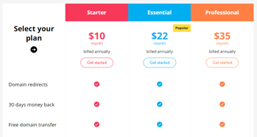
Before we start building our switch, let’s first get inspiration from a few pricing pages that use toggle switches.
1. Begin With the HTML Markup
We’ll define a container that will include two nested wrappers: the switch wrapper and the table wrapper.
Inside the switch wrapper, we’ll place two radio buttons followed by their associated labels and an empty span element with the class of highlighter. By default, the first radio button will be checked.
It’s worth mentioning that there are different approaches we can follow to build the component. An alternative implementation might be to get rid of the empty span and use pseudo-elements.
Inside the table wrapper, we’ll place the table.
Here’s the starting markup:
<div class="container">
  <div class="switch-wrapper">
    <input id="monthly" type="radio" name="switch" checked>
    <input id="yearly" type="radio" name="switch">
    <label for="monthly">Monthly</label>
    <label for="yearly">Yearly</label>
    <span class="highlighter"></span>
  </div>
  <div class="table-wrapper">
    <table>...</table>
  </div>
</div>
Most of the table contents and styling will come from a previous tutorial where we built a pricing table with a sticky header. From this tutorial, I’ve cleared out all the unnecessary styles. I’ve also made a few style adjustments to match the target of this demonstration. Anyhow, the table styles are of secondary importance.


For this exercise, we’ll only update the table headings, so the .info element will include two different amounts depending on the plan. By default, only the monthly amount will be visible.
Here’s what the markup of a table heading will look like:
...
<th>
  <div class="heading">Starter</div>
  <div class="info">
    <div class="price monthly">
      <div class="amount">$10 <span>month</span></div>
    </div>
    <div class="price yearly hide">
      <div class="amount">$7 <span>month</span></div>
      <div class="billing-msg">billed annually</div>
    </div>
    <button type="button">Get started</button>
  </div>
</th>
...
2. Define the Switch Styles
Similar to our previous switch component, we’ll also take advantage of the “CSS checkbox hack technique” to toggle the switch.


There are already lots of implementations of this method in the Tuts+ library, so I won’t go into more detail. I would recommend going through all these examples to become familiar with how to simulate JavaScript’s click event on CSS elements though.
Here are (briefly) the steps we’ll follow:
Here are all the styles attached to our component:
/*CUSTOM VARIABLES HERE*/

.switch-wrapper {
  position: relative;
  display: inline-flex;
  padding: 4px;
  border: 1px solid lightgrey;
  margin-bottom: 40px;
  border-radius: 30px;
  background: var(--white);
}

.switch-wrapper [type="radio"] {
  position: absolute;
  left: -9999px;
}

.switch-wrapper [type="radio"]:checked#monthly ~ label[for="monthly"],
.switch-wrapper [type="radio"]:checked#yearly ~ label[for="yearly"] {
  color: var(--white);
}

.switch-wrapper [type="radio"]:checked#monthly ~ label[for="monthly"]:hover,
.switch-wrapper [type="radio"]:checked#yearly ~ label[for="yearly"]:hover {
  background: transparent;
}

.switch-wrapper
  [type="radio"]:checked#monthly
  + label[for="yearly"]
  ~ .highlighter {
  transform: none;
}

.switch-wrapper
  [type="radio"]:checked#yearly
  + label[for="monthly"]
  ~ .highlighter {
  transform: translateX(100%);
}

.switch-wrapper label {
  font-size: 16px;
  z-index: 1;
  min-width: 100px;
  line-height: 32px;
  cursor: pointer;
  border-radius: 30px;
  transition: color 0.25s ease-in-out;
}

.switch-wrapper label:hover {
  background: var(--lightgray);
}

.switch-wrapper .highlighter {
  position: absolute;
  top: 4px;
  left: 4px;
  width: calc(50% - 4px);
  height: calc(100% - 8px);
  border-radius: 30px;
  background: var(--darkgreen);
  transition: transform 0.25s ease-in-out;
}
3. Toggle Table Info With JavaScript
Up to this point, we’ve successfully created the switch. But, there’s one extra thing that we have to do; show the relevant table prices depending on the active selection.
To do this, we’ll use a bit of JavaScript. Specifically, each time a user toggles the switch, we’ll do the following things:
- Grab the ID of the selected radio button.
- Hide all the table elements with the class of
.price. - Show only the
.priceelements whose class matches this ID.
Here’s the required JavaScript code:
const tableWrapper = document.querySelector(".table-wrapper");
const switchInputs = document.querySelectorAll(".switch-wrapper input");
const prices = tableWrapper.querySelectorAll(".price");
const toggleClass = "hide";

for (const switchInput of switchInputs) {
  switchInput.addEventListener("input", function () {
    for (const price of prices) {
      price.classList.add(toggleClass);
    }
    const activePrices = tableWrapper.querySelectorAll(
      `.price.${switchInput.id}`
    );
    for (const activePrice of activePrices) {
      activePrice.classList.remove(toggleClass);
    }
  });
}
And the associated CSS class:
table .hide {
  display: none;
}
Conclusion
Thanks for following across another tutorial, folks! I hope this exercise has given you enough knowledge to build a CSS-only toggle switch for filtering parts of your website or app. Here we covered how to use such a switch as a part of a pricing page—another use case might be to have it switch layout views (grid and list views).
Of course, if you need to create switches with complex functionality, JavaScript will probably be a better approach.
Here’s a reminder of what we built:
As always, thanks a lot for reading!