To better understand what we’re going to build, check out the demo page. Be sure to click on the menu links to repeat the page loading JavaScript animation.
As both JS animations have similarities, I’ll borrow some content sections from the previous tutorial. This will help keep each tutorial detailed and independent.
Web page loading animation JavaScript demo
For this tutorial our web page loading animation demo won’t live on CodePen. As we need different pages to showcase the JS page loading, I decided that it’s better to host it on GitHub. Here’s the project structure for the JS page loading:
1 |
panels-animation/ |
2 |
├── about.html |
3 |
├── contact.html |
4 |
├── index.html |
5 |
├── main.css |
6 |
└── main.js |
Before we continue, it’s worth noting that the inspiration for this page loading animation JavaScript demo is taken from the rather lovely Nine Orchard’s website.


1. Begin with the page markup
Let’s describe the markup for the index.html page. This will be similar to the other pages.
Inside it, we’ll place:
- A typical page header
- The panels that will be responsible for splitting the screen into seven equal parts.
- The
mainelement where the page’s main content will live.
Additionally, we’ll import:
With all the above in mind, here’s the associated markup for the animation with JavaScript:
1 |
<!doctype html>
|
2 |
<html lang="en"> |
3 |
<head>
|
4 |
<meta charset="utf-8"> |
5 |
<meta name="viewport" content="width=device-width, initial-scale=1"> |
6 |
<link rel="preconnect" href="https://fonts.gstatic.com"> |
7 |
<link rel="stylesheet" href="https://fonts.googleapis.com/css2?family=Montserrat:wght@400;700&display=swap"> |
8 |
<link rel="stylesheet" href="main.css"> |
9 |
<title>Simple JavaScript Page Loading Animation</title> |
10 |
</head>
|
11 |
|
12 |
<body>
|
13 |
<header class="page-header"> |
14 |
<nav>
|
15 |
<ul>
|
16 |
<li>
|
17 |
<a href="index.html">Home</a> |
18 |
</li>
|
19 |
<!-- more list items -->
|
20 |
</ul>
|
21 |
</nav>
|
22 |
</header>
|
23 |
|
24 |
<ul class="panels"> |
25 |
<li class="panel" style="--index: 3"></li> |
26 |
<li class="panel" style="--index: 2"></li> |
27 |
<li class="panel" style="--index: 1"></li> |
28 |
<li class="panel" style="--index: 0"></li> |
29 |
<li class="panel" style="--index: 1"></li> |
30 |
<li class="panel" style="--index: 2"></li> |
31 |
<li class="panel" style="--index: 3"></li> |
32 |
</ul>
|
33 |
|
34 |
<main class="page-main"> |
35 |
<div>
|
36 |
<h1>Home Page</h1> |
37 |
<!-- put more content here -->
|
38 |
</div>
|
39 |
</main>
|
40 |
|
41 |
<script src="main.js"></script> |
42 |
</body>
|
43 |
</html>
|
Consider the inline styles that we add to the panels. As we’ll see later, we’ll use the index CSS variable to animate them. The bigger the value, the more time it’ll take for the associated element to animate.
2. Define some basic styles for JS page loading
Next, we’ll continue with some CSS variables and reset styles:
1 |
:root { |
2 |
--panel-width: calc(100% / 7); |
3 |
--darkblue: #02020c; |
4 |
--white: #fff; |
5 |
--lightgray: #fafafb; |
6 |
}
|
7 |
|
8 |
* { |
9 |
padding: 0; |
10 |
margin: 0; |
11 |
box-sizing: border-box; |
12 |
}
|
13 |
|
14 |
ul { |
15 |
list-style: none; |
16 |
}
|
17 |
|
18 |
a { |
19 |
color: inherit; |
20 |
text-decoration: none; |
21 |
}
|
22 |
|
23 |
h1 { |
24 |
font-size: 3rem; |
25 |
}
|
26 |
|
27 |
body { |
28 |
height: 100vh; |
29 |
font-family: "Montserrat", sans-serif; |
30 |
color: var(--white); |
31 |
background: var(--darkblue); |
32 |
overflow: hidden; |
33 |
}
|
Three things to note:
- The
panel-widthvariable will determine the panel width. - The page height will be equal to the viewport height.
- We’ll hide any potential scrollbars that might appear depending on the amount of page content.
3. Specify the main styles for the JS page loading
Let’s now concentrate on the main styles for the page loading JavaScript animation. We’ll leave out the header styles as they haven’t any importance.
The panels
The panels will be fixed-positioned elements, and their width and left property values will depend on the panel-width variable. That said, the left value for the first panel will be 0, for the second one around 14.28%, for the third one around 28.5%, and so on. Their height will be equal to the viewport height and invisible by default. We’ll use the clip-path property to squeeze and move them to the bottom part of the page.
Main element
The main element will be fullscreen with horizontally and vertically centered content. For simplicity, we’ll only put a heading and a link, but you can put anything you like. Again, by default, all this content will be invisible and sit 100px away from its original position.
Here are the relevant styles of the page loading JavaScript animation:
1 |
/*CUSTOM VARIABLES HERE*/
|
2 |
|
3 |
.panels .panel { |
4 |
position: fixed; |
5 |
top: 0; |
6 |
left: 0; |
7 |
bottom: 0; |
8 |
width: calc(var(--panel-width) + 1px); |
9 |
clip-path: inset(100% 0 0 0); |
10 |
background: var(--lightgray); |
11 |
transition: all 1s cubic-bezier(0.25, 1, 0.25, 1); |
12 |
}
|
13 |
|
14 |
.panels .panel:nth-child(2) { |
15 |
left: var(--panel-width); |
16 |
}
|
17 |
|
18 |
.panels .panel:nth-child(3) { |
19 |
left: calc(var(--panel-width) * 2); |
20 |
}
|
21 |
|
22 |
.panels .panel:nth-child(4) { |
23 |
left: calc(var(--panel-width) * 3); |
24 |
}
|
25 |
|
26 |
.panels .panel:nth-child(5) { |
27 |
left: calc(var(--panel-width) * 4); |
28 |
}
|
29 |
|
30 |
.panels .panel:nth-child(6) { |
31 |
left: calc(var(--panel-width) * 5); |
32 |
}
|
33 |
|
34 |
.panels .panel:nth-child(7) { |
35 |
left: calc(var(--panel-width) * 6); |
36 |
}
|
37 |
|
38 |
.page-main { |
39 |
display: flex; |
40 |
height: 100%; |
41 |
padding: 100px 15px; |
42 |
overflow-y: auto; |
43 |
}
|
44 |
|
45 |
.page-main > div { |
46 |
text-align: center; |
47 |
margin: auto; |
48 |
}
|
49 |
|
50 |
.page-main > div > * { |
51 |
opacity: 0; |
52 |
transition: all 0.5s ease-out; |
53 |
}
|
54 |
|
55 |
.page-main h1 { |
56 |
transform: translateY(-100px); |
57 |
}
|
58 |
|
59 |
.page-main p { |
60 |
font-size: 20px; |
61 |
margin-top: 20px; |
62 |
transform: translateY(100px); |
63 |
}
|
info
if you check the width value of the panels, you’ll notice there’s an extra pixel. Its job is to make the panels overlap a little bit, and thus prevent the blue borders (their color will depend on the page color) between the adjacent panels.


4. Fire the JS animations
When the page loads, the following page loading JavaScript animations have to play in this order:
- First, the panels should appear from bottom to top.
- Then, the panels should disappear and move to the top.
- Finally, all page contents should become visible.
During the first two steps, the panels will be transitioned with some delay. As we’ve discussed before, this will depend on the value of their index variable.
Mimic a timeline
To create a sequence of tweens as we did the last time with GSAP’s Timeline, we’ll take advantage of a lesser-known event called transitionend. This event fires each time a CSS transition finishes and gives us the ability to synchronize page loading JS animations.
Of course, we aren’t interested in all transitions, instead, we only care about the panels’ transitions and specifically the transitions of the last JS animated panel. In our case, the last animated panels will be the first and seventh (last) ones as both have index: 3.

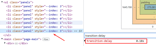

As you’ll see in the code, we’ll work with the last one, but we could equally have used the first one. To better understand it, try to give the selected panel a large delay of around 1s and see how the JavaScript animations get out of sync.
In terms of the code logic, we’ll do the following things in this order:
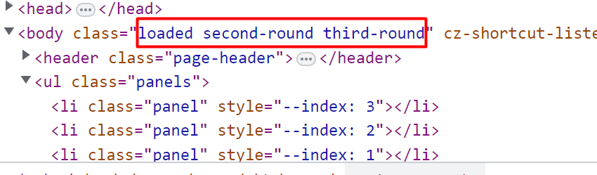
- First, when the page loads, we’ll add the
loadedclass to thebody. - Then, we’ll wait till the transition of the last panel finishes—this will fire twice in total. At that point, we’ll add another class to the
body. The first time we’ll add thesecond-roundclass, while the second time, we’ll add thethird-round.
After the completion of our transitions, the body will have these classes:

Here’s the JavaScript code:
1 |
const body = document.body; |
2 |
const lastPanel = document.querySelector(".panels .panel:last-child"); |
3 |
|
4 |
window.addEventListener("load", () => { |
5 |
body.classList.add("loaded"); |
6 |
|
7 |
lastPanel.addEventListener("transitionend", () => { |
8 |
if (body.classList.contains("second-round")) { |
9 |
body.classList.add("third-round"); |
10 |
} else { |
11 |
body.classList.add("second-round"); |
12 |
}
|
13 |
});
|
14 |
});
|
Instead of the load event, we could have used the DOMContentLoaded event.
And the corresponding styles of the page loading JS animation:
1 |
.loaded .panels .panel { |
2 |
clip-path: inset(0); |
3 |
transition-delay: calc(var(--index) * 0.06s); |
4 |
}
|
5 |
|
6 |
.loaded.second-round .panels .panel { |
7 |
clip-path: inset(0 0 100% 0); |
8 |
}
|
9 |
|
10 |
.loaded.third-round { |
11 |
overflow: auto; |
12 |
}
|
13 |
|
14 |
.loaded.third-round .page-main > div > * { |
15 |
opacity: 1; |
16 |
transform: none; |
17 |
}
|
Now you know how to put together a page loading JS animation!
Congrats, folks! We managed to build an attractive JavaScript page loading animation by staggering animations thanks to the transitionend event. Obviously, for more heavy use of page loading JS animations, a library like GSAP is a more robust approach to follow. Feel free to extend the demo as you wish and share it with me!
As always, thanks a lot for reading!
More projects to practice
Take a look at these projects on Tuts+ that use the clip-path property to apply different kinds of animations.