Learning and understanding how to build a layout is one of the hardest aspects of visual design to master. Many designers have trouble grasping the concept of alignment and how to use grids to make their designs balanced and principled. The reason that grids work so well is because they help you divide content into discrete, manageable modules. This makes your content more flexible and organized. It also makes your content easier to view and experience. We will take a look at grids and how they are used to help make layouts quicker to build and more enjoyable to view.
Types of Grids
Many designers use a grid as the foundation for every one of their designs. Some will use a 12-column grid, some will use a 16-column grid, some will use a 24-column grid, and others will use anything in between. The point isn’t so much the type of grid that you use, but the fact that you use one. Grids in web design are very common, and with the implementation of responsive web design, grids have become even more important than ever.
When using a grid, I prefer to use a 12 column layout. The width of each column depends on the medium (such as print or web), and the overall width of what I am designing. If I am designing something with a lot of smaller elements, I may switch to a 24-column grid. The gutter width is determined by the content itself and how much space that might be needed between each design element. If I am building a masonry-type layout, then I may only have a 1-2px gutter width. It really just depends on the application.
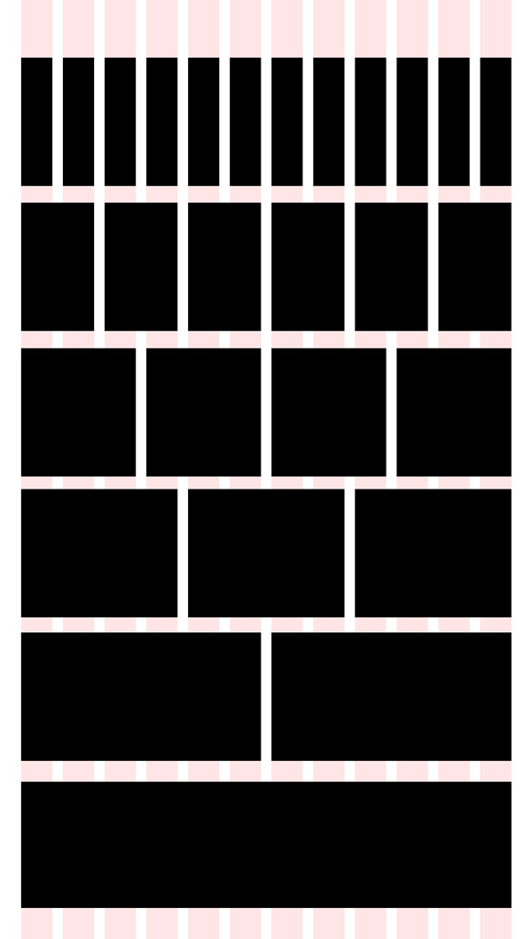
The reason I like 12 or 24column grids is because they offer a lot of different choices for your layout. You can choose from 1 block of 24-column wide content, 2 blocks of 12-column wide content, 3 blocks of 8 column content, 4 blocks of 6-column content, and so on. You can see this flexibility in the example shown above. This makes your design very malleable, because you can mix and match different combinations as well. You aren’t stuck with only using even and symmetrical layouts. Looking at the example below; you can mix and match different elements for a more dynamic look while still being well structured.
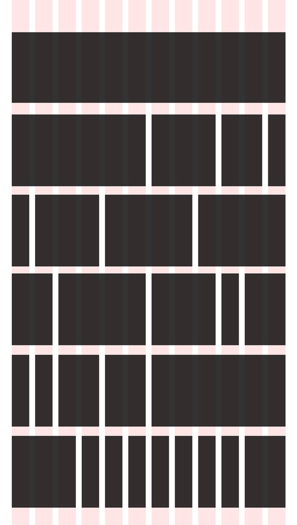
As you can see from the example above, the options are endless. Some designers are afraid of using grids because they think they will be confined to some kind of rigid, monolithic structure, but in reality there are unlimited options and combinations available. The example below shows a grid in use. The navigation spans the entire width, while the main content slider is roughly 60% of the width. The sidebar takes up around 40%. In the next row, the 3 articles are broken down evenly. Each row in succession is broken down into 3 even columns, making each article easy to process, and the gutter gives ample space for dividing the content.

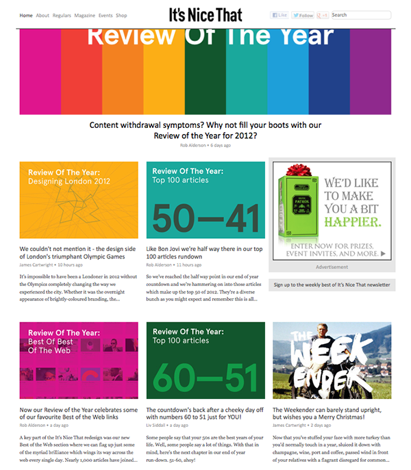
The website below follows a simple 3 column grid. This gives plenty of room for images and it breaks the paragraphs and articles into manageable chunks. It also makes it easy to slip an advertisement into the layout as well.
Grids in InDesign
Grids originated in print design, and they’re definitely still useful in the print medium. Setting up a structured grid for your print designs is simple, and it’s usually done in InDesign, but you can also set up a grid in Illustrator. In InDesign, you can determine your grid upon initially setting up your document. Simply create a new document in InDesign and the dialog box will come up with various options.
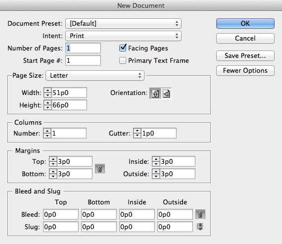
You will set up your document as usual, but note that you can change a few key settings to set up a multi-column grid. The default measurement is in picas, but if you are more comfortable with inches, you can change your unit of measure in InDesign’s preferences. In the initial setup menu, change the number of columns to something that works with your layout. Some designers prefer a 5-column grid, other designers use different variations. The gutter is the space between each column and should be substantially wide but not excessive. Margins are the space around your content. You never want to let text get too close to the edge. In the printing process it could get cut off of the document entirely.
Grids in Illustrator
In Illustrator, the grid setup process is a little different. You don’t create your grid during the initial document creation period. In Illustrator, you create your document as usual, select the text tool, and draw your text area by clicking and dragging to create a text box. The difference in this method is that you will want to set up guides to determine your margins for the document. Then, you can simply snap the text box to those carefully-placed guidelines.
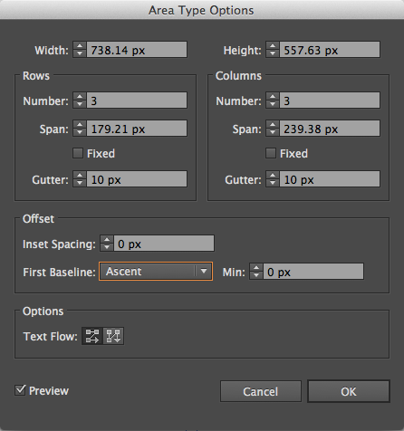
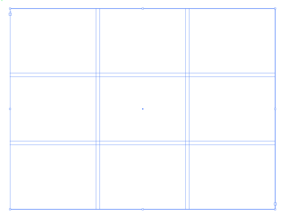
Then, go to “Type” in the top menu and choose “Area Type Options.” This will bring up a dialog box similar to the one found in InDesign. There are a couple of differences, such as the ability to create rows along with columns, so you can make a vertical grid, a horizontal one, or a grid that goes both ways. You will want to pay attention to the gutter settings as well. In Illustrator, you can check via preview and see how your grid looks as you build it, which is very helpful. Under “Options,” notice that you can determine whether the text flow from box to box is vertical or horizontal. The resulting grid from the settings above is shown below.
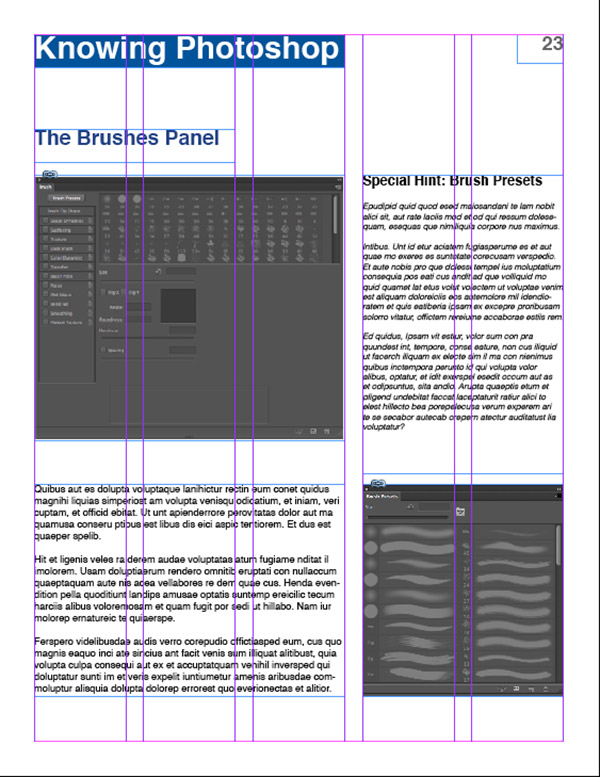
Below is an example of our InDesign grid in use. Using a 5-column layout, we have 3 columns for the main content, and two columns for side content. Notice the headline above the main image. Although the main structure of this section is a 3-column layout, the headline is only two columns and that is perfectly fine. The grid is made as a guide, and it doesn’t have to be followed to the letter in every single instance. The page number, 23, doesn’t fill an entire column.
Conclusion
Using grids in your designs is an excellent way to bring logical structure your work. Using a framework is a good way to organize information and group important elements together in order to make your content easier to experience and understand. The purpose of our work as designers is to communicate a message in the most palatable and most creative way possible, making the message stay with whoever views our design. Grids are a great way to guide our design elements, but we don’t always have to stick to the grid 100% of the time. Knowing when to break the grid structure can be a great way to create visual interest and draw attention to certain parts of your design.
Do you use grids in your design work? If so, what is your favorite type of grid? Do you have a versatile grid structure that works great in many different applications? If so, share your technique in the comments section below.