
Duration: 1 hour, 21 mins | Lessons: 9
In UI design, components are regular elements like buttons or forms that are used through the design process for the sake of speed and efficiency.
In Figma, you can create components super easily — and as a part of your standard workflow — so they can be reused later in different projects. So, minimal upfront (and one-time) effort means you’ll have a streamlined design experience from here on out. Let’s dive in!
1. Introduction
So yes, making a button and saving it as a component means you can use that same button time and time again across multiple designs. But by far the most popular aspect of components in Figma is the fact that if you make a change to a saved component, this change will be automatically reflected in every single instance of that component in your current design.


If you want to change the color of a button, you only need to do so on the main button and every instance of this button will be updated.
Now to follow along with this course, you will need a few files at your disposal. Downloading the following will help you follow this tutorial step-by-step. Once you have everything downloaded and ready-to-go, move on to the next lesson:
2. Creating one or more components
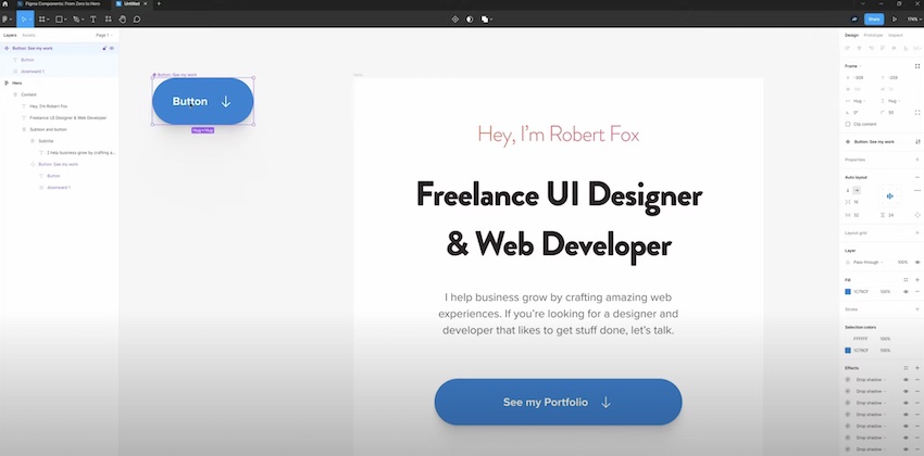
With the source Figma file open, you can begin the process of create a component. To create a component, you first need to select the layers you’d like to include in it. Continuing with our button example, you’d need to select the text and shape layers — or a group of elements — to ensure you’re properly creating a component.
A simple right-click is all it takes to create a new component in this fashion.
An element (or group of elements) will turn purple in the left hand menu when it’s become a component.
3. Main components vs. instances
One thing that’s important to understand about components is related to terminology — just so you don’t confused as you progress through various Figma tutorials.
So, the first time you create a component, this is referred to as the main component. However, anytime you create a copy of that main component, this is referred to as an instance.


Notably, you can’t change any attributes of an instance — only on the main component.
4. Making changes to components and instances
You can change the content contained within the instance of a component. This is called a component override and describes any of the changes you make within an individual instance. These overrides can include things like:
- The content within the instance
- The fill and stroke
- Border radius
- Layout grids
- Export settings
- Layer names
- Layer and text styles
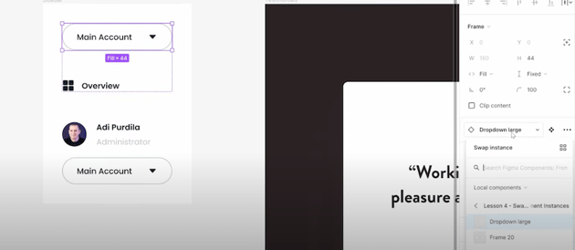
5. Swapping component instances
In Figma, instance swap describes the process where you can change out one component’s instance with another instance. This can be helpful in a wide variety of situations, but it’s particularly helpful in menus where you may need to move around menu options or buttons on the fly.


6. Naming and organizing components
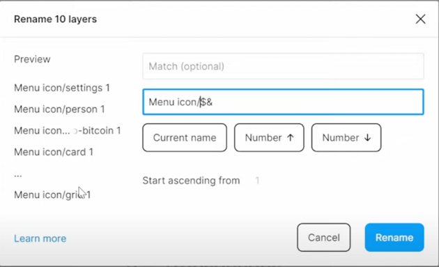
A design file should always be organized and Figma gives us a ton of tools for that. One of these is the ability to automatically organized components if they’re named a certain way.
Using the “slash” or “” separated naming convention in Figma, which makes it so all of the components selected are named as “Name You Choose / component name.” This makes it much easier to located like items in your component list. In this example, the items are organized under the category “Menu Icon.”


7. Using component variants
Variants allow you to group similar components within the same container. For instance, a button can have different states like pressed, mouse-over, or disabled. But instead of creating a separate component for each of these states, you can create a single component with multiple variants.
Using component variants results in a much cleaner artboard and workflow.
8. Working with component properties
Watch video lesson [1:00:26] ↗
So now you know that component variants can be very powerful, however, there does come a point where using them becomes inefficient. For instance, you might have a button that has dozens of variants to account for different color options, states, light and dark mode, and so forth. But having all of these variants can make it difficult to find the correct one you need at any given time.
The solution to this issue in Figma is component properties. While not a substitute for variants, they work alongside them to greatly simplify the design process.
There are 4 types of component properties: instance swap, text, boolean, and variant.
9. Prototyping with interactive components
Watch video lesson [1:13:31] ↗
Prototyping is all about interaction, it’s purpose being to show you how a design would work in the real world. To make the prototypes it produces to be as close to the real thing as possible, Figma allows you to create interactive components.
Interactive components make it possible to switch between different variants in a prototype.
Learn More About Figma and How to Use It
Now that you’ve got a handle on Figma components, you may wish to expand your skill set even further. This collection of tutorials ought to keep you occupied for some time!