Let’s Start by Painting a Picture
It’s a few weeks before Christmas, the snow has started to fall, and Geetha is planning to buy Christmas gifts for her family members. Geetha finds it easiest to shop online to avoid the Christmas rush in stores.
The first option that comes up is a clothing store, so Geetha visits the website and is greeted by this image.


Geetha feels the need to quickly buy a sweater for her nephew because the offer expires in 47 minutes. She selects a sweater quickly, proceeds to the checkout, and makes the payment. Geetha is satisfied with her purchase because she saved 30%. She closes her computer and leaves.
After a few hours, Geetha decides to buy more Christmas gifts, so she opens her computer again and is once again greeted by the discount, even though it has been more than 47 minutes.
What has happened?
Geetha has Fallen Victim to a Dark Pattern
Dark patterns deceive users, steering them towards unintended actions. They employ tactics like adding unnecessary items, subscribing users without consent, and forcing them to share a lot of personal information. Instead of focusing on what the user wants, dark patterns prioritise the company’s objectives. They often trick users into making unnecessary purchases through hidden buttons or misleading information.
In essence, dark patterns take advantage of user-centred design principles for their own benefit.
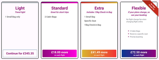
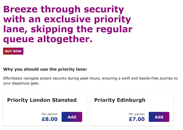
Another Dark Pattern Example
Imagine you’re booking a flight online for your upcoming trip. After selecting your departure and destination, you see a flight with a special offer: “Only 2 seats left at this price!” Intrigued, you proceed to book it.
But as you reach the booking page, you encounter a sneaky trick. The website automatically adds extras like seat selection, priority boarding, or travel insurance, which you didn’t necessarily want or need. The layout of the page makes it unclear how to proceed without selecting these extras, making it seem like they are necessary to secure the discounted fare.
In this scenario, the website tricks you into thinking you have to choose these additional features to continue with the booking. Instead of providing a straightforward process, the design aims to make you spend more money on unnecessary add-ons, rather than giving you control over your choices as a user.


In Conclusion
Dark patterns subvert all our knowledge of user-centred design, turning it against the user’s best interests.
Categories of Dark Patterns to Consider
Trick Questions
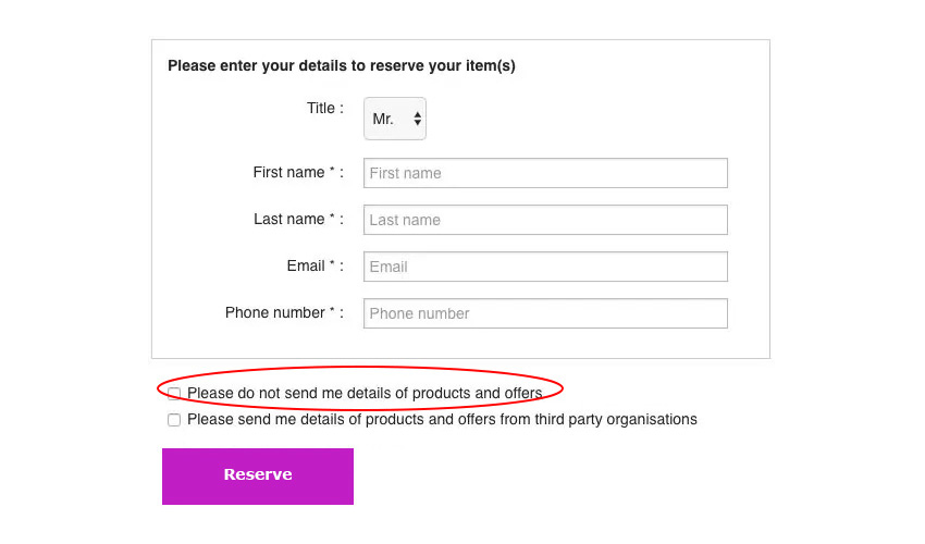
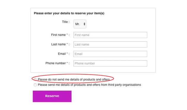
When you fill out a form, you might encounter a question that tricks you into giving an unintended answer. It seems to be about one thing at first glance, but actually asks something completely different.
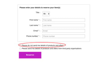
Sneak Into Basket
While making a purchase, the website sneaks in another item into your shopping cart without your notice, often by using a checkbox or button that you have to uncheck on a previous page.
Roach Motel
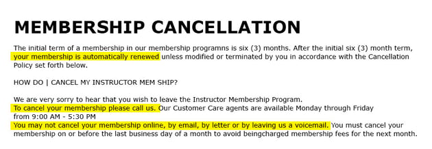
You quickly find yourself in a situation but then struggle to escape from it (e.g., a challenging premium subscription).

Privacy Zuckering
You’re deceived into sharing more personal information publicly than you originally intended. This term comes from Mark Zuckerberg, the CEO of Facebook.
Price Comparison Prevention
The retailer makes it difficult for you to compare prices between different products, making it hard for you to make an informed decision.
Misdirection
The design deliberately directs your focus to one thing to distract you from something else important.
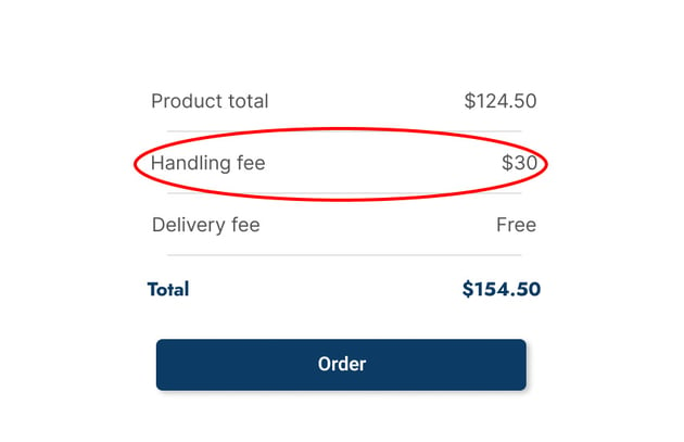
Hidden Costs
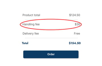
Just when you’re about to complete the checkout process, you discover unexpected charges like shipping fees or taxes.

Bait and Switch Tactics
You plan to do one thing, but end up with something else you didn’t want.
“Confirmshaming”
You feel pressured into choosing a particular option, and declining it makes you feel guilty.
Disguised Advertisements
Ads that pretend to be something else, like regular content or navigation elements, in order to trick you into clicking on them.

Forced Continuity
After a free trial period for a service ends, your credit card is charged without warning. Cancelling the membership may become a challenge.
Which Websites Use Dark Patterns?
In 2017, Nexer Group (then Sigma) conducted an online study to assess the use of dark patterns on the web. They discovered the presence of dark patterns on various platforms such as Amazon, boohoo.com, Clas Ohlson, PC World, Etsy, and more. Their results:
”Dark patterns are not at all poor design by mere negligence. They are intended to persuade and dissuade consumers in ways that benefit the brand rather than the user. In our research, we found some retailers using colour theory and vague micro-copy to misdirect and manipulate their users. In this respect, we questioned the ethics around such dark patterns and the approach retailers take regarding short-term sales over longer-term, more valued customer relationships and satisfaction.
People might have a negative experience on a website because of bad user experience design, whereas dark patterns are premeditated – they are well thought out and based on behavioural psychology.”
So, Dark Patterns Are Bad, But What’s the Alternative? Nudging of Course!
Nudging is about gently guiding people towards making better choices for society as a whole. It’s about positively influencing behaviour, something many organisations aim to do for their customers, employees, and (again) society as a whole. By using nudging techniques, they seek to encourage positive changes and help individuals make more favourable decisions.
Here are some examples of nudging out in the wild you might have seen before:
1. The Urinal Fly
Reducing Spillage Around Urinals.
Back in the early 1990s, the genius cleaning manager at Amsterdam’s Schiphol Airport cracked the code for reducing pee spillage at urinals. His solution? Etching tiny, realistic flies right near the drain. They’re small and a bit cute, definitely not as terrifying as spiders, which could scare people away from doing their business.
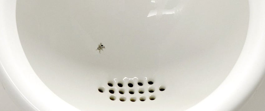


According to Aad Kieboom, the mastermind behind this idea, people have no qualms about taking aim at something as cute as a fly. And it worked! They saw a whopping 80 percent drop in mess and even saved around eight percent on bathroom cleaning costs. That’s why you’ll now find those little fly engravings in restrooms all over the globe.
2. The Colourful Dove
Encouraging smokers to utilise the provided ashtrays.
Led by the nudging company Win Win World, this Swedish project took a more hands-on approach at selected bus stops. They strategically placed cool ground stickers and signs with doves to get smokers to actually use the ashtrays provided. And guess what? It worked like a charm!


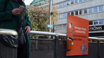
After careful evaluation, they found out that bus stops with signs and ashtrays had the biggest impact in the long run. They saw a whopping 70% drop in cigarette butt litter. But here’s the funny part: when they only had a plain black ashtray with no fancy signs, the litter went up. Turns out, people need a little nudge to do the right thing.
3. Ballot Bins
Engage communities beyond football.
Hubbub, an environmental organisation, creatively taps into the passion of football fans to combat cigarette litter. Their innovative ashtrays, called ’Ballot Bins,’ engage communities beyond football and have achieved impressive results.
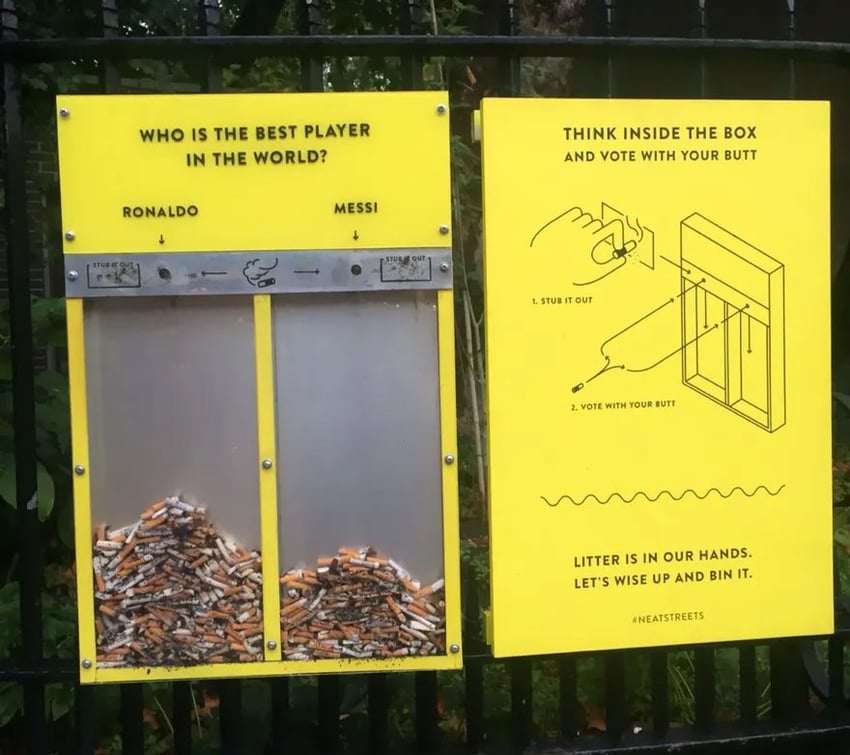
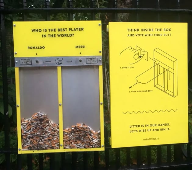
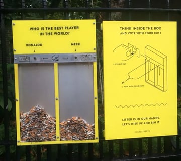
Southend Council witnessed a 46% reduction in cigarette litter, while Keep America Beautiful reported a remarkable 74% decrease on busy streets. Currently used by 30 UK councils, these ashtrays make a significant impact.
4. Checkout
Nudging people to make environmental shipping choices.
When it comes to the checkout process, loads of retailers are all about getting users to make greener shipping choices that match their eco-friendly preference. So, alongside the usual shipping options, there are two nudging options. The first one’s the handy in-store pickup, where they give users a gentle nudge to go for this eco-friendly choice, where they explain how it reduces their carbon footprint and cuts down on packaging waste.

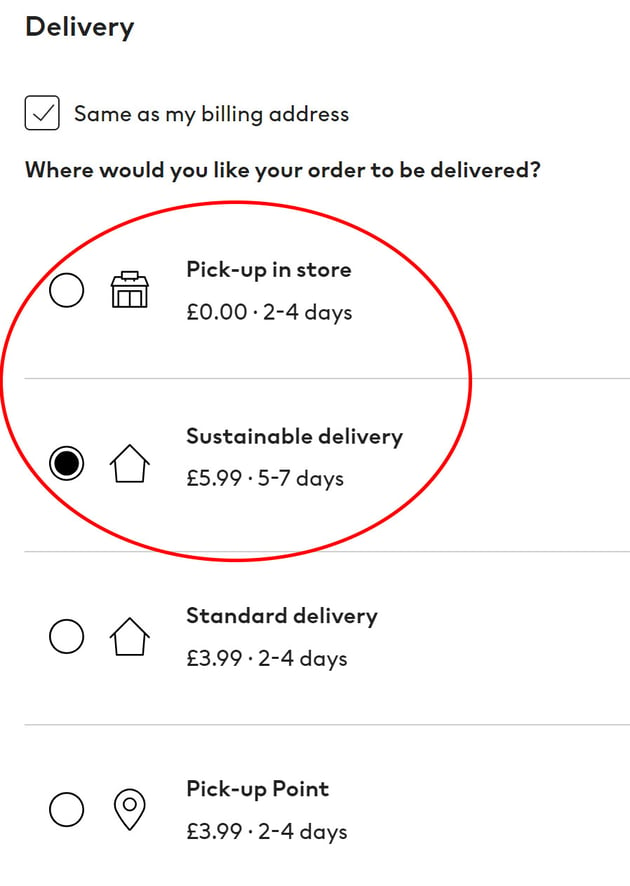

The other option is the green sustainable shipping, where users can choose to pay a bit more money to make sure their package gets shipped using eco-friendly methods. The whole idea behind these nudges is to give users the power to make smart choices that help create a greener and more sustainable future.
Conclusion
In a nutshell, when it comes to UX design, we have a clash between dark patterns and nudging. Dark patterns play dirty by tricking users into certain actions, while nudging takes the subtle approach of guiding them towards better choices that benefit everyone. It’s like a battle between deception and gentle persuasion.
So, as designers, it’s our job to create user-centred experiences that respect autonomy and foster positive engagement. We need to leave the sneaky tricks and embrace nudging techniques to empower users and make the digital world a more ethical and user-friendly place. Let’s nudge our way to better UX!