In the second of our two part tutorial, I’m going to show you how to use our
1. Set Up Your Grid
Step 1
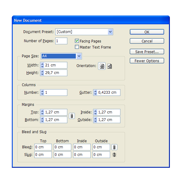
OK time to go into InDesign. Open a New A4, spread document.
Step 2
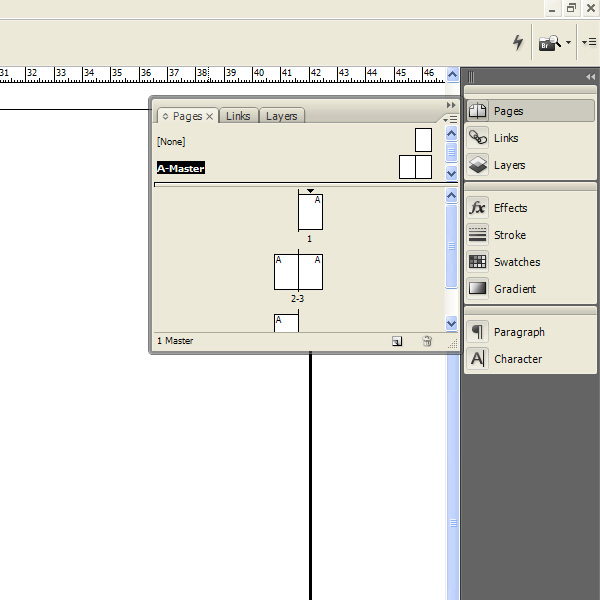
Head over to your Pages panel and create an extra spread (double page). Select the Master page by double-clicking on it. We’re now working on this page exclusively.
Step 3
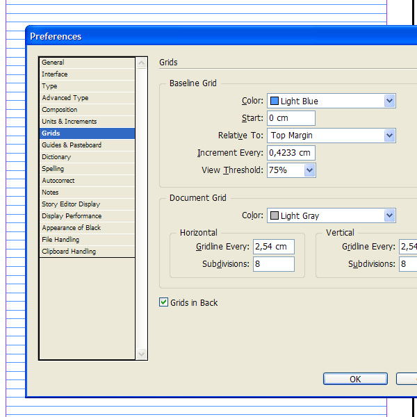
Go to Edit > Preferences and edit the baseline to the appropriate settings.
Step 4
We’re now going to create a modular grid that fits to the baseline. This is pretty easy to do with a legal/letter page where the baseline is a proportionate fraction of the overall page height. On an A4, the division doesn’t fit perfectly. The last baseline is always cropped, which makes it difficult to make a modular grid on an A4 with an aligned baseline.
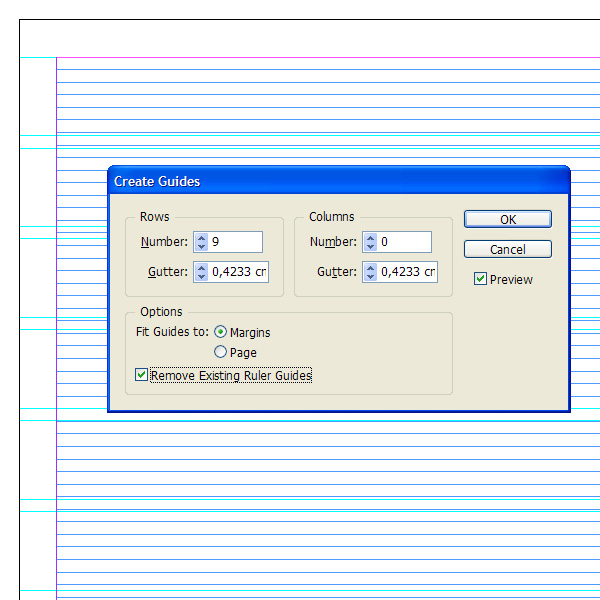
Here’s a trick you can try. First of all, go to Layout > Create Guides and add the following settings. Use 12pt for gutters, same as the baseline size.
Step 5
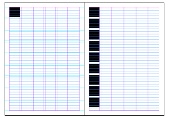
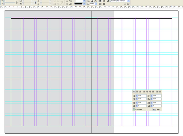
Create a shape which follows the newly created modular grid. The baseline and new guides won’t fit perfectly so draw the shape so that it fits approximately into one modular cell. See the left side of the page for reference. Then hide the modular guides and begin multiplying the shape downward with a 12pt gutter – see right page for reference. It won’t fit your page perfectly, which is OK.
Step 6
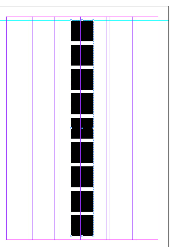
Group the shapes together (Control-G) and center them on the page using the align tools. This will basically become your new modular grid which will fit a baseline grid as well, on an A4. Now drag a guide and snap it to the top of the line of boxes.
Step 7
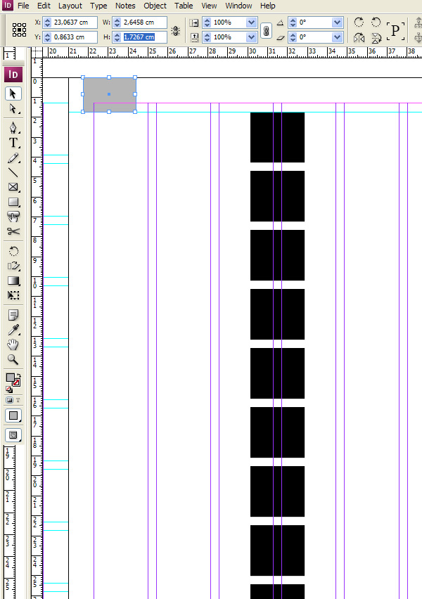
Create a shape which stretches from the newly created guide to the top of the page. This will be your new paper margin, so copy its height measurement from the top menu.
Step 8
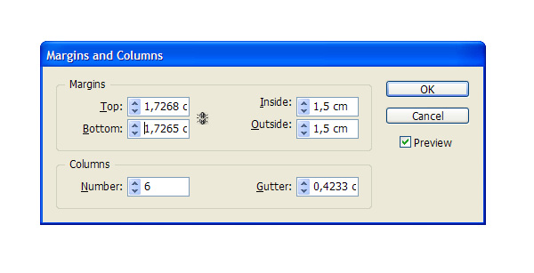
Go to Layout > Margins and columns and paste this measurement in the top and bottom margin. Keep a 1.5 margin on the sides and interior of the spread.
Step 9
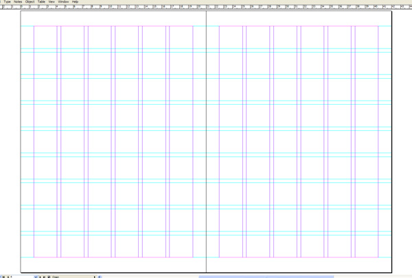
Great, now draw the guides and snap them to the boxes on each page to get that new modular grid. Your spread should now look like this. If you kept your baseline grid to start from the top margin, and not the top of the page, then you now have modular baseline grid. Stop working on the master page and go to page 1, or the cover. Let’s add the image as a background.
2. Design Your Front Cover
Step 1
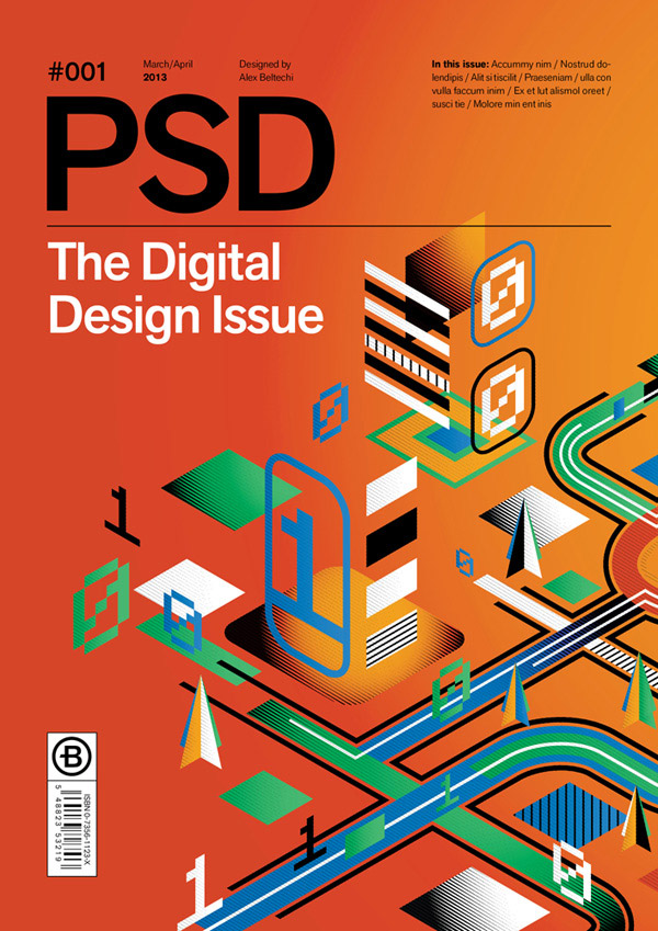
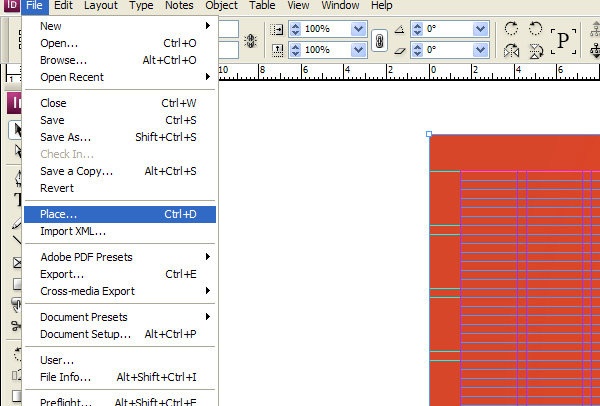
Go to File > Place and select the exported illustration. Place it as a full page by dragging the shape from one corner to the other.
In InDesign, placing an image is done inside a shape which acts like a mask in Photoshop. If you want to crop the image, simply make the box smaller. If you want to change the dimensions or move the image itself, use the Direct Selection Tool and edit it after you’ve clicked it.
Step 2
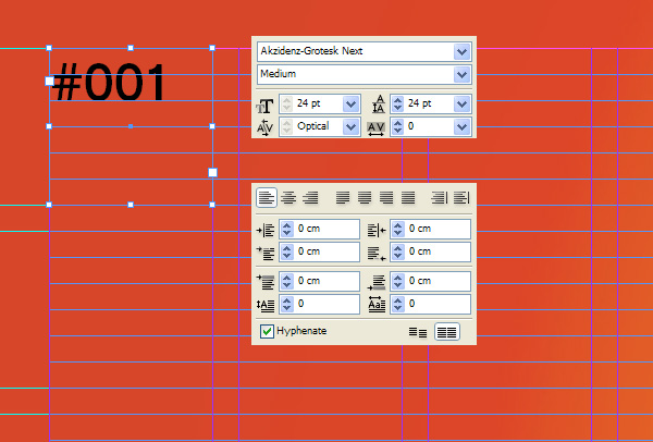
Adding content now should be easy, since you have the guides to rely on. Let’s start by making a magazine title and additional info. I’ll only cover the technical aspects of this, since the matter of choosing where to place content really is up to you.
Use the Type Tool (T) to drag a box in the first column in the top left corner and use the following settings. In the Paragraph panel, don’t forget to activate ‘snap to baseline grid‘, it’s the right lower corner box in the Paragraph panel and it makes all text snap to the baseline.
Step 3
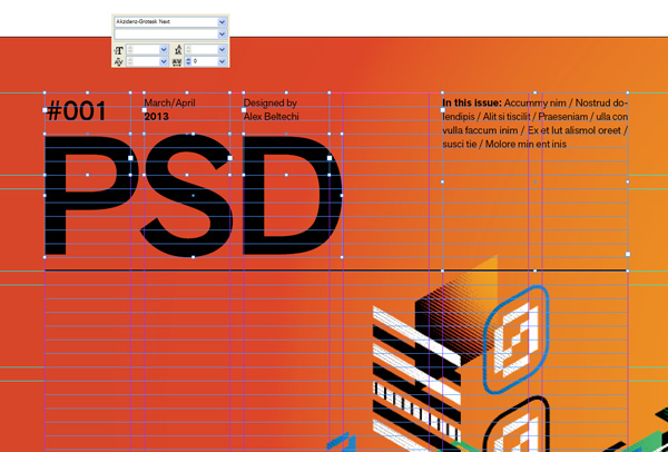
Awesome, add the rest of the content similarly, using the same technique as above. For the PSD title, I just "expanded" the text by going to Type > Create Outlines and stretched it proportionately to fit the required boxes of the grid.
Step 4
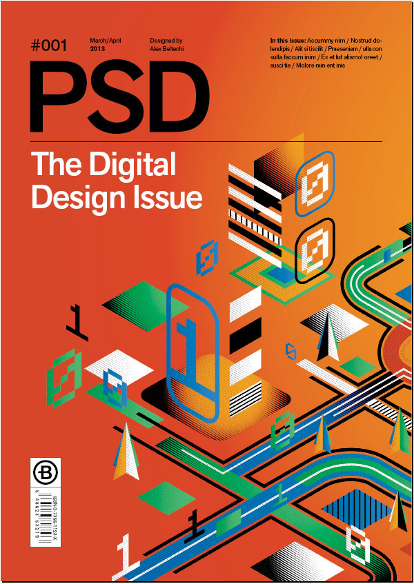
Final adjustments to the cover: adding a subtitle and a fake bar code box and a dummy logo.
Now, how to change text color. If you have a text box selected, go to Window > Swatches. All colors attributed to shapes, text etc need to be picked from here. Click on the little T icon and change the text color to white. The T icon is text color, as opposed to shape color which is positioned to its left.
3. Design Your Inside Spread
Step 1
Onto the next page, the spread.
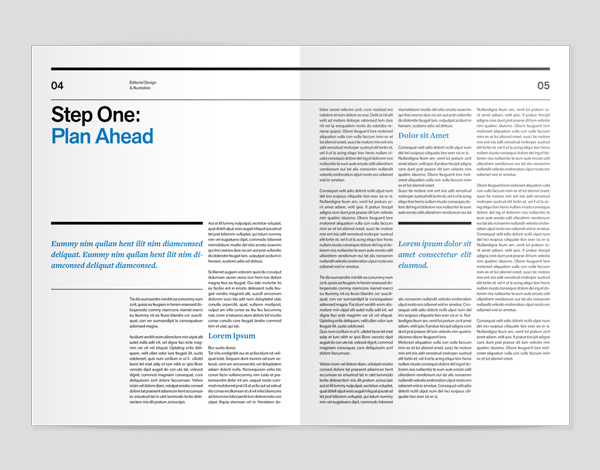
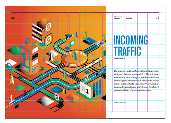
I’ve decided to make the spread mostly photographic so I’ve snapped a shape for where my illustration will be that goes full left page and 1.25 columns of the right. I’ve also placed a 6pt stroke on the top to start creating the header.
The grey shape is basically a placeholder which I’ll use later to fill it with the image by using File > Place. You can already place it if you like, but I recommend using simple non color shapes to plan the composition and add the rest near the end.
Step 2
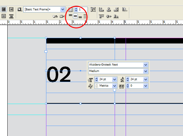
Next create the page number on the left page. Use the following settings and create its text box so that it fills up a whole column. Align the text to the center of the text box (icon circled in red) and don’t forget to make it snap to baseline in the Paragraph settings.
Step 3
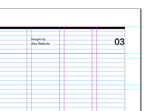
The same goes for the opposite side. Add the page number and chapter title on the right page.
Step 4
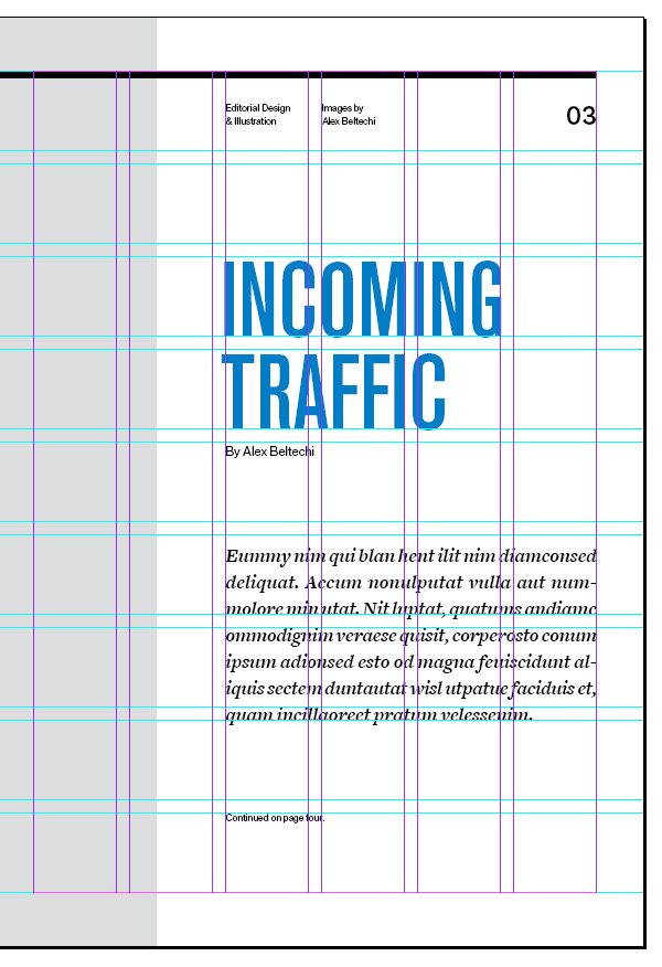
Add the rest of the info: Article title set in "Akzidenz Grotesk BQ Condensed", 96pt size, 84pt spacing. Why this size? Simple, I’ve made the text spacing and size so that it is proportionate to a row size. Notice that the text snaps to the bottom of two vertical rows from my modular grid.
Underneath I’ve placed the so called author title, and a dummy text introductory paragraph set in "Freight Text Bold Italic".
Step 5
Just place the illustration inside the placement box and you’re done with your first spread.
Step 6
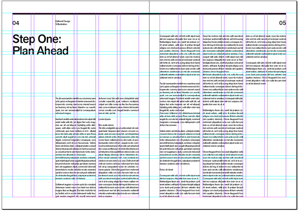
I’ve made an addition spread that focuses on text only. Cosing which columns to use for body text and which to not use, is a matter of planning the composition while allowing content room to breathe through white space (inactive areas).
What you want to do is add the body text and the headline to start with. Slowly we will add quotes, introductory paragraphs, images perhaps (not in this case though)..
Step 7
Now let’s add an intro paragraph.
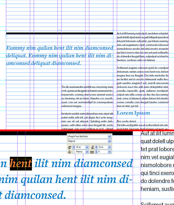
You can see the settings below for the text but let me go over some info on how to decide what font size to use on your page. A 12 point baseline is very compatible with your standard font sizes in the font size drop down menu, in general.
If your row spacing is 12pt, then your font size should be 9 or 12, so as to allow room in between each row. Having 12pt size / 12 pt spacing will choke it up and make reading slightly more difficult as well as making the paragraph too heavy and intimidating. Allow your rows room to breath.
A 12pt baseline means your spacing is always a multiple of 12pts. 12 pt, 24pt, 48 pt etc. That means that choosing a larger font size is also easy. 24 pt row spacing? Use 18pt font size. 48 row spacing? Use 36 pt font size. The list goes on.
Another beautiful example of why you should use a baseline can be seen in the screenshot. Notice how the larger and smaller fonts align. This is more difficult to do without a baseline. If you’re having trouble aligning the top of the paragraphs with an image frame for instance, you might want to change your baseline to 6pt which doesn’t change the basic layout of anything since it’s a division of your existing 12 pt baseline. It does however allow further refinement for aligning and a more flexible row spacing. You may want to do this only after gaining some experience with combining font size and row spacing.
Step 8
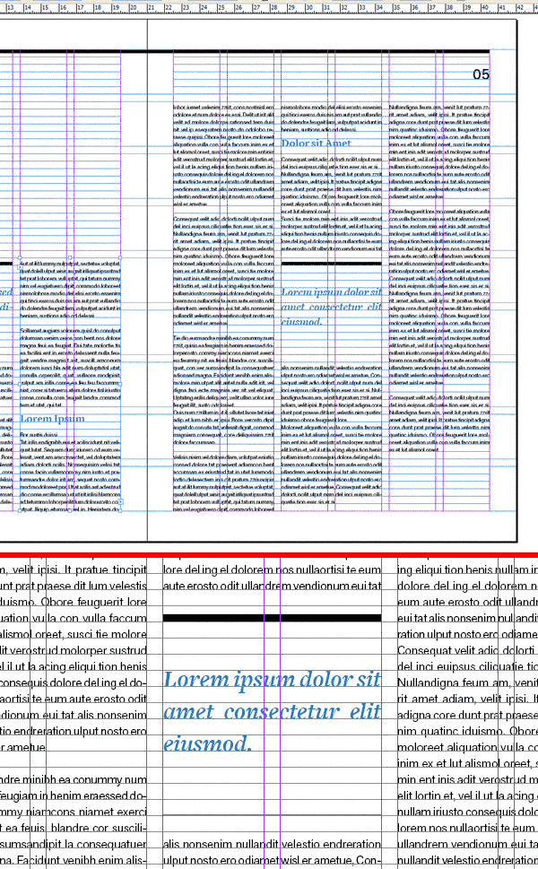
I’ve also added titles and quote sections on my page using the same techniques.
4. Create a Mock Up for Your Spread
Step 1
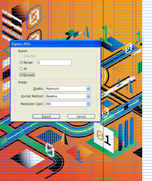
Alright, time to make a mock-up of our cover and spreads. Export each spread as a jpeg through File > Export. Use the settings below. We’re going to work on the first spread and you can do the cover and last spread yourself.
Step 2
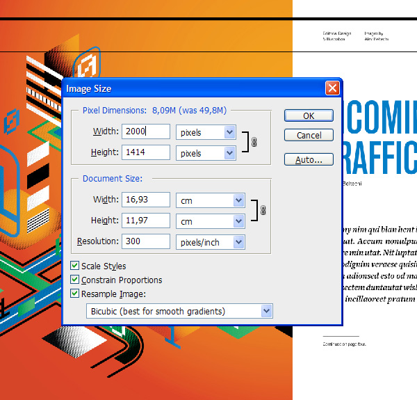
Resize your image in Photoshop to 2000 pixels. If you want to keep it at the original 4500px size, that’s fine. I’m making this mock-up for screen sizes and resizing InDesign and Illustrator exports to smaller sizes is better because it softens the anti aliasing on text and graphics, which creates a more photographic look.
Step 3
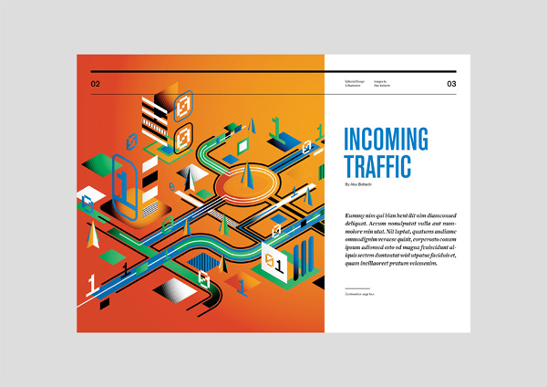
Name your background layer and re-crop the canvas so that it allows extra space. Fill the background with a grey you are comfortable with.
Step 4
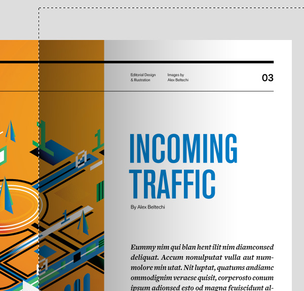
Create a new layer and make it a Clipping Mask for the spread layer. Drag a guide in the center of the canvas (should snap automatically to the center with Smart Guides enabled).
Use the Gradient Tool (G) to make a black to transparent gradient on the right page. Use the Marquee Tool to limit the gradient to the right page (using the center guide as a center limit). If it’s too dark, you can change the transparency of the layer.
Step 5
Do the same for the left side this time and blur the gradient layer by 1px (Filter > Blur > Gaussian Blur). This will make the center line look more like a realistic fold.

Step 6
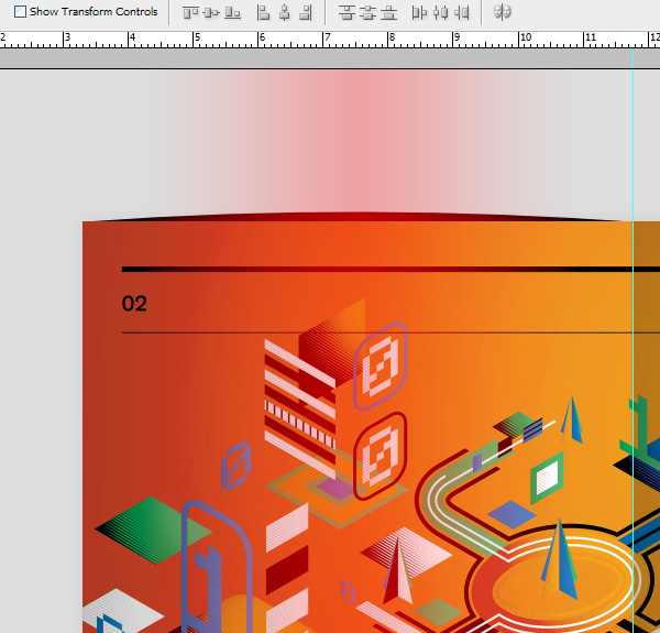
Create a new layer underneath the magazine layer. Fill it with black and make it fit as much as the left page. Use the Warp Tool to warp it as seen below. Do the same for the bottom (warping).
Step 7
Enter Quick Mask Mode (Q) and create a gradient using black like in the image below. We’re going to make a selection using gradients.

Step 8
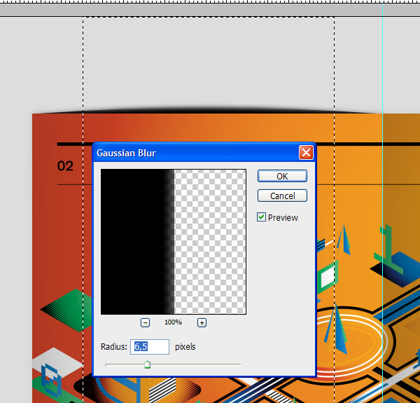
Exit Quick Mask Mode (Q) and invert your selection (Control-Shift-I). Go to Filter > Blur > Gaussian Blur. Blur the selection by 6.5px.
Step 9
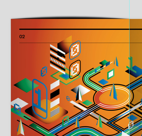
Deselect and blur the whole layer now by 1px.
Step 10
Drop the layer Opacity to 20%. It should be barely visible. Duplicate it and drag it to the right page as well.
Erase a bit of the top with a gradient mask so it’s heavier on the bottom and lighter on top. Now double-click the spread layer and add a Dropshadow.

Awesome Work, You’re Now Done!
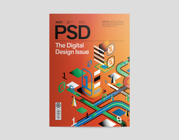
That’s it! Here are the final mock-ups and cover of our project. I hope you’ve picked up some great tips along the way.
