In this new tutorial, we’ll learn how to build an animated JavaScript accordion component with overlapping panels.
We won’t focus so much on accessibility in this tutorial, so exploring how to make this component more accessible would be a valid next step.
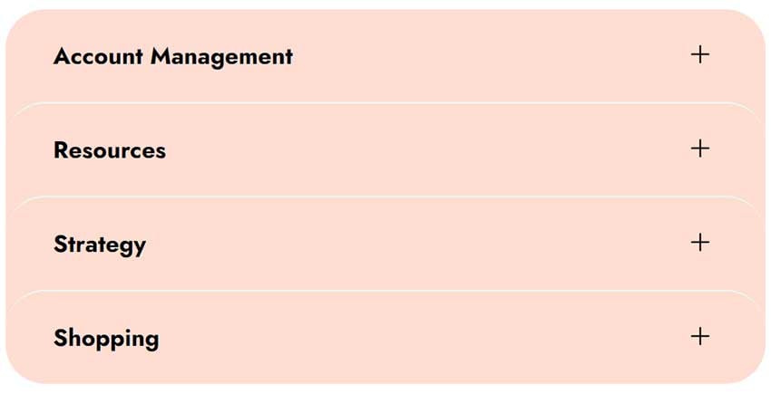
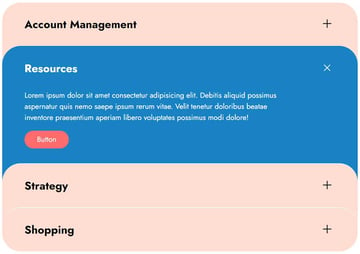
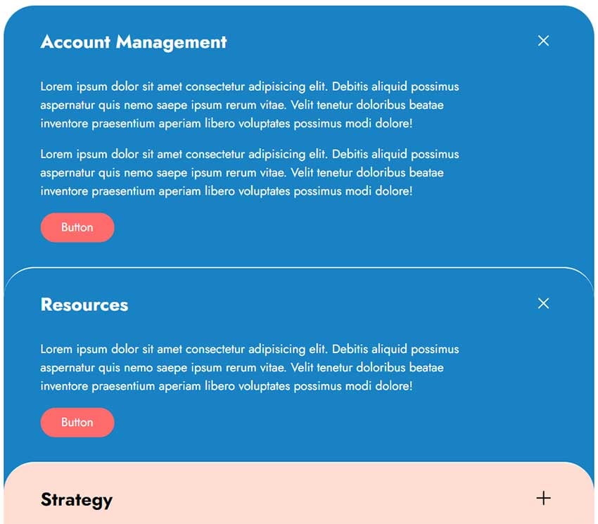
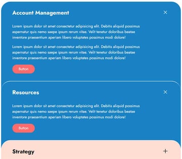
Our accordion component
Here’s what we’re going to create (click on a panel to test the behavior):
1. Begin with the page markup
Inside a container, we’ll place a list of panels.
Each panel will have a title and content. Within the title, we’ll add a Close button from where we can close the active panel.
Here’s the required structure:
1 |
<div class="accordion-wrapper"> |
2 |
<ul>
|
3 |
<li>
|
4 |
<h2 class="accordion-title">...</h2> |
5 |
<div class="accordion-content"> |
6 |
<div class="inner">...</div> |
7 |
</div>
|
8 |
</li>
|
9 |
<li>
|
10 |
<h2 class="accordion-title">...</h2> |
11 |
<div class="accordion-content"> |
12 |
<div class="inner">...</div> |
13 |
</div>
|
14 |
</li>
|
15 |
<li>
|
16 |
<h2 class="accordion-title">...</h2> |
17 |
<div class="accordion-content"> |
18 |
<div class="inner">...</div> |
19 |
</div>
|
20 |
</li>
|
21 |
<li>
|
22 |
<h2 class="accordion-title">...</h2> |
23 |
<div class="accordion-content"> |
24 |
<div class="inner">...</div> |
25 |
</div>
|
26 |
</li>
|
27 |
</ul>
|
28 |
</div>
|
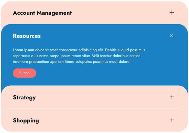
Initial accordion state/active items
By default, all panels will be collapsed.
To prevent this behavior, we’ve to assign the active class to one or more panels like this:
1 |
<ul>
|
2 |
<li class="active">...</li> |
3 |
</ul>
|

Multiple open panels
There’s also the option to have more than one panel open simultaneously without one collapsing when the other is open. To enable this, we should add the data-multiple="true" attribute to the accordion wrapper like this:
1 |
<div class="accordion-wrapper" data-multiple="true">...</div> |

2. Add the CSS
Let’s now concentrate on the key styles—most of the other styles aren’t anything special, so let’s leave them for now:
- To make the panels overlap and create a different accordion layout compared to the standard ones, we’ll give them a negative top margin and an equal bottom padding. Only for the first and last items, we’ll cancel the top margin and bottom padding respectively.
- To hide the content of each panel, we’ll give them
height: 0andoverflow: hidden. Then, as we’ll see later, through JavaScript, we’ll recalculate their height and reveal them smoothly. Just, note that we’ll also useheight: 0 !importantto reset the height to 0 and override the JavaScript styles for a previously active panel. - To open the modal, the whole panel area will be clickable. To make it clear, we’ll assign
cursor: pointerto all panels. On the contrary, when a panel is open, we can close it only via the close button. At this moment, only this button will havecursor: pointerwhile the panel will havecursor: default.
Here’s a part of the required styles:
1 |
/*CUSTOM STYLES HERE*/
|
2 |
|
3 |
.accordion-wrapper li { |
4 |
padding: 0 20px 100px; |
5 |
cursor: pointer; |
6 |
border-top-left-radius: var(--accordion-radius); |
7 |
border-top-right-radius: var(--accordion-radius); |
8 |
background: var(--accordion-bg-color); |
9 |
transition: all 0.2s ease-out; |
10 |
}
|
11 |
|
12 |
.accordion-wrapper li:not(:first-child) { |
13 |
margin-top: -100px; |
14 |
border-top: 2px solid var(--light-cyan); |
15 |
}
|
16 |
|
17 |
.accordion-wrapper li:nth-last-child(2), |
18 |
.accordion-wrapper li:last-child { |
19 |
border-bottom-left-radius: var(--accordion-radius); |
20 |
border-bottom-right-radius: var(--accordion-radius); |
21 |
}
|
22 |
|
23 |
.accordion-wrapper li:last-child { |
24 |
padding-bottom: 0; |
25 |
}
|
26 |
|
27 |
.accordion-wrapper:not([data-multiple="true"]) li.active { |
28 |
border-top-color: var(--accordion-active-bg-color); |
29 |
}
|
30 |
|
31 |
.accordion-wrapper li.active { |
32 |
cursor: default; |
33 |
color: var(--white); |
34 |
background: var(--accordion-active-bg-color); |
35 |
}
|
36 |
|
37 |
.accordion-wrapper li:not(.active) .accordion-content { |
38 |
height: 0 !important; |
39 |
}
|
40 |
|
41 |
.accordion-wrapper .accordion-content { |
42 |
height: 0; |
43 |
overflow: hidden; |
44 |
transition: height 0.3s; |
45 |
}
|
46 |
|
47 |
.accordion-wrapper .inner { |
48 |
padding-bottom: 40px; |
49 |
}
|
50 |
|
51 |
@media (min-width: 700px) { |
52 |
.accordion-wrapper li { |
53 |
padding-left: 60px; |
54 |
padding-right: 60px; |
55 |
}
|
56 |
|
57 |
.accordion-wrapper .inner { |
58 |
max-width: 85%; |
59 |
}
|
60 |
}
|
3. Add the JavaScript
The way we’ll animate each panel and achieve a slide effect similar to jQuery’s slideToggle() function is by taking advantage of the scrollHeight property.
This property measures the height of an element’s content, including content not visible on the screen due to overflow. In our case, we’ll need to calculate that value for the .accordion-content elements which have height: 0 and overflow: hidden by default.
When DOM ready
As a first action, when the DOM is ready, we’ll check if there are any active panels, and if so, we’ll set the height for the .accordion-content element of each active panel equal to its scrollHeight property value.
Here’s the related JavaScript code:
1 |
const activeItems = accordionWrapper.querySelectorAll("li.active"); |
2 |
|
3 |
if (activeItems) { |
4 |
activeItems.forEach(function (item) { |
5 |
const content = item.querySelector(".accordion-content"); |
6 |
content.style.height = `${content.scrollHeight}px`; |
7 |
});
|
8 |
}
|
Toggle accordion panels
Next, each time we click on a panel, we’ll do the following things:
- Check if we clicked on the close button. If that happens and the panel is open, we’ll close it by removing the
activeclass and ignoring all the next steps. - Check if we’ve set the option to have multiple panels open together. If that isn’t the case and there’s an active panel, we’ll close it.
- Add the
activeclass to that panel. - Set the height for the
.accordion-contentelement of this panel equal to itsscrollHeightproperty value.
Here’s the JavaScript code that implements all that behavior:
1 |
const accordionWrapper = document.querySelector(".accordion-wrapper"); |
2 |
const items = accordionWrapper.querySelectorAll("li"); |
3 |
const multiple_open = accordionWrapper.dataset.multiple; |
4 |
const ACTIVE_CLASS = "active"; |
5 |
|
6 |
items.forEach(function (item) { |
7 |
item.addEventListener("click", function (e) { |
8 |
// 1
|
9 |
const target = e.target; |
10 |
if ( |
11 |
(target.tagName.toLowerCase() === "button" || target.closest("button")) && |
12 |
item.classList.contains(ACTIVE_CLASS) |
13 |
) { |
14 |
item.classList.remove(ACTIVE_CLASS); |
15 |
return; |
16 |
}
|
17 |
|
18 |
// 2
|
19 |
if ( |
20 |
"true" !== multiple_open && |
21 |
document.querySelector(".accordion-wrapper li.active") |
22 |
) { |
23 |
document
|
24 |
.querySelector(".accordion-wrapper li.active") |
25 |
.classList.remove(ACTIVE_CLASS); |
26 |
}
|
27 |
|
28 |
// 3
|
29 |
item.classList.add(ACTIVE_CLASS); |
30 |
|
31 |
// 4
|
32 |
const content = item.querySelector(".accordion-content"); |
33 |
content.style.height = `${content.scrollHeight}px`; |
34 |
});
|
35 |
});
|
Conclusion
Done! I hope you enjoyed the JavaScript accordion we built and learned one or two new things.
Before closing, let’s recall our main creation today:
As always, thanks a lot for reading!