In the following tutorial, you’ll learn everything you need to know about Adobe Illustrator’s Character panel. You can read this detailed written guide, and additionally, you can follow this new video from the Envato Tuts+ YouTube channel:
What You’ll Learn in This Character Panel Illustrator Tutorial
- How to open the Character panel in Illustrator
- How to adjust leading in Illustrator
- How to adjust kerning in Illustrator
- How to change the spacing between letters in Illustrator using tracking
- How to change the baseline shift in Illustrator
- How to capitalize text in Illustrator
- How to do superscript in Adobe Illustrator
- How to do subscript in Illustrator
- How to snap to glyphs using Illustrator’s Character panel
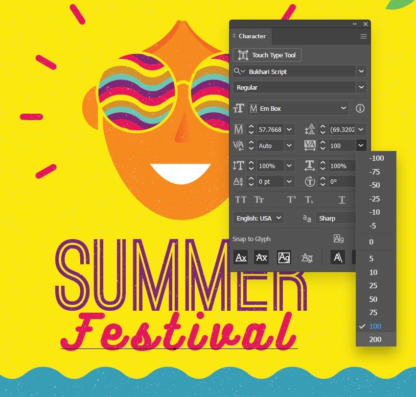
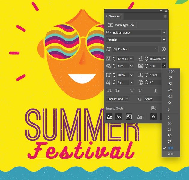
- How to adjust letter spacing in Illustrator using the Touch Type Tool
- How to adjust the default character style in Illustrator
- How to create a character style in Illustrator
1. How to Open the Character Panel in Illustrator
Illustrator’s Character panel is one of the most essential instruments if you’re looking to work with text in Illustrator. Besides the classic font, size, or style attributes, it provides access to more precise text settings. In this tutorial, we’ll have a look at all the available settings, and hopefully by the end you’ll understand much better the power that you have when working with text in Illustrator.
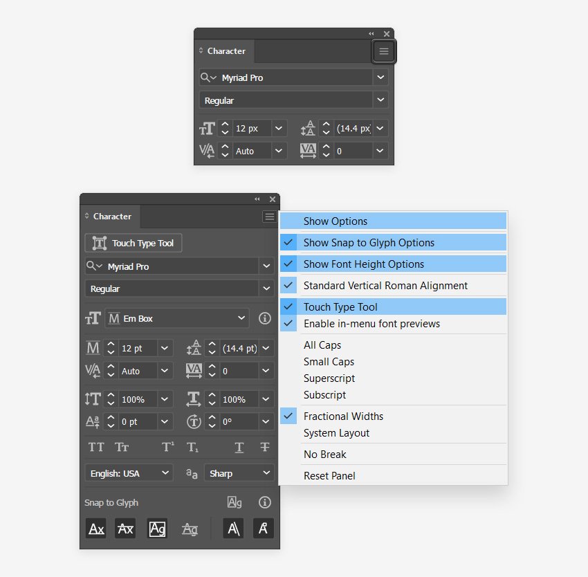
To start, let’s learn how to show the Character panel in Illustrator. You can either go to Window > Type > Character or you can use the Control-T keyboard shortcut.
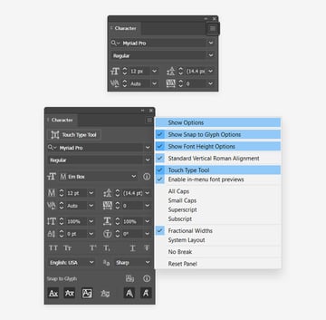
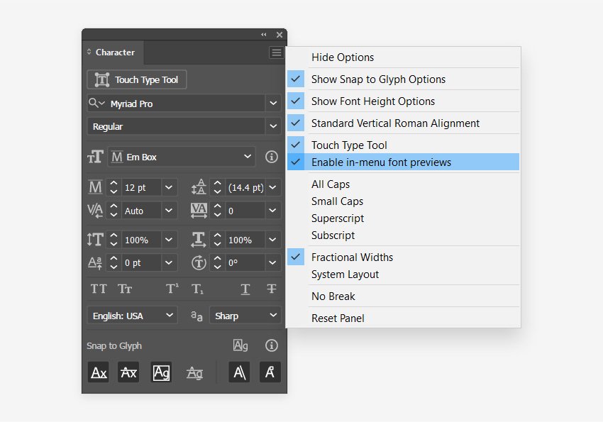
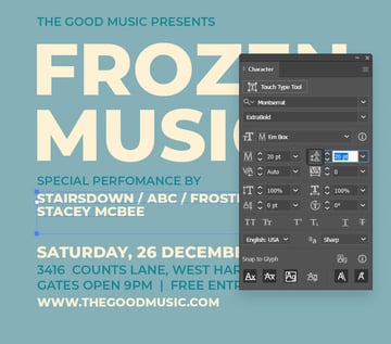
By default, you’ll have access to some of the most basic settings. To add the rest of the settings, you need to open the fly-out menu from the Character panel. Start by selecting Show Options, and then reopen the fly-out menu to enable the Snap to Glyph and Font Height Options, and also the Touch Type Tool.

2. How to Show the Character Panel in Illustrator
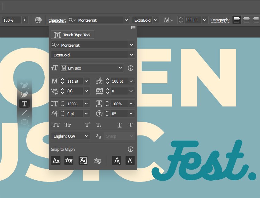
As long as you have a text tool selected, you can also access the Character panel using the Control panel. Go to Window > Control if you can’t see the Control panel.
Simply click the Character text, and this will open the Character fly-out panel. This can be pretty useful when you need to make some quick text adjustments.


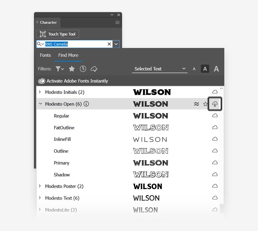
3. How to Browse and Preview Fonts Using the Character Panel in Illustrator
Step 1
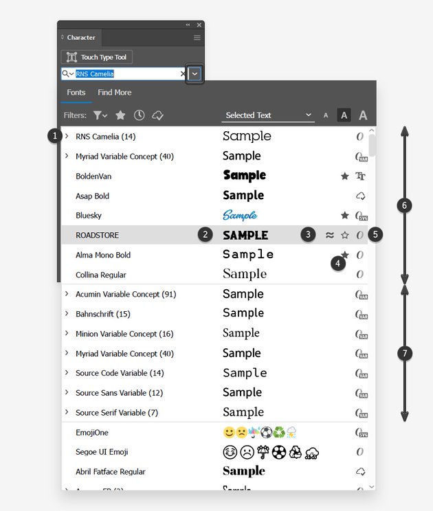
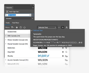
Focus on the Character panel, and let’s start with the font. Just click that arrow button to open the Fonts list. At the top of the list you’ll find the recently selected fonts (6), and below this list you have the variable fonts. Then the list continues with the rest of the fonts.
On the left side (1), you have the name of the font, and between parentheses is the number of available styles. You can click that arrow button on the left-hand side to have a look at all the available styles.


Step 2
Next, you have a preview of the font (2). If you can’t see it, you need to open the fly-out menu from the Character panel and Enable in-menu font previews.

Use that wavy button (3) to quickly view similar fonts. Remember to click that Back button to remove the filter and return to the entire list of fonts.
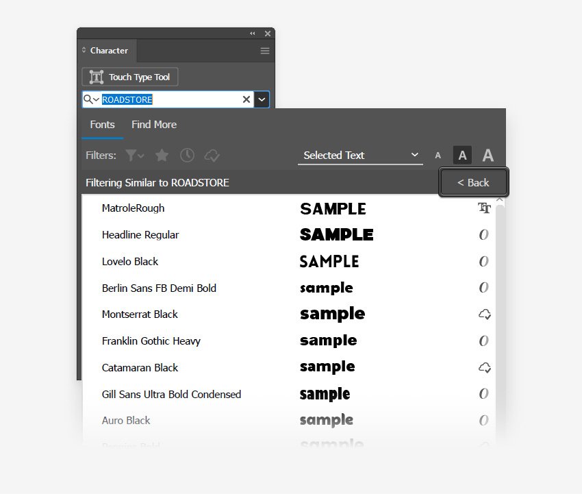


Using the star buttons (4), you can easily save fonts as favorites or remove them from the favorites list.
On the right-hand side (5), you have a series of icons which indicate the type of the font: OpenType, Variable, TrueType, SVG, or Activated Adobe Font.


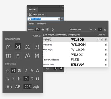
4. How to Filter Fonts Using the Character Panel in Adobe Illustrator
If you have hundreds of fonts installed, it might be a bit of a hassle to find the font that you like. Using the Filters, you can easily narrow down the list. First of all, if you know the name of the font, you can type the name in the font field and it will show up in the list.


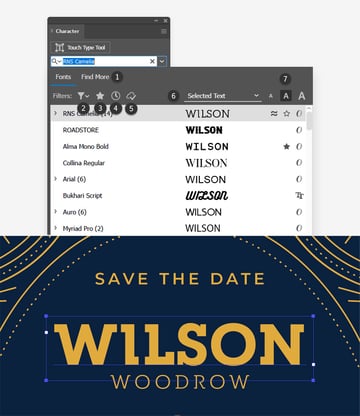
Click the Find More tab (1), and you can scroll through the fonts that Adobe provides. Once you find a font that you like, click that Activate button on the right-hand side, and the font can be used in your design.

Moving to the Filters section, using the first button (2) you can filter your fonts by classification and properties. Just check the settings that interest you, and the list of available fonts will update accordingly.


Click the star button (3) from the Filters section whenever you want to view only the fonts that you marked as favorites.


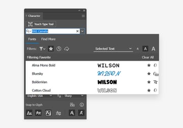
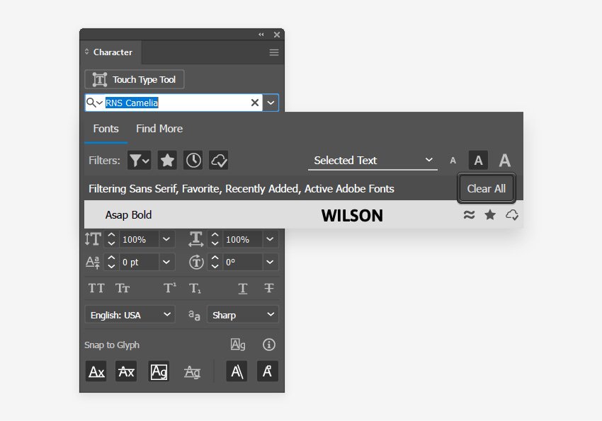
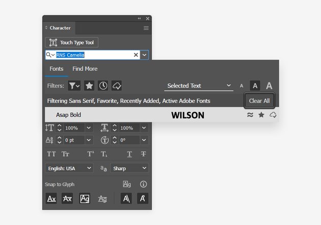
The next two buttons from the Filters section can be used to only view the recently added fonts (4) or the activated fonts (5). Keep in mind that you can combine these filters to narrow down the list of fonts as much as possible. Remember to click that Clear All button whenever you wish to remove all the filters.

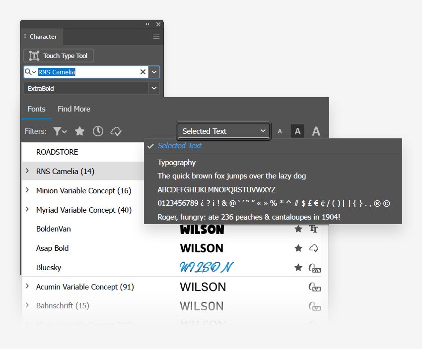
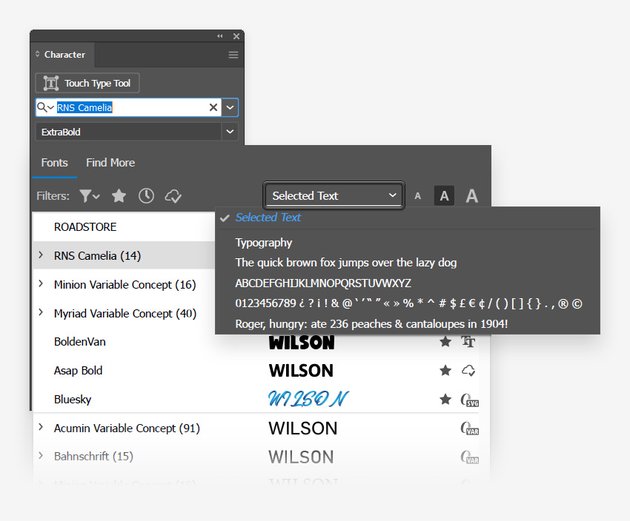
Moving to the dropdown menu (6), this can be used to set the look of the font preview. By default, it will show a preview with your selected text. If you don’t have any text selected, it will show a preview of the text “Sample”. Feel free to select one of the other preview options if you prefer to view the capital letters from a font, the numbers, or the symbols.
Finally, using the three buttons from the right-hand (7) side, you can adjust the size of the font sample.


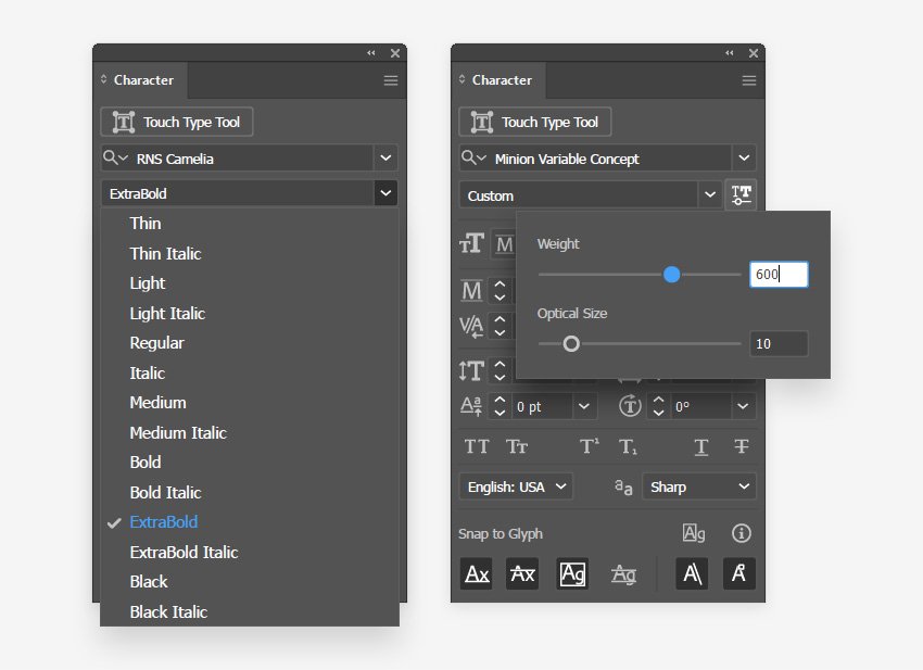
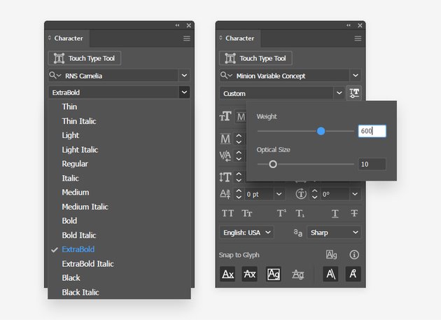
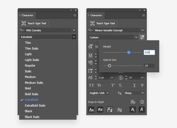
5. How to Set the Font Style Using the Character Panel in Adobe Illustrator
If a font has more than one style, you can change it from the Font Style menu.
Selecting a variable font will also give you access to the Variable Font settings. Just click the button and minutely adjust your font using those sliders.
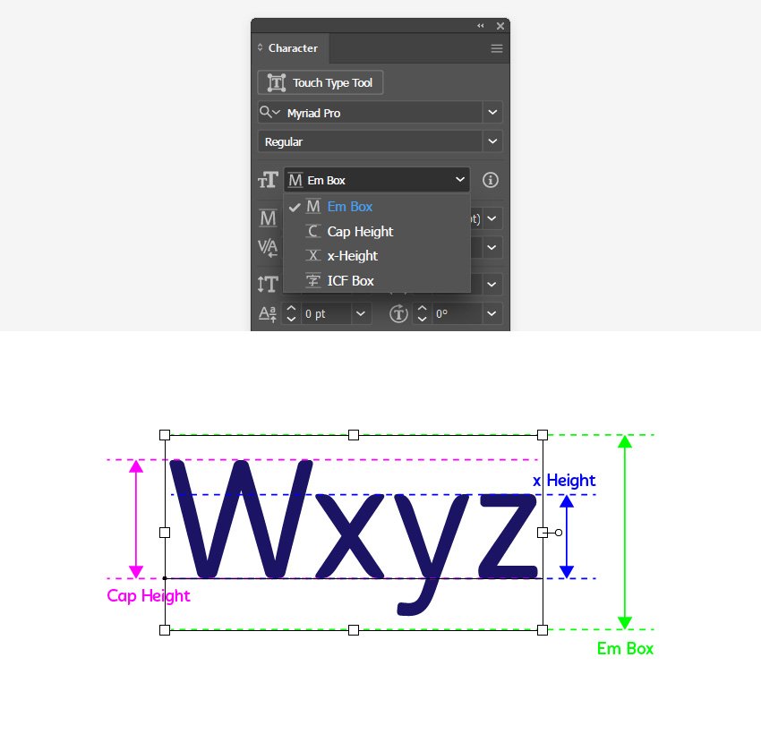
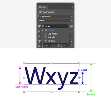
6. How to Set the Font Height Reference Using the Character Panel in Illustrator
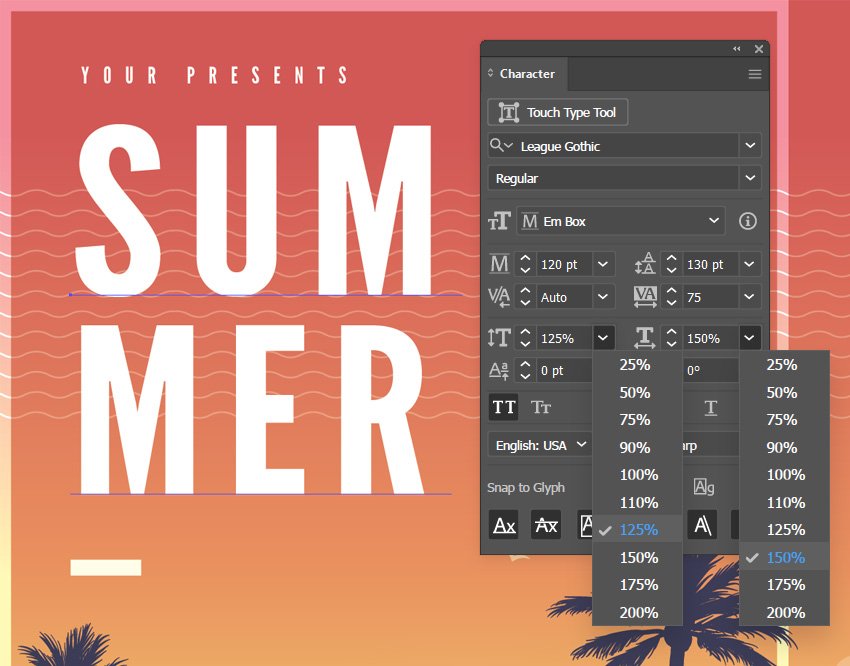
Next, you have the Font Height Reference menu. The default Em Box displays the font size including the height of the bounding box around the font.
Select Cap Height to adjust the font size in reference to the uppercase letters. x-Height sets the font size with reference to the lowercase letters, such as x. Finally, use ICF box to set the font size with reference to the ICF box. This applies in general for CJK fonts.

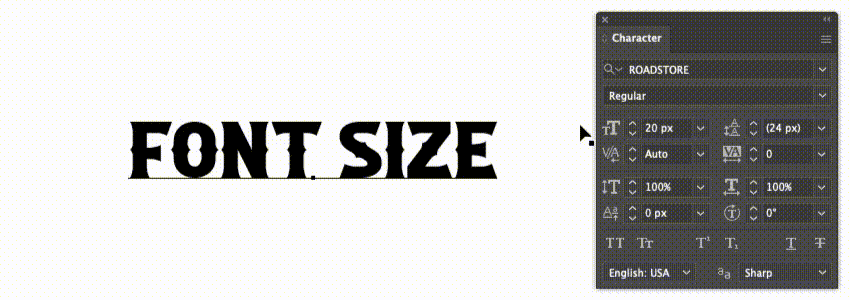
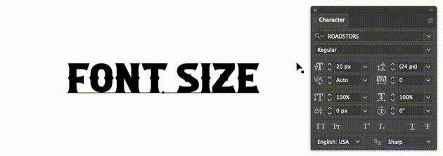
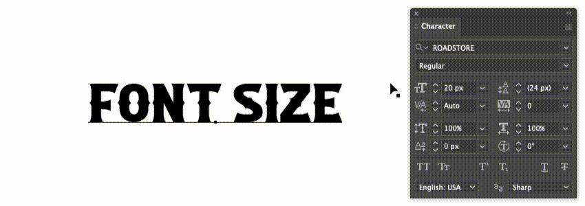
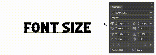
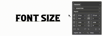
7. How to Set the Font Size Using Adobe Illustrator’s Character Panel
Step 1
Moving to the next set of settings, you can use these buttons to change the size of the text, increase or decrease the space between paragraphs, edit the kerning in Illustrator, or adjust the leading in Illustrator.
Let’s start by seeing how you can adjust the font size using Illustrator’s Character panel.

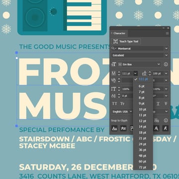
Step 2
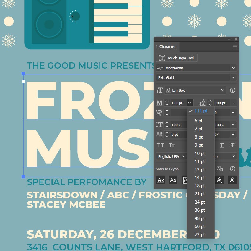
First, you can click that arrow button and select one of the preset font size values.
Step 3
Using the tiny arrow buttons, you can increase or decrease the font size by 1 px. Hold down the Shift key as you click these buttons to increase or decrease the size by 10 px.
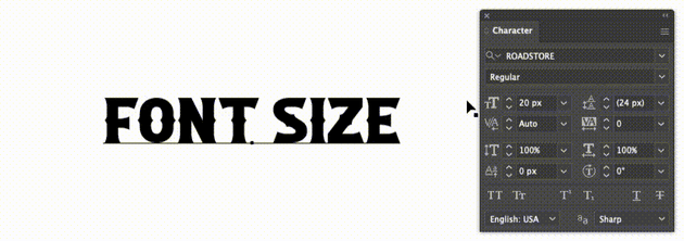
Step 4
Click the font size icon to quickly select the existing value, and press the up or down arrow buttons to increase or decrease the font size by 1 px. Again, you can also hold down the Shift key as you press the arrow buttons to increase or decrease the size by 10 px.

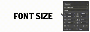
Step 5
Finally, you can select the existing font size and type in the new value. Keep in mind that any of these techniques can also be used to adjust the leading, kerning, tracking, vertical or horizontal scale, baseline shift, and rotation.
8. How to Adjust the Leading in Illustrator
Step 1
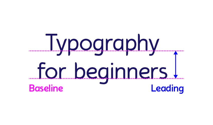
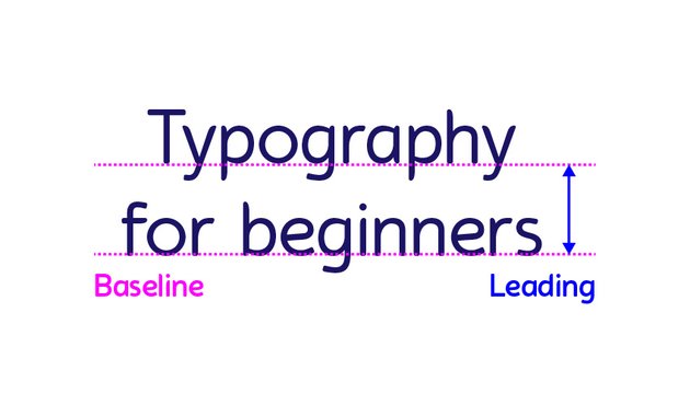
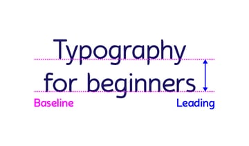
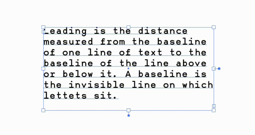
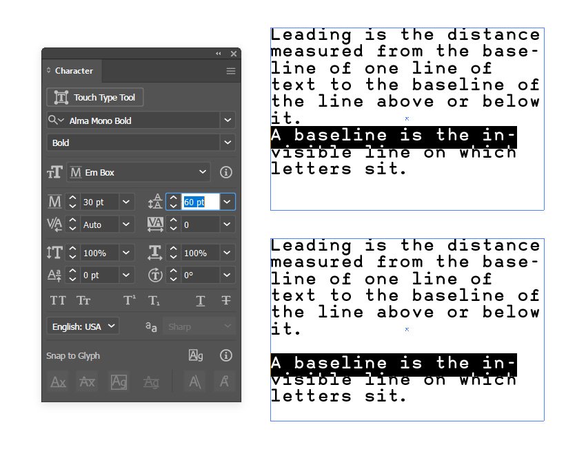
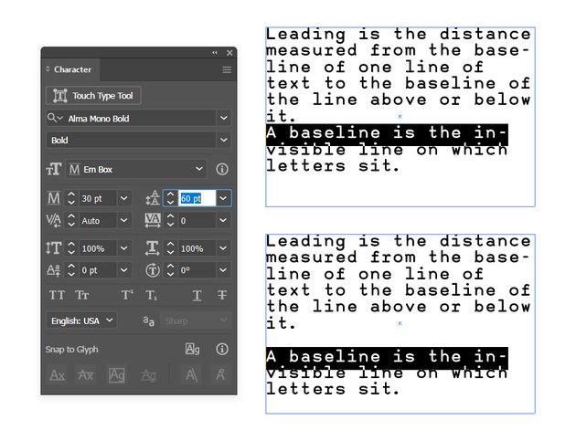
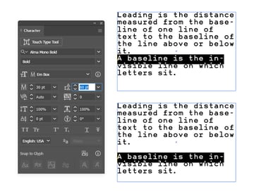
Leading is the distance measured from the baseline of one line of text to the baseline of the line above it. A baseline is the invisible line on which letters sit. Let’s see how you can adjust the leading in Illustrator.
Step 2
You can find the leading settings on the right-hand side of the font size settings. To edit the leading in Illustrator, you can use the same techniques that we used to adjust the font size.
Double-click the Leading icon from the Character panel whenever you wish to quickly change the leading value with the same value that’s used for the font size.

Step 3
Alternatively, you can use a keyboard shortcut to edit the leading in Illustrator. Select your text and press Alt-Up Arrow or Alt-Down Arrow to decrease or increase the leading value by 2 px. Pressing Control-Alt-Up Arrow or Control-Alt-Down Arrow will decrease or increase the leading value by 10 px.
Step 4
You can also set custom leading settings for specific lines of text from a paragraph. Use the Type Tool to select one or more lines of text from a paragraph and adjust the leading in Illustrator’s Character panel.
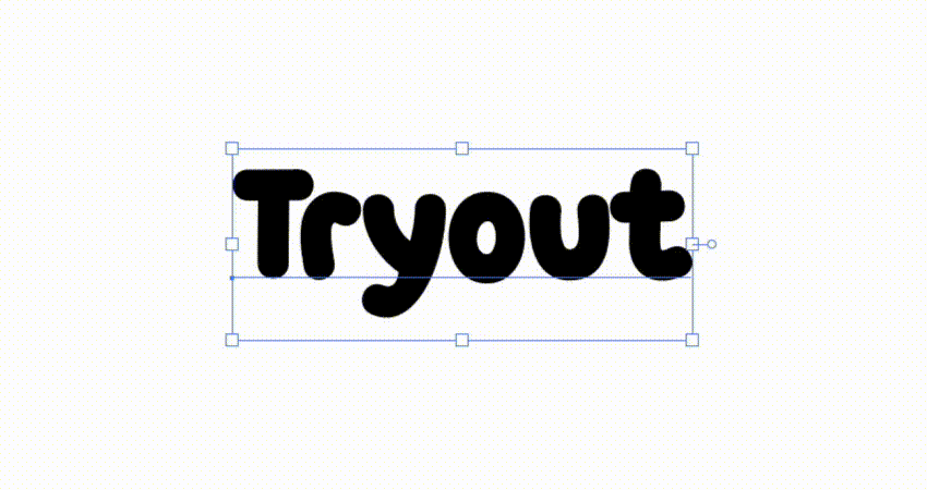
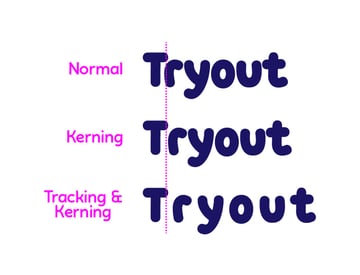
9. How to Adjust the Kerning in Illustrator
Step 1
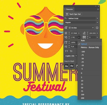
Using Kerning in Illustrator, you can adjust the spacing between specific pairs of letters. You can find the kerning settings below the font size settings.
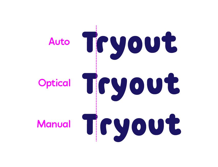
Select a piece of text and make sure that the Type Tool (T) is active before you start kerning text in Illustrator. Click between two letters, focus on the Kerning box, and edit the existing value, thus adjusting the spacing between those two letters. When kerning is set to Auto (Metric kerning), the value appears between parentheses.


Step 2
Metric kerning (Auto) is the default one, and it uses the kerning settings that come with most fonts. These settings set specific spacing values for particular combinations of letters, the most common being LA, P., To, Try, Ta, Tu, Te, Ty, Wa, WA, We, Wo, Ya, and Yo.
Optical kerning adjusts the letter spacing in Illustrator based on their shapes. This can be useful when you’re using a font that lacks built‑in kerning, or if you use several typefaces or sizes in your text.
Manual kerning is in your hands. Just click between the letters in your text and adjust the kerning values as you wish.


Step 3
Kerning text in Illustrator can also be done using keyboard shortcuts. Click between the pair of letters and press Alt-Right Arrow or Alt-Left Arrow to increase or decrease the kerning by 20. Pressing Control-Alt-Right Arrow or Control-Alt-Left Arrow will increase or decrease the tracking by 100.


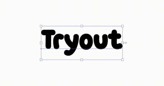
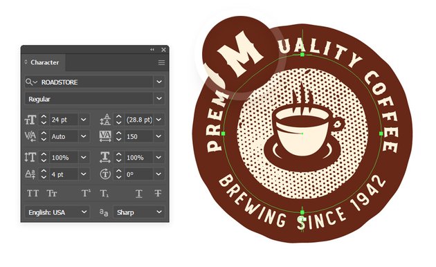
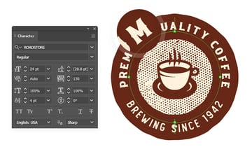
10. How to Change the Space Between Letters in Illustrator Using Tracking
Step 1
Using Tracking, you can change the space between letters in Adobe Illustrator. You can find the tracking settings below the leading settings.
Select a piece of text, focus on the Tracking settings, and edit the existing value to easily adjust the font spacing in Illustrator.
Step 2
As with kerning, you can use a keyboard shortcut to change the space between letters in Adobe Illustrator. Select your text and press Alt-Shift-Right Arrow or Alt-Shift-Left Arrow to increase or decrease the font spacing in Illustrator by 20. Pressing Control-Alt-Shift-Right Arrow or Control-Alt-Shift-Left Arrow will increase or decrease the tracking by 100.

Step 3
You can also set custom tracking settings for specific characters from a word. Use the Type Tool to select one or more characters from a word and adjust the tracking value in the Character panel.


Step 4
Tracking and kerning go hand in hand, so feel free to combine these settings to meticulously change the space between letters in Adobe Illustrator.


11. How to Scale Text Using the Character Panel in Illustrator
The Vertical and Horizontal Scale settings can be used to scale text in Illustrator. You can find these settings below the kerning and tracking attributes.
Use the percentage values to scale your selected text relative to the existing text settings.


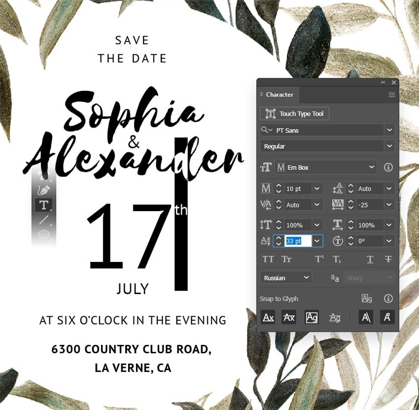
12. How to Change the Baseline Shift in Illustrator
Step 1
A baseline is the invisible line on which letters sit. Using baseline shift in Adobe Illustrator, you can move the entire text or selected letters up or down relative to the baseline. But where is Baseline Shift in Illustrator? You can find it right below the Vertical Scale setting inside the Character panel.
Select a piece of text or use the Type Tool (T) to select a part of that text, focus on the Baseline Shift setting, and edit the existing value to move the selection relative to the baseline.


Step 2
Alternatively, you can use a keyboard shortcut to adjust the baseline shift in Illustrator. Select your text and press Alt-Shift-Up Arrow or Alt-Shift-Down Arrow to increase or decrease the baseline shift by 2 px. Pressing Control-Alt-Shift-Up Arrow or Control-Alt-Shift-Down Arrow will increase or decrease the baseline shift by 10 px.


Step 3
Baseline shift can be particularly useful when you’re working with text on a path as it provides a pretty quick way for you to align and move text along that path.

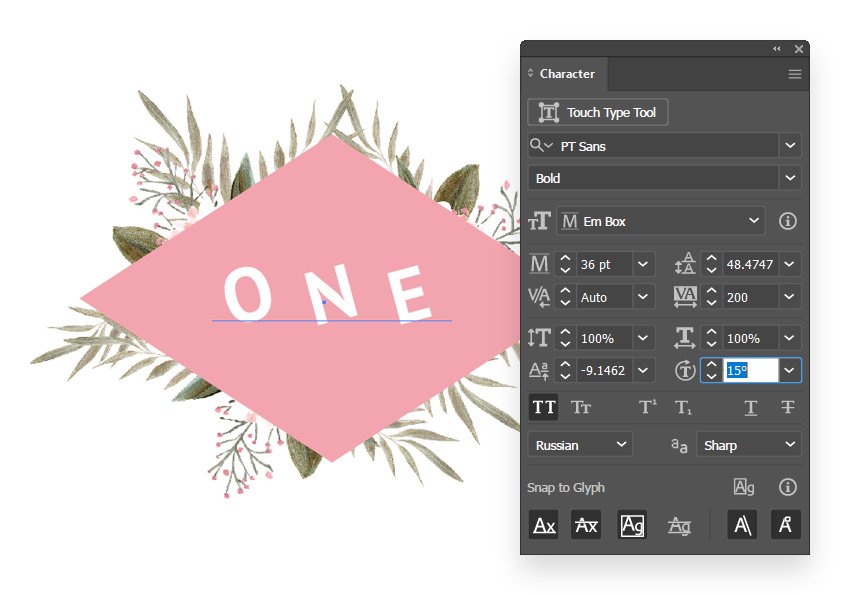
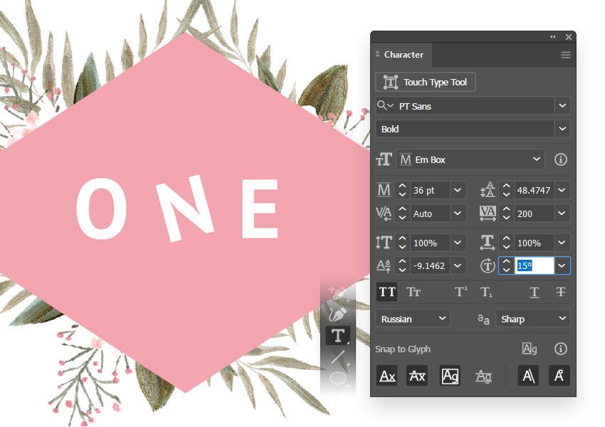
13. How to Rotate Text Using the Character Panel in Adobe Illustrator
Step 1
Using the Character Rotation settings, you can easily rotate letters from a text. All you have to do is select a piece of text and set the angle. This will independently rotate each letter in your text.
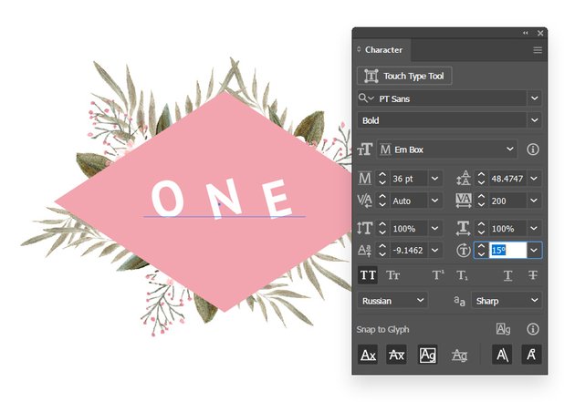

Step 2
To rotate just a particular letter from your text, use the Type Tool (T) to select it and then set the Rotation angle.


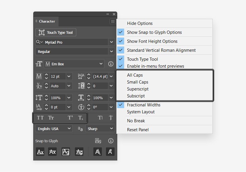
14. How to Capitalize Text in Illustrator
Using the All Caps and Small Caps button from the Character panel, you can easily make text caps in Illustrator.
Select a piece of text or parts of it and simply click the All Caps button to turn the lowercase letters into capital letters.
Small caps are lowercase characters that resemble the uppercase letters but are reduced in size, close to the lowercase letters. Again, select a piece of text or parts of it, and just click the Small Caps buttons to easily turn the lowercase letters into small caps.


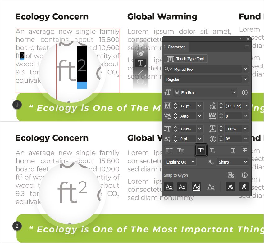
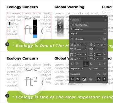
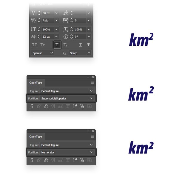
15. How to Do Superscript in Adobe Illustrator
Superscript is a piece of text reduced in size in relation to the existing font size and raised in relation to the baseline.
Use the Type Tool (T) to select letters from your text, and simply click the Superscript button from the Character panel to turn the selected text into superscript.

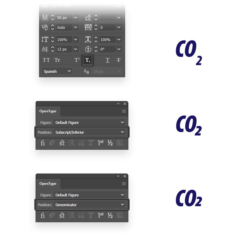
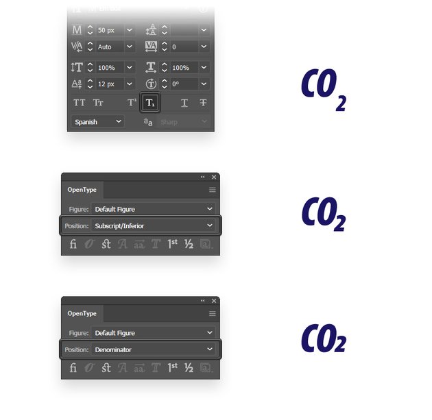
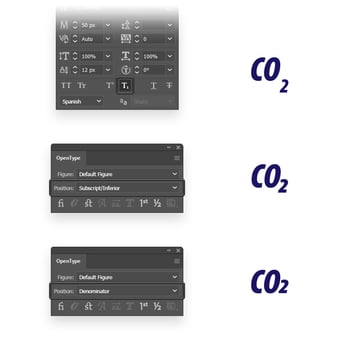
16. How to Do Subscript in Illustrator
Subscript is a piece of text reduced in size in relation to the existing font size and lowered in relation to the baseline.
To create subscript text in Adobe Illustrator, pick the Type Tool (T) and use it to select the letters that you want to turn into subscript. Just click the Subscript button from the Character panel to turn the selected text into subscript.

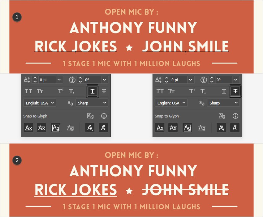
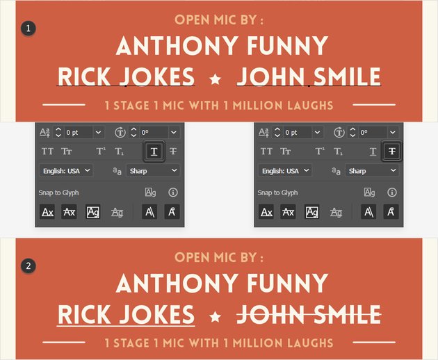
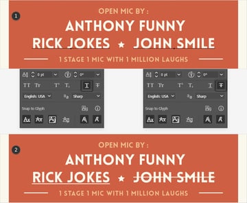
17. How to Underline or Strikethrough Text Using the Character Panel
The Underline and Strikethrough buttons are pretty self-explanatory. Select some text or parts of it using the Type Tool (T), and just click those two buttons whenever you wish to underline or strikethrough that selection.
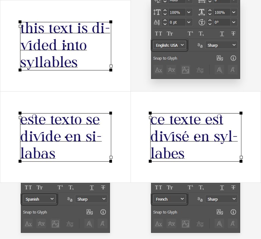
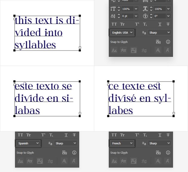
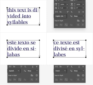
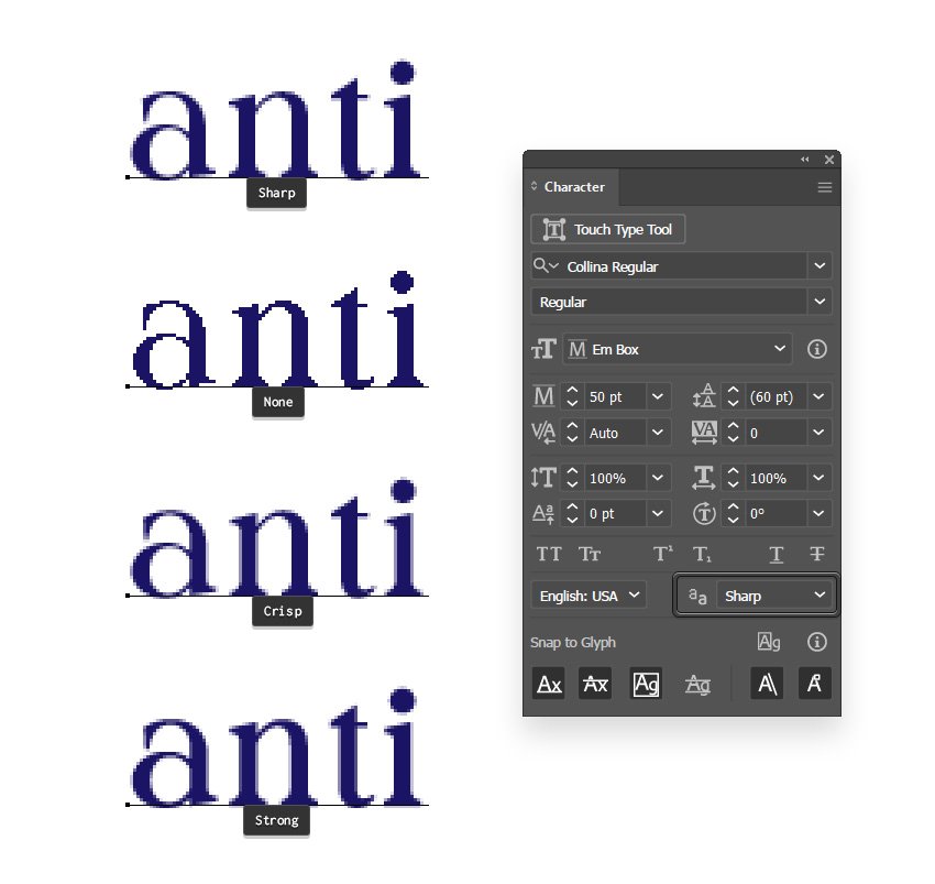
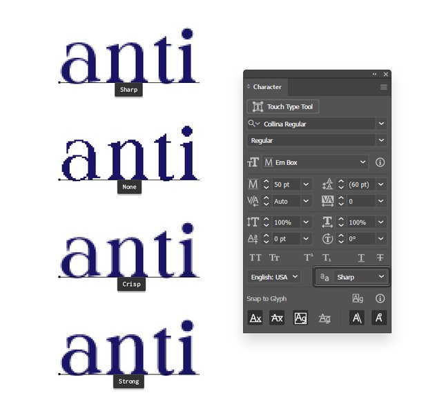
18. How to Set the Hyphenation Language and the Anti-Aliasing Method
Step 1
Using the Language drop-down menu, you can set the hyphenation language for any piece of text.
Step 2
Next to the Language setting, you have the Anti-Aliasing method, which is set to Sharp by default. This feature can be helpful if you’re planning to save the text as a rasterized image.
First, go to View > Pixel Preview to see how your text will look once it’s rasterized. Using one of the Anti-Aliasing methods, you can smoothen out the appearance of those curvy edges. Generally, the default Sharp anti-aliasing is the ideal option so you won’t have to mess with the other settings.

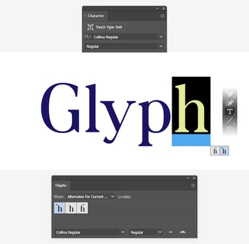
19. How to Use Glyphs and the OpenType Panel in Illustrator
Step 1
Besides the default letter designs, fonts can include additional characters which are called glyphs.
For example, the “h” lowercase from this Collina Regular font comes with two glyph alternatives. Use the Type Tool (T) or the Touch Type Tool (Shift-T) to select just one letter from the text and a small menu below the selection will let you know if that character has glyph alternatives.
Using the Glyphs panel (Window > Type > Glyphs) you can view all available glyphs for each font. Use the Show drop-down menu to filter the existing glyphs, and just double-click a glyph to insert it in your selected text.


Step 2
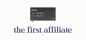
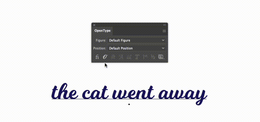
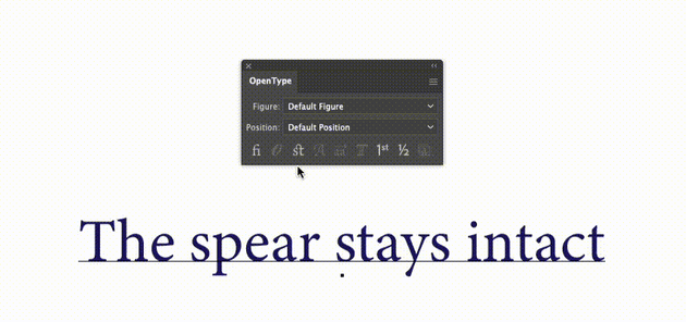
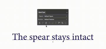
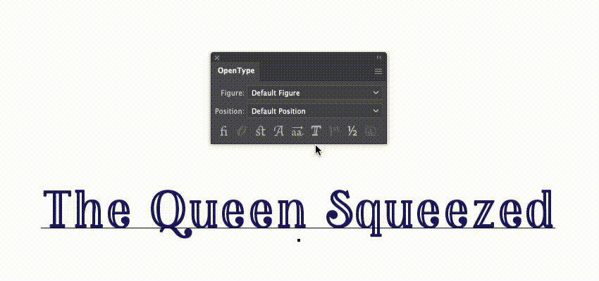
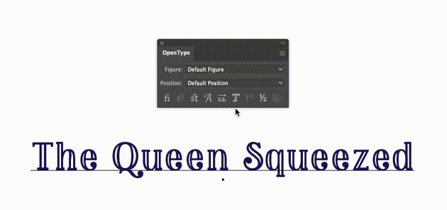
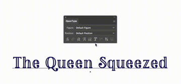
The type and number of available glyphs vary from font to font. The Glyphs panel can be useful when you want to insert a few glyphs, but if you need to activate a specific set of glyphs for an entire paragraph, the OpenType panel (Window > Type > OpenType) is a much better solution. Using the buttons from the bottom of this panel, you’ll be able to easily activate or deactivate the available sets of glyphs for any OpenType font.
First, you have the Standard Ligatures. Ligatures are additional replacement characters for certain letter combos, such as fi, fl, ff, ffi, ffl, aff, and many more.
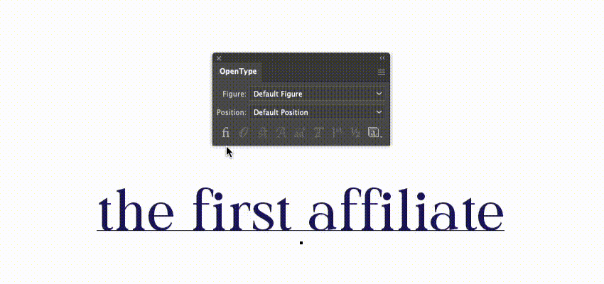
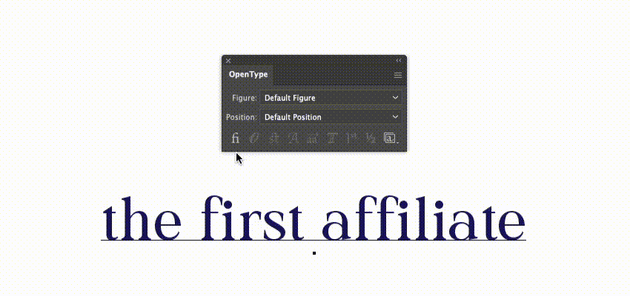
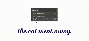
Next, you have Contextual Alternates which glue together certain letters, giving your text a better flow.

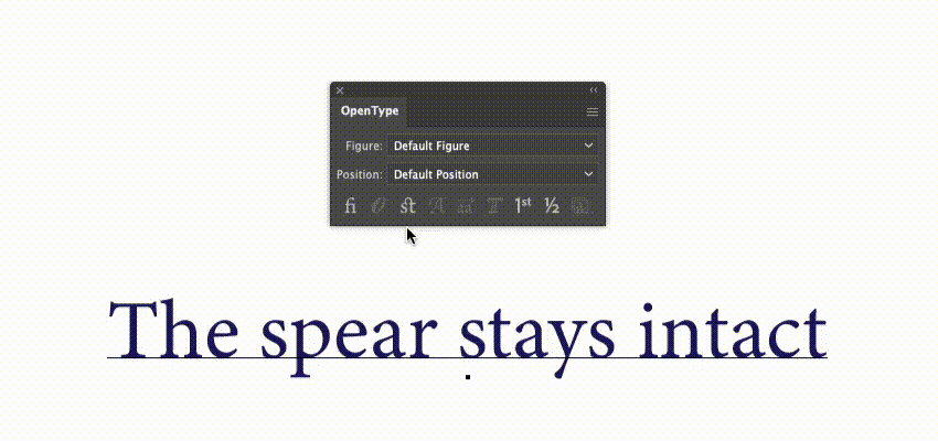
Besides the Standard Ligatures, some fonts also include Discretionary Ligatures for letter pairs such as ct, st, and ft.
Swashes are decorations that embellish characters. These are generally added at the beginning or end of a word.
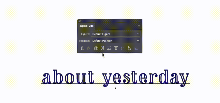
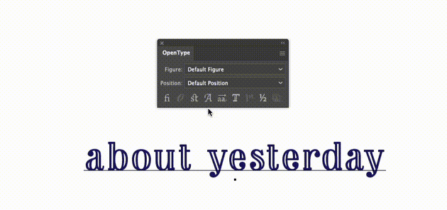
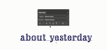
Use Stylistic Alternates to stylize the font. Although it’s not a rule, most of the time, this will replace a double-storey “a” with a single-storey “a” and adjust the look for most of the vowels.
As the name implies, Titling Alternates are mostly for titling. Titling fonts are usually all caps fonts designed specifically for headlines or display usage. Using Titling Alternates, you can further decorate such fonts.
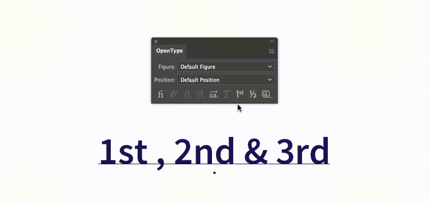
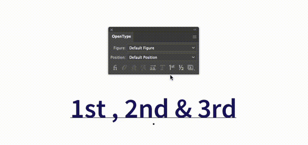
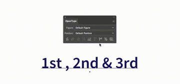
If the font makes it available, the Ordinals button can be another method that you can use to insert a superscript in Adobe Illustrator. It can be a bit of a time saver as it adds more than one superscript with only one click.
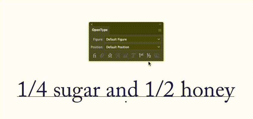
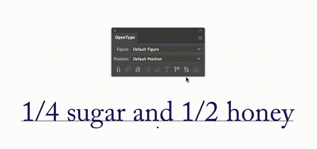
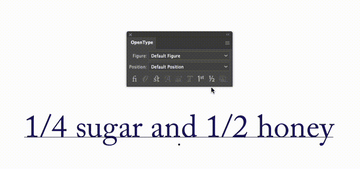
If you’re working with fractions and the font allows it, you can use this Fractions button to nicely nest the numbers on top of one another.
Finally, using the Stylistic Sets button, you can activate specific style sets. Depending on the font, the names of these sets might help you understand what will change with each stylistic set that you enable.
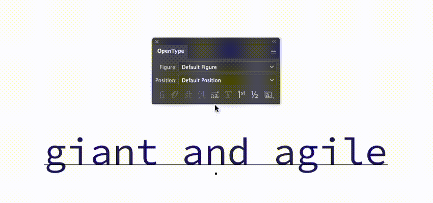
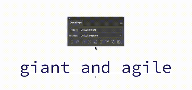
Step 3
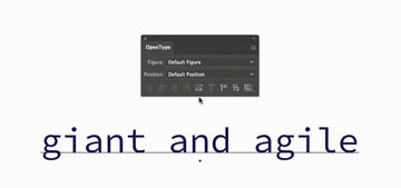
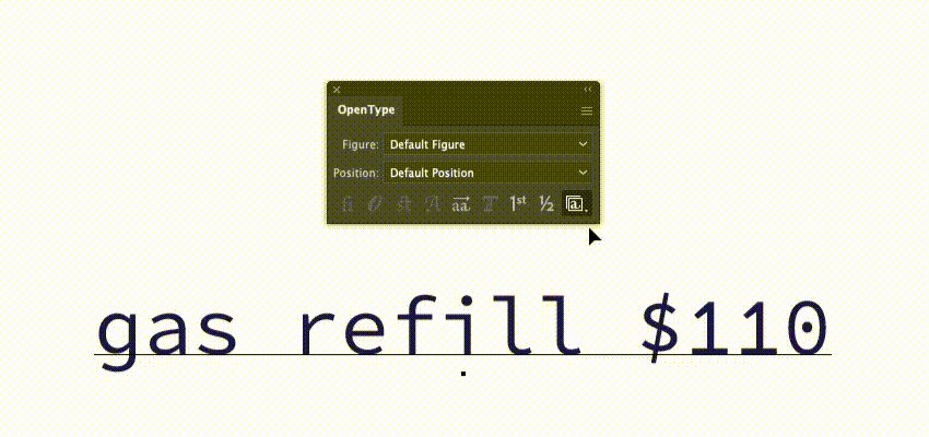
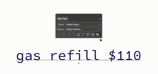
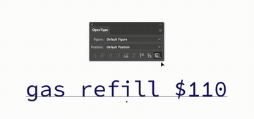
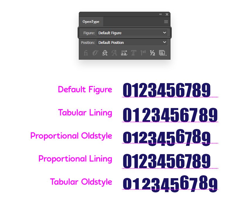
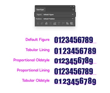
When the font allows it, you can use the Figure drop-down menu to particularly style the numbers.
Select Tabular Lining to use full-height numbers of the same width. This can be useful when you need to perfectly align numbers in columns. Proportional Oldstyle will create numbers that have varying heights and widths. Select Proportional Lining to use full-height numbers with varying widths or Tabular Oldstyle for numbers with equal widths but varying heights.

Step 4
When available in the font, you can use the Superscript/Superior or the Numerator settings to insert different variations of a superscript in Adobe Illustrator.
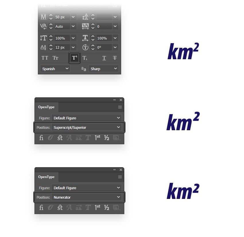

Using the Subscript/Inferior and Denominator settings, you can insert variations of a subscript in Illustrator.
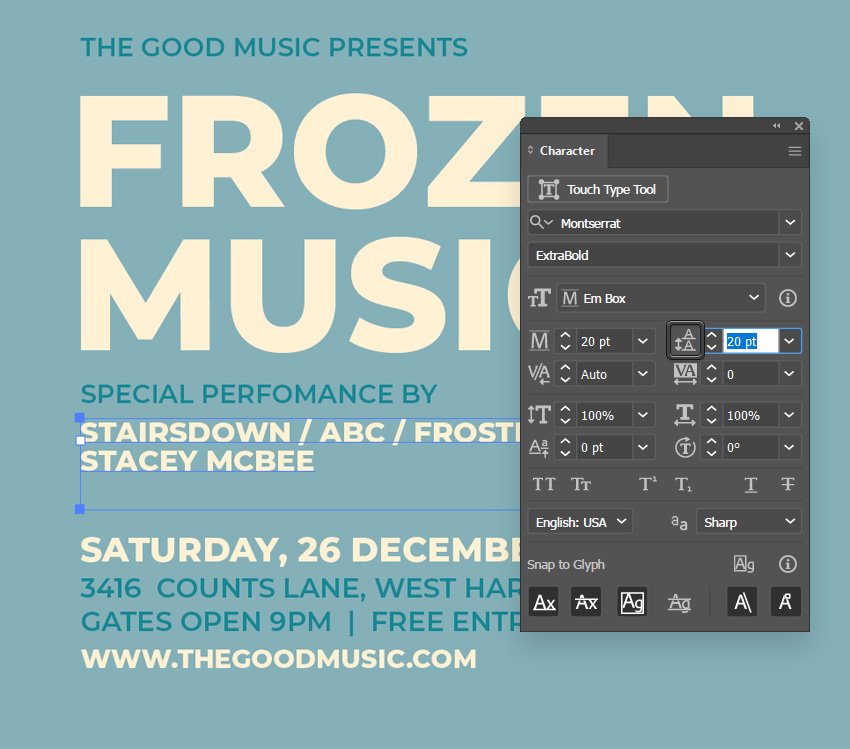
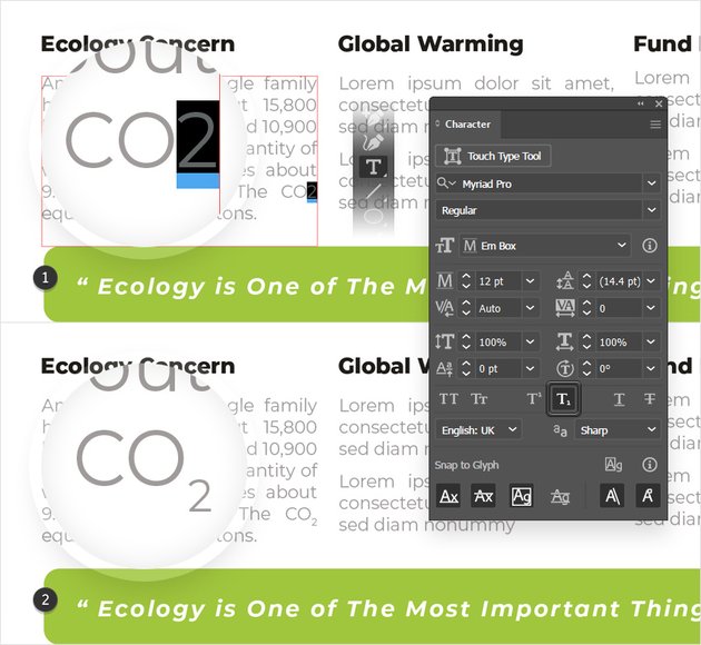
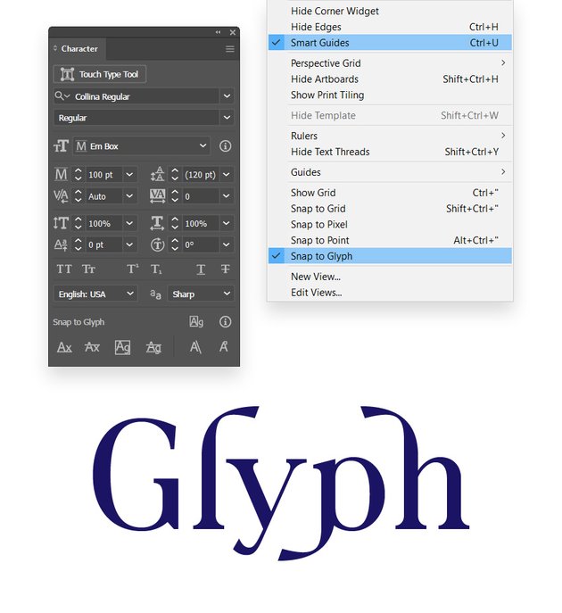
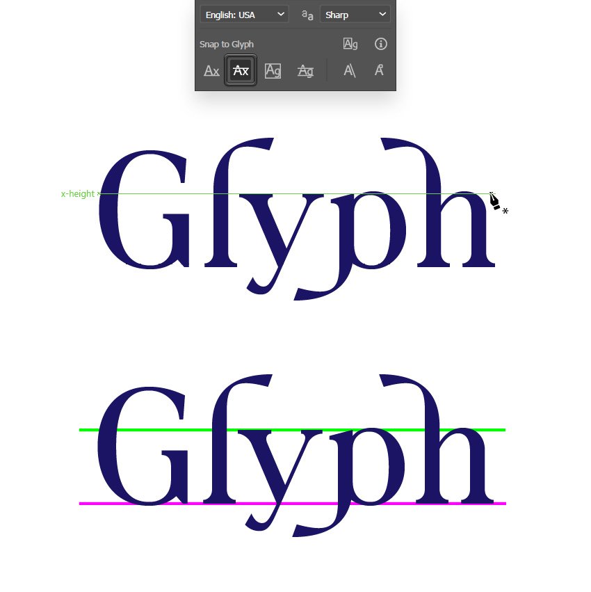
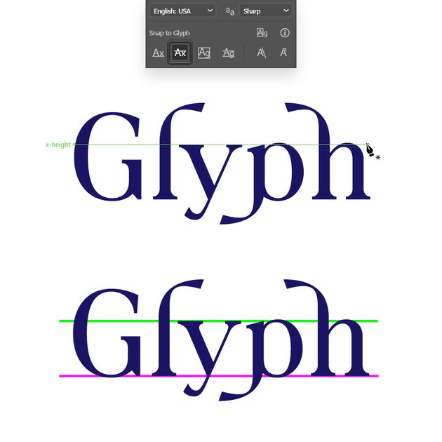
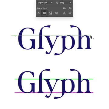
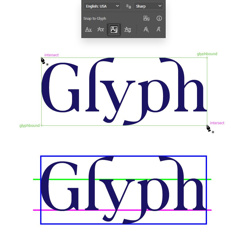
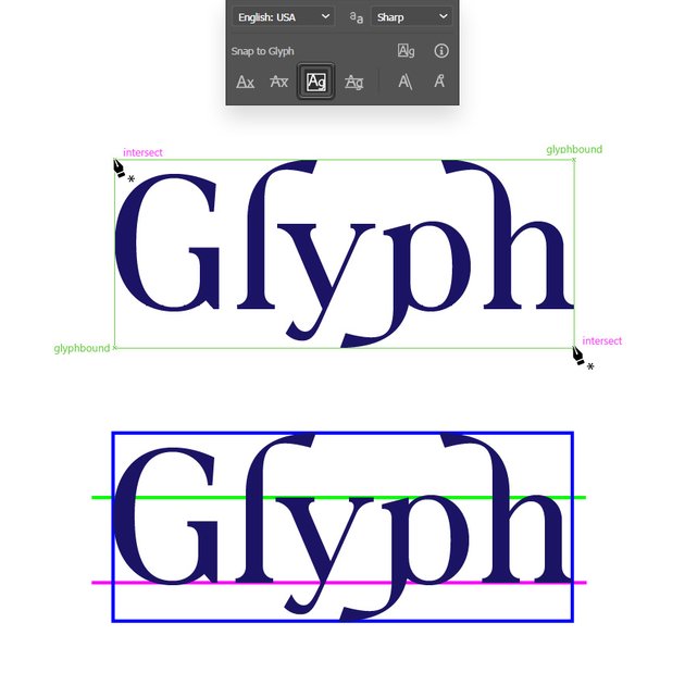
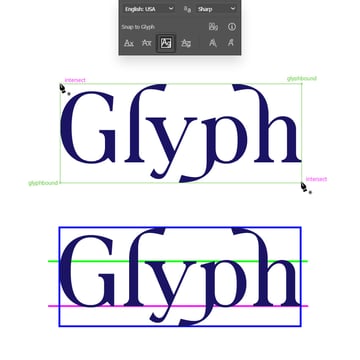
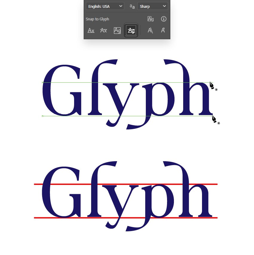
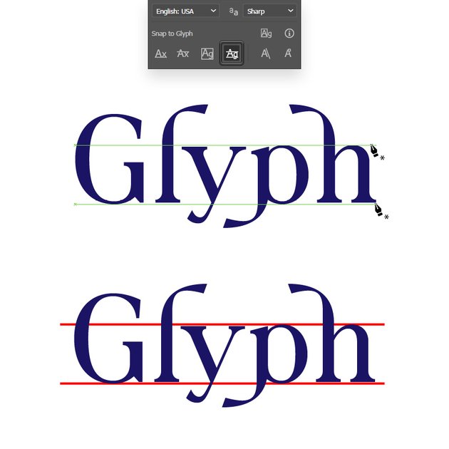
20. How to Snap to Glyphs Using Illustrator’s Character Panel
Step 1
Now that you know everything you need to know about glyphs and Illustrator’s OpenType panel, let’s get back to the Character panel and see how you can use the Snap to Glyph settings.
Most importantly, you need to go to View in the menu bar to enable the Smart Guides and Snap to Glyph. Keep in mind that Snap to Glyph won’t work when the Snap to Grid is enabled, if the Alignment Guides are disabled (Edit > Preferences > Smart Guides), or when the Snapping Tolerance is set to 0.

Step 2
Enable the first one whenever you wish to snap to the baseline of glyphs while drawing, moving, or scaling an object. The glyph guides will appear on the text when you draw, scale, rotate, or move objects.
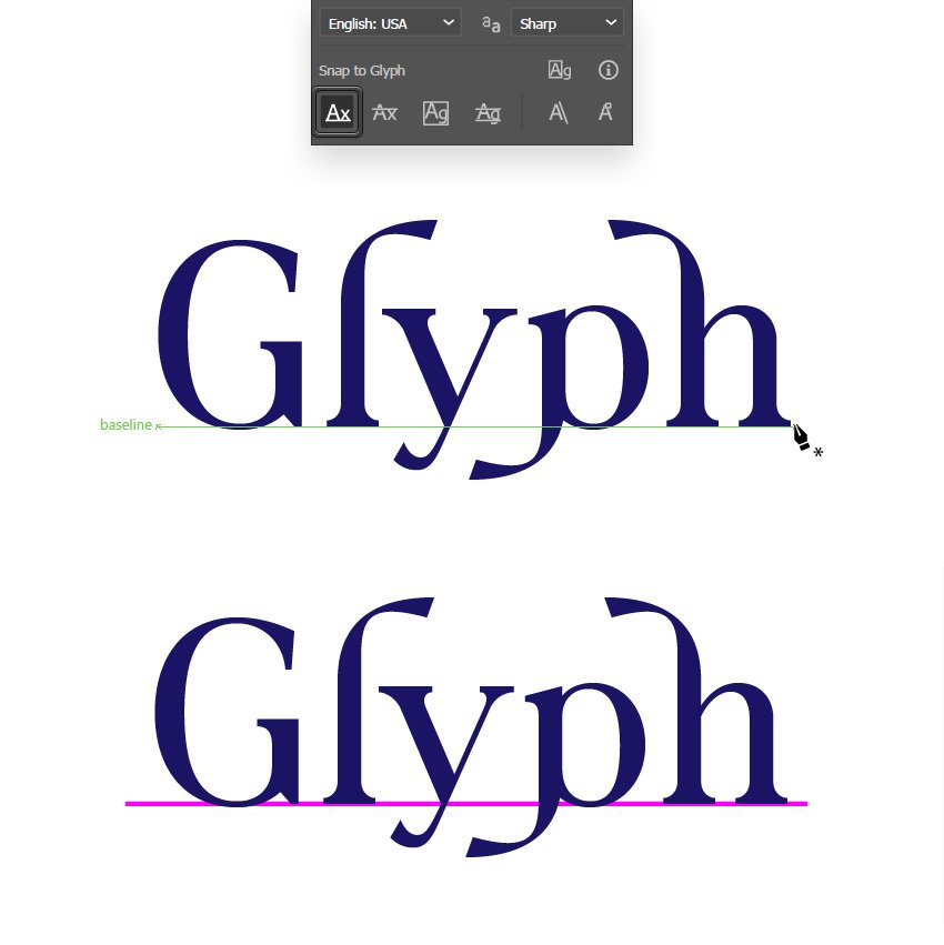
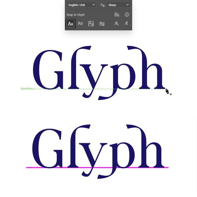
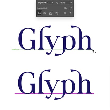
Step 3
Enable the second one to snap to the height of lowercase glyphs (x, z, v, w) while drawing, moving, or scaling an object.
Step 4
When you use the Glyph Bounds setting, the glyph guides will appear on the left, right, top, and bottom of glyphs.
Step 5
The Proximity Guides will generate guides near the baseline, x-height, and glyph bound.
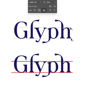
Obviously, you can enable more than one of these snap features to easily align your shapes with the glyph edges.


Step 6
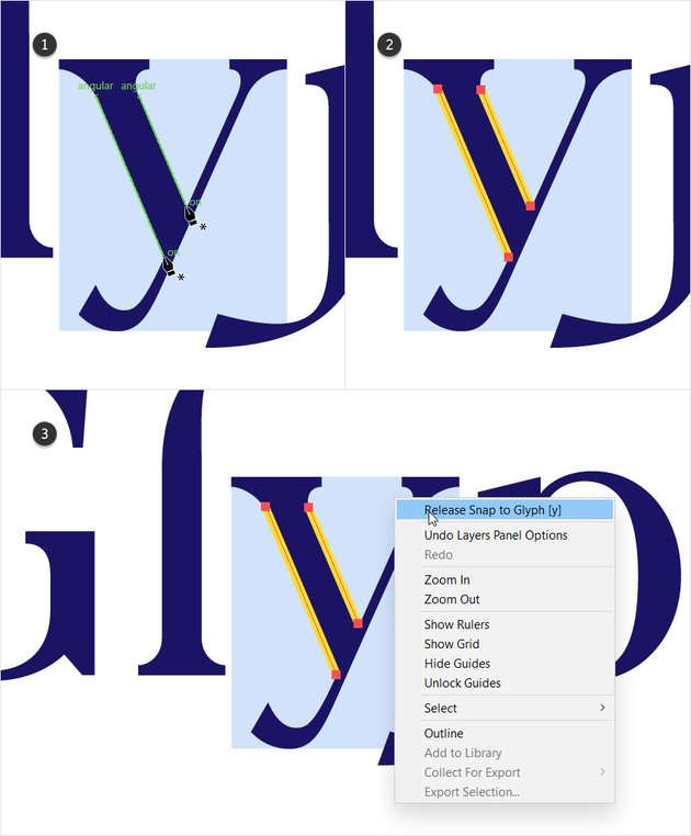
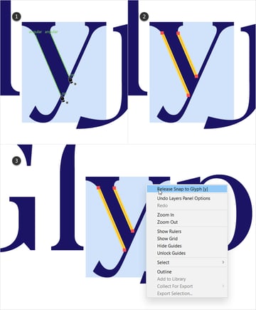
Additionally, you can isolate a character to generate guides solely around it. Pick the Selection Tool (V), right-click a letter from your text, and select Snap to Glyph [symbol].


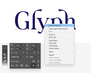
Step 7
Remember to isolate a character whenever you wish to use the Angular Guides. Using this feature, you can snap to the angles of glyphs while drawing, moving, or scaling objects.
To release an isolated character, you can either right-click it and select Release Snap to Glyph or you can click the Release Glyph button from the control panel.

Step 8
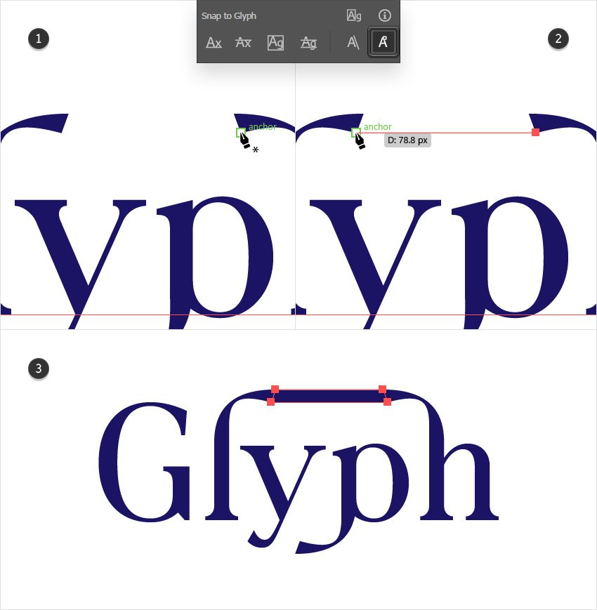
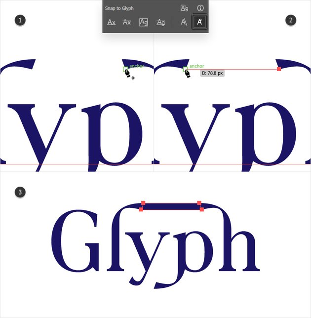
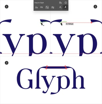
Finally, using the Anchor Point setting, you can snap to the anchor points of a glyph while drawing. This can be pretty useful if you need to decorate a font.
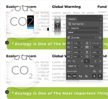
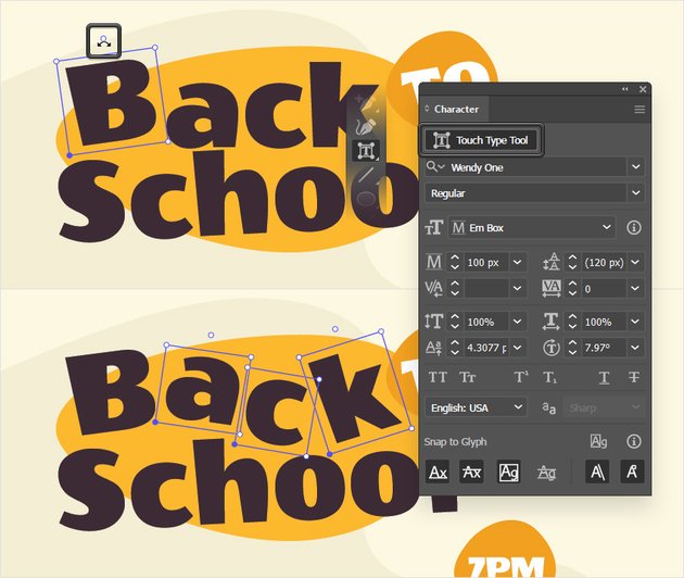
Pressing the Touch Type Tool button from the Character panel will activate this amazing tool. Alternatively, you can press Shift-T to activate it.
Click any character from a text to select it, use the round handle to rotate the character, and click and drag to move it wherever you wish.


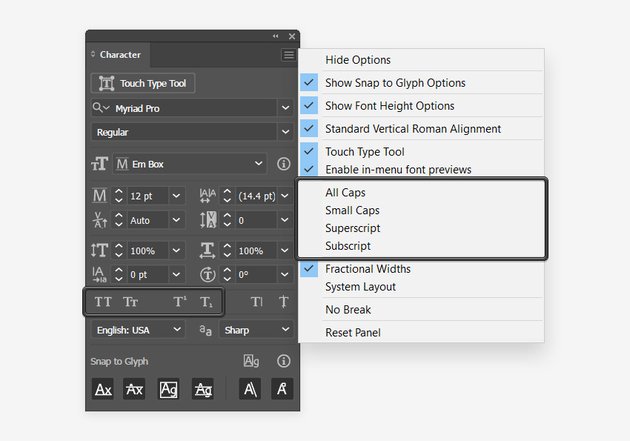
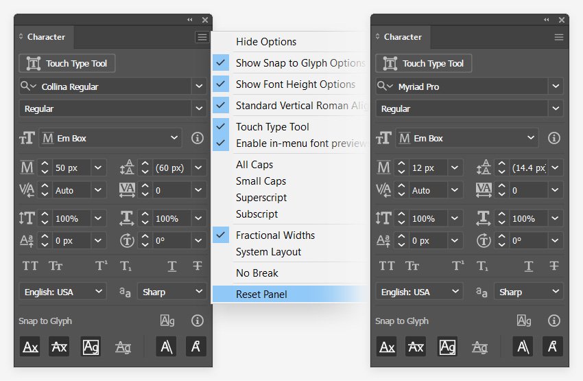
22. How to Use the Commands From the Fly-Out Menu
Step 1
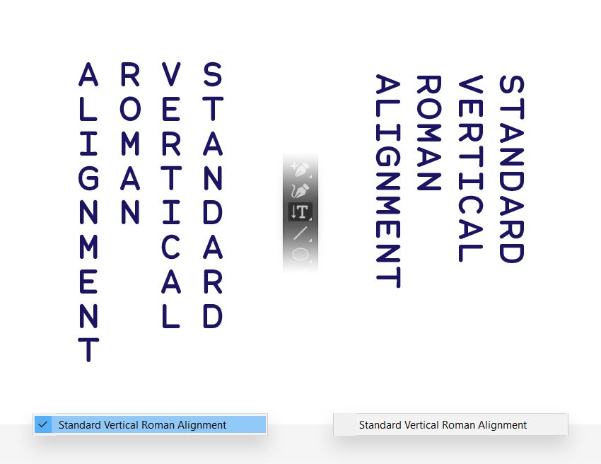
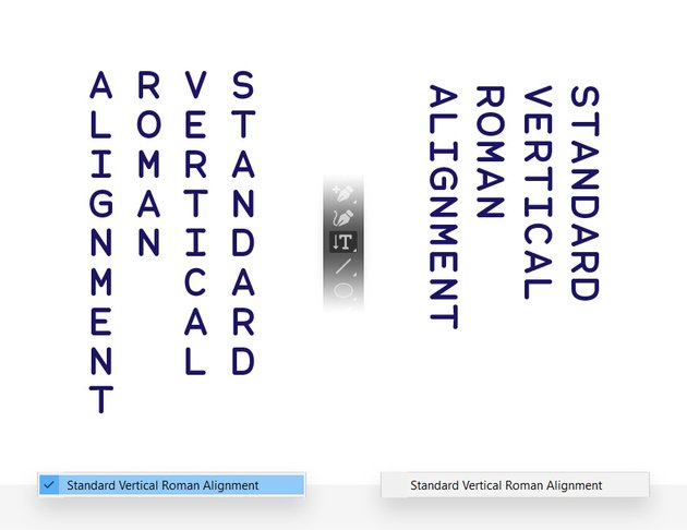
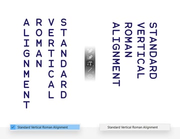
Now that you understand all the settings from the Character panel, let’s have a look at the remaining commands from the fly-out menu. Open it, and we’ll start with the Standard Vertical Roman Alignment features.
Step 2
Besides the buttons from the Character panel, you can also use the commands from the fly-out menu to add text caps in Illustrator, or to insert superscript and subscript in Illustrator.
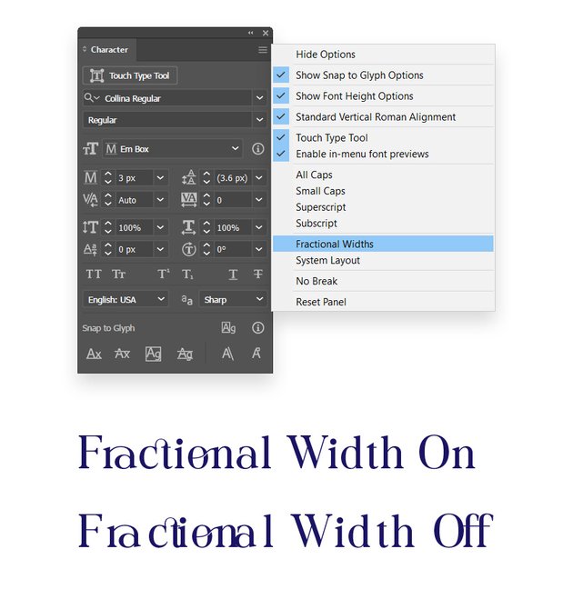
Step 3
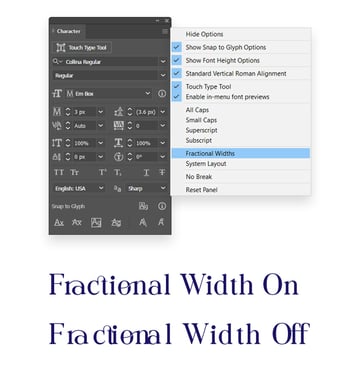
By default, the Fractional Widths feature is enabled. It varies the spacing between characters and sometimes uses only fractions of whole pixels.
The only time when you might need to disable it is when you set the font size to be really small. Keeping the Fractional Widths enabled might cause the text to overlap or have too much extra space.

Step 4
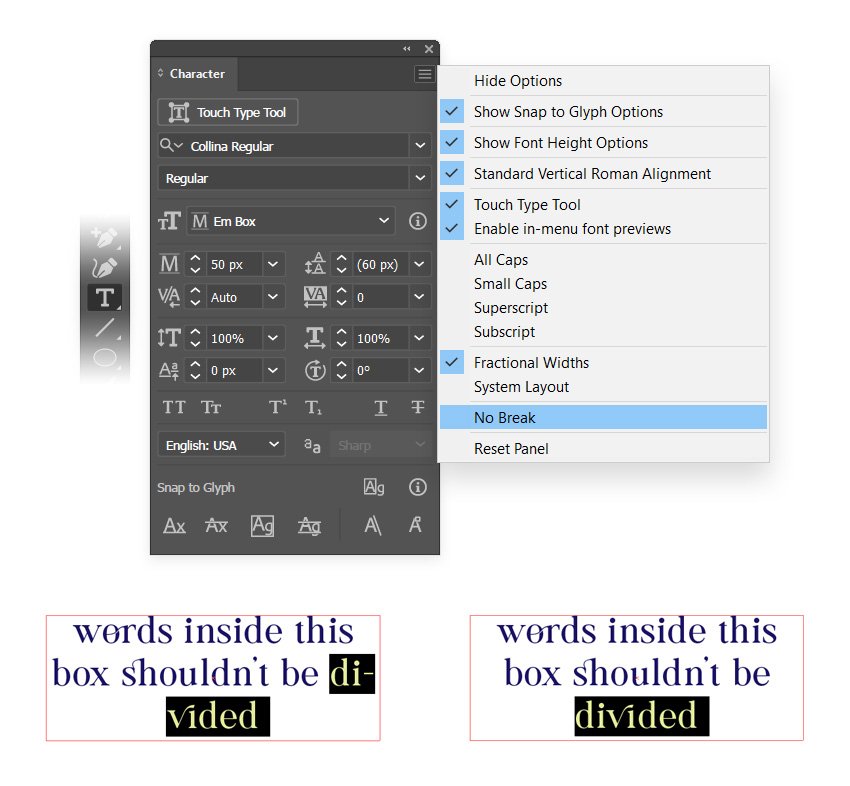
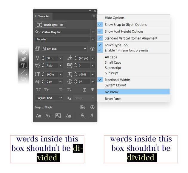
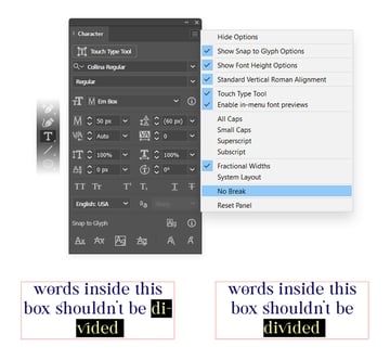
To make sure that a word won’t break into syllables, select it and select No Break from the fly-out menu of the Character panel.
Step 5
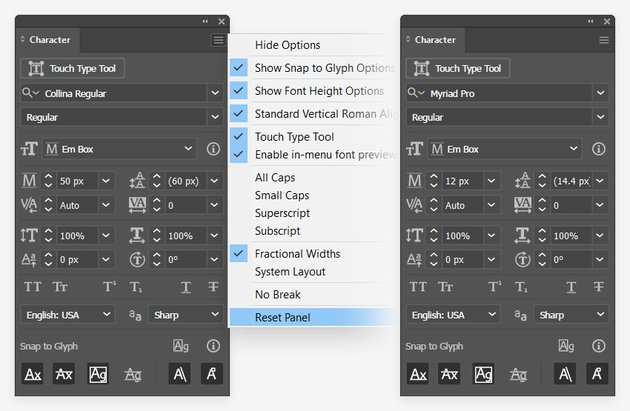
Select Reset Panel from the fly-out menu of the Character panel whenever you wish to replace the existing settings with the default ones.
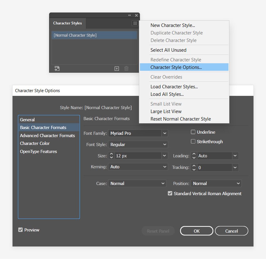
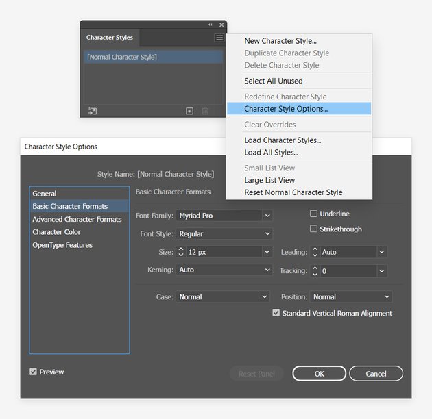
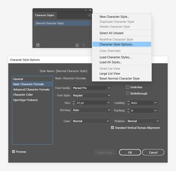
23. How to Adjust the Default Character Style in Illustrator
To adjust the default Character panel settings, you need to go to the Character Styles panel (Window > Type > Character Styles), open the fly-out menu, and go to Character Style Options.
You can start with the Basic Character Formats to adjust the main settings, and remember to click the OK button when you’re done.
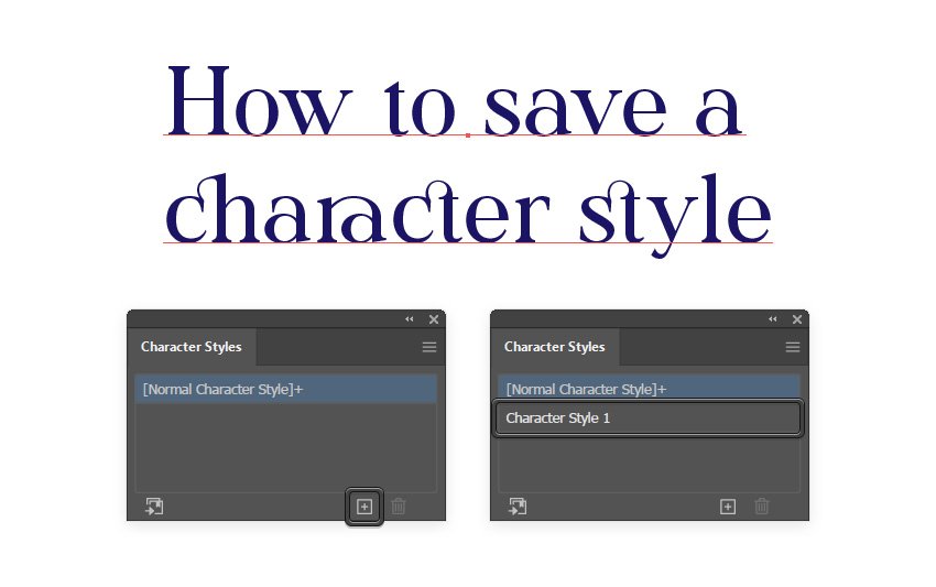
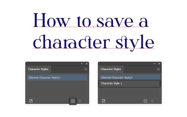
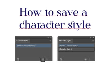
24. How to Create a Character Style in Illustrator
Once you’ve created a text style that you like, you might want to save it or apply it to other text. You can do this easily using character styles in Illustrator.
Make sure that your text is selected, focus on the Character Styles panel, and simply click the Create New Style button to save the style of your selected text. Now, select another piece of text and just click your saved style to instantly apply all those text settings.
Congratulations! You’re Done!
Now that you’re familiar with the Character panel and character styles in Illustrator, I hope you can apply these techniques in your future projects.
Feel free to build on this and create amazing text designs using the Character panel in Illustrator. You can find some great sources of inspiration at Envato Elements, with interesting solutions to improve your character styles in Illustrator.
Popular Fonts From Envato Elements
Envato Elements is an excellent resource for fonts. Here’s a short list of some of the fonts that were used throughout this tutorial.
Collina Font (OTF, TTF, WOFF)
This font comes with some nice ligatures, and it could be a perfect start if you’re looking to better understand glyphs and ligatures.


Roadstore Font (OTF, TTF)
Roadstore is a bold and robust font that could be the perfect choice if you’re looking to create posters or banners with bold titles.


Alma Mono Font (OTF, TTF)
Alma Mono is a sleek mono-spaced font which means that each character occupies the same amount of horizontal space.


Auro Font (OTF, TTF)
Here’s a smoother bold font that might help when you’re looking to create titles that stand out.


Knicknack Font (OTF, TTF)
Looking for a bold font with rounder edges? This fuzzy cartoonish font might be the perfect solution.

Want to Learn More?
We have loads of tutorials on Envato Tuts+, from beginner to intermediate level. Take a look!