Looking for a way to stand out on the web? We designers have all
sorts of tricks up our sleeves. From attention-getting animations to
slick JavaScript interfaces, there are plenty of bells and whistles to
keep users interested in our content.
Yet, even with all of these advanced techniques, one simple mainstay
has remained: the need for compelling images. On their own, images can
make a powerful statement. But they can also play an important role as
part of those special effects. And one particular category of images is
making a huge splash in this area.
The use of 3D render graphics is on the rise, and for good reason.
These objects offer a precise level of control when compared to a
traditional 2D image. You can position them exactly the way you want –
ensuring you get the perfect look. Plus, these
exportable images offer transparent backgrounds and are easily edited
within a graphics program. The result is a completely custom image,
ready to use in mere minutes.
Today, we’ll introduce to some ways you can leverage 3D render
graphics to make an impact on your own website. We’ll show you some
inspirational examples from established sites, as well as some of the 20,000+ objects
available with your subscription to Envato Elements. They are incredbily easy to customize, as each image can be positioned right within your browser and exported to either PNG or PSD format. Now, let’s get started!
1. Demonstrate a Mobile Perspective
One of the most prevalent needs for web designers and app developers
is to show off their work on mobile devices. Thus, the iconic render
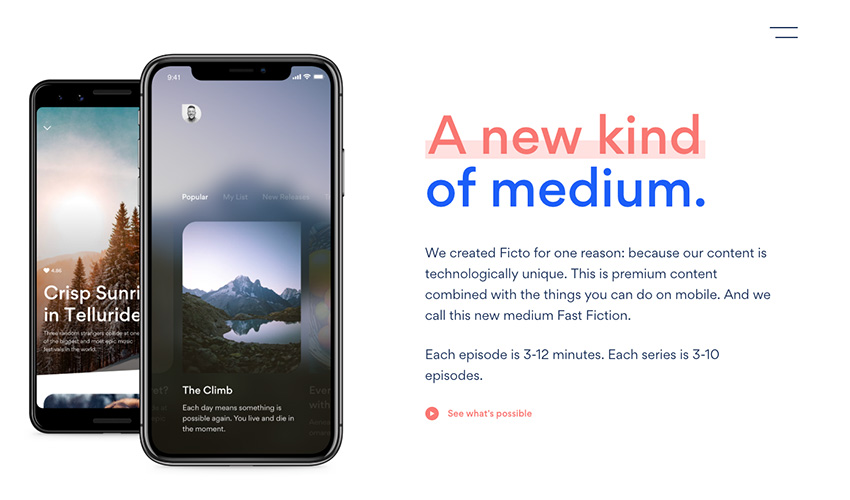
of a smartphone or watch is used quite often. One particularly common
use can be seen at mobile video platform Ficto, where devices are part of a scroll-based animation.
While the straight-on device mockup is always welcome, 3D renders such as Smartphone and Smart Watch
let you take things a step further.
Because you can choose any angle
within a 360° view, it’s possible to present your images in a different
light.
2. Activate Their Appetites
Whether it’s a gourmet dish or top-quality ingredients, nothing
tempts users quite like a mouthwatering food image. For instance, just
one look at the scrumptious grapes on Menada Winery’s site may be all one needs to get in the mood for a fine wine (or, at the very least, a few servings of grapes).
If your mission is to turn hungry mouths into satisfied customers,
capture their attention with a 3D food image. With selections like this
tasty Pepperoni Pizza Slice or savory Cranberry Tart, you’ll have no trouble working up an appetite or two.
3. Create Your Own Environment
An important part of selling an experience online is in creating a
virtual world that transports users to a different place. It might be a
destination resort or a product, but the idea is to help convey the
feeling of being there. Consider the prominent splash of water on the Ondaplus
website. This imagery offers a peek into what it might be like to use
one of their luxury pool and sauna systems. It makes you want to dive
right in.
The right 3D image can also help you take your visitors to another locale. Utilizing Water Splash will offer the feeling of refreshment, while a group of Palm Trees
will bring daydreams of a tropical paradise.
There really are no
limits when it comes to using these objects to build an appealing
environment.
4. Go Retro
Websites that feature a retro style not only make for a cool look,
they also help you to establish a fun personality. Exploring the classic
computer UI of Oizo3000,
complete with dot matrix printer sound effects, you can’t help but
crack a smile. The site is simple and incredibly charming.
Want to take your audience back in time? Let them tune into a Vintage Television or help them to relive the days of film with a Vintage Rangefinder Camera.
Images like these evoke a feeling of nostalgia and stand out from the ultra-modern fare we’re so used to seeing.
5. Do Something Unique
The 3D renders we’ve discovered so far have one thing in common:
They’re very realistic. But if your style is a little more otherworldly,
there is plenty of inspiration out there. Take the polygon-based
images used by Viion World.
They run the gamut from basic shapes all the way to the human body.
While everything is easily recognizable, they are anything but
ordinary.
If you’re looking to add a similar unique flair to your projects, selections such as Low Poly Fox and Low Poly Brain will help you hit the mark.
It’s a good reminder that 3D objects won’t limit your creative options.
Making an Object Your Own
When it comes to finding the right images, so often the process is
slowed down while we look for an item that provides us with that
perfect perspective. Part of the beauty of 3D render graphics is that
you’re literally a few clicks and drags away from producing your own
custom interpretation. You’ll never have to settle for anything less.
Having this level of control provides you with an incredible amount
of design flexibility and creative freedom. Indeed, these images will
add another dimension to any project.
