 These days front-end developers can build complex page layouts by taking advantage of different CSS layout techniques. Some of those techniques have a long history (e.g. floats), while others (e.g. flexbox) have gained popularity over the last few years.
In this article, we’ll have a closer look at a few little-known things related to the CSS positioning layout method.
Before we get started learning about those things, let’s take a quick yet essential tour of the available positioning types.
Overview of the Available CSS Positioning Types
The position CSS property allows us to specify the positioning type of an element.
CSS Positioning Options
static is the default value of this property. At this point, we tell that an element isn’t positioned. In order to position it, we have to change its predefined type.
To do this, we set the value of the aforementioned property to one of the following:
relativeabsolutefixedsticky
Only then, can we use the offset properties to specify the desired position for our element:
toprightbottomleft- The initial value of these properties is the
autokeyword.
One thing to keep in mind is that an element whose position property is set to absolute or fixed is called an absolutely positioned element. Also, note that a positioned element can take advantage of the z-index property to specify its stack order.
CSS Positioning Property Main Differences
Now, let’s briefly discuss three core differences between the available positioning types:
- An absolutely positioned element is completely removed from the normal flow. The adjacent sibling elements occupy its space.
- A relatively or stickily positioned element preserves its space. The adjacent elements aren’t repositioned to occupy the reserved space for this element. However, the offsets of this element don’t occupy space. They’re completely ignored from the other elements, and hence that may causes elements to overlap each other.
- A fixed positioned element (remember that the fixed positioning is a subcategory of the absolute positioning) is always positioned relative to the viewport (it ignores its positioned parents), while a stickily positioned element is positioned relative to the nearest ancestor with a scrolling box (e.g.
overflow:auto). If there isn’t such an ancestor, it is positioned relative to the viewport.
Explore how all these types work in the following demo:
See the Pen Overview of the available positioning types by George (@georgemarts) on CodePen.
Note: The sticky positioning type is still considered as an experimental technology with limited browser support. Of course, if you want, you can use a polyfill (e.g. stickyfill) to add this functionality to the browsers that don’t natively support it. Due to its limited support though, we’ll not take this type into account for the rest of the article.
Positioning Elements with Absolute Positioning Type
I’m sure many of you already know how the absolute positioning works. However, this type of positioning can be tricky and confuse new designers.
For this reason, I decided to include it in the list of the little-known concepts (along with the corresponding demo) that are covered in this article.
So, an element whose positioning type is set to absolute is positioned relative to its closest positioned ancestor. Of course, that works only if the positioning type of the parent element isn’t equal to static. With that in mind, if the element doesn’t have any positioned ancestors, it’s positioned relative to the viewport.
To demonstrate that behavior, see the following live demo:
See the Pen Little-known thing #1 – Positioning elements with absolute positioning type by George (@georgemarts) on CodePen.
In this demo, we give green box an initial positioning type of absolute with offset values bottom:0 and left:0. Moreover, we don’t specify a positioning type for its direct parent (red box).
However, we relatively positioned the outer wrapper (i.e. the element with the jumbotron class). Notice how the position of the green box changes as long as we modify the positioning type of its ancestors.
The Absolutely Positioned Elements Ignore the float Property
If an element is floated to the left or right and we set its positioning type to absolute or fixed, the value of the float property becomes none. On the other hand, if we set its positioning type to relative, the element remains floated.
Look at the relevant demo:
See the Pen Little-known thing #2 – The absolutely positioned elements ignore the “float” property by George (@georgemarts) on CodePen.
In this example, we define two different elements which are floated to the right. Notice that when the red box becomes an absolutely positioned element, it ignores the value of the float property, whereas the relatively positioned green box keeps this value.
The Inline Elements Which are Absolutely Positioned Behave as Block-level Elements
An inline element whose position is set to absolute or fixed, obtains the capabilities of the block-level elements. This table summarizes what types of elements are converted into block-level elements.
Here’s an example:
See the Pen Little-known thing #3 – The inline elements which are absolutely positioned behave as block-level elements by George (@georgemarts) on CodePen.
In this case, we define two different elements. The first one (e.g. green box) is a block-level element (i.e. div). The second one (e.g. red box) is an inline (i.e. span) element. Notice though that only the green box appears.
The red box isn’t currently visible because we give it a width and a height property which can only be applied to the block-level and inline-block elements. Plus, it’s an empty element (i.e. it doesn’t contain any nested/children element(s) like text nodes).
Keep in mind that if we set its positioning type to absolute or fixed, the element appears because it behaves as a block-level element.
The margins don’t collapse on absolutely positioned elements
By default, when two vertical margins touch each other, they collapse into a single margin whose value is specified by the larger of those margin values. This behavior is known as margin collapsing.
Similar to what happens with the margins of a floated element, the margins of an absolutely positioned element don’t collapse with any other margins.
Consider the example below:
See the Pen Little-known thing #4 – The margins don’t collapse on absolutely positioned elements by George (@georgemarts) on CodePen.
In this demo, initially the element has margins equal to 20px. In addition, its top margin collapses with the parent’s top margin, which is also 20px. As you can see, only when we absolutely position the element, the top margin doesn’t collapse with the ancestor’s relevant margin.
But, how we can prevent our margins from collapsing? Well, we have to put something that will separate them.
Let’s say, for example, a little bit of padding or a border (we should apply this rule to the parent or the child). Another option is to add the clearfix class (in our example) to the parent element.
Positioning elements with pixels and percentages
Have you ever used percentages instead of pixels to define the offsets for a positioned element? If the answer is yes, you may have noticed that the calculated offset values are different depending on the CSS units (i.e. pixels or percentages) you choose.
This seems a little confusing, right? So, let’s first see what spec says about the offsets which are declared as percentages:
The offset is a percentage of the containing block’s width (for
leftorright) or height (fortopandbottom). For stickily positioned elements, the offset is a percentage of the flow root’s width (forleftorright) or height (fortoporbottom). Negative values are allowed.
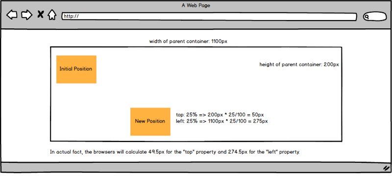
That being said, as long as we define the offset values as percentages, the position of the target element depends on the width (for left or right offsets) and height (for top or bottom offsets) of its parent.
The demo below demonstrates this difference:
See the Pen Little-known thing #5 – The difference between positioning elements with pixels and percentages by George (@georgemarts) on CodePen.
In this example, we use pixels and percentages to move the element. Sure enough, when the offsets are declared as pixels, the element is moved to a position that we expect. So far, so good!
On the contrary, when we choose percentages as the desired CSS unit for our offsets, the element’s position depends on the dimensions of its parent. Here’s a helpful visualization showing how the new position is calculated (with percentages):

Note: As you probably already know, the transform property (along with the different translate functions) also let us change the position of an element. But, please note that if we use percentages as the CSS unit, the element will be positioned relative to its dimensions and not relative to its parent dimensions (unlike offsets).
Conclusion
I hope that this article has helped you gain a solid understanding of the CSS positioning layout method and has highlighted a few CSS concepts that might be confusing. I’d love to share your thoughts, questions, or recommendations in the comments below. Thanks for reading!
