
Adobe Illustrator is experiencing a come-back in the world of web design. Not only is SVG becoming commonly used online, but more and more designers are using vectors for wireframing. The following tips will help you make the most of Illustrator as a wireframing tool.
Wireframing is about working rapidly and iterating quickly. The aim is not to create attractive interfaces; your number one priority is to design information and experience.
1. Go Monochrome
Wireframes make clear the hierarchy on a web page; they visually demonstrate the order in which users should process the available information. If you want users to process the headline before hitting the “buy now” button, the headline needs to “trump” the button by demanding more attention.
This visual hierarchy can be defined in a number of ways. We could use size to make the headline more impactful, we could use positioning (by placing it before the button). We could use colour, contrast and a range of other things, but doing so in a wireframe only makes things more confusing.
By removing color from the equation, the visual relationship defined by position, size and (if you want to go the extra step) contrast, is much cleaner.
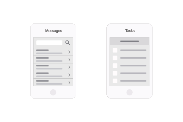
We’re not building pretty, pixel-perfect UI kits here. Stick to a limited range of greys, then use colour just for labels and notes.
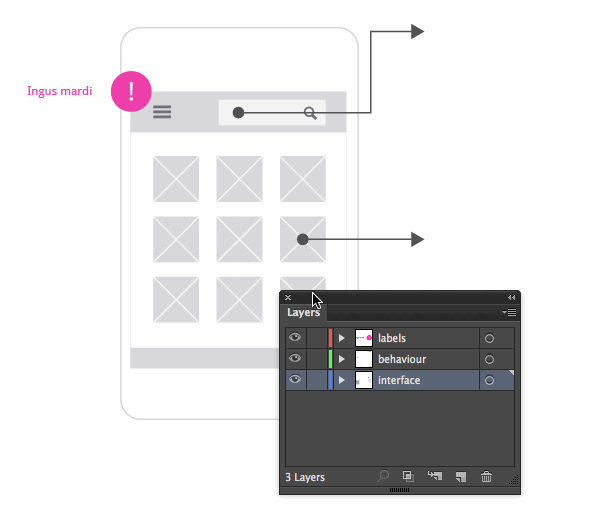
2. Keep Layers for Specific Purposes
Speaking of labels, notes and comments, it’s a great idea to place each one on a dedicated layer. The same goes for anything else which has a specific purpose; such as behaviour, interaction, gestures and so on.
Place visuals on one layer, behaviour on another, and labels on another, so that you can easily toggle their visibility when needed.
3. Leverage Symbols
D.R.Y. is generally used as a programming term, but is equally applicable to design workflow. In any given wireframe, we’re going to be using and reusing certain objects. Turn these objects into symbols and any changes you make to one will instantly be reflected in the rest.
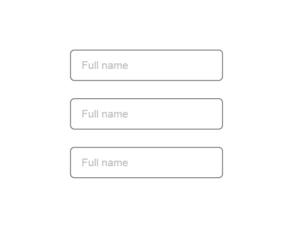
For example, here’s a simple form field:
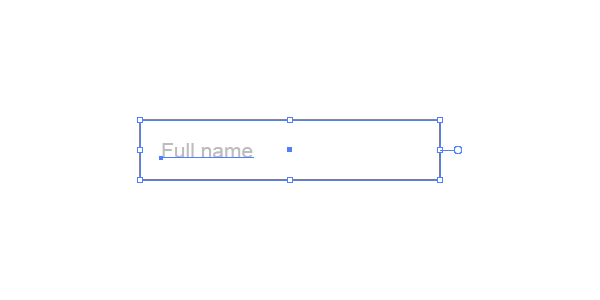
Let’s drag it into the Symbols pane (Shift + Command + F11)
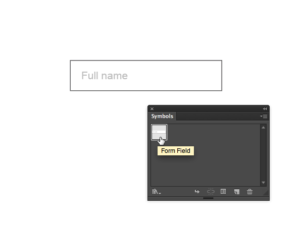
We can now pull this symbol from the Symbols pane, as many times as we like, onto the artboard. By double-clicking any one of them, we’ll isolate it (a bit like grouped objects) so we can edit it. Any changes we make, in this case rounding the corners of the rectangle, will be applied to each and every one of the form field symbols we’ve used.
Once we have a collection of symbols, we can also save them as a set:
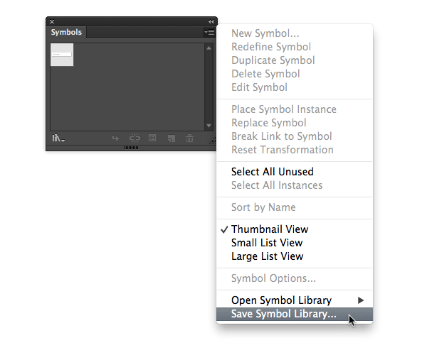
This will allow us to load them into other files for the future.
If you’d like to learn more about the symbols palette, take a look at Quick Tip: Working With Symbols in Adobe Illustrator.
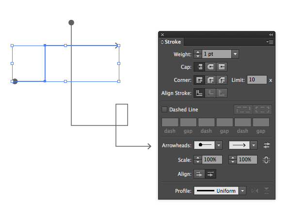
4. Arrowheads Are Perfect for Pointing
One great tip is to leverage stroke arrowheads, something readily available in Illustrator straight out of the box since CS5. Wireframes are the ideal opportunity to visually describe interactions, application flow, navigation and movement.
These days we can easily add arrowheads to strokes, directly from the Stroke pane.
We can even edit the Illustrator source “Arrowheads.ai” file, as explained by Ryan Cornwell, and add our own arrowheads to the mix.
Note: Annoyingly, the dropper tool doesn’t apply arrowheads along with other stroke styles, so it’s not as easy as it could be to duplicate the effect you’ve chosen. But still, they’re perfect for wireframing.
5. Snap to Grid for Unified Spacing and Sizing
In many ways, this follows on from not using colour. Unifying dimensions and spacing removes an element of distraction from wireframes, helping us visually concentrate on what’s important.
It doesn’t matter if the exact dimensions don’t reflect what the UI will be like further down the line; as long as the hierarchy and relationships remain true, we’re good to go.
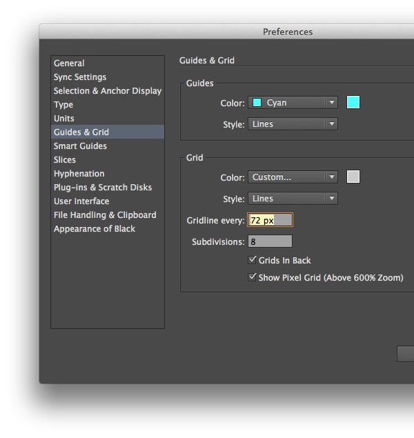
Apply a grid to your Artboard by going View > Show Grid. Selecting View > Snap to Grid will help you position your objects with precision.
To specify exactly what you want your grid to look like (and remember, you’re not going for tiny detail here) go to Illustrator > Preferences > Guides & Grid.. Once there you can define the distance between the gridlines, then state how many subdivisions you want within those lines.
Note: Feel free to colour your grid in something other than grey; it won’t be part of the final product.
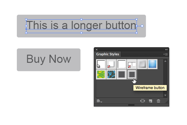
6. Use Graphic Styles for Flexible Buttons
Depending on the level of fidelity (how true to the final website you’re aiming for) you may have actual text within, for example, buttons. To get these buttons to grow and shrink depending on the content within them, don’t use objects, use graphic styles.
Let’s begin with a string of dummy text.

Now let’s open up the Appearance pane by going Window > Appearance.
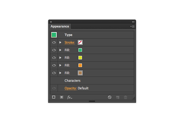
Using the Appearance pane, you can add multiple fills to one object. We can layer those fills in the order we’d like them to display; in this image you can see several, all piled on top of one another.
For now, we just need two fills, so let’s add a dark fill for the text, then a paler colour for the background.
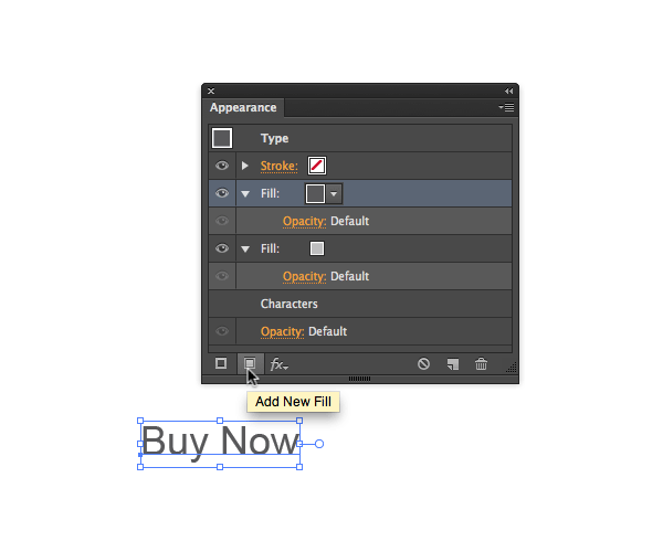
Currently, we can’t see the pale grey background, because it’s exactly the same shape as the uppermost fill. However, we can isolate and manipulate each fill separately. Select the bottom fill in the Appearance pane, then go to Effect > Convert to Shape > Rounded Rectangle…
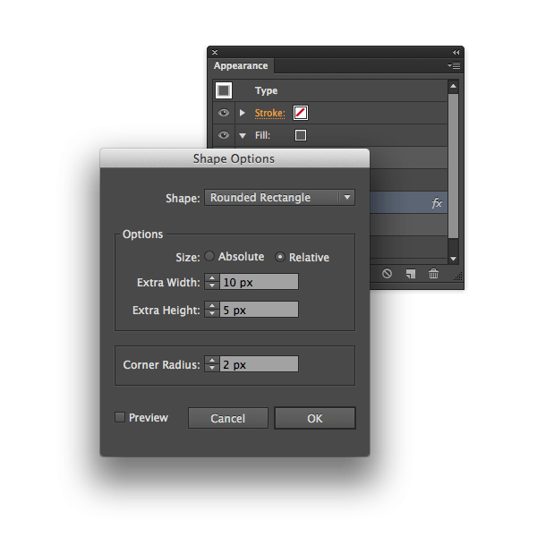
Enter some settings, whatever you see fit, just make sure the size is relative to the object we’re applying this to.
The pale grey fill on the bottom has now taken the form of a rounded rectangle, relative to the size of the text. A button! To apply this appearance to other objects, open up the Graphic Styles pane and drag the whole button into it. Its appearances will be saved as a style which you can reuse.
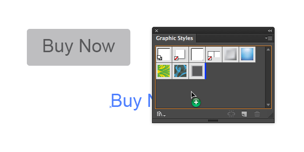
For example, here’s a longer string of text. With the text selected, click on the newly created Graphic Style (which I double-clicked and renamed) to apply it instantly.
7. Setup Some Commonly Used Artboards
Speed is the name of the game with wireframing! Scribble down a layout, move on, scribble down another, move on. It therefore makes sense to have a ready-made starting point you can access easily. You might find you work best on a massive artboard first, pulling finalised objects into a separate file, or you might prefer to work directly with properly-sized artboards.
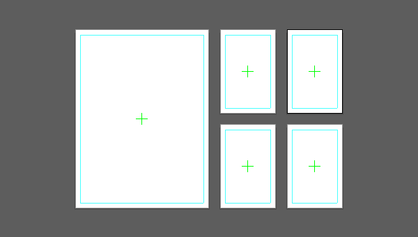
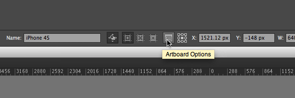
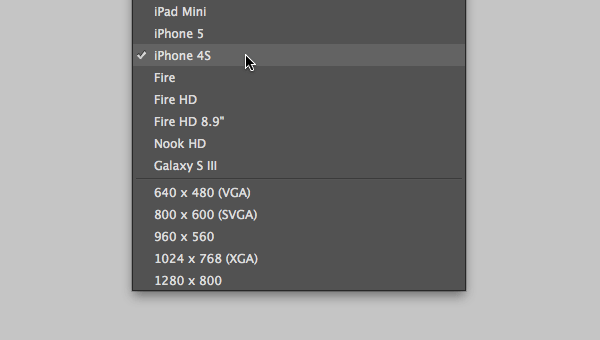
Here, for example, is a layout with an iPad screen (1536x2048px) and four iPhone 4S screens (640x960px), though you can prepare a file with any number of device screen examples. Either set your preferred dimensions manually, or choose from any of the available presets from the Artboard Options:
Include any common guides, layer names, symbol sets etc. that you might use, then save the whole thing as a template for future use (File > Save as Template..) This starting point will then be available to you by going File > New from Template.., complete with all the bits and pieces you left there.

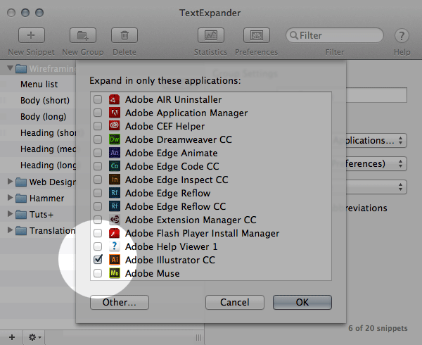
8. Use TextExpander for Dummy Text
Illustrator doesn’t come with any dummy text tools. There are some scripts which are worth playing with, but the easiest way to get dummy text into your Illustrator Wireframes is to use TextExpander.
Note: if you’re a Windows user, PhraseExpress offers similar functionality to TextExpander
Add a series of text snippets which you find yourself commonly using for wireframes (such as a large heading, a short heading, body copy of varying lengths, typical button text, menu items and so on) so they’re readily available from within Illustrator.

By defining a key phrase for each snippet, TextExpander will replace that phrase with your content whenever you type it, saving you bags of time. You can also use the folder options to make sure these snippets only take effect in Illustrator, should you want to.
To learn more on optimising your TextExpander workflow, take a look at Master TextExpander With These Helpful Tips & Tricks.
9. Practice Logical File Naming
Being able to rapidly visualise changes and ideas is at the heart of wireframing, but this can lead to a huge pile of disorganised files if you’re not careful. The key is to save at significant stages and with logical file naming conventions.
For example, we might want to begin each filename with the name of the page we’re working on. Then it might be sensible to use some kind of variant name, after which the version number: page-variant-version.ai
For example, we might be working on a landing page; one which concentrates on promoting either an email campaign, or an ebook. We might have filenames like:
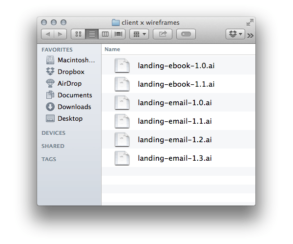
Not only does this keep project folders organised, but it acts as a form of manual versioning. Matt Smith discusses the idea more in his article Wireframing With Illustrator and InDesign.
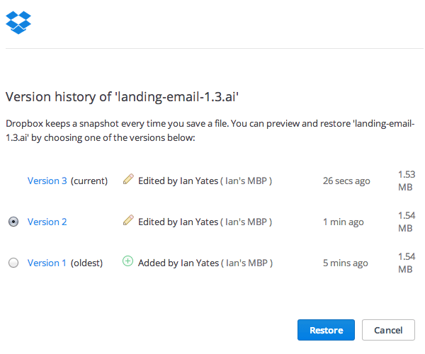
10. Save in Dropbox for Easy Versioning
Taking the idea of versioning even further, saving your files directly in Dropbox will remove that task from your todo list completely. Even the free plan from Dropbox will store a copy of your files each time you save them, for thirty days.
Likewise, Layervault offers similar awesomeness in its free plan.
In either case, this is especially useful if you’re collaborating with a team. Having all members working from one central location, with the option to restore any version if someone does something strange, is ideal for teamwork.
Conclusion
Many of these tips are entirely personal to my own workflow and may not translate perfectly into your own way of doing things. However, I hope they at least trigger some curiosity, to get you thinking about the way you wireframe web layouts. If you have any other tips of your own, please share them in the comments!