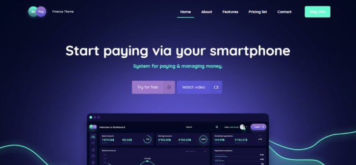
Every job has its ups and downs, but that doesn’t mean you have to live with every one of the downs. Getting started on a new assignment is almost always a thrill. Before you get too far into it, little problems make their presence known.
The net result can be like a wild ride on an emotional rollercoaster. Enter the magic kingdom of pre-built websites. All the problems you typically face won’t necessarily be eliminated. But most of them including those that cause the most pain and trouble will be.
When everything begins to move along smoothly DO NOT PANIC!! There’s nothing wrong with you. With pre-built websites, it’s simply the way it’s supposed to be – from here on out.
A (Very) Brief Tutorial
What is it about pre-built websites that makes site building proceed so smoothly?
Let’s first visit the source.
BeTheme is a top resource for pre-built websites. It’s been a top 5 ThemeForest seller for years and it currently offers 380+ of these pre-built websites.
Consequently, it’s easy to find a theme to match any website type you have in mind. Plus, each pre-built website is customizable. The bottom line is that you can have a website ready to go in as little as 4 hours. This is without having to put up with the usual pains and problems.
Here’s why.
The 5 Most Common Web Design Pains Pre-built Websites can Eliminate
The Pain Associated with Not Knowing the Market
“Unique” barely describes the niche your newest client belongs to. How do you get a handle on the market? You can (a) take days to research it, or (b) browse Be’s catalog of pre-built websites.
We suggest opting for “b”. Pick one that’s close, you should be able to customize it to cover any niche.
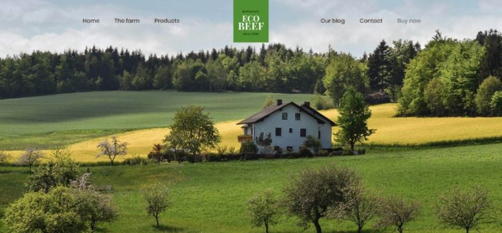
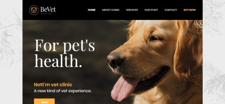
Ecology, pets, and tech-based designs are each broad enough to start with. All you need to do is a little tweaking and add the necessary details to make your client a happy client.
Finding the Right Color
Some clients already know which color or color palette will be best, and some will leave it up to you. Still others pick their favorite color, whether it’s a good match for their specific niche or not. That can be painful to you the designer, and that pain can extend to design choices beyond those of color.
Pre-built websites adhere to industry standards. Thus, you have a built-in argument you can use to help your client make a proper choice. This is whether the subject is color or content architecture.
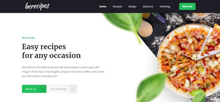
Here’s a couple of examples where the colors are just as you would expect them to be.
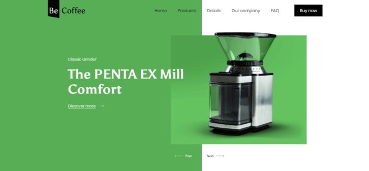
And one niche in which you wouldn’t expect to be using green as the primary color – but Hey! It works.
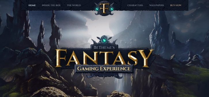
How about a great, big logo that really pops out of the page?
Why not strictly use upper-case red letters and plenty of exclamation points? The same effect – it’s a turnoff.
Your client might really want a larger than a normal logo. There are plenty of pre-built websites that show how to turn it into a work of art.
In each of the preceding examples, the larger than life logo looks just right. Agree?
Dynamic website design is scary, isn’t it?
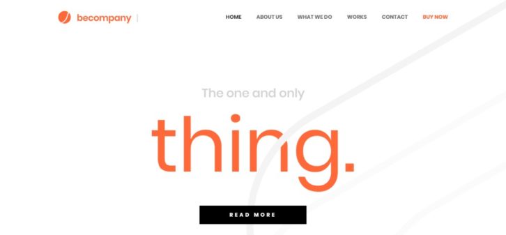
Then we have the dynamic, eye-candy, looks-like-it’s-actually-moving website. Most designers rise to challenge of course, and they are proud of the results they achieve.
Using pre-built websites to create dynamic websites is not hard at all. It’s quite easy in fact.
If you don’t believe it, you can see for yourself.
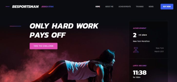
Then, there’s the client who will settle for nothing less than stunning (often without defining just what it means).
“Stunning”, “Awesome”, “Magnificent” like beauty, is often in the eye of the beholder.
How about “Super-Innovative”? In truth, when you start with the right pre-built website. All the above are not only achievable but almost ridiculously easy to accomplish.
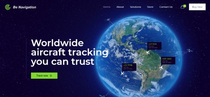
Not to forget “Futuristic”.
Conclusion
So, why not start enjoying web design life to the fullest?
– No creativity issues– check!
– Managing your own projects – check!
– Getting rid of annoying stuff – check!
– No more wasting precious time dealing with the same pains over and over again – double check!
Unless you’re a closet masochist, you can at least *try* using pre-built websites. You might just LOVE knowing how easy it is to avoid those annoying little things.
But first, go ahead and browse those 380+ designs. You’re welcome!
0 Comments
