A few days ago, the big tech news was that Jack Dorsey was stepping down from his role as Twitter CEO to focus on Square, the payment processor he founded in 2009.
Two days later, it was announced that Square will now rebrand under the umbrella of Block. Like Meta and Alphabet, Block is a parent company — Square will remain Square, just as Facebook is still Facebook. The only actual product name change is that of Square Crypto will now be known as Spiral.
The move has reportedly been in the works for over a year. However, despite the marketing team’s best efforts to spread around the reference, it’s reasonably clear that Block is a reference to blockchain, the technology that powers cryptocurrency.
Dorsey has been a longtime advocate of cryptocurrency, particularly Bitcoin. With PayPal and Mastercard entering the crypto space, it was only a matter of time before Square’s focus was redirected away from legacy money.
The recent Meta rebrand was much scorned, but the new Block brand has been received with considerably more positivity. So what’s the difference?
Typically corporate rebrands, especially those in fintech, are detestable exercises in cowardice, where all trace of personality is driven out in favor of a nice safe sans-serif and a logomark as some form of tick or wave. Not so the Block branding, which feels like a cross between an Apple store and a hardcore night out in Berlin.
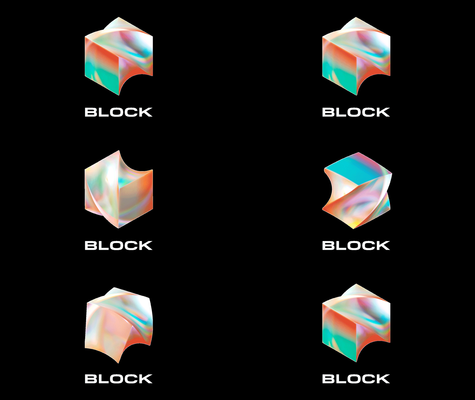
Yes, the logotype is sans-serif — it’s Pilat, to be precise. But the characters are pleasingly wide, and the overall shape of each is a rounded square. So much so that the ‘K’ feels a little out of place due to the rounded characteristics of the other letters. Most obviously of all, it’s uppercase, which in itself is nothing new, except that it breaks from the recent trend for lowercase. It’s incredibly refreshing to look at a brand that doesn’t mimic everything else in the space.
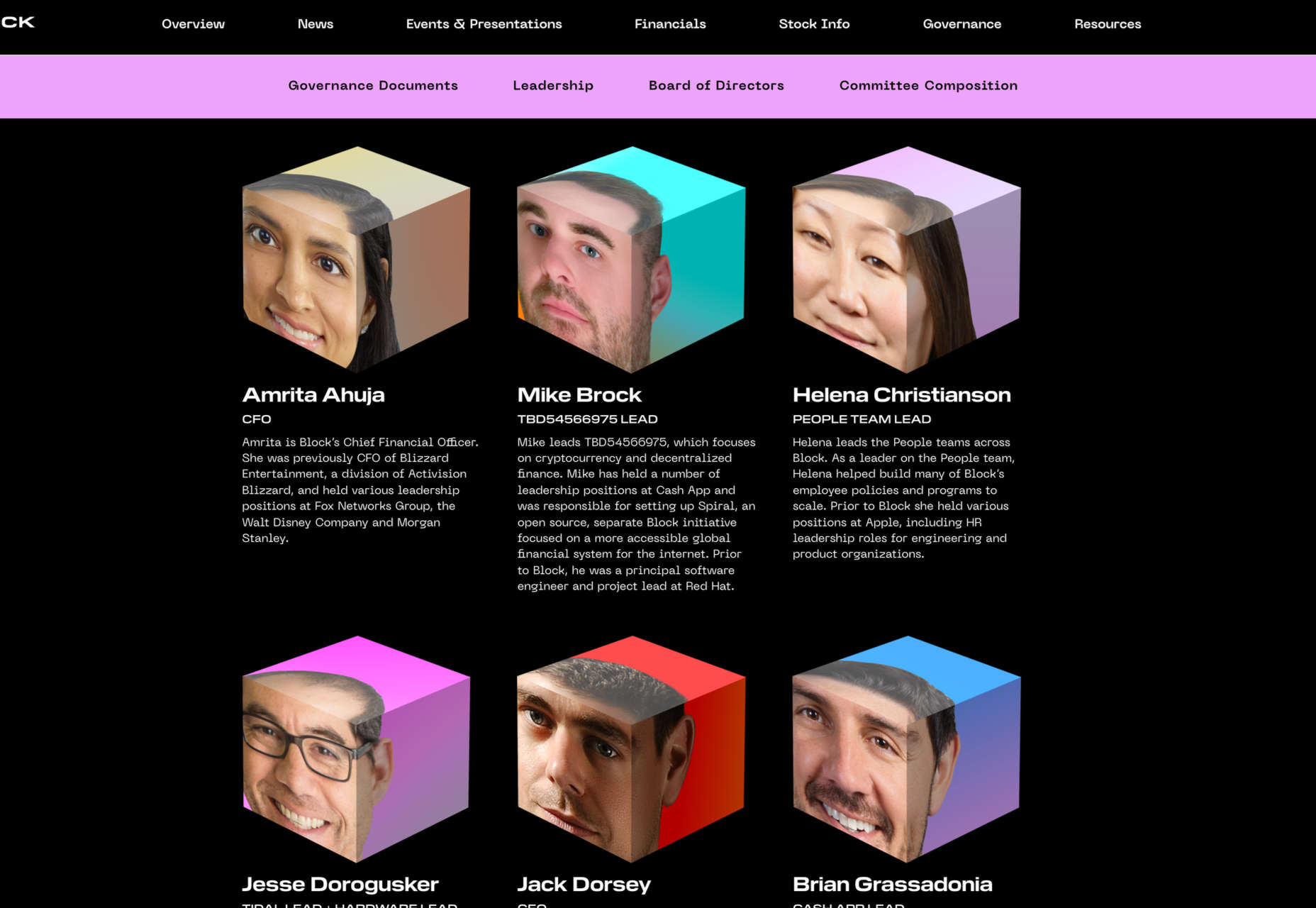
The logotype is crowned with a pleasantly brave mark; a morphing, twisting cube across the surface of which rainbows of gradients dance and play as it flips and spins. Interestingly, the logomark’s animated form is considered the primary version, with static versions only to be used when required.
The logo isn’t perfect — clearly, a design so dependent on color lends itself far better to dark mode than anything else — a good logo should be robust enough to work well in any context. However, I really like the design’s ambition to define itself, and the playfulness with which it does it.

