Candy is a normal design theme, but designing a candy website for National Candy Day is not too common. As designers, we have designed for education, fashion, and all that. But, candy? It is quite a rare design project. Knowing this, it could be a pretty overwhelming job. Choosing to make it appealing and colorful without making the overall design too distracting is a true challenge. Thankfully, there are multiple candy websites we can explore for inspiration. Here are some of them:
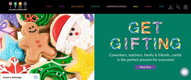
Dylan’s Candy Bar
How deliciously cute are candy-themed typography? Dylan’s Candy is one of the most popular candy stores on the internet. If you are looking for a colorful inspiration for your candy website, Dylan’s is the best to explore.
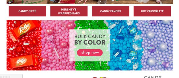
Just Candy
Isn’t it cool that Just Candy has organized their catalog by color? They have designed their website by color as well – in colorful rainbow designs.
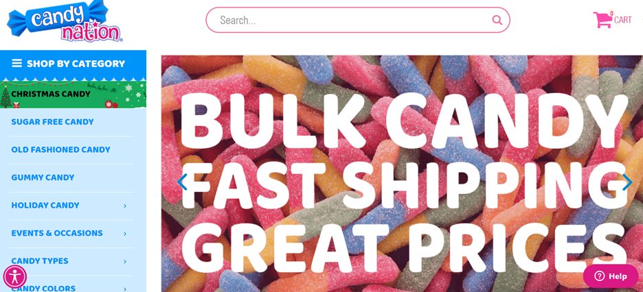
Candy Nation
On this website, we will see a lot of blues and pinks. But their background choices will surely make your mouth water.
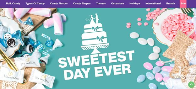
Candy Warehouse
Looking for themed candy or candies that are occasion-specific? This is the best website for you – you can already see in their website design how they market their themed and occasion candies.
Candy Favorites
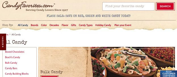
Unlike other candy websites that are themed with reds, pinks, and blues, Candy Favorites is designed with something creating – brown paper bags. When candy shops became popular for our granddads and grandmoms, candy was placed in gigantic glass jars. When you buy some, it will be covered in brown paper. So this website’s design is giving us that retro vibe.
Joys Delights
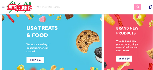
What is great about the design of this website is that the candy graphics are not too overwhelming. It’s there but look at how it is cleverly used as a border instead of the main highlight of the slider.
Sugarfina
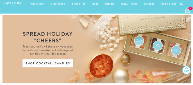
Sugarfina is the kind of candy website you wouldn’t feel childish shopping in. Why? Because it is designed not with childish candy graphics or rainbows, but instead with lots of rich colors like dark forest greens, burgundies, golds, and crystals. It is very luxurious looking too.
See’s Candies
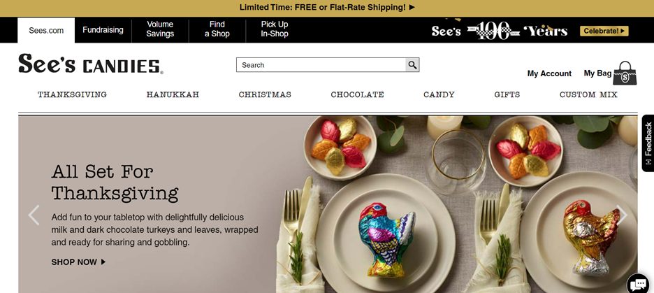
If you are thinking of a minimalist candy-themed website design, See’s candies are the best inspiration for you.
Old Time Candy
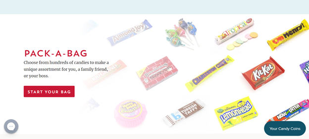
What is so sweet about this website is not just the design but the “candy memories” shared by the customers. You will see lots of people commenting on their favorite candies, including memories and experiences tagged with it, from the ’50s and ’60s. This proves that designing websites is not just about aesthetics but about the content presentation as well.
It Sugar
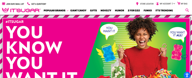
The brand sells novelty, humor, and trendy candies. Using a meme for a web background is very reflective of this. We also love and enjoy how they use typographies and hashtags in their design. Also, can we just talk about how witty the logo design is?
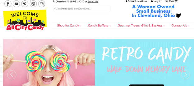
All-City Candy
Soft pinks, blues, rainbow colors – this is the general design theme of All-City candy. Remember how deliciously pretty Katy Perry’s California Girls MV is? It is exactly that pretty.
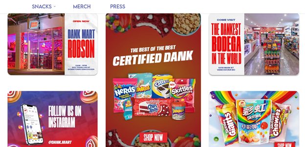
Dank Mart
We all love the graphic design on this website and how hilarious everything is. It is unique and flavorful, just like the snacks and candies that they sell on their website. If you are looking for one-of-a-kind candies and one-of-a-kind design themes, the Dank Mart is waiting for you.
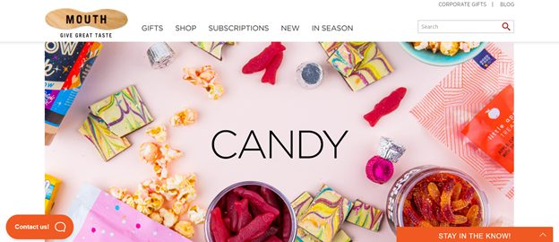
Mouth
The overall aesthetic of mouth is palatable and appetizing. Just by looking at it, you’d think that the website smells like candy.
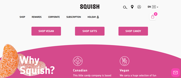
Squish
Instead of creating a colorful website, the general theme of Squish is pink. Using varying shades of pink (from dark to neon) gives it an appealing monochromatic look.
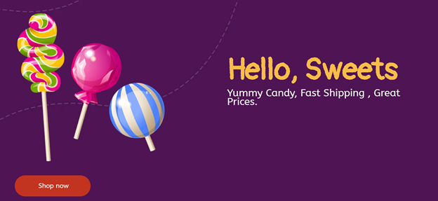
Hello Sweets!
This is the kind of website that will make you reminisce about your childhood. Handpainted candy on a dark purple background makes you think about carnivals, theme parks, and magicians, right?
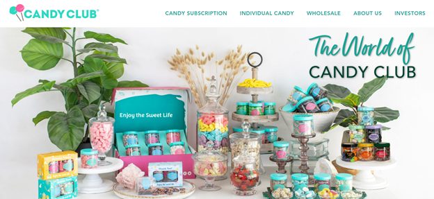
Candy Club
Candy aesthetics, anyone? The Candy Club website is eye-candy with its subtle monochrome styling. The use of real candy instead of cartoons and graphics also gives the website a more luxurious vibe.
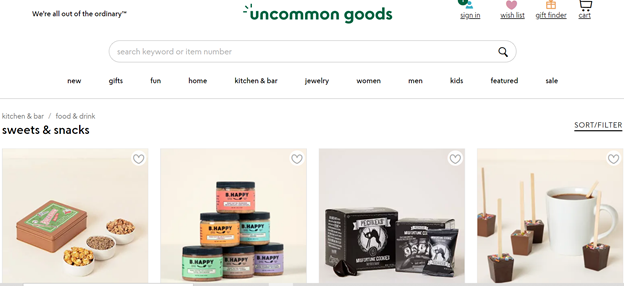
Uncommon Goods
A minimalist website that highlights the product than the design – Uncommon Goods gives good design inspiration. Although the products are from different suppliers and candy makers, the website still looks coherent because of the photography, background, and layout. It is safe to say that the website design is not as distracting.
