Today we’d like to share some tooltip styles and effects with you. Tooltips are normally used for providing some kind of extra information and they can be found in almost every website. Those tiny little helpers offer a great opportunity to add some subtle and unique effects to any design. So today we want to show you some possibilities of showing those elements in style.
We only use CSS transitions via hover and also some SVGs to create unique shapes. Icons are from Font Awesome and the profile pictures are from the Random User Generator.
Please note that we use some modern CSS properties, like 3D transforms, which only work in modern browsers.
There seems to be an issue with using a percentage-based transform-origin value for SVG paths in Firefox. You might not be able to see the correct transform effect, so we recommend using Google Chrome to see all the examples working correctly.
Also note that animating the stroke-dasharray does not work in the IE < 11.
The examples are CSS-only using hover to show the tootlips, which is not a mobile solution. You would want to use some JavaScript for controlling the appearance on click, rather than hover in that case. A full-blown solution would also take the positioning of the tooltip into account so that they don’t appear off-screen. Some useful solutions are the following:
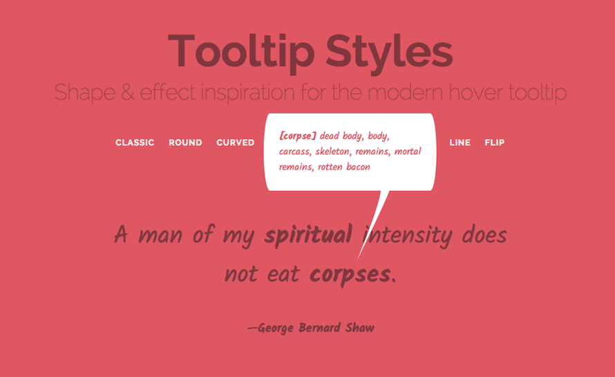
Let’s have a look at the “sharp” tooltip style. The markup is as follows:
<blockquote> <p>A man of my <span class="tooltip tooltip-turnright"><span class="tooltip-item">spiritual</span><span class="tooltip-content"><strong>[spir·it·u·al]</strong> affecting the human spirit or soul as opposed to material or physical things</span></span> intensity does not eat <span class="tooltip tooltip-turnleft"><span class="tooltip-item">corpses</span><span class="tooltip-content"><strong>[corpse]</strong> dead body, body, carcass, skeleton, remains, mortal remains, rotten bacon</span></span>.</p> <footer><span class="tooltip tooltip-turnright"><span class="tooltip-item">George Bernard Shaw</span><span class="tooltip-content"><strong>George Bernard Shaw</strong> (26 July 1856 – 2 November 1950) was an Irish playwright and a co-founder of the London School of Economics.</span></span></footer> </blockquote>
We have two tooltip variations: the one that turns the tip to the left and the one that has it turned to the right. For this example we will be using an SVG shape for the tip.
So, let’s have a look at the CSS:
@import url(http://fonts.googleapis.com/css?family=Kalam:700,400);
.tooltip {
position: relative;
z-index: 999;
}
This is our trigger text:
.tooltip-item {
font-weight: bold;
cursor: pointer;
}
The content of the tooltip will have a matching border radius that fits with the sharp tip. We’ll position it absolutely right above the trigger item and then adjust the position with margins. While the width is fixed, the height will increase as needed. Initially, we’ll set it to be transparent.
.tooltip-content {
position: absolute;
bottom: 100%;
left: 50%;
z-index: 9999;
margin: 0 0 105px -140px;
padding: 25px;
width: 280px;
border-radius: 10px/50%;
background: #fff;
color: #dd5864;
text-align: left;
font-size: 16px;
opacity: 0;
cursor: default;
transition: opacity 0.3s, transform 0.3s;
pointer-events: none;
}
Depending on the turn of the tip, we’ll set the according rotation of the content. We basically want the content to rotate along with the tip, creating an “opening” effect.
.tooltip-turnright .tooltip-content {
transform: translate3d(0,50px,0) rotate3d(1,1,1,6deg);
}
.tooltip-turnleft .tooltip-content {
transform: translate3d(0,50px,0) rotate3d(1,1,1,-6deg);
}
On hover, we show the content:
.tooltip:hover .tooltip-content {
opacity: 1;
transform: translate3d(0,0,0);
pointer-events: auto;
}
Now, let’s have a look at that tip. We’ll be using the ::after pseudo element to add the tip, which is a SVG:
.tooltip-content::after {
position: absolute;
top: 100%;
width: 60px;
height: 120px;
background: url(../img/tooltip3.svg) no-repeat center center;
background-size: 100%;
content: '';
transition: transform 0.3s;
transform-origin: 50% 0;
}
Depending on how we want the tip to turn, we set the rotation. You’ll notice that we use scale3d(-1,1,1) for the right turning tip. This is a way of “reflecting” or “mirroring” an element with CSS.
.tooltip-turnright .tooltip-content::after {
left: 25%;
transform: scale3d(-1,1,1) rotate3d(1,1,1,25deg) translate3d(0,-15px,0);
}
.tooltip-turnleft .tooltip-content::after {
right: 25%;
transform: rotate3d(1,1,1,25deg) translate3d(0,-15px,0);
}
On hover, we reset the transforms to the final position:
.tooltip-turnright:hover .tooltip-content::after {
transform: scale3d(-1,1,1) rotate3d(1,1,1,0) translate3d(0,-5px,0);
}
.tooltip-turnleft:hover .tooltip-content::after {
transform: rotate3d(1,1,1,0) translate3d(0,-5px,0);
}
And that all makes an exquisite tooltip with a unique shape.
We hope you enjoy these styles and get inspired :)


