 Burger King, the globally recognized food chain with 19,000 restaurants worldwide, has unveiled a redesigned set of brand assets.
Since the late 1960s, the company has used a logotype sandwiched between two buns. In 1999 the design was updated to add a blue swoosh and some plastic highlights to the bun; Jones Knowles Ritchie’s new design reverts to the classic 1969 approach, with some modern refinements.
![]()
Left: The 1999 design, Right: JKR’s redesign
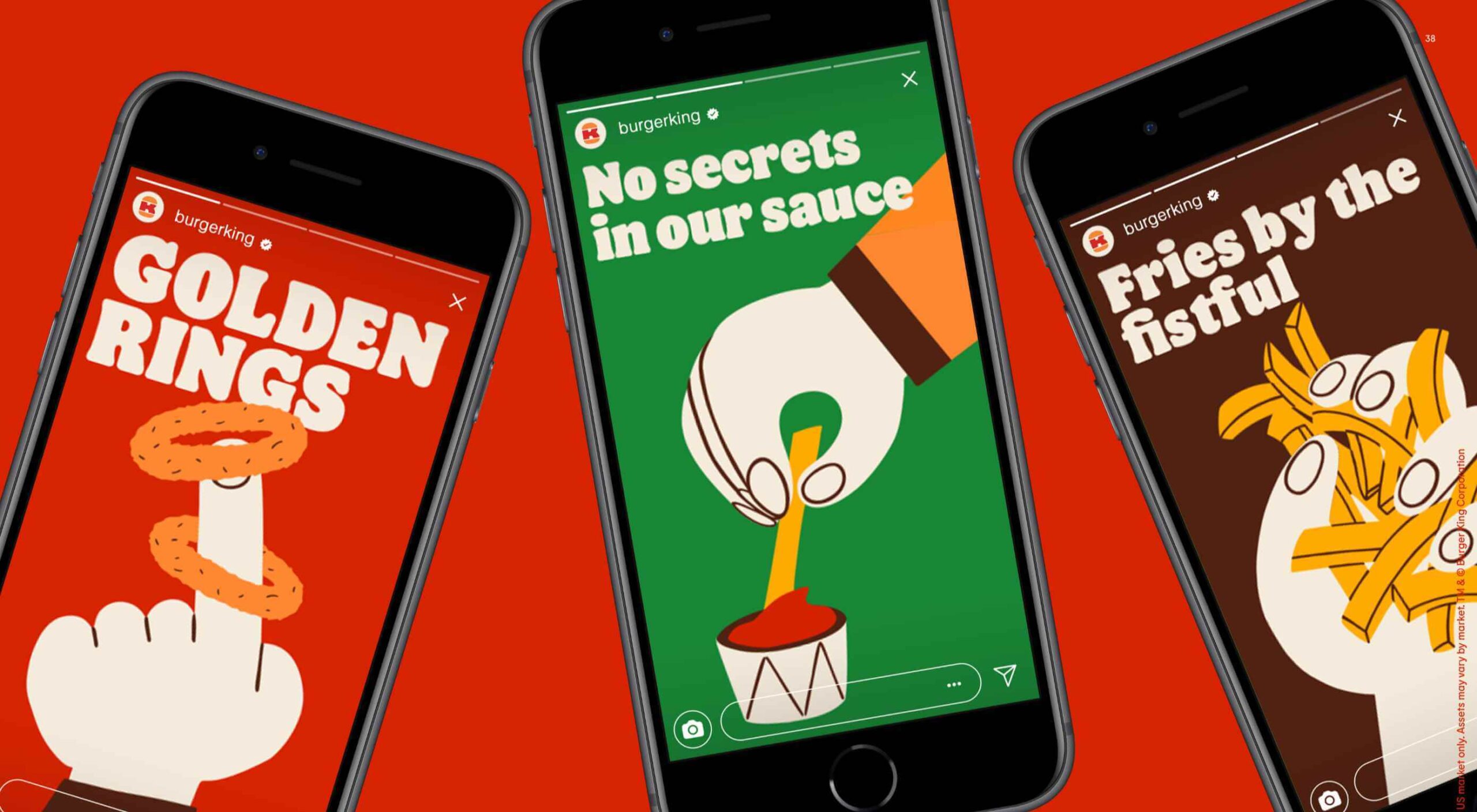
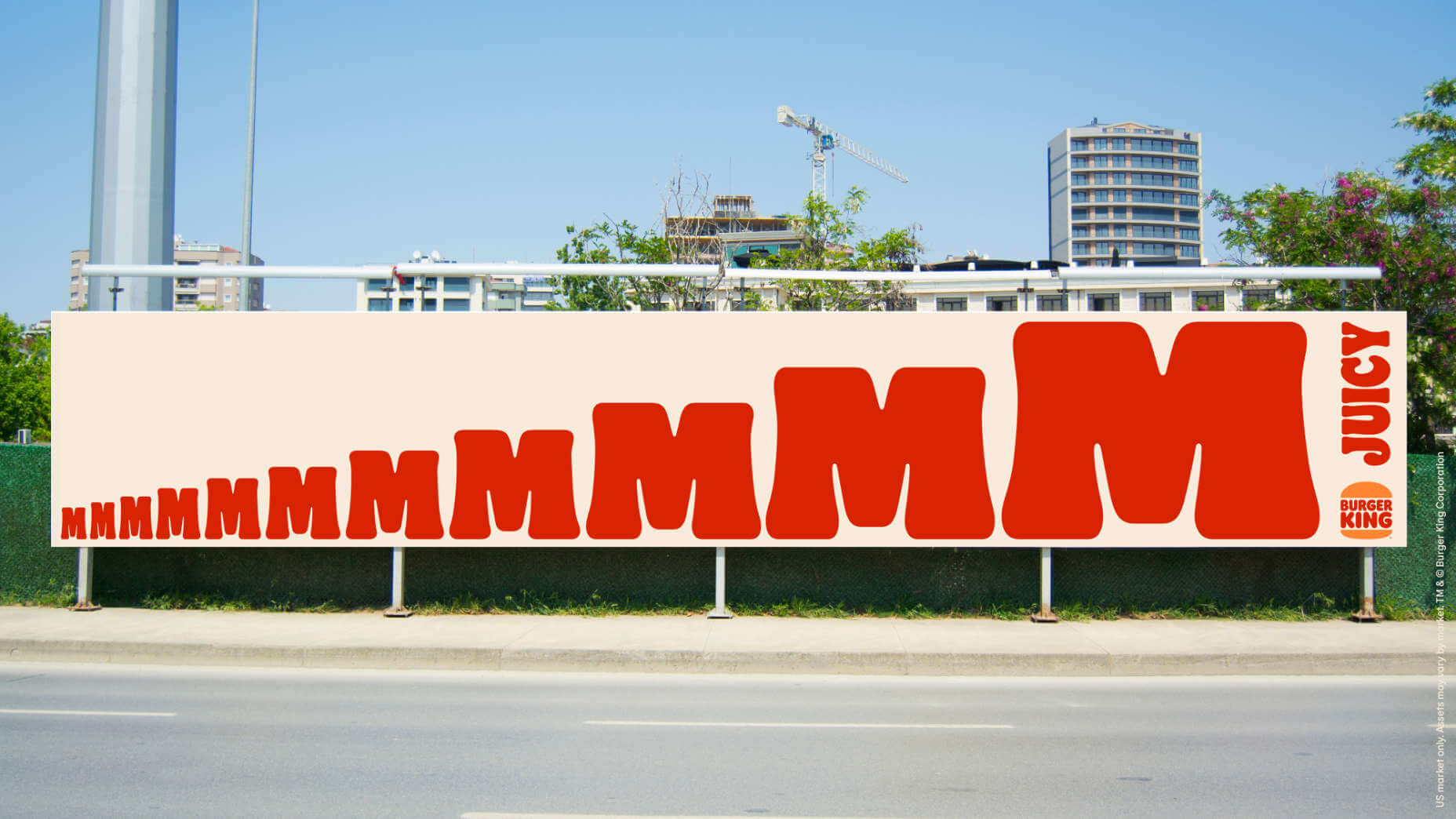
The lettering has been plumped up and resized, giving the impression of a sandwich bursting with filling. The sports-bar primary colors have been replaced with a warm, nostalgic, red and orange combination.
Alongside the logo, macro photography has been introduced to focus on food, and 70s-style illustration has been designed to allow for more creative storytelling. There’s a delicious custom typeface called Flame Sans designed to mimic the organic shape of food.
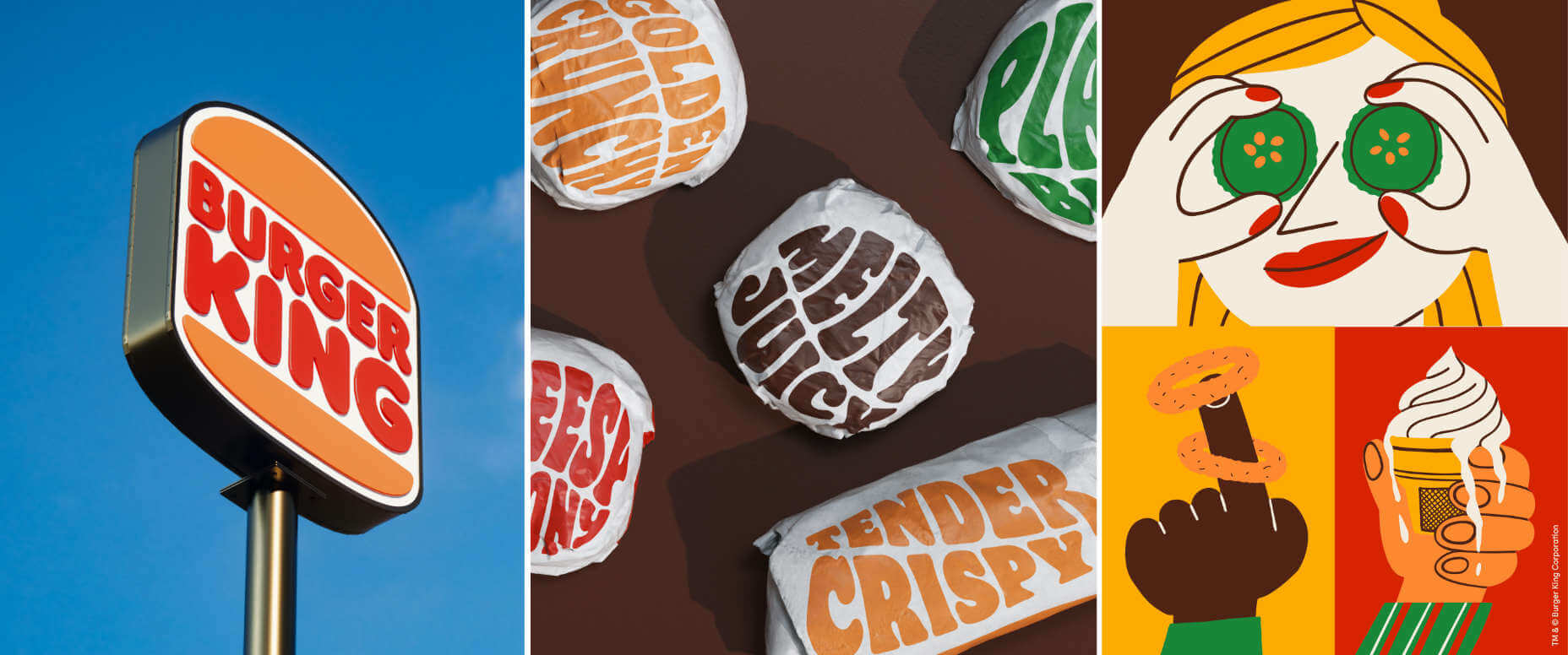
The rebrand is distinctly retro Americana, reminiscent of the work of Milton Glaser.
Design is one of the most essential tools we have for communicating who we are and what we value
— Raphael Abreu, head of design at Burger King owner Restaurant Brands International
With the trauma of recent events, it’s unsurprising that brands seek to transport us to a time that, with the benefit of rose-tinted spectacles, was simpler and more welcoming.
Burger King’s branding will take several years to roll out worldwide, by which time the style could be a popular trend.
p img {display:inline-block; margin-right:10px;}
.alignleft {float:left;}
p.showcase {clear:both;}
body#browserfriendly p, body#podcast p, div#emailbody p{margin:0;}
The post Poll: Is Burger King Rebrand a Taste of the Future? first appeared on Webdesigner Depot.
![]()