With the increase of mobile devices as a usual means of accessing the internet and the subsequent increase in app development, it is important to consider typography when designing an app or website. Luckily there are frameworks that specialize in adaptive design and currently, HTML and CSS are optimized to offer a good experience on mobile devices. You can use many different tools to beautiful typography of your Android app. App development companies can help you with this. ![]()
You should also consider your usual resources such as images and typography, an essential element in any app and web design. There is a great challenge in this regard: on mobile devices, the screens are smaller.
In this article, we give you some general tips to optimize your typography in these smaller screens.
Think of the spaces

Although it may not seem like it, typography has a lot to do with the spaces that exist around it. And we do not refer only to the space that exists between one letter and another, but the space that makes up typography. If you think about it for a moment, you will notice that many letters of the alphabet such as “o”, “b” or “p” have holes. These holes are usually called “eyes” and although their size varies according to the particularities of each letter, you will always find them in any type of font. These holes in the letters help create space, so they help with readability.
Since space improves readability it is important to take it into account when designing a site or mobile application. In order to improve the readability in mobiles, special attention must be paid to the space and the hierarchy of which we have previously spoken. This hierarchy allows you to create the group feeling so that the user knows which paragraph differs from another and can read the text more fluently.
Determine the ideal length of a line of text
Why is it important to consider the length of the line? Readability. If the line is very long or short, the flow and rhythm of the visual design are lost and the paragraph is much more complicated to read.
The ideal size for computers is usually 65 characters. Regarding the space you occupy depends on the type of typography you use and the length of the text you want to include. Likewise, the format must be taken into account: if it is in italics, in bold, the score, etc. There are many factors that can influence the total space that your text occupies in the design.
However, this 65-character measure is likely to exceed the limits of a browser on a mobile device. For this reason, the number of characters must be smaller. Usually, 35 characters are placed as a suitable length on mobile devices. This length is also affected by the same factors that influence a mobile computer (typeface, score, format, etc).
You must bear in mind that this ideal measure is not always the most optimal for your designs, but at least it helps you to have a basis to establish the ideal length in your specific designs. Just make sure to observe your text and read it to verify that there are no readability problems.
Modify line spacing

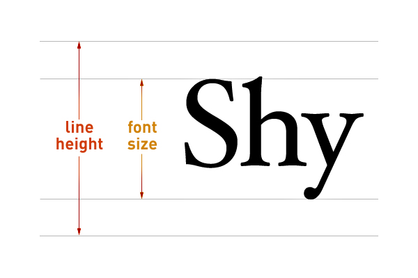
Pay special attention to line spacing because it helps to group and differentiate paragraphs. When the line spacing is too high, it interrupts the reading because the reader won’t understand which line continues and which one belongs to the paragraph. When the spacing is very low, the poles of certain letters may collide with the base of others, this makes legibility difficult. For optimal readability, line spacing must be adequate.
In programs such as Photoshop, line spacing is associated by default, but we suggest modifying it slightly or at least trying to see how the paragraph looks if you use another interline measurement. You may notice that with a higher or lower measurement the text looks better. It’s hard to believe, but small details like these can help improve the readability of your text.
In general, the line spacing is usually smaller in mobile devices due to the screen size. However, this measure should not put the readability of your texts on mobile devices at risk.
Reduce the contrast

It is usual to use the score of a text to indicate its importance. Thus, the titles are usually in a higher score (and even in bold) than the subtitles and text body. Although this works perfectly in computers, the opposite happens in mobile due to the amount of text that is visible on the screen.
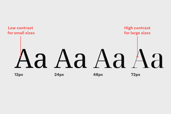
It is important to generate contrast and hierarchy. But in the case of mobiles, the score of titles, subtitles, and body of text must be reduced so that they are legible. The hierarchy is still present and recognizable, but the contrast between fonts is not as exaggerated as in computers.
Modify the tracking
![]()
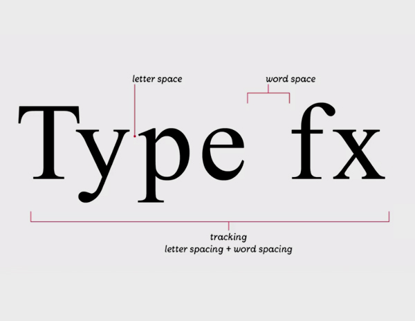
When you have to modify the size of your mobile source, you must take into account the tracking. The tracking refers to the spacing that exists in the entire group of characters that make up a word. Usually, this value is associated by default, but you can modify it if you notice readability problems.
These problems are likely to occur in titles or footnotes. Remember that the higher the score of typography, the less should be the tracking and vice versa. This is because a high-grade typeface can be easily read and for this reason, you do not need as many blank spaces as low-typography may need.
Every time you change the size of your mobile sources, keep in mind that the smaller a font is, the higher the tracking value should be.
These are the typography rules for the design of your mobile app and website. Ensure you meet with app development companies to hire dedicated developers for your Android apps.
