 There is no shortage of places to buy fonts online, but the quality of what is on offer is variable, and the way of searching catalogs has remained largely unchanged since the first stores appeared decades ago.
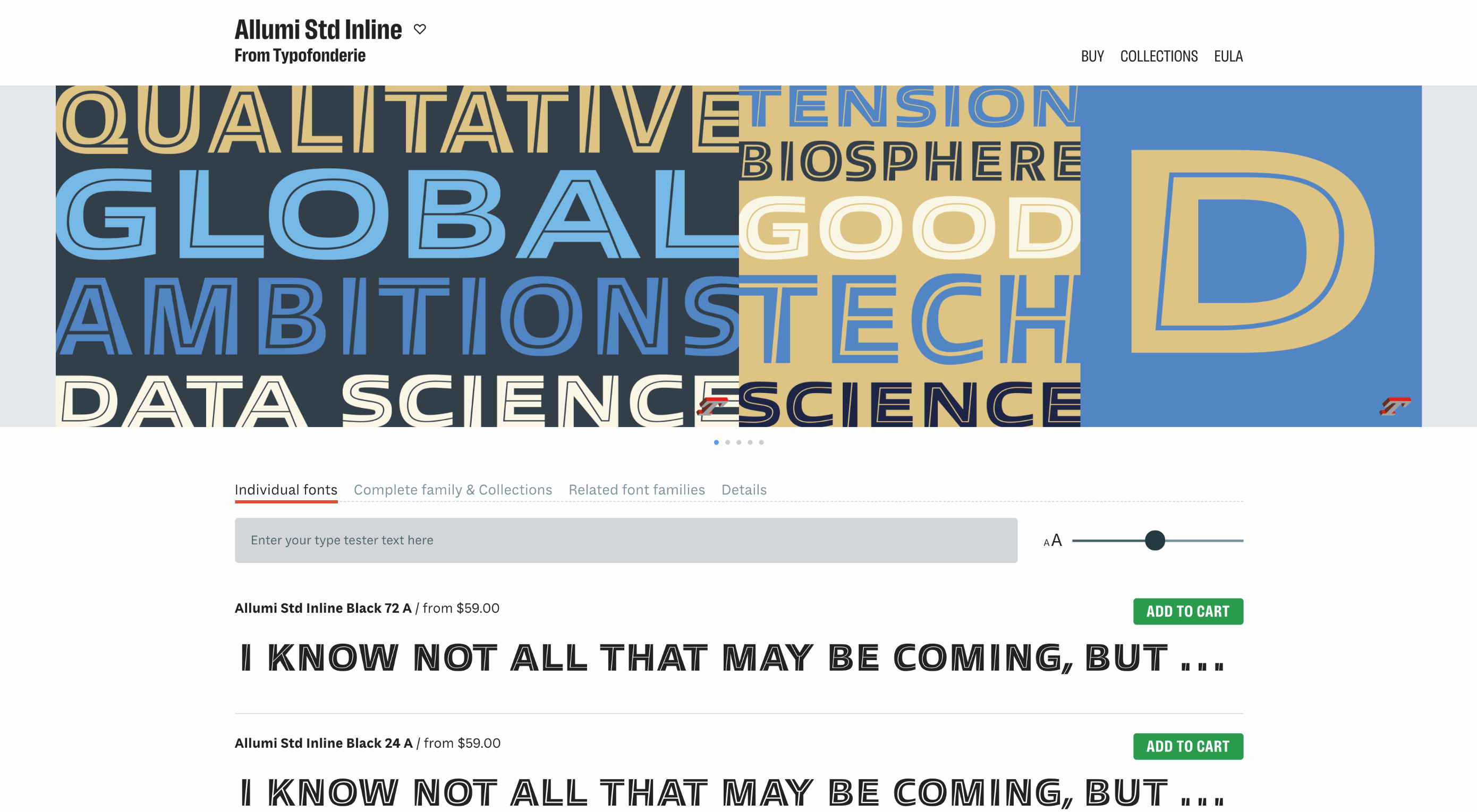
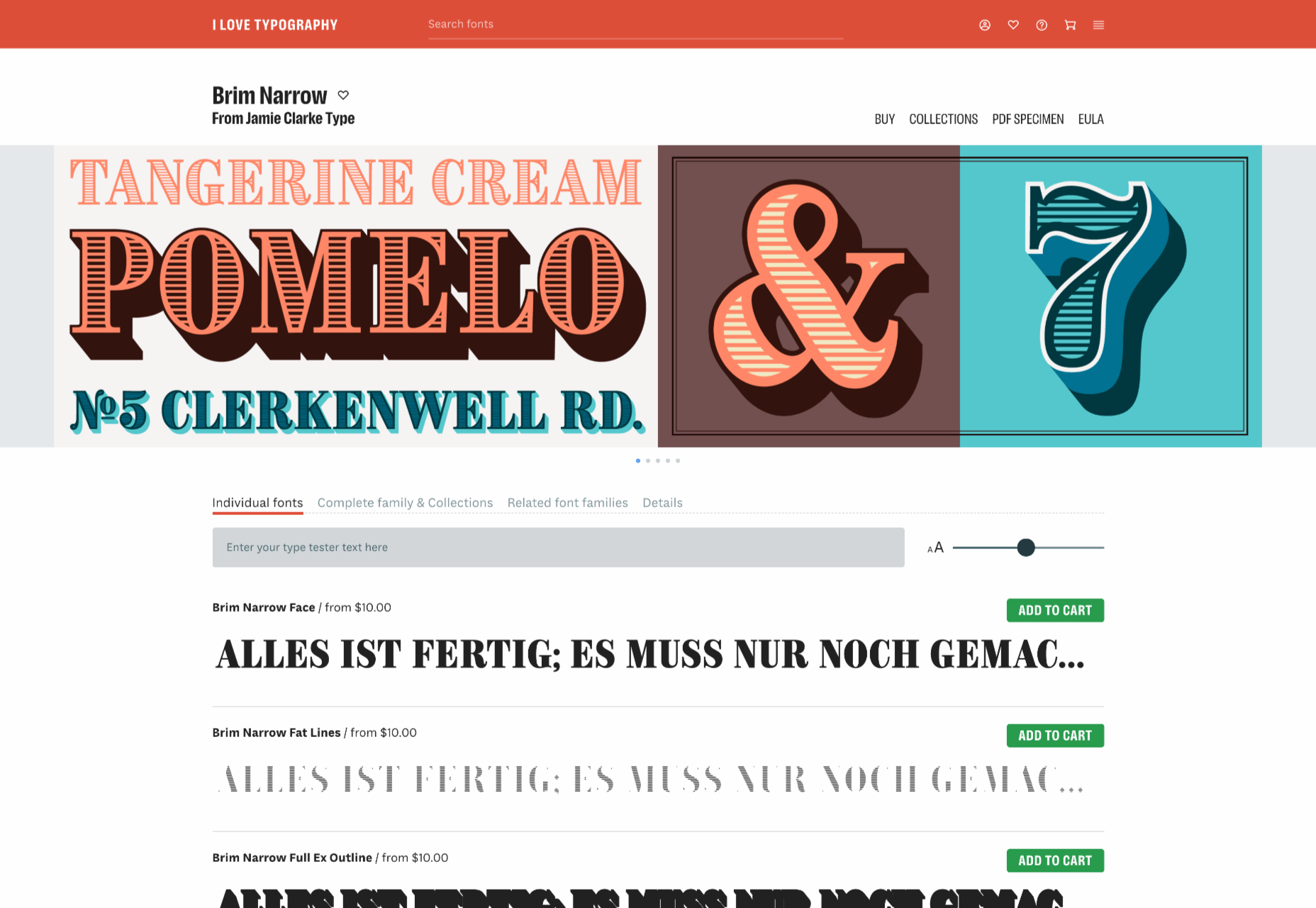
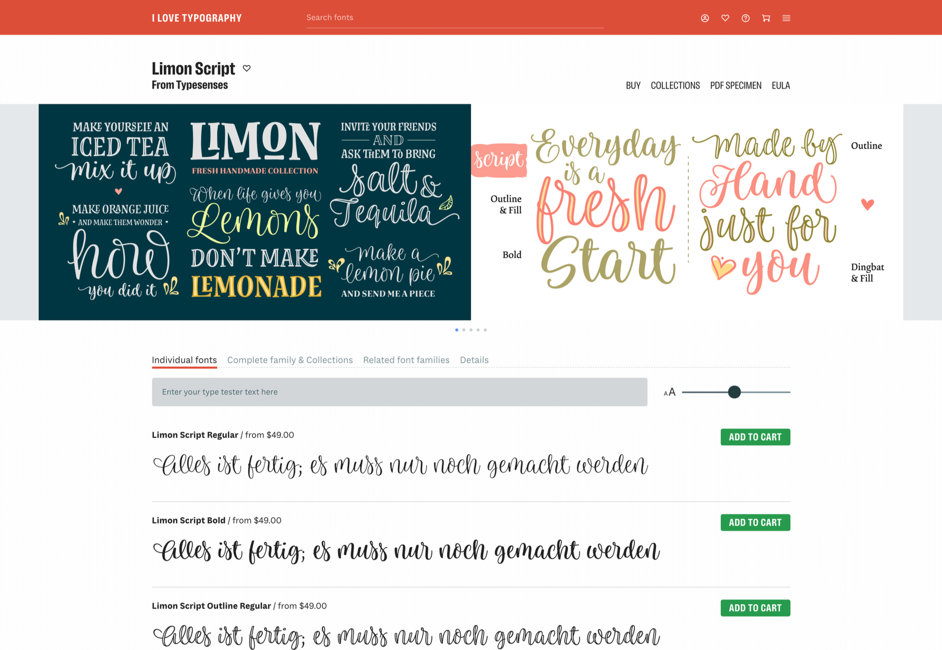
I Love Typography — a popular source of news about typography and type design since 2007 — has stepped into the marketplace, starting by inviting some of the world’s top designers to contribute to its new store, resulting in 40 foundries joining the project and 15 new type families available at launch.
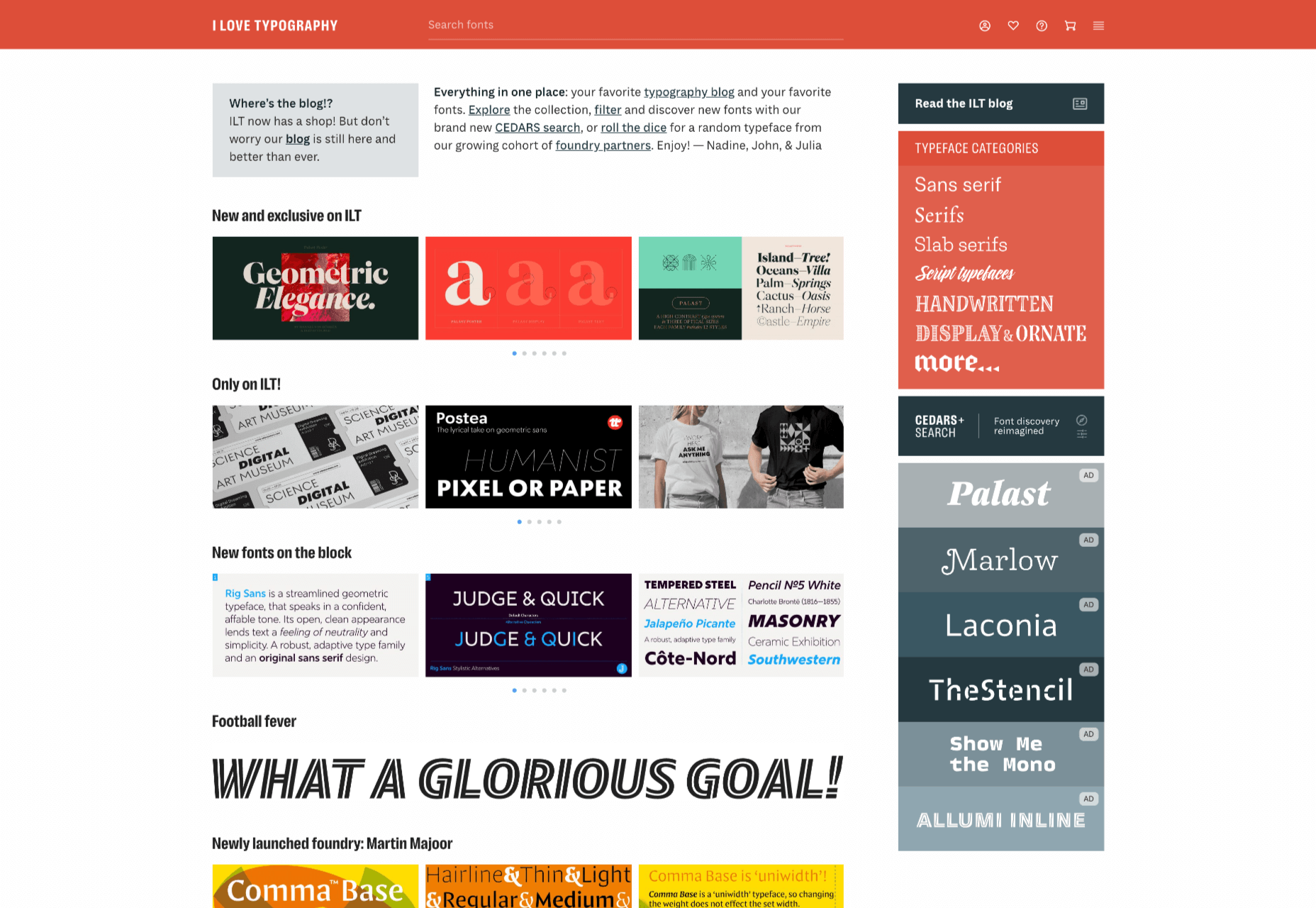
ILT’s boldest move is to step away from the traditionally shallow type categories and attempt to devise a system that drills down into the nuances of type design, all to aid discovery.
The approach is named CEDARS+, which is a method of describing the formal characteristics of a (mainly Latin) typeface based on the characteristics of the marks if made by a writing tool such as a pen or chisel.
CEDARS+ can be broken down as follows:
- Contrast: the difference between the thickest and the thinnest strokes in a character. Permissible values range from ‘none’ through ‘medium’ to ‘extreme.’
- Energy: the visual energy in the letterform. Values range from ‘calm’ to ‘lively’ and ‘very high.’
- Details: with several sub-categories, details is a catch-all category that covers aspects such as how strokes end and intersect.
- Axis: the angle at which the tool would be held to create the form. Axis uses degrees, with 90 degrees being a vertical axis.
- Rhythm: covers both the tightness or looseness of letters varying from ‘very tight’ to ‘very loose, and the difference in width between the narrow and wide letters varying from ‘highly regular’ to ‘highly irregular.’
- Structure: another catch-all category that covers the structure of loops with values such as ‘triangular’ and ‘oval,’ and the general construction, which can be ‘formal,’ ‘cursive,’ ‘organic,’ ‘layered,’ ‘stencil,’ or ‘modular.’
- +: the plus covers several characteristics that don’t fit neatly into an acronym, including the shape of crossbars, and single or double storey ‘a’s and ‘g’s.
With a way to browse font families that is based on the feel of the design, rather than popularity (or alphabetical order!) ILT hopes to expose lesser-known designs and designers, and to encourage more creative typography on the web.
p img {display:inline-block; margin-right:10px;}
.alignleft {float:left;}
p.showcase {clear:both;}
body#browserfriendly p, body#podcast p, div#emailbody p{margin:0;}
The post I Love Typography Launches Font Store first appeared on Webdesigner Depot.
![]()